
Wikipedia:Featured picture candidates/June-2008
| Featured picture tools |
|---|
Please cut and paste new entries to the bottom of this page, creating a new monthly archive (by closing date) when necessary.
Valued image seal[edit]

- Reason
- It is the logo for a new review system that emphasizes the images that are available in the commons collection and selects the superior image for conveying the information it is supposed to convey. For me, I thought I knew about the subject that the image I had given favorable support to in another review system but while checking the requirements of this new review system, I realized how little I knew about the subject and looking at the other images available was a very good exercise. As English wikipedia is today rerunning one of their featured pictures, let me use the example of a spoon. An image of a spoon might not have enough whatever for the other review systems but if that image of a spoon is the best one that is available to represent the idea of a spoon, then it should become the Valuable Image and get this seal. Handcrafted by LadyofHats and/or LadyofHats for use at the new review system.
- Articles this image appears in
- none yet, sorry
- Creator
- LadyofHats
- Support as nominator --carol (talk) 03:03, 1 June 2008 (UTC)
- Oppose It's not in any articles, hence it doesn't meet the criteria of adding to an article. Capital photographer (talk) 03:08, 1 June 2008 (UTC)
- Close nomination, it's nice but FPC is not for nice images--that's the Commons. This is for images very useful to the English language encyclopedia... not outside project. Try commons:C:FPC. gren グレン 04:25, 1 June 2008 (UTC) Oh, you already are doing this on the commons 04:25, 1 June 2008 (UTC)
Question -- I understand the not being used in an article critique, but to say it is different projects when there is so much encouragement here to upload images there, the 'outside' project idea is confusing to me. It is a review system which finds available images to illustrate articles with. Indeed, images which are being used for articles here are not being supported there due to higher quality images being available. Please define 'different project' `cause I think in this case it makes those 'different projects' appear to provide higher quality and that much additionally "encyclopedic" images than this review system is doing. -- the consensus (talk) 06:31, 1 June 2008 (UTC)[Sockpuppet of nominator]- Commons has different standards for what is required and expected of a Featured Picture (as do other Wikipedias). The only images that are eligible for the English Wikipedia featured status are ones that are used to illustrate articles on English Wikipedia. Because of that, this image is not eligible. Certainly the new valued image process will be useful for many projects in terms of identifying the highest quality, most encyclopedic illustrations we have for a given topic; the featured pictures process here has different goals from valued images (and featured pictures) on Commons. I am closing this nomination, since this image cannot be placed in an article.--ragesoss (talk) 06:56, 1 June 2008 (UTC)
- Comment: Close the nomination, certainly, however I have seen many a nomination remain on this page. The image is good, the review system is going to improve articles. The removal of the nomination from the candidate page is kind of sad and not useful. -- carol (talk) 07:14, 1 June 2008 (UTC)
Not promoted --ragesoss (talk) 06:56, 1 June 2008 (UTC)
Arrival of Jews at Auschwitz-Birkenau[edit]
- Reason
- Having arrived on the ramp at Auschwitz-Birkenau, the vast majority of those visible will be killed within hours. Of the approx 3,000,000 people killed in Nazi death camps, Crematoria II and III (visible in the background) account for around a quarter of that amount. Arguably a defining moment of the 20th century.
- Articles this image appears in
- Extermination camp, Rudolf Höß, Auschwitz concentration camp
- Creator
- Uploaded by WilliamH
- Support as nominator --WilliamH (talk) 18:58, 29 May 2008 (UTC)
- Nomination withdrawn - see comment. WilliamH (talk) 11:25, 30 May 2008 (UTC)
- Strong support--Mbz1 (talk) 19:01, 29 May 2008 (UTC)
- Support per Mbz1. Good historical value, as well. Juliancolton Tropical Cyclone 19:05, 29 May 2008 (UTC)
- Strong oppose. Can you clean this image up before you nominate it please? Papa Lima Whiskey (talk) 19:21, 29 May 2008 (UTC)
- Please keep in mind that it's an image from 1944, and the historical value outweighs the issues with artifacts and such. Juliancolton Tropical Cyclone 19:24, 29 May 2008 (UTC)
- We've cleaned up every other historic image so far. What's so precious about the particular artefacts in this one? Papa Lima Whiskey (talk) 19:33, 29 May 2008 (UTC)
- Please keep in mind that it's an image from 1944, and the historical value outweighs the issues with artifacts and such. Juliancolton Tropical Cyclone 19:24, 29 May 2008 (UTC)
- Oppose and downsample unless someone can explain why this is PD. (I know the USHMM says so, but it needs a reason to say so.) Current tag is the pre-1923 one, which makes no sense. The USHMM says these photos were taken by SS-Hauptscharführer Bernhardt Walter and his assistant, SS-Unterscharführer Ernst Hofmann and were later found in abandoned SS barracks.[1] (Though a more comprehensive discussion of the photos' origin, which can be found here, says the photographer is unknown - see p102.) They were sold by the finder to Yad Vashem, but that doesn't make them PD. Mangostar (talk) 21:31, 29 May 2008 (UTC)
- Note that anonymous works, under German copyright law, enter the public domain 70 years after creation. (Or at least that's what I'm pretty sure is the law, according to a machine translation of [2].) If it's not PD now, it will be in 6 years. Mangostar (talk) 21:47, 29 May 2008 (UTC)
- Oppose until it is cleaned up. Clegs (talk) 22:55, 29 May 2008 (UTC)
- Oppose at present I agree with Papa Lima Whisky, this image is in need of some restoration. Specs of dirt, fading and other artifacts can be easily rectified. I would support a restored image. Capital photographer (talk) 07:53, 30 May 2008 (UTC)
- Comment: I believed this image was public domain at least in the United States (following a conversation I had with users in #wikimedia-commons), because the USHMM stated it was public domain. I contacted the USHMM and they said that the image is in the public domain courtesy of Yad Vashem. However, as far as I have now been able to prudently construe, as the 25 year old Germany rule was superseded, this image that would have been public domain in Germany in 1969 had its copyright reinstated in 1995. Accordingly, this means that as of January 1, 1995, the image is still copyright in America. When the USHMM says/displays it as public domain, and personally tells you it's public domain, well, I'm surprised and disappointed at how undiscerning Yad Vashem and the USHMM have been. I certainly thought that those at the helm of the USHMM photo archives would be in a better position than me to comment on issues like this. Nonetheless, thanks for everyone's constructive comments and I respectfully ask for this discussion to be closed. Regards, WilliamH (talk) 11:23, 30 May 2008 (UTC)
- This should be made clear and go to an IfD. If not deleted I say we continue with this FPC... (and I have no opinion on the copyright issues...) gren グレン 08:15, 31 May 2008 (UTC)
- The image is unfortunately ineligible as a featured picture candidate because fair use images are not allowed. I will downsize it shortly though, as there is certainly legitimate fair usage and encyclopedic value in it. WilliamH (talk) 12:31, 31 May 2008 (UTC)
Not promoted MER-C 10:03, 1 June 2008 (UTC)
Benin baptism[edit]

- Reason
- A very interesting and encyclopedic photograph depicting Christian practices in Africa. The composition could be improved somewhat (I wish more of the pool of water were in view), but it is relatively hard to obtain high-quality pictures from the developing world. I think this is one of the best photographs of an Africa-related subject I've come across on Wikipedia. A pretty striking contrast to what baptisms look like in my church.
- Articles this image appears in
- Christianity in Africa, Celestial Church of Christ, Religion in Benin, Benin, Baptism (just added to the last two, hopefully they'll stick)
- Creator
- Ferdinand Reus
- Support as nominator --Mangostar (talk) 17:51, 26 May 2008 (UTC)
- Regretful Oppose The most important part is obscured by the angle, you can't see what the head is about to be dipped into. Clegs (talk) 16:22, 27 May 2008 (UTC)
- There's no dipping involved. Just pouring from his hands which you can see reasonably well. Papa Lima Whiskey (talk) 07:48, 28 May 2008 (UTC)
- That's exactly what I was talking about. The bodies are placed at the wrong angle so that you can't tell what's going on. If it's pouring from the hands, a much better shot would be a closeup of the hands and head. Clegs (talk) 22:21, 28 May 2008 (UTC)
- There's no dipping involved. Just pouring from his hands which you can see reasonably well. Papa Lima Whiskey (talk) 07:48, 28 May 2008 (UTC)
- Oppose Regardless of whether the subject is interesting or not, the photograph is not an exceptional photograph. Not good composition; too cluttered. Would have been better taken from further away and from a different angle. Oska (talk) 08:10, 28 May 2008 (UTC)
- Conditional support if someone can create EV for the fact that the men and women are waiting in separate lines. Papa Lima Whiskey (talk) 13:13, 29 May 2008 (UTC)
Not promoted MER-C 07:02, 2 June 2008 (UTC)
Fifteen major paradigm shifts[edit]

- Reason
- I feel this meets all of the criteria because
- it is of high-resolution and high-quality
- visually contributes to the articles it is in
- and I feel it is of Wikipedia's highest quality
- Articles this image appears in
- Technological singularity, Accelerating change
- Creator
- Ray Kurzweil; recreated by Tkgd2007 in SVG format.
- Support as nominator --TIM KLOSKE|TALK 00:04, 26 May 2008 (UTC)
- Oppose I can't for the life of me tell what it is trying to depict. Paradigm shifts, But paradigms of what? And the timeline is next to unreadable, as well. Clegs (talk) 00:36, 26 May 2008 (UTC)
- Oppose per Clegs. Matt Deres (talk) 01:45, 26 May 2008 (UTC)
- Oppose what Clegs said, plus it's just a simple graph with no wow, what ever the bigger implications may be, it's not special as a picture I am afraid. Mfield (talk) 02:24, 26 May 2008 (UTC)
- Oppose per Clegs. I note the original was by Ray Kurzweil, whose writing I find obscure as well. Pete Tillman (talk) 03:02, 26 May 2008 (UTC)
- Comment I have removed it from the articles. I think this is pretty clear-cut OR. Thegreenj 06:44, 26 May 2008 (UTC)
- I've put it back. The synthesis is by Ray Kurzweil, not some Wikipedian. A near-identical graph is on p.19 of The Singularity is Near, as the image page says. ~~ N (t/c) 20:15, 26 May 2008 (UTC)
- Oppose per others, hardly gripping out of context, and can it really be CC when the differences from Kurzweil's graph are trivial? ~~ N (t/c) 20:15, 26 May 2008 (UTC)
- Oppose because Wikipedia is not a valid source. You will need to plot some based reliable sources (and I disagree with most of the "too hard to understand" opposes). gren グレン 06:13, 27 May 2008 (UTC)
- Then perhaps you can explain what the 15 shifts are, based on the information present in the graph. Or perhaps you could explain what the point of the graph even is. Something about plotting time since present against time to next "event" on a logarithmic scale strikes me (on the face of it) as somewhat circular, but that could well be because I don't know what the graph is trying to show. Matt Deres (talk) 16:24, 27 May 2008 (UTC)
- Comment. As I understand it, the graph shows that the time gap between paradigm shifts is getting smaller as each subsequent shift takes place (the paradigm shifts being identfied by the authors in the legend). The implication is that we will reach some sort of technological singularity when the curve intersects the x-axis. Pstuart84 Talk 16:38, 27 May 2008 (UTC)
- Oppose Sorry, another pile-on vote. Clegs said it. Crassic! (talk) 02:07, 28 May 2008 (UTC)
- Oppose - very nice diagram, but having examined it at full size I still haven't got a clue what any of it means. —Vanderdecken∴ ∫ξφ 17:51, 28 May 2008 (UTC)
- Oppose - The diagram is ridiculous and highly misleading. As Pstuart has said, it implies a technological singularity. For arithmetic reasons, it points to the present as the projected time of singularity, and it must do so regardless of the events plotted. I explained this in more detail at Talk:Accelerating_change. Dzhim (talk) 00:26, 31 May 2008 (UTC)
Not promoted MER-C 07:02, 2 June 2008 (UTC)
1909 Tulsa Panorama[edit]


- Reason
- This is a wonderful photo that shows the amount of growth that the city of Tulsa, Oklahoma went through only two years after Oklahoma became a state. It is very fine quality with high resolution and illustrates the article, History of Tulsa, Oklahoma very well.
- Articles this image appears in
- History of Tulsa, Oklahoma
- Creator
- Clarence Jack, Library of Congress.
- Support as nominator --CPacker (talk) 06:34, 25 May 2008 (UTC)
- Support Very nice. -Fcb981(talk:contribs) 07:25, 25 May 2008 (UTC)
- Support Excellent panorama, very sharp. --Chrome89 (talk) 17:33, 25 May 2008 (UTC)
- Support Good historic panorama. DurovaCharge! 00:22, 26 May 2008 (UTC)
SupportTerrific quality for its age. Crassic! (talk) 00:39, 26 May 2008 (UTC)
- Support edit 1 Crassic! (talk) 02:08, 27 May 2008 (UTC)
Reluctant Oppose - wonderful scene, and it's great to see a panorama that's this old, but there's two major vertical stitching errors - the first roughly x=784 pixels from left, and the second at x=3122. Oppose until these are corrected.See below. —Vanderdecken∴ ∫ξφ 11:29, 26 May 2008 (UTC)- Support Edit1 - I closed up the gap and added Edit1. I will have a further examination and see if there's anything more to fix/repair and if so I will replace. Mfield (talk) 19:16, 26 May 2008 (UTC)
- Check the spots Vanderdecken mentioned. There are a few other extremely minor stitching problems too (eg. 1257px from left on edit 1), but they're bordering on imperceptible. Thegreenj 20:45, 26 May 2008 (UTC)
- Fixed the other major stitch error too, replaced Edit 1 with new version. Mfield (talk) 20:52, 26 May 2008 (UTC)
- Fixed another three, replaced it again. I am pretty certain I have got them all now. Mfield (talk) 23:40, 26 May 2008 (UTC)
- Fixed the other major stitch error too, replaced Edit 1 with new version. Mfield (talk) 20:52, 26 May 2008 (UTC)
- Fixed, change vote to Strong Support edit 1. —Vanderdecken∴ ∫ξφ 07:21, 27 May 2008 (UTC)
- Check the spots Vanderdecken mentioned. There are a few other extremely minor stitching problems too (eg. 1257px from left on edit 1), but they're bordering on imperceptible. Thegreenj 20:45, 26 May 2008 (UTC)
- Support Edit 1 No reason not to support this now. Thegreenj 00:00, 27 May 2008 (UTC)
- Support Edit 1. Sweet.--ragesoss (talk) 01:27, 27 May 2008 (UTC)
- Support Edit 1. The image is quite encyclopedic, and Mfield did a good job fixing the errors. NauticaShades 02:40, 27 May 2008 (UTC)
- Support Edit 1 Per above.--Fireaxe888 (talk) 09:37, 27 May 2008 (UTC)
- Comment moved - it split Nautica's sig in half. —Vanderdecken∴ ∫ξφ 13:10, 27 May 2008 (UTC)
- Comment Am I crazy or does there still seem to be a tiny error at approximately x=3,8000 (guess) at the very bottom. Not a huge deal, I suppose, but it's still there. Crassic! (talk) 17:13, 27 May 2008 (UTC)
- Now you see it, now you don't? Mfield (talk) 17:24, 27 May 2008 (UTC)
- Indeed. ;) Crassic! (talk) 17:35, 27 May 2008 (UTC)
- Support Edit 1 nice found, will do much good for the content illustration. M.K. (talk) 16:06, 28 May 2008 (UTC)
- Support Edit 1 A good historic image. This pic was taken 99 years ago. My grandmother was born in 1909. And she is still living.(^^)/ Laitche (talk) 21:30, 28 May 2008 (UTC)
- Support Edit 1. High encyclopedic value. - Darwinek (talk) 16:02, 30 May 2008 (UTC)
- Support Edit 1 Great panorama for this time. SpencerT♦C 01:16, 31 May 2008 (UTC)
Promoted Image:Tulsa Panorama 1909 edit1.jpg MER-C 07:02, 2 June 2008 (UTC)
A day on Io[edit]

- Reason
- A composite of a full day rotation on Jupiter's moon Io.
- Articles this image appears in
- Io (moon)
- Creator
- NASA Voyager and Galileo spacecraft
- Support as nominator --DurovaCharge! 05:26, 25 May 2008 (UTC)
- Oppose Please forgive me if I'm missing something or if it isn't really a defect, but the object appears oval in shape... shouldn't it be round. I think the aspect ratio is wrong. Capital photographer (talk) 08:09, 25 May 2008 (UTC)
- Comment The aspect ratio is wrong when played on the MediaWiki applet, but it's OK when played with mplayer. I think ffmpeg2theora was putting 640x480 in the metadata but encoding the actual file in the correct 640x440. Anyway, I've gone back to the original NASA mpeg and re-encoded it with ffmpeg2theora -x 640 -y 440 and it seems to fix the ratio problem. Time3000 (talk) 10:27, 25 May 2008 (UTC)
- Comment Thanks for fixing the aspect ratio. However, the South pole is now sliced off, and the color balance has changed. Pete Tillman (talk) 03:08, 26 May 2008 (UTC)
- Maybe try a different browser? I see the South Pole on my system and the color balance looks the same. DurovaCharge! 06:07, 26 May 2008 (UTC)
- I can't see any difference in the colour balance, but I just noticed that the new version's only about 4s long. I think the problem with the south pole being cut off is the mediawiki applet when it's a thumbnail - it always cuts off the bottom 10px or so as a scrubber. Anyway, I've re-encoded it again so it is now 640x480, with padding instead of scaling (to fix both aspect ratio and south pole issue). This time I used an intermediate step of very high quality (about 4000kbps) MPEG-4 (so I could use the ffmpeg options to sort out the aspect ratio and padding) and then ffmpeg2theora to convert to ogg/theora. The length is slightly different (NASA's original mpeg wasn't sure whether it was 25 of 30fps) so it's now 28.8s instead of 24s, but I don't think it makes much difference to the animation. The re-encoding has also had the side effect of making the file appear the right length instead of 25mins when using the mplayer plugin on firefox. Time3000 (talk) 11:54, 26 May 2008 (UTC). Sorry about the huge comment, feel free to ignore it ; ).
- Maybe try a different browser? I see the South Pole on my system and the color balance looks the same. DurovaCharge! 06:07, 26 May 2008 (UTC)
- Support Alternative 2. Can't help the MediaWiki problems, but it's a feature-worthy clip.--ragesoss (talk) 01:33, 27 May 2008 (UTC)
- If there's a MediaWiki problem, report it at Bugzilla. MER-C 13:16, 29 May 2008 (UTC)
- Comment Nice idea. I just have trouble believing that Io is a perfect sphere. It's probably an irregular shape, maybe slightly oval, but definitely with some bumps on the surface by the looks of it. Can we not produce such a rendering? I know there are ways to apply raster graphics textures as depth maps on a 3D object. Papa Lima Whiskey (talk) 08:01, 28 May 2008 (UTC)
- If the Earth were scaled down to six feet in diameter, Mount Everest would be a thin coat of paint. All the substantial moons and solid rocky planets are near-perfect spheres. Io is a Galilean moon; it's got enough mass to be spherical, and any aberration wouldn't be visible in a scaled representation as small as this. DurovaCharge! 11:53, 29 May 2008 (UTC)
- Earth is not a good reference for several reasons (much larger, has an atmosphere, has liquid on the surface), but even so, Earth has bumps far larger than mountains. Earth has a reference about why Mount Everest isn't actually necessarily the highest mountain, for instance. I don't think we need to argue about the fact that in the nominated image, the texture is projected on a perfect sphere. As for the rest of your argument, can I put a [citation needed]? Also, please note that the photograph at the top of the Io (moon) article suffers the same problem. You can verify this by the fact that no "anti-aliasing" is present, i.e. the borders were drawn as hard pixels by a computer program that does not support anti-aliasing. Meanwhile, my argument about non-perfect shape would seem to be supported by Image:Iosurface.jpg and Image:Tvashtarvideo.gif, which are also in the article. Papa Lima Whiskey (talk) 13:09, 29 May 2008 (UTC)
- I agree that Earth isn't a perfect reference, but the same argument can be applied more validly to the Moon (a similar size to Io - 1700km radius compared to Io's 1800km). From Earth, the only way to tell that the Moon is not a perfect sphere is to look at it through a telescope or binoculars at a bit where shadows from crater walls etc. are visible. For this video of Io, the light source is in the same direction from Io as the 'camera', so no such shadows appear. It would be possible to use a normal map of Io's surface to simulate these, but because of the direction of the light source, there's really no point.
- Earth is not a good reference for several reasons (much larger, has an atmosphere, has liquid on the surface), but even so, Earth has bumps far larger than mountains. Earth has a reference about why Mount Everest isn't actually necessarily the highest mountain, for instance. I don't think we need to argue about the fact that in the nominated image, the texture is projected on a perfect sphere. As for the rest of your argument, can I put a [citation needed]? Also, please note that the photograph at the top of the Io (moon) article suffers the same problem. You can verify this by the fact that no "anti-aliasing" is present, i.e. the borders were drawn as hard pixels by a computer program that does not support anti-aliasing. Meanwhile, my argument about non-perfect shape would seem to be supported by Image:Iosurface.jpg and Image:Tvashtarvideo.gif, which are also in the article. Papa Lima Whiskey (talk) 13:09, 29 May 2008 (UTC)
- If the Earth were scaled down to six feet in diameter, Mount Everest would be a thin coat of paint. All the substantial moons and solid rocky planets are near-perfect spheres. Io is a Galilean moon; it's got enough mass to be spherical, and any aberration wouldn't be visible in a scaled representation as small as this. DurovaCharge! 11:53, 29 May 2008 (UTC)
- The image and video you link to don't show that Io isn't a perfect sphere. Io is volcanically active, hence the change in surface in the image. The video is of a volcanic eruption in progress, but the plume hardly counts as a part of Io's surface. From Io (moon): "As a by-product of this activity, sulfur, sulfur dioxide gas and silicate pyroclastic material (like ash) are blown up to 500 km (310 mi) into space, producing large, umbrella-shaped plumes...". You might just as well say that the Earth's atmosphere is a part of the Earth's surface. Time3000 (talk) 14:34, 29 May 2008 (UTC)
- It's good that you bring up the moon, as the featured picture I added to the nomination should convince you of its unevenness. The fact that Io's surface changes is irrelevant, as photos and videos are frozen in time. This animation should accurately represent the point in time when the probe passed. A natural satellite is a 3D object. This candidate animation fails to capture planet shape and surface structure, and so it fails on the grounds that it is inaccurate. Papa Lima Whiskey (talk) 15:20, 29 May 2008 (UTC)
- I have to disagree again - firstly, the animation you linked to and the data used for this video were taken by different probes (this video - Voyager 1 and Galileo (spacecraft); the animated GIF - New Horizons). When Voyager flew by Io there was an eruption, but there were plenty of times during the Galileo mission when there were no eruptions which would be visible on this scale. Still, if you want to oppose, go ahead : ). Time3000 (talk) 16:57, 29 May 2008 (UTC)
- Once again, your comments come across as irrelevant. The fact that one of the pictures I cited shows an eruption has nothing to do with the fact that the surface of Io is not as even as you claim, clearly visible in both the cited pictures, and a consistent property of Io, regardless of when the pictures are taken. In fact, the time between those two exposures substantiates my argument: Io is not a perfect sphere, and this property is invariant through time. From one of the sources cited in the article: We have identified 115 mountain structures (covering ~3% of the surface) and 541 volcanic centers, including paterae (calderas and dark spots) and shield volcanoes. The average length of an Ionian mountain is 157 km, with the longest being 570 km. The mean height of Ionian mountains is 6.3 km, and the highest known mountain is Boösaule Montes (17.5+/-3km). Papa Lima Whiskey (talk) 21:54, 29 May 2008 (UTC)
- The image and video you link to don't show that Io isn't a perfect sphere. Io is volcanically active, hence the change in surface in the image. The video is of a volcanic eruption in progress, but the plume hardly counts as a part of Io's surface. From Io (moon): "As a by-product of this activity, sulfur, sulfur dioxide gas and silicate pyroclastic material (like ash) are blown up to 500 km (310 mi) into space, producing large, umbrella-shaped plumes...". You might just as well say that the Earth's atmosphere is a part of the Earth's surface. Time3000 (talk) 14:34, 29 May 2008 (UTC)
- Oppose given the above argument. Papa Lima Whiskey (talk) 15:20, 29 May 2008 (UTC)
- Support alt 2. The composite does make it look almost perfectly spherical at the edges but the images themselves quite clearly show that it is pockmarked and it's a pretty impressive achievement to be able to watch a complete rotation of a distant satellite. Pstuart84 Talk 15:30, 31 May 2008 (UTC)
- There are tools that allow you to use textures as elevation maps. Papa Lima Whiskey (talk) 10:29, 1 June 2008 (UTC)
Not promoted MER-C 07:02, 2 June 2008 (UTC)
A tropical beach Sunset in Cuba[edit]

- Reason
- It has good colors, and shows a beautiful sunset after a hard day in Cuba.
- Articles this image appears in
- Cuba
- Creator
- Aaron Escobar
- Support as nominator --Aaron1a12 (talk) 04:28, 25 May 2008 (UTC)
- Comment Do you possibly have a higher quality version of this shot? Crassic! (talk) 04:35, 25 May 2008 (UTC)
- Oppose Burnout in sky, picture postcard/snapshot type image - could be anywhere, thus low enc. --Janke | Talk 07:01, 25 May 2008 (UTC)
- Oppose - As Janke says, nice photo but could be anywhere. Not illustrative. |→ Spaully₪† 10:50, 25 May 2008 (GMT)
- Oppose - small, major vignetting. Trash in the plants to the right, snapshot quality image. —Vanderdecken∴ ∫ξφ 12:18, 26 May 2008 (UTC)
- Oppose I have a suspicion that sunset pictures generally have low EV. I'm pretty sure this one does. Papa Lima Whiskey (talk) 14:21, 26 May 2008 (UTC)
- Oppose YABS. Unencyclopedic, could-be-anywhere glare shot Motmit (talk) 16:25, 26 May 2008 (UTC)
- Oppose via Motmit - also image size is abominable. Teque5 (talk) 01:12, 27 May 2008 (UTC)
- Oppose Unencyclopedic.--Fireaxe888 (talk) 09:39, 27 May 2008 (UTC)
- Oppose Tilted (look at the horizon) - Adrian Pingstone (talk) 18:44, 27 May 2008 (UTC)
- Oppose -per Motmit Nelro (talk) 19:53, 27 May 2008 (UTC)
- Oppose Flare, foreground is too dark --βαςεLXIV™ 15:17, 28 May 2008 (UTC)
- Oppose This is why they invented Graduated ND filters. Capital photographer (talk) 14:37, 29 May 2008 (UTC)
Not promoted MER-C 07:02, 2 June 2008 (UTC)
Retired Pacific hurricane names[edit]


- Reason
- This is a very encyclopediac image, covering track maps of all the Pacific hurricanes to have their names retired.
- Articles this image appears in
- List of retired Pacific hurricane names
- Creator
- User:Ajm81 on Wikimedia Commons
- Support as nominator --Juliancolton Tropical Cyclone 01:02, 25 May 2008 (UTC)
- Comment For an image like this, the size needs to be much bigger in my opinion. SpencerT♦C 01:14, 25 May 2008 (UTC)
- Thank you for your comment, but from what I can tell it still meets the minimum size. Please let me know if I'm mistaken. Juliancolton Tropical Cyclone 01:18, 25 May 2008 (UTC)
- That's just a guideline--and a minimum--and I think the point is that on an image of this type we should have higher resolution. gren グレン 02:13, 25 May 2008 (UTC)
- Yeah, that's what I mean...sorry for not clarifying. SpencerT♦C 02:14, 25 May 2008 (UTC)
- That's just a guideline--and a minimum--and I think the point is that on an image of this type we should have higher resolution. gren グレン 02:13, 25 May 2008 (UTC)
- Thank you for your comment, but from what I can tell it still meets the minimum size. Please let me know if I'm mistaken. Juliancolton Tropical Cyclone 01:18, 25 May 2008 (UTC)
- Oppose, I'd like to see mores specific referencing on the image page such as all of the lat/longitudes plotted and for each hurricane with their specific references rather than just a link to the site. The info is public domain so that should be no problem. Images should be as clearly sourced as articles. gren グレン 02:13, 25 May 2008 (UTC)
- Oppose Does not indicate which track goes with which hurricane, making it essentially meaningless for the intended purpose. If the name and year were added, it would be a lot more encyclopædic. Shoemaker's Holiday (talk) 02:33, 25 May 2008 (UTC)
Oppose per Shoemaker. Weak Oppose The font color in both is hard to read against the land. Maybe a thicker font would help? Clegs (talk) 03:25, 25 May 2008 (UTC)- Alright, check out edit 1, I added storm names and years to the image. Juliancolton Tropical Cyclone 02:01, 26 May 2008 (UTC)
- Comment - Ioke's is missing parenthesis for its year, also you may want to change the text color as the current one blends in with the coloring of the Rocky Mts. on the satellite imagery. Hello32020 (talk) 02:07, 26 May 2008 (UTC)
- Ooh, good point. I'll get on that tomorrow morning... Juliancolton Tropical Cyclone
- Comment Might support if labels are consistent, and contrast against background (rightmost three are bad). Papa Lima Whiskey (talk) 14:10, 26 May 2008 (UTC)
- Correction and new colors added. Juliancolton Tropical Cyclone 15:06, 26 May 2008 (UTC)
- Oppose. Labels: Poor font and placement (should show which end is the start); neither color contrasts well with the land. Low resolution: IMO it should be at least 2 times bigger in both directions. No Latitude/Longitude lines on the image: In particular, where are the dateline, 140E and the equator, the boundaries of the basin? The caption is not useful. Would be more valuable if it was on a plain map, not a satellite image - the background distracts from the important info.--CycloneAlley (talk) 15:13, 26 May 2008 (UTC)
- Weak Support - It's much better, but you should probably implement at least some of the suggestions the other users have stated. Hello32020 (talk) 15:20, 26 May 2008 (UTC)
- Oppose, captions are illegible at thumbnail resolutions, and the text color causes too much contrast with the blue background, which hurts eyes. Titoxd(?!? - cool stuff) 00:49, 30 May 2008 (UTC)
- Oppose. I like the concept but not the execution: the labels are useless at thumb and not very attractive at full size, and the map element is pretty basic, without much informational content (per CycloneAlley). Pstuart84 Talk 15:32, 31 May 2008 (UTC)
Not promoted MER-C 07:01, 2 June 2008 (UTC)
Louis Brandeis[edit]

- Reason
- One of the more important justices to sit on the United States Supreme Court. Justice Louis Brandeis authored the landmark Brandeis Brief. He was the first Jewish justice on the Supreme Court and was a leading American Zionist. Two institutions of higher learning have been named after him: the Louis D. Brandeis School of Law of the University of Louisville, and Brandeis University. A well-composed portrait carefully restored. After days of work solving more than the usual problems (there was chemical damage to the negative), I think it's safe to say Wikipedia now has the best portrait of Justice Brandeis available to the public. Original version at Image:Brandeisa.jpg.
- Articles this image appears in
- Louis Brandeis, Demographics of the Supreme Court of the United States, United Kingdom agency worker law
- Creator
- Harris & Ewing
- Support as nominator --DurovaCharge! 02:13, 24 May 2008 (UTC)
- Support Fantastic restoration.--HereToHelp (talk to me) 02:30, 24 May 2008 (UTC)
- Support per HereToHelp. Highly encyclopedic. An exceptional historic photo. Pete Tillman (talk) 05:31, 24 May 2008 (UTC)
- Support Historical and a nice image. SpencerT♦C 01:17, 25 May 2008 (UTC)
- Support great photo.--CPacker (talk) 06:41, 25 May 2008 (UTC)
- Question is there any source that indicates its copyright status or date of first publication better than the "circa. 1916" on the image description page? Guest9999 (talk) 11:58, 25 May 2008 (UTC)
- The Library of Congress doesn't contest its copyright status. This was taken seven years before the 1923 cutoff for PD-US and during the interim he was appointed to the Supreme Court. DurovaCharge! 15:44, 25 May 2008 (UTC)
- Support. Papa Lima Whiskey (talk) 13:24, 29 May 2008 (UTC)
- Support Capital photographer (talk) 01:04, 31 May 2008 (UTC)
Promoted Image:Brandeisl.jpg MER-C 07:01, 2 June 2008 (UTC)
Yellowlegs - natures pics[edit]


- Reason
- Good quality, highly encyclopedic, I think this image meets the FP criteria.
- Articles this image appears in
- Lesser Yellowlegs, Tringa, List of birds of Chile, Birds of North American boreal forests
- Creator
- Alan D. Wilson, www.naturespicsonline.com (public domain)
- Support as nominator --Skolan124 (talk) 07:49, 19 May 2008 (UTC)
- Support Edit Very good pic- I was taking pics of this same species last week, and didn't get anything even close to this. I think the removal of the rock is the final capstone. Clegs (talk) 16:27, 19 May 2008 (UTC)
- Support Either. The shot is not at the best angle, but it makes up for that with its dynamism. The quality is high enough to warrant a support. NauticaShades 21:16, 19 May 2008 (UTC)
- Support Bewareofdog 23:25, 19 May 2008 (UTC)
- Weak support It's a nice image, but the blurry rock right behind the tail annoys me. SpencerT♦C 01:08, 20 May 2008 (UTC)
- Oppose The legs are waaay out of focus. And ... whatever the other object is behind it's tail, would it be possible for someone to clone that out? crassic![talk] 02:33, 20 May 2008 (UTC)
- Oppose. Yeah, DOF, and a little bit of noise as well. A good image otherwise. Papa Lima Whiskey (talk) 13:20, 20 May 2008 (UTC)
- Can't anyone make an edit, and remove that stone behind the tail? I don't have the right tools. Skolan124 (talk) 17:47, 21 May 2008 (UTC)
- I tried, but it looks bad. SpencerT♦C 22:20, 22 May 2008 (UTC)
- Support per Clegs/ well done. —αἰτίας •discussion• 23:32, 21 May 2008 (UTC)
- weak oppose some grain, DOF issues. I also tried removing the rock behind the tail, but the grain there makes removing it especially tricky... and kind of a moot point. Matt Deres (talk) 01:59, 23 May 2008 (UTC)
- Moderate support I don't see any grain, and I don't htink the blurryness in the legs make it a bad image. I just wish that big rock wasn't there. Juliancolton Tropical Cyclone 12:52, 23 May 2008 (UTC)
- Comment I tried to remove the stone. Muhammad(talk) 21:30, 23 May 2008 (UTC)
- And I think you did a decent job, but I still have to weak oppose due to the graininess on the bird (tail and legs) and some lack of clarity on the legs. Matt Deres (talk) 20:26, 25 May 2008 (UTC)
- Support Edit I don't think the focus on legs is really a problem and In all honesty I'm not sure how you would reproduce a similar image of the bird with everything in focus. With the rock up it's bum gone it makes a pretty solid FP candidate. Billsmith453 (talk) 09:20, 27 May 2008 (UTC)
Promoted Image:Yellowlegs - natures pics edit.jpg MER-C 07:01, 2 June 2008 (UTC)
Snipefly[edit]

- Reason
- A very detailed and aesthetic image of a snipefly
- Articles this image appears in
- Rhagionidae
- Creator
- Richard Bartz aka Makro Freak
- Support as nominator --Richard Bartz (talk) 22:27, 28 May 2008 (UTC)
- Strong support as of great quality -- Dmitry A. Mottl (talk) 23:58, 28 May 2008 (UTC)
- Strong support great focus, and... the eyes... are amazing. SpencerT♦C 02:08, 29 May 2008 (UTC)
- Support Large DOF makes this a very good macro. Surprising sharpness at 1/4s. Well done. victorrocha (talk) 19:45, 28 May 2008 (UTC)
- Strong Support Great sharpness, DOF is controlled well, wonderfully diffused background, rich colour, just a really great shot both artistically and technically! Capital photographer (talk) 03:23, 29 May 2008 (UTC)
- Support Stunning. Laitche (talk) 05:34, 29 May 2008 (UTC)
- Support - A professional shot. I whish it could be done without focus bracketing and special lighting... Why this tight crop above the critter?-- Alvesgaspar (talk) 07:20, 29 May 2008 (UTC)
- If you look where the foot goes down to below the leaf, the image seems well balanced to me and very focused. Capital photographer (talk) 09:22, 29 May 2008 (UTC)
- It's not so much the lack of head room as the cutting off of the leaf tip which is wrong with the composition in this photo IMO --Fir0002 12:25, 29 May 2008 (UTC)
- The tip was far away, it's a twist --Richard Bartz (talk) 15:25, 30 May 2008 (UTC)
- If you're a professional, you may be able to make such a matter of fact statement. Capital photographer (talk) 14:34, 29 May 2008 (UTC)
- I'm not a professional but I do at least have some credentials and as a pretty experienced amateur, particularly in macro, I feel perfectly qualified to offer that opinion. --Fir0002 01:00, 30 May 2008 (UTC)
Indeed, we're all here to offer an opinion. Which is why when I make judgements about composition, lighting or processing, I try to make it clear that it is just my opinion. I don't believe it's okay to just bluntly say that something is wrong. You could have said that you "don't feel the composition is the best for that subject". Capital photographer (talk) 03:57, 30 May 2008 (UTC)- Well call me naive, but I would have thought Fir's use of IMO in his ORIGINAL comment made it pretty darn clear that he was just offering his opinion. --jjron (talk) 13:52, 30 May 2008 (UTC)
- I'm not a professional but I do at least have some credentials and as a pretty experienced amateur, particularly in macro, I feel perfectly qualified to offer that opinion. --Fir0002 01:00, 30 May 2008 (UTC)
- It's not so much the lack of head room as the cutting off of the leaf tip which is wrong with the composition in this photo IMO --Fir0002 12:25, 29 May 2008 (UTC)
- If you look where the foot goes down to below the leaf, the image seems well balanced to me and very focused. Capital photographer (talk) 09:22, 29 May 2008 (UTC)
- Support Nice macro shot. However as much as I like the soft lighting it seems that the sharpness of the body has really suffered due to the extended exposure time (the eyes excepted - they are uncharacteristically sharp). Maybe next time try use ~1/60s with some fill flash that way you'll get much better sharpness and still have nice lighting. Oh and I think the WB could do with some tweaking - too much in the greens (check out the eyes) but I'll let you decide. --Fir0002 12:25, 29 May 2008 (UTC)
- Sharpness has suffered? I'm looking at it at 100% on a 30" Apple Cinema HD Display. Looks pretty sharp to me. WB also looks fine. And I would definitely not advise using fill flash unless absolutely necessary. One of your own images exemplifies how the use of flash can advserley affect image quality by creating a synthetic look (http://wiki.riteme.site/wiki/Image:Hoverfly_perched_on_grass.jpg). The lighting in this image is ideal, neutral and even, perfect for an accurate, pure and natural capture. The photographer used a Canon 40D so I would have bumped it up to ISO400 to get a better shutter speed, which is easily achievable without detriment on the 40D. And (if not used) use a tripod. What display are you looking at this on? And is it colour calibrated? Capital photographer (talk) 13:10, 29 May 2008 (UTC)
- Yes sharpness has definitely suffered - check out the body hairs etc, they have no definition. If you honestly can't see it open it up at full res in one tab and something like this in another and flick between the two and it will become pretty obvious. A 40D with that lens is capable of producing much better results. I first looked at it at home on a $300 Polyview 17" (an everyday user LCD) and am now looking at it on a 20" SyncMaster at uni and am seeing no difference. WB is not drastically off but could do with improvement (open it in Photoshop and adjust the shadows in colour balance to about 6 bias to the magenta/cyan IMO). I maybe be wrong here but I don't think you're in a good position to lecture on WB or colour calibration on screens given your recent Toyota Aurion nom with burnt red wheels (despite having a Mk III!!). Yes definitely ISO400 would have been a good way to increase shutter speed (I automatically assumed he was using that as 90% I use ISO400). 1/4s, macro photography with a 180mm lens? Obviously he had a tripod! But 1/4s is almost never feasible in outdoor photography (even with a tripod, cable release and MLU) because tiny movements (due to wind etc) become very apparent at the magnifications you're working at. Anyway just FYI I'm unlikely to post any further responses on this topic due to time pressures in real life. --Fir0002 01:00, 30 May 2008 (UTC)
- Burnt red wheels? Seriously, get a decent display and calibrate it. Capital photographer (talk) 03:57, 30 May 2008 (UTC)
- Reply. Seriously open up in PS and hit ctrl+shift+b --Fir0002 05:45, 30 May 2008 (UTC)
- Hm, so you found time to reply. Well, for starters, the wheel is the big silvery thing in the middle. They're 16" alloys. The part you are reffering to is called the tyre. Dunlop sports, and they go around the wheel. And yes, there is some red colouring on the tyre, you know why... it's the dirt I was driving on that stuck to the tyre because of recent rain. The saturation was bumped up a bit making it more obvious but rest assured, any orange-red coloring on the tyres is dirt and was in the original scene. And going back to your own image (http://wiki.riteme.site/wiki/Image:Hoverfly_perched_on_grass.jpg), with over sharpening and synthetic lighting, not to mention most of it's body is out of focus.Capital photographer (talk) 07:47, 30 May 2008 (UTC)
- No ,the big silvery thing is the hubcap. You can't see the wheel. :P Anyway, the sharpness has suffered, I can vouch for that. —Vanderdecken∴ ∫ξφ 11:36, 30 May 2008 (UTC)
- They're alloy wheels, alloys don't have hubcaps. See: http://wiki.riteme.site/wiki/Hubcaps , http://wiki.riteme.site/wiki/Image:Alloy_wheel_of_a_2007_Subaru_Liberty_3.0R_Spec_B.jpg and http://www.jaxquickfit.com.au/Wheels/breyton.html . Some have small centre caps. And even if there is a hubcap on a steel wheel, you can still see the wheel behind it. In any case, Fir doesn't know the various parts of a car and was referring to the wrong part. Capital photographer (talk) 13:57, 30 May 2008 (UTC)
- Sorry, what this has still 2 do with the snipefly ? --Richard Bartz (talk) 15:22, 30 May 2008 (UTC)
- They're alloy wheels, alloys don't have hubcaps. See: http://wiki.riteme.site/wiki/Hubcaps , http://wiki.riteme.site/wiki/Image:Alloy_wheel_of_a_2007_Subaru_Liberty_3.0R_Spec_B.jpg and http://www.jaxquickfit.com.au/Wheels/breyton.html . Some have small centre caps. And even if there is a hubcap on a steel wheel, you can still see the wheel behind it. In any case, Fir doesn't know the various parts of a car and was referring to the wrong part. Capital photographer (talk) 13:57, 30 May 2008 (UTC)
- No ,the big silvery thing is the hubcap. You can't see the wheel. :P Anyway, the sharpness has suffered, I can vouch for that. —Vanderdecken∴ ∫ξφ 11:36, 30 May 2008 (UTC)
- Hm, so you found time to reply. Well, for starters, the wheel is the big silvery thing in the middle. They're 16" alloys. The part you are reffering to is called the tyre. Dunlop sports, and they go around the wheel. And yes, there is some red colouring on the tyre, you know why... it's the dirt I was driving on that stuck to the tyre because of recent rain. The saturation was bumped up a bit making it more obvious but rest assured, any orange-red coloring on the tyres is dirt and was in the original scene. And going back to your own image (http://wiki.riteme.site/wiki/Image:Hoverfly_perched_on_grass.jpg), with over sharpening and synthetic lighting, not to mention most of it's body is out of focus.Capital photographer (talk) 07:47, 30 May 2008 (UTC)
- Reply. Seriously open up in PS and hit ctrl+shift+b --Fir0002 05:45, 30 May 2008 (UTC)
- Burnt red wheels? Seriously, get a decent display and calibrate it. Capital photographer (talk) 03:57, 30 May 2008 (UTC)
- Yes sharpness has definitely suffered - check out the body hairs etc, they have no definition. If you honestly can't see it open it up at full res in one tab and something like this in another and flick between the two and it will become pretty obvious. A 40D with that lens is capable of producing much better results. I first looked at it at home on a $300 Polyview 17" (an everyday user LCD) and am now looking at it on a 20" SyncMaster at uni and am seeing no difference. WB is not drastically off but could do with improvement (open it in Photoshop and adjust the shadows in colour balance to about 6 bias to the magenta/cyan IMO). I maybe be wrong here but I don't think you're in a good position to lecture on WB or colour calibration on screens given your recent Toyota Aurion nom with burnt red wheels (despite having a Mk III!!). Yes definitely ISO400 would have been a good way to increase shutter speed (I automatically assumed he was using that as 90% I use ISO400). 1/4s, macro photography with a 180mm lens? Obviously he had a tripod! But 1/4s is almost never feasible in outdoor photography (even with a tripod, cable release and MLU) because tiny movements (due to wind etc) become very apparent at the magnifications you're working at. Anyway just FYI I'm unlikely to post any further responses on this topic due to time pressures in real life. --Fir0002 01:00, 30 May 2008 (UTC)
- Sharpness has suffered? I'm looking at it at 100% on a 30" Apple Cinema HD Display. Looks pretty sharp to me. WB also looks fine. And I would definitely not advise using fill flash unless absolutely necessary. One of your own images exemplifies how the use of flash can advserley affect image quality by creating a synthetic look (http://wiki.riteme.site/wiki/Image:Hoverfly_perched_on_grass.jpg). The lighting in this image is ideal, neutral and even, perfect for an accurate, pure and natural capture. The photographer used a Canon 40D so I would have bumped it up to ISO400 to get a better shutter speed, which is easily achievable without detriment on the 40D. And (if not used) use a tripod. What display are you looking at this on? And is it colour calibrated? Capital photographer (talk) 13:10, 29 May 2008 (UTC)
- Support excellent detail — BRIAN0918 • 2008-05-29 13:12Z
- Support image, oppose pissing contest.--ragesoss (talk) 07:13, 1 June 2008 (UTC)
- Support the image. We can do away with irrelevant details about photography which doesn't add value to the current topic.Avik pram (talk) 06:51, 2 June 2008 (UTC)
- Support. Simply an incredible image. NauticaShades 19:27, 2 June 2008 (UTC)
Promoted Image:Schnepfenfliege Rhagio scolopaceus2.jpg MER-C 08:48, 4 June 2008 (UTC)
Pelopidas mathias[edit]

- Reason
- A good quality image of Dark Small-branded Swift.
- Articles this image appears in
- Pelopidas mathias
- Creator
- Laitche
- Support as nominator Laitche (talk) 20:18, 28 May 2008 (UTC)
- Support Very high level of detail. Clegs (talk) 22:24, 28 May 2008 (UTC)
- Weak Support Though almost all of the subject is very clear, I find it annoying that the antennae are out of focus. Otherwise, a very colourful and nice picture. SpencerT♦C 02:06, 29 May 2008 (UTC)
- Support great detail and enc. value — BRIAN0918 • 2008-05-29 13:12Z
- Support. Papa Lima Whiskey (talk) 19:24, 29 May 2008 (UTC)
- Support. --Richard Bartz (talk) 21:21, 29 May 2008 (UTC)
- Support Rich colour, good detail and composition Capital photographer (talk) 10:56, 30 May 2008 (UTC)
- Support -- Alvesgaspar (talk) 07:22, 2 June 2008 (UTC)
Promoted Image:Dark Small-branded Swift.jpg MER-C 08:48, 4 June 2008 (UTC)
Two Phalacrocorax auritus and one fish[edit]


- Reason
- The image adds value to the articles It is a very interesting action shot, which shows the birds and their behavior.
- Articles this image appears in
- Double-crested CormorantCormorant
- Creator
- Mbz1 edit by user: Lycaon
- Support both as nominator --Mbz1 (talk) 15:19, 28 May 2008 (UTC)
- Oppose - sorry, but it's too unsharp and has blown highlights. Encyclopaedic, but to me not visually pleasing or stunning. —Vanderdecken∴ ∫ξφ 17:47, 28 May 2008 (UTC)
- Oppose. Nice capture, but the left side bird is cut off which doesn't really help the composition. Its also just not that sharp, as mentioned above. Would be a different story if the bird mostly filled the frame and was sharper. I know it isn't easy to get a shot such as that, but bird photography standards are quite high on Wikipedia. Diliff | (Talk) (Contribs) 21:42, 28 May 2008 (UTC)
- Regretful Oppose per above. Clegs (talk) 22:24, 28 May 2008 (UTC)
- Thank you, Clegs, that you added the word "Regretful" to your oppose!--Mbz1 (talk) 01:42, 29 May 2008 (UTC)
- Regretful Oppose It's quite a good action shot, marred by some issues such as softness and one of the birds being partially out of frame. The meta data suggests it was taken at 300mm, so the lens was zoomed in. I have learnt that for shots like this, it is best to keep fairly wide, camera shake is reduced and you can easily crop down to frame the important detail. Zoom in and you get poor shaprness and action can slip out of frame. This taken as a wide shot and cropped to a 3:1 ratio would have being great. Capital photographer (talk) 03:23, 29 May 2008 (UTC)
- Thank you too for your Regretful Oppose and for advise, Capital photographer. I do not think I could have used your advise in that particular situation. First a cormorant got a fish and he was relatively far, so I zoomed my lens. Then two other cormorants came and all of them started to run and to fly in my direction. There was no time to zoom lens out, simply no time and although I do agree that Wikipedia FP has many beautiful and amazing images of the birds and few very, very nice images of birds in flight, none of them shows the kind of action I captured, not even close. Thank you.--Mbz1 (talk) 03:53, 29 May 2008 (UTC)
- Comment - the strengths of this picture are that it manages to capture the dynamic action brilliantly, and it tells an exceedingly good story. These are almost enough to outweigh the faults listed, and I won't oppose, but rules are rules I suppose. Edit 1 addresses compositional issues as the original looks a bit untidy on first glance. Pity. Motmit (talk) 06:53, 4 June 2008 (UTC)
Not promoted MER-C 08:47, 4 June 2008 (UTC)
1997 F-4 Heritage Flight over Florida[edit]


- Reason
- Great shot of the plane, great background.
- Articles this image appears in
- F-4 Phantom II
- Creator
- Master Sergeant Michael Ammons - US Airforce
- Support as nominator --Alokprasad84 (talk) 10:18, 27 May 2008 (UTC)
- Support Edit Very good, encyclopedic picture. Clegs (talk) 16:19, 27 May 2008 (UTC)
- Strong support It's on the main page and hasn't been put up for FPC yet? :P Well, it desrves it. High quality picture with great EV. Crassic! (talk) 17:10, 27 May 2008 (UTC)
- Oppose I'm sorry but this photograph is too grainy to be a featured picture --Hadseys 18:52, 27 May 2008 (UTC)
*Support -per Clegs Nelro (talk) 19:52, 27 May 2008 (UTC)
- Support Hadseys, I see the grain you're talking about, but it's nowhere near opposition-worthy levels (though it would be nice if it could be removed).--HereToHelp (talk to me) 20:36, 27 May 2008 (UTC)
- Support Edit 1 nice adjustments--CPacker (talk) 06:31, 28 May 2008 (UTC)
- support edit 1 perclegsRyan shell (talk) 15:20, 28 May 2008 (UTC)
- Support edit 1 Looks great...I like the profiles of the streets on the ground.
- Support edit 1 A nicely composed photograph with a good subject and background.
SpencerT♦C 01:11, 31 May 2008 (UTC)
- Support Edit One Since everyone else is doing it, i might as well support the edit over the original, eentthough it makes little difference to me --Nelro (talk) 20:34, 3 June 2008 (UTC)
Promoted Image:1997 F-4 Heritage Flight over Florida-edit 1.jpg MER-C 08:47, 4 June 2008 (UTC)
Aurora borealis[edit]
- Reason
- given first place on Picture of the Year 2006, adding value to article.
- Articles this image appears in
- Aurora (astronomy), Wonders of the World, Natural phenomenon .
- Creator
- Joshua Strang
- Support as nominator --Alokprasad84 (talk) 10:15, 3 June 2008 (UTC)
Not promoted
- Withdrawn. Julia\talk 21:41, 24 June 2012 (UTC)
Forest in Autumn[edit]

- Reason
- Illustrates the change in color, and the eventual falling of leaves in Autumn.
- Articles this image appears in
- Temperate deciduous forest, Autumn
- Creator
- Sodpzzz
- Support as nominator --Sodpzzz (talk) 22:47, 31 May 2008 (UTC)
- Oppose This image does not do justice to the beautiful autumns of New England and elsewhere. I can find several images that are more striking in the Commons category. Cacophony (talk) 01:37, 1 June 2008 (UTC)
- OpposeA potentially nice image, but not using a cir-pol has yielded sub-optimum contrast and saturation and flat sky.. Capital photographer (talk) 09:04, 1 June 2008 (UTC)
- Neutral, while I like the composition and colours, I agree that we have better illustrations of "autumn" available than this. --Aqwis (talk – contributions) 13:37, 1 June 2008 (UTC)
- Comment. I think this is rather a nice image. It shows the forest at several scales, from leaf litter on the ground to nearby trees, to the look of the forest on the other side of the river. In including the river and broken tree, it gives an idea of the dynamics of this landscape. It's clearly remote, and little maintained by man. Nonetheless there's not much brush, and I get a good feel for the spacing of the trees. If I could have had a wish, I might have expanded the framing on the right hand side, to include more of the nearby trees, and what looks like a path. On the whole, though, it's a superb illustration of this biome. Papa Lima Whiskey (talk) 13:57, 1 June 2008 (UTC)
- Oppose Snapshot. I also agree with Cacophony. ¢rassic! (talk) 18:41, 1 June 2008 (UTC)
- Comment Can people please take into account the picture's inclusion in temperate deciduous forest? Opposing it because you don't like its inclusion in autumn isn't doing full justice to the nomination. Papa Lima Whiskey (talk) 19:47, 1 June 2008 (UTC)
- Oppose, I suppose. It is nice enough photo (one of the better ones at Autumn), and does show falling leaves pretty well; not so much the colors. As for "remote and little maintained by man", I don't know, it looks more like a canal to me, with probably some maintenance by man to keep the grass as grass rather than shrubs (hard to be sure, though). I don't know, I don't really vote on featured pictures enough to really have a good feel for what I am comparing it with. Kingdon (talk) 20:32, 1 June 2008 (UTC)
- Comment. The forest is clearly second-growth (like virtually all the forests of the eastern US). The leaf litter is a plus from a descriptive viewpoint, but that's not brought out in temperate deciduous forest.--Curtis Clark (talk) 21:13, 1 June 2008 (UTC)
- Comment The encyclopaedic value of the image would be enhanced if a more specific location was given on the image description page. Location-specific information could then potentially be referenced to determine the species mix and the land use history - this could lead to more informative captions for the image in the articles Melburnian (talk) 08:14, 2 June 2008 (UTC)
- Comment Regarding Cacaphony's comment, this is a late Fall image, it isn't appropriate to compare it to the forest at the height of its colours. The only tree with leaves is an oak to the right of centre in the foreground. The rest of the trees have dropped their leaves, although there are some bits of green along the riverbank - some grasses, and perhaps a shrub (largely obscured by the oak). I think it does capture this sort of "sad" time in late Fall when everything is dead, but it isn't quite winter yet either. Guettarda (talk) 14:58, 2 June 2008 (UTC)
- Oppose A picture on such a subject needs real artistic merit to stand out. This unfortunately does not, and it is not sufficiently visually appealing. To start with it should be set up with a good composition, which it does not have. There is not enough story or added elements to make up for this and for me it does not convey atmosphere strongly enough. Motmit (talk) 07:18, 4 June 2008 (UTC)
Not promoted MER-C 09:15, 6 June 2008 (UTC)
Baptism of Christ[edit]

- Reason
- In my opinion it meets all the criteria.
- Articles this image appears in
- Tornabuoni Chapel
- Creator
- Domenico Ghirlandaio
- Support as nominator --Bewareofdog 01:18, 31 May 2008 (UTC)
- Oppose Poor reproduction — Preceding unsigned comment added by Capital photographer (talk • contribs)
- Oppose. Unsightly reflections easily visible on top border. Papa Lima Whiskey (talk) 09:25, 31 May 2008 (UTC)
- Oppose-Per Papa Lima Whiskey. ~Meldshal42 01:09, 3 June 2008 (UTC)
Not promoted MER-C 09:16, 6 June 2008 (UTC)
Apparition of the Angel to Zechariah[edit]

- Reason
- In my opinion meets all the criteria.
- Articles this image appears in
- Tornabuoni Chapel Zechariah
- Creator
- Domenico Ghirlandaio
- Support as nominator --Bewareofdog 01:09, 31 May 2008 (UTC)
- Oppose Poor reproduction. — Preceding unsigned comment added by Capital photographer (talk • contribs)
- Oppose Top edge tilted, right edge out of focus. Papa Lima Whiskey (talk) 09:24, 31 May 2008 (UTC)
Oppose-This picture seems to be unbalanced. Way unbalanced. ~Meldshal42 01:10, 3 June 2008 (UTC)
Not promoted MER-C 09:16, 6 June 2008 (UTC)
Scorpion under blacklight[edit]

- Reason
- It's something different on creepy-crawlies - educational, but different.
- Articles this image appears in
- Scorpion, black light
- Creator
- Jonbeebe
- Support as nominator --Papa Lima Whiskey (talk) 00:30, 31 May 2008 (UTC)
- Oppose the back half of the scorpion is blurry. SpencerT♦C 00:47, 31 May 2008 (UTC)
- Neutral I don't mind that the body is out of focus, this isn't a full body shot after all, the emphasis is on the front half. Certainly interesting. Capital photographer (talk) 00:57, 31 May 2008 (UTC)
- Weak Oppose Deliciously creepy image, but I find the very shallow depth-of-field seriously distracting. Pete Tillman (talk) 03:51, 31 May 2008 (UTC)
- Oppose Snapshot quality. The body is out of focus, and it'd be a poor representation of a scorpion. ¢rassic! (talk) 18:40, 1 June 2008 (UTC)
- I'm not sure how you would illustrate this very significant property of the scorpion carapace in any other way. Papa Lima Whiskey (talk) 10:53, 2 June 2008 (UTC)
- Oppose inadequate DOF. Mfield (talk) 13:01, 2 June 2008 (UTC)
- Why? The point of this shot isn't to provide an encyclopedic full view of the body, but rather to illustrate this unique effect. Given the focus of the image, I don't see the DOF as a problem. If it were full colour and intended to illustrate the creature rather than this effect, then it would be an issue. Capital photographer (talk) 13:13, 2 June 2008 (UTC)
- Why? Because choosing the right aperture (and a tripod if necessary) would have made the picture much better, and this is FP and it is an easy to repeat image that should be captured properly. Mfield (talk) 18:12, 2 June 2008 (UTC)
- It's overly simplistic to say everything must be in focus. The inclusion of the body would not add anything significant and the shallow DOF enhances the viewers focus. Capital photographer (talk) 06:43, 3 June 2008 (UTC)
- I don't think that the shallow DOF was a deliberate effect. I stand by the fact that the shot would look better if the photographer had chosen the correct aperture. Having it all in focus would only improve it and make it more detailed and interesting. Mfield (talk) 09:21, 3 June 2008 (UTC)
- But what is the "correct" aperture and would having the body in focus add anything? Artistic difference I guess. Capital photographer (talk) 10:11, 3 June 2008 (UTC)
- It's not about art - this is WP and this is supposed to be an image that is demonstrating a scientific phenomenon. The correct aperture would be the one that provides sufficient DOF to cover the entire subject. I'm am not that interested in going and looking at the EXIF to work it out, but it looks like the photographer either chose a wide aperture to get a high enough shutter speed not to need a tripod, or simply didn't think at all and had it wide open in aperture priority or program mode. Mfield (talk) 10:45, 3 June 2008 (UTC)
- Artistic as in composition, not as in art work. In other words, a difference in desired composition. The fact remains, the photograph is illustrating the effect of black light on a creature. It succeeds at this. Would having the body (what little is visible from this angle) illustrate the effect any better? No. You don't see the BBC Natural History unit filming every animal in their docos side on and entirely in focus,but rather using what ever composition is effective in showing what they want to show. Capital photographer (talk) 11:10, 3 June 2008 (UTC)
- It's not about art - this is WP and this is supposed to be an image that is demonstrating a scientific phenomenon. The correct aperture would be the one that provides sufficient DOF to cover the entire subject. I'm am not that interested in going and looking at the EXIF to work it out, but it looks like the photographer either chose a wide aperture to get a high enough shutter speed not to need a tripod, or simply didn't think at all and had it wide open in aperture priority or program mode. Mfield (talk) 10:45, 3 June 2008 (UTC)
- But what is the "correct" aperture and would having the body in focus add anything? Artistic difference I guess. Capital photographer (talk) 10:11, 3 June 2008 (UTC)
- I don't think that the shallow DOF was a deliberate effect. I stand by the fact that the shot would look better if the photographer had chosen the correct aperture. Having it all in focus would only improve it and make it more detailed and interesting. Mfield (talk) 09:21, 3 June 2008 (UTC)
- It's overly simplistic to say everything must be in focus. The inclusion of the body would not add anything significant and the shallow DOF enhances the viewers focus. Capital photographer (talk) 06:43, 3 June 2008 (UTC)
- Why? Because choosing the right aperture (and a tripod if necessary) would have made the picture much better, and this is FP and it is an easy to repeat image that should be captured properly. Mfield (talk) 18:12, 2 June 2008 (UTC)
- Why? The point of this shot isn't to provide an encyclopedic full view of the body, but rather to illustrate this unique effect. Given the focus of the image, I don't see the DOF as a problem. If it were full colour and intended to illustrate the creature rather than this effect, then it would be an issue. Capital photographer (talk) 13:13, 2 June 2008 (UTC)
- Weak Support-A great image, but the back half of the body is out of focus as spencer said. ~Meldshal42 01:12, 3 June 2008 (UTC)
- Oppose I don't understand how this is encyclopedic. Lots of things glow under black lights. I'm surprised this photo has not been removed from Scorpion. Mangostar (talk) 04:34, 5 June 2008 (UTC)
- Incorrect. Within arachnids, and probably crustaceans, the glowing of the carapace is a unique property of scorpions. There may be individual species in other taxonomic groups that have acquired similar properties much later (I'm just guessing that there are, insects are very diverse and it would be surprising if you didn't find one or two species who also do this), BUT all scorpions do this, and it's relevant to humans because you can use a blacklight to help you avoid stepping on them in the night, or to find them if you're collecting (but they don't taste that great). It's also interesting because no adaptive reason is known for this property.87.165.221.143 (talk) 10:25, 5 June 2008 (UTC)
Not promoted MER-C 09:16, 6 June 2008 (UTC)
Personal computer, exploded 6[edit]


- Reason
- This began as an effort to replace this image and ended up as the mother of all computer diagrams. It shows many common peripherals and also system and application software. It uses numbered labels, but if English is desired I can do that too. I used Image:Personal computer, exploded 5.svg as a starting point, but I consider the result so different that it deserves its own nom, rather than a delist and replace sort of thing (which will happen separately pending promotion of the new image). See Nom of original and Picture Peer Review.
- Articles this image appears in
- Personal computer
- Creator
- HereToHelp (original by Gustavb)
- Support as nominator --HereToHelp (talk to me) 20:25, 30 May 2008 (UTC)
OpposeThe mp3 player is branded. We should stick with no advertising on Wikipedia. Please make it generic. Papa Lima Whiskey (talk) 21:23, 30 May 2008 (UTC)- Secondly, if you're going to include an mp3 player, then where is the digital camera, where is the personal digital assistant (PDA), where is the card reader, where is the web cam and where is the modem? All of these are at least as important as an mp3 player, and some are less peripheral than an mp3 player. Whether you want to throw a graphing pad into the mix, I leave up to you. Papa Lima Whiskey (talk) 21:29, 30 May 2008 (UTC)
- And this is not strictly necessary, but it would be nice to show a fan. The components won't live long without one. Papa Lima Whiskey (talk) 21:33, 30 May 2008 (UTC)
- Someone seems to think that ATA sockets are important. Those particular ones are probably out of date (I seem to recall that S-ATA are much smaller than that), so a revision might be necessary. Papa Lima Whiskey (talk) 21:36, 30 May 2008 (UTC)
- I tried a webcam back at PPR but it didn't turn out well. (Unless you want a lens in the monitor.) The modem is just a box (much like the external HDD), and what exactly does a generic portable mp3 player look like? Would it just be easier to take it out?--HereToHelp (talk to me) 21:46, 30 May 2008 (UTC)
- That might be a good solution, actually. Papa Lima Whiskey (talk) 21:51, 30 May 2008 (UTC)
- As in, remove the iPod, or as in, add the lens in the monitor as a webcam?--HereToHelp (talk to me) 22:00, 30 May 2008 (UTC)
- Remove iPod. Papa Lima Whiskey (talk) 00:15, 31 May 2008 (UTC)
- As in, remove the iPod, or as in, add the lens in the monitor as a webcam?--HereToHelp (talk to me) 22:00, 30 May 2008 (UTC)
- That might be a good solution, actually. Papa Lima Whiskey (talk) 21:51, 30 May 2008 (UTC)
- Oppose Aside from product placement, this is a very old and general representation of a computer system. If it were just an image of a computer ATX case exploded, fine. But people now have a diverse range of systems. People have MFC often instead of separate scanners and printers. People have all in ones (iMac, XPS One) instead of box and screen combos. I don't know why this image is of any value, the only part that would be interesting "exploded" is the case. Capital photographer (talk) 01:00, 31 May 2008 (UTC)
- Comment Okay, the iPod is gone. Capital Photographer, would it help it I exploded the parts of a scanner and printer? I've been so focused on the details (is this perspective correct?--Apparently; nobody has commented) that I missed the big picture. If the consensus is for a major overhaul of the presentation, I could focus on one task--say, word processing--from keyboard to printer. But I'll leave this up and see where it goes.--HereToHelp (talk to me) 02:15, 31 May 2008 (UTC)
- The problem is the image is called "Personal computer, exploded". Why does anything other than the case and screen have to be present. Everything other than the computer case/tower is a peripheral, with the possible exception of the display. Overall, this image tries to do everything, but nothing is done well. We get no real insight into anything present. If the image were to focus on the case and possible the display only, the essentials of a personal computer, it would allow for much more useful detail. Where the FSB, CPU, RAM, PCIx, system board and all the other internals of a computer are. The current FP is focused and accurate. It could use a few more inclusions, but nothing more external to the case.Capital photographer (talk) 04:28, 31 May 2008 (UTC)
- Comment, I really liked the original FP... for yours I kind of think 1) we don't need to explode the case if we're showing all external components otherwise. 2) the speakers are too big and look like home theater ones and not (average) PC ones. I like this idea though... gren グレン 08:14, 31 May 2008 (UTC)
- Not everyone has 5.1 surround sound on their computer? ;) 8thstar 19:33, 31 May 2008 (UTC)
- Support - Regardless of quibbles over the mp3 player, it is better than the current FP. (and my L and R speakers are that size)Teque5 (talk) 04:09, 1 June 2008 (UTC)
- Oppose - inaccurate, confusing at times, peripherals are not really necessary and there are still major perspective problems (speakers). —Vanderdecken∴ ∫ξφ 10:00, 1 June 2008 (UTC)
- Oppose I don't like it, I think it looks too cluttered, the current FP is more than enough for me. Also not all PC's have these items --Hadseys 23:05, 1 June 2008 (UTC)
- Comment - Perhaps it would be much more encyclopedic in Peripheral? -Halo (talk) 09:06, 6 June 2008 (UTC)
- Having thought about it Strong Oppose - There seems to be licensing issues that you've derived from multiple images with incompatible licenses and then relicensed it again - that's not allowed and makes this a copyright violation. The scanner also looks rather out of proportion and misaligned to the rest of the image, as well as the lid being disproportionate in size compared to the rest of the scanner. There is also several peripherals missing (MP3 player, digicam, webcam, tablet) which could improve the image and make it more comprehensive and as such this isn't really a very encyclopedic image. -Halo (talk) 09:13, 6 June 2008 (UTC)
Not promoted MER-C 09:17, 6 June 2008 (UTC)
Sadhu, hindu hermit[edit]

- Reason
- highly encyclopedic, good quality
- Articles this image appears in
- Hermit, Sadhu, Kathmandu Valley, Kathmandu District
- Creator
- Luca Galuzzi
- Support as nominator --Alokprasad84 (talk) 16:51, 30 May 2008 (UTC)
- Taken aback by Mr. Sadhu no. 2's watch. He seems to be practicing both kama (money) and artha (appointments). Papa Lima Whiskey (talk) 17:51, 30 May 2008 (UTC)
- Comment. I think this one is a much better photo of a Sadhu, at least aesthetically and compositionally. Diliff | (Talk) (Contribs) 18:28, 30 May 2008 (UTC)
- Can we nominate that as an alternative? Papa Lima Whiskey (talk) 00:17, 31 May 2008 (UTC)
- Oppose That watch is a deal killer.--HereToHelp (talk to me) 19:47, 30 May 2008 (UTC)
- Oppose Should more fit Western ideals, how many Sadhu's wear watches? Those who wanted to be photographed for Western encyclopedias don't. --Blechnic (talk) 01:46, 31 May 2008 (UTC)
- Comment On the one hand, the wristwatch is a distracting element (ooh, sorry ;-); on the other hand, who are we to tell these guys what they should and shouldn't wear? Should an encyclopedia be descriptive or prescriptive? Why should it offend our sensibilities to find that these men don't dress and act as if they're part of a museum exhibit? If the positions were reversed, would Nepali encyclopedists be right in objecting to images of cowboys wearing wristwatches? Matt Deres (talk) 14:25, 31 May 2008 (UTC)
- Yet that's exactly what encyclopedias are in a sense, museums in written form. The watch kills the ency. value - simply because it isn't typical. If this were nominated for showing an anachronism or some such, it would be appropriate. However, it is nommed for showing a typical Sadhu, which this fellow clearly is not. pschemp | talk 16:57, 31 May 2008 (UTC)
- But these fellows aren't in a museum, are they? I mean, that's my point. We apparently want them to behave and dress in a certain way that appeals to our concepts - concepts usually based on simplistic, apocryphal accounts. This picture isn't from 100 years ago; there's nothing anachronistic about it at all. They're not attempting to look like Sadhu from the 1500s, they're Sadhu from today, right now. And they apparently wear watches if they feel like it. To me, objecting to the watch is like objecting to a photo of the Colosseum because there are electric lights in the background. See similar arguments here. Matt Deres (talk) 19:14, 31 May 2008 (UTC)
- I'm disappointed that it hasn't occurred to anyone that the watch might be an indication that these guys are just posing for tourists. They may not in fact be recognised as proper sadhu in their own culture at all. Papa Lima Whiskey (talk) 21:09, 31 May 2008 (UTC)
- I considered it, but think that a couple of frauds would most likely not be willing to go the whole nine yards with the extreme hairstyles. :-) faithless (speak) 09:54, 3 June 2008 (UTC)
- I'm disappointed that it hasn't occurred to anyone that the watch might be an indication that these guys are just posing for tourists. They may not in fact be recognised as proper sadhu in their own culture at all. Papa Lima Whiskey (talk) 21:09, 31 May 2008 (UTC)
- But these fellows aren't in a museum, are they? I mean, that's my point. We apparently want them to behave and dress in a certain way that appeals to our concepts - concepts usually based on simplistic, apocryphal accounts. This picture isn't from 100 years ago; there's nothing anachronistic about it at all. They're not attempting to look like Sadhu from the 1500s, they're Sadhu from today, right now. And they apparently wear watches if they feel like it. To me, objecting to the watch is like objecting to a photo of the Colosseum because there are electric lights in the background. See similar arguments here. Matt Deres (talk) 19:14, 31 May 2008 (UTC)
- Yet that's exactly what encyclopedias are in a sense, museums in written form. The watch kills the ency. value - simply because it isn't typical. If this were nominated for showing an anachronism or some such, it would be appropriate. However, it is nommed for showing a typical Sadhu, which this fellow clearly is not. pschemp | talk 16:57, 31 May 2008 (UTC)
- Question When did encyclopedias become museums? Where's the ban on modern culture, pschemp? I missed that. --Blechnic (talk) 03:49, 1 June 2008 (UTC)
- Oppose as per Diliff comments. The other photo is better. Wikidās-ॐ 09:21, 1 June 2008 (UTC)
- Oppose (just to make it clear). I also allowed myself to de-indent some comments, please change it back if you're unhappy. Papa Lima Whiskey (talk) 22:22, 2 June 2008 (UTC)
- Weak Oppose because of the bright background at right - would maybe support a crop of just the left person, but the size might be too small. But... I definitely don't oppose this because of the watch. Rejecting this image because of speculation about the appropriateness of an ascetic wearing a watch borders seems to just be caving to stereotypes. de Bivort 22:54, 2 June 2008 (UTC)
- Consider the possibility that some of us are actually knowledgeable about Eastern belief systems. Papa Lima Whiskey (talk) 09:04, 4 June 2008 (UTC)
- Comment I don't quite understand why people are opposing based on the watch. Presumably, the rationale is something along the lines of, "a real Sadhu wouldn't be wearing such a thing." Well, considering this image, that would appear to be patently incorrect. But if these men are the genuine article and one is wearing a watch, wouldn't it stand to reason that that must not be such a bad thing? I mean, surely they would know what is acceptable in their culture better than we would. faithless (speak) 09:54, 3 June 2008 (UTC)
- I think the issue is not whether they are Sadhus (in the general sense of the term) or not, but whether they are particularly representative of Sadhus. There are plenty of adherents to various religions/philosophies that don't necessarily follow the dogma particularly well, but it wouldn't be a great idea to feature a picture of them unless the point was to illustrate nonconformity in religion or something. Ultimately though, it does seem that freeing oneself from earthly possessions and a life of devotion to its purity is a fundimental part of what makes a Sadhu and I think we should feature an image that best illustrates one (as long as it also meets the other criteria too). Featuring this would probably be the rough equivalent of featuring a picture of a Rabbi or Imam eating pork! Diliff | (Talk) (Contribs) 12:54, 4 June 2008 (UTC)
- Very well put; my only point is, are we sure that this picture doesn't illustrate the subject well? That is, is the watch such an egregious offense that this man is no longer representative of his people? Mind you, I don't know, which is why I'm not arguing support or oppose, just raising the point.Honestly, even without the watch I'm not 100% on whether I would support or not. Cheers, faithless (speak) 07:38, 5 June 2008 (UTC)
- I think the issue is not whether they are Sadhus (in the general sense of the term) or not, but whether they are particularly representative of Sadhus. There are plenty of adherents to various religions/philosophies that don't necessarily follow the dogma particularly well, but it wouldn't be a great idea to feature a picture of them unless the point was to illustrate nonconformity in religion or something. Ultimately though, it does seem that freeing oneself from earthly possessions and a life of devotion to its purity is a fundimental part of what makes a Sadhu and I think we should feature an image that best illustrates one (as long as it also meets the other criteria too). Featuring this would probably be the rough equivalent of featuring a picture of a Rabbi or Imam eating pork! Diliff | (Talk) (Contribs) 12:54, 4 June 2008 (UTC)
- Support I don't understand how a watch can spoil that picture Blieusong (talk) 20:31, 3 June 2008 (UTC)
- Sadhus are meant to be free from earthly possessions. Papa Lima Whiskey (talk) 09:02, 4 June 2008 (UTC)
- Then whose clothes, beads, weavings and paint are they wearing? The assumption, not backed by any research on this page, appears to be that clothings, makeup, weavings, and beads are not earthly possessions while watches are. I doubt this dividing line holds true among the Sadhu, but I don't know. I haven't researched it, and I'm unwilling to support or reject the picture based upon my guesses. Is a watch against the Sadhu equivalent of Kosher law? (And Halal to a Muslim is not the same thing as Kosher to a Jew, but, sure, throw the Muslims and Jews in.) Is a bead allowed? Is a belt allowed? Is clothing allowed? Is paint allowed or required? --Blechnic (talk) 07:51, 5 June 2008 (UTC)
- Our article on Sadhus doesn't say they give up all worldy possessions, what it says is they often are the people who give up all worldly possessions, "Sadhus are often sanyasi, or renunciates, who have left behind all material and sexual attachments and live in caves, forests and temples all over India." So we need one in a cave, not on a street. --Blechnic (talk) 07:56, 5 June 2008 (UTC)
- The article states very clearly that they reject kharma, artha and dharma. I'll leave it to you to look up what those are and how they relate, especially as I feel I've already rather clearly stated that at the beginning of this discussion. Papa Lima Whiskey (talk) 08:01, 5 June 2008 (UTC)
- No need to look up anything, as I'm not afraid to post the whole line: "In Hinduism, sadhu is a common term for an ascetic or practitioner of yoga (yogi) who has given up pursuit of the first three Hindu goals of life: kama (enjoyment), artha (practical objectives) and even dharma (duty)." And which is the watch? Or do you need original research to tie that in?--Blechnic (talk) 19:23, 5 June 2008 (UTC)
- The article states very clearly that they reject kharma, artha and dharma. I'll leave it to you to look up what those are and how they relate, especially as I feel I've already rather clearly stated that at the beginning of this discussion. Papa Lima Whiskey (talk) 08:01, 5 June 2008 (UTC)
- Our article on Sadhus doesn't say they give up all worldy possessions, what it says is they often are the people who give up all worldly possessions, "Sadhus are often sanyasi, or renunciates, who have left behind all material and sexual attachments and live in caves, forests and temples all over India." So we need one in a cave, not on a street. --Blechnic (talk) 07:56, 5 June 2008 (UTC)
- Then whose clothes, beads, weavings and paint are they wearing? The assumption, not backed by any research on this page, appears to be that clothings, makeup, weavings, and beads are not earthly possessions while watches are. I doubt this dividing line holds true among the Sadhu, but I don't know. I haven't researched it, and I'm unwilling to support or reject the picture based upon my guesses. Is a watch against the Sadhu equivalent of Kosher law? (And Halal to a Muslim is not the same thing as Kosher to a Jew, but, sure, throw the Muslims and Jews in.) Is a bead allowed? Is a belt allowed? Is clothing allowed? Is paint allowed or required? --Blechnic (talk) 07:51, 5 June 2008 (UTC)
- Sadhus are meant to be free from earthly possessions. Papa Lima Whiskey (talk) 09:02, 4 June 2008 (UTC)
Not promoted MER-C 09:17, 6 June 2008 (UTC)
James H. Clark Center at night HDR[edit]

- Reason
- A good free picture of an iconic building on Stanford's campus.
- Articles this image appears in
- James H. Clark Center
- Creator
- Starwiz
- Support as nominator --Starwiz (talk) 09:06, 30 May 2008 (UTC)
- Neutral Seems quite soft and noisy in places when viewed at 100%, but the overall image is quite good. Capital photographer (talk) 10:50, 30 May 2008 (UTC)
- Support Although it might benefit from noise reduction and sharpening.--HereToHelp (talk to me) 19:49, 30 May 2008 (UTC)
- Weak support I agree with HereToHelp, but otherwise it seems like a good image. SpencerT♦C 00:52, 31 May 2008 (UTC)
SupportCool photo, interesting building, good encyclopedic value. Much improved over the previous versions -- though the softness is a negative. Pete Tillman (talk) 03:47, 31 May 2008 (UTC)
- [change to] Strong Support. I'm really drawn to this photo. For nighttime architectural photography, it doesn't get much better than this. The softness adds a dreamlike quality, and it's just a whole lot of fun looking through the windows, trying to figure out what's going on inside. Starwiz, whether or not this makes FP, you have a publishable picture here. Shop it around. Cheers, Pete Tillman (talk) 02:46, 3 June 2008 (UTC)
- PS -- was the sky really that color?
- Thanks for your encouragement, Pete. The sky here at Stanford is a kind of haze at night--there's a lot of light pollution, and you can see very few stars. My best guess is that it came out reddish because I exposed the base shot for the HDR (which I used without modification for the roof, sky, tree, and walkway) a bit more than the camera would have liked. I think it's cool, but it could obviously be changed if we wanted. --Starwiz (talk) 08:59, 4 June 2008 (UTC)
- Oppose Whilst a certain amount of tone mapping can certainly add to the encyclopedic value of a photograph I feel that in the case of this particular photo it's been somewhat overdone. It is too noisy and unsharp for an FP, and I think that a long exposure would have more benefit than an HDR shot in this instance. It's certainly not without it's merits, but not FP material. bad_germ 23:28, 31 May 2008 (UTC)
- Regarding the use of tone mapping vs. a single long-exposure, just keep in mind that this image contains exposures from 30s to 1/3s. That's a lot of dynamic range to try to capture in one exposure. (In fact, I originally tried to, and the result clearly isn't FP quality.) When we look at the scene with our eyes, we can look at only part of it at once, and our eye adjusts to the brightness of the part we're currently viewing. Essentially, I used HDR to try and duplicate that process with the wide-angle shot. The picture really does resemble what you see when you go there. That said, I'm not an expert on sharpening and de-noising. There may or may not be hope for improving this image in those areas, but I hope someone might be able to take a stab at it. --Starwiz (talk) 00:24, 1 June 2008 (UTC)
- Oppose - Not bad, but just not good enough of a photo for FP. Teque5 (talk) 04:16, 1 June 2008 (UTC)
- Weak Support- Bizzare picture, kind of out of focus. But I'm drawn to it. ~Meldshal42 01:14, 3 June 2008 (UTC)
- Oppose Not bad, but images produced by EF-S 18-55mm lens isn't sharp enough, plus there is CA. Nice HDR though. --βαςεLXIV™ 12:10, 3 June 2008 (UTC)
- I'll be the first to admit that there are sharpness and CA problems with this image, but I just want to stick up for my EF-S 18-55 lens here. We have plenty of FPs taken on cheap point-and-shoot cameras, and the 18-55mm is perfectly capable of taking pictures which are much sharper than those. I just hope this image doesn't give anyone reason to oppose other pictures taken on this lens. --Starwiz (talk) 08:53, 4 June 2008 (UTC)
- The 18-55mm, both versions of it, are terrible. Chromatic aberration, poor sharpness even stopped down, poor build quality, a far cry from the newer IS version. Capital photographer (talk) 12:27, 5 June 2008 (UTC)
- I'm so sorry, I should have added 'for 100% upload' in my oppose. Just a clarification, I'm not trying to say that 18-55mm (Non-IS) is totally unsharp, but this image was uploaded as almost uncroped. Which makes me think that this image is unsharp. Images taken by point as shoot are mostly downsampled to smaller size first. Partial unsharp is not a problem, may be the 'out of focus' issue is the most dominant factor for bad sharpness. FYI, you may look at other 18-55mm user's opinion in the review. --βαςεLXIV™ 14:35, 5 June 2008 (UTC)
- The 18-55mm, both versions of it, are terrible. Chromatic aberration, poor sharpness even stopped down, poor build quality, a far cry from the newer IS version. Capital photographer (talk) 12:27, 5 June 2008 (UTC)
- I'll be the first to admit that there are sharpness and CA problems with this image, but I just want to stick up for my EF-S 18-55 lens here. We have plenty of FPs taken on cheap point-and-shoot cameras, and the 18-55mm is perfectly capable of taking pictures which are much sharper than those. I just hope this image doesn't give anyone reason to oppose other pictures taken on this lens. --Starwiz (talk) 08:53, 4 June 2008 (UTC)
- Neutral Kind of out of focus, but I've never seen anything like it anywhere. I can't make up my mind. Thingg⊕⊗ 16:33, 3 June 2008 (UTC)
- Support - Nice HDR.. And imo its sharp enough.. Yzmo talk 20:52, 3 June 2008 (UTC)
- Oppose - A better than nothing illustration, and a vast improvement on the previous version in the article. However, if it is an iconic building it would be helpful to have a shot in daylight. And presumably it is normally a hive of activity. There is artistic merit in the work, but I find it just a bit eerie and depressing Motmit (talk) 07:02, 4 June 2008 (UTC)
- Oppose - Too much HDR effect. Not realistic. Kaldari (talk) 22:04, 5 June 2008 (UTC)
Not promoted MER-C 09:17, 6 June 2008 (UTC)
Chris Mordetzky[edit]

- Reason
- I am in no way, shape, or form a fan of professional wrestling, but this picture (used in the subject's biography) made me want to find out more. In addition, the technical qualities of this image are excellent, with good focus, size, and lighting without noticeable glitches or artifacts.
- Articles this image appears in
- Chris Mordetzky
- Creator
- commons:User:-Marcus-
- Support as nominator --jonny-mt 04:11, 30 May 2008 (UTC)
- Oppose Extremely busy background. Papa Lima Whiskey (talk) 08:29, 30 May 2008 (UTC)
- Oppose The background is very distracting, as is the object in the background intersecting with the fighter's head. Actual exposure is quite plain, it's nothing special and the shot isn't unique. Capital photographer (talk) 10:52, 30 May 2008 (UTC)
- Not quite sure what you mean by "the shot isn't unique" as a criticism - that's vague enough to use as a criticism against 99% of FPs if you wanted to. And I'd doubt that there's many duplicate versions of Masters doing this pose at the Bagram Air Base in Afghanistan, which would indicate it is pretty unique. FWIW the caption and image page description could really do with years in them; this is apparently from 2005, as are all references to the program airing, etc. --jjron (talk) 13:38, 30 May 2008 (UTC)
- Ok, the subject of the image us quite unique. But the image itself of a wrestler and audience doesn't show much unique. The image shows a fabric background with US soldiers and a wrestler in the ring, so the image doesn't really show the unique event. It could be on US soil, in Iraq or in Germany, you can't tell where it is based on the image. But uniqueness of the shot aside, which is a subjective issue, the exposure seems off. Capital photographer (talk) 13:43, 30 May 2008 (UTC)
- Not quite sure what you mean by "the shot isn't unique" as a criticism - that's vague enough to use as a criticism against 99% of FPs if you wanted to. And I'd doubt that there's many duplicate versions of Masters doing this pose at the Bagram Air Base in Afghanistan, which would indicate it is pretty unique. FWIW the caption and image page description could really do with years in them; this is apparently from 2005, as are all references to the program airing, etc. --jjron (talk) 13:38, 30 May 2008 (UTC)
- Oppose I'm sorry, but the background does it. I've got to agree with the two above me. ¢rassic! (talk) 15:40, 30 May 2008 (UTC)
- Support I don't understand the problems with the "busy" background. This man is a professional entertainer who typically does his thing on a stage surrounded by people, strobe lights, and exploding fireworks; if anything, the background here isn't busy enough. My only quibble is that the crowd is a military group rather than screaming halfwits. ;-) Matt Deres (talk) 15:32, 31 May 2008 (UTC)
- Oppose Background is very distracting. Clegs (talk) 18:43, 1 June 2008 (UTC)
Not promoted MER-C 09:17, 6 June 2008 (UTC)
Young paper wasp taking off[edit]

- Reason
- Detailed and high quality depiction of a paper wasp in its natural environment
- Articles this image appears in
- Paper wasp, Polistes
- Creator
- Joaquim Alves Gaspar
- Support as nominator --Alvesgaspar (talk) 07:40, 29 May 2008 (UTC)
- Support - excellent enc. value and detail. — BRIAN0918 • 2008-05-29 13:11Z
- Support shows it good --Richard Bartz (talk) 21:20, 29 May 2008 (UTC)
- Support. I would suggest, however, editing the caption to something a little more formal in style. Clegs (talk) 23:00, 29 May 2008 (UTC)
- Support. Great shot, perfect exposure. Would prefer to not have the other wasp in the corner, but its rare to get everything right. :-) Diliff | (Talk) (Contribs) 23:05, 29 May 2008 (UTC)
- Support Very nice capture. Yeah, the wasp in the corner is stealing a bit of the limelight, but can't be helped. Capital photographer (talk) 13:39, 30 May 2008 (UTC)
- Support I wish the other wasp wasn't there, but otherwise, it's a nice image. SpencerT♦C 01:00, 31 May 2008 (UTC)
- Support -- Laitche (talk) 16:11, 1 June 2008 (UTC)
- Support -- Ilikefood (talk) 23:02, 1 June 2008 (UTC)
- Support although would prefer a wider crop for the wing's sake. Papa Lima Whiskey (talk) 15:08, 4 June 2008 (UTC)
Promoted Image:Wasp May 2008-11.jpg MER-C 09:18, 6 June 2008 (UTC)
Mig-29UB[edit]


- Reason
- rather rare shot at small distance, encyclopedic value (too little photos of this aerobatic team at Wikipedia), aesthetic value
- Articles this image appears in
- Strizhi, Mikoyan MiG-29
- Creator
- Dmitry A. Mottl
- Support as nominator --Dmitry A. Mottl (talk) 00:08, 29 May 2008 (UTC)
- Comment Do you have any other angles of this plane? This one makes it hard to see much of the plane or the paint scheme. Clegs (talk) 23:02, 29 May 2008 (UTC)
- Certainly, I have a series of photos where this plane is racing to parking place, and I think this photo is the best :) -- Dmitry A. Mottl (talk) 05:34, 31 May 2008 (UTC)
- Do you have any angles that show more of the plane? Right now, we're looking at it so close to head-on, we can't see much of it or its paint scheme. Clegs (talk) 18:45, 1 June 2008 (UTC)
- Certainly, I have a series of photos where this plane is racing to parking place, and I think this photo is the best :) -- Dmitry A. Mottl (talk) 05:34, 31 May 2008 (UTC)
- Weak Oppose I find the angle awkward, and the puddle in the foreground distracting. I would suggest a slight crop on the left to cut out the dark box in the grass. SpencerT♦C 01:03, 31 May 2008 (UTC)
Not promoted MER-C 09:18, 6 June 2008 (UTC)
Swamp chrysanthemum[edit]


- Reason
- High resolution photograph of Leucanthemum paludosum(Swamp chrysanthemum).
- Articles this image appears in
- Leucanthemum
- Creator
- Laitche
- Support as nominator Laitche (talk) 15:44, 19 May 2008 (UTC)
- Support The freddinator (talk) 22:07, 19 May 2008 (UTC)
- Support improved over the flower below. SpencerT♦C 01:16, 20 May 2008 (UTC)
- Support- Rather excellent. ~Meldshal42Hit meWhat I've Done 19:30, 20 May 2008 (UTC)
- SupportRyan shell (talk) 03:00, 21 May 2008 (UTC)
- Support well done. —αἰτίας •discussion• 23:30, 21 May 2008 (UTC)
- What's the deal here? Yes, it's pretty and technical quality is ok (DOF is a little low). But the subject is just ordinary, and the crop is not encyclopedic at all, where is the rest of this plant? You cannot determine species from the flower alone. --Dschwen 01:43, 23 May 2008 (UTC)
- I nominated the alternative2, you can see the leaves more. -- Laitche (talk) 21:05, 28 May 2008 (UTC)
- Many flowers were chosen to the FP as the flower alone (without leaves). >> Wikipedia:Featured pictures/Plants/Flowers Why only this one? -- Laitche (talk) 21:45, 4 June 2008 (UTC)
Promoted Image:Leucanthemum paludosum May 2008.jpg MER-C 09:20, 6 June 2008 (UTC)
(Re-?)Nomination for M104 - Sombrero Galaxy Image[edit]

- Reason
- This image already is a FP, but I cannot find the nomination page anywhere. I suspect that it was promoted back before peer reviews were necessary and just slipped through the cracks. I'm sure it's just a formality, but we should all probably make it "official". If anyone can find the peer review page for this picture, please let me know that this is not necessary. Thanks!
- Articles this image appears in
- Galaxy, Sombrero Galaxy, List of Messier objects, etc.
- Creator
- Created by the Hubble Space Telescope, originally uploaded by Bricktop
Support as nominator
- Thank you! Nomination withdrawn. -Sarfa (talk) 18:58, 5 June 2008 (UTC)
- Comment I found the original nomination: Wikipedia:Featured picture candidates/September-2004#Sombrero Galaxy M104. Thingg⊕⊗ 18:49, 5 June 2008 (UTC)
One point perspective[edit]

- Reason
- An encyclopedic image of one-point perspective.
- Articles this image appears in
- Perspective (graphical), Perspective (visual)
- Creator
- Laitche
- Support as nominator Laitche (talk) 05:21, 5 June 2008 (UTC)
- Comment Good image, but needs better placement in articles, only in galleries now.
--Janke | Talk 07:42, 5 June 2008 (UTC)
- Oppose Only in galleries (though this could be fixed fairly easily), and the photo is not looking down the centre of the structure - the pillars are closer together on the LHS, and the roof support going away from the camera in the centre is drifting to the left. Given how easily the image could be reproduced, this is a fairly big problem. Time3000 (talk) 10:38, 5 June 2008 (UTC)
- Comment Why is that a big problem? It's illustrating one point perspective, not symmetry. Matt Deres (talk) 10:52, 5 June 2008 (UTC)
- Oppose Aside from the technical problems, I don't really think this is good enough from a composition standpoint. That tree on the right and the other background objects just make the image too cluttered. -- Grandpafootsoldier (talk) 15:41, 5 June 2008 (UTC)
- I withdraw my nomination. Thanks. -- Laitche (talk) 20:06, 5 June 2008 (UTC)
Sunset on Mars[edit]

- Reason
- Yes, another sunset photo! :) Encyclopedic in showing how a sunset looks different depending on a planet's distance to the sun and its atmospheric composition. Also interesting and even eerie - I had never thought about what a sunset would look like from another planet before seeing this image. This appears to be the only available photo of a sunset from another planet except one really poor-quality panorama.
- Articles this image appears in
- Sunset
- Creator
- NASA
- Support as nominator --Mangostar (talk) 00:50, 7 June 2008 (UTC)
- Comment: I admire your superb taste. See Image:MarsSunset.jpg. DurovaCharge! 02:25, 7 June 2008 (UTC)
- I move we close this nom, based on the fact that it's already an FP ;-) Clegs (talk) 02:38, 7 June 2008 (UTC)
Not promoted MER-C 05:13, 7 June 2008 (UTC)
Archbishop of York[edit]
- Reason
- It's a very high quality image
- Articles this image appears in
- John Sentamu
- Creator
- Doops
- Support as nominator --Thanks, Hadseys 22:22, 6 June 2008 (UTC)
- Comment I just nominated this image for deletion. Just being a "downloadable photo" at a church website with a recommended credit line does not make something a free image. Mangostar (talk) 00:56, 7 June 2008 (UTC)
- Oppose possible unfree status. DurovaCharge! 02:27, 7 June 2008 (UTC)
- Oppose Probably not a free pic. Clegs (talk) 02:39, 7 June 2008 (UTC)
Not promoted MER-C 05:13, 7 June 2008 (UTC)
Autumn Trees[edit]

- Reason
- This image more clearly illustrates the forests in the Eastern United States, New Jersey to be exact. This image features the changing of color in the leaves, and the leaf litter represents the falling of these leaves. Sodpzzz uploaded the image Forest in Autumn. I feel this one, which is also his, makes more sense in the encyclopedia.
- Articles this image appears in
- Autumn temperate deciduous forest
- Creator
- Sodpzzz
- Support as nominator --Jammathehamma (talk) 12:36, 2 June 2008 (UTC)
- Oppose unsharp. Mfield (talk) 12:57, 2 June 2008 (UTC)
- Oppose Unfortunately, while the colours are nice and vivid, sharpness is poor which is quite curious given 1/160 shutter speed. —Preceding unsigned comment added by Capital photographer (talk • contribs) 13:11, 2 June 2008 (UTC)
- Oppose. Yeah, definitely looks like there may have been some vertical camera movement. 1/160th isn't that fast if you're not holding the camera particularly still. Diliff | (Talk) (Contribs) 13:19, 2 June 2008 (UTC)
- I suppose, I can typically handhold down to 1/125 and have on occasion gone down to 1/60 without an IS lens. Given how much coffee I drink, that is quite surprising. Capital photographer (talk) 06:39, 3 June 2008 (UTC)
- Well it really depends on the focal length, but they say that generally if the focal length is 50mm, you should be able to hand-hold 1/50s. Obviously that depends on the individual though. The thing is, this photo was taken with a point and shoot camera, and a lot of people tend to be more careless with holding them, using just one hand for example, and thinking that all a good photo requires is pressing the shutter - not holding it as still as possible and not having the advantage of holding the lens with your other hand for support. I think thats why this isn't as sharp as it could be. Diliff | (Talk) (Contribs) 22:43, 3 June 2008 (UTC)
- Um, yes. Hence I meant given the same conditions and equipment. Capital photographer (talk) 06:35, 5 June 2008 (UTC)
- Well it really depends on the focal length, but they say that generally if the focal length is 50mm, you should be able to hand-hold 1/50s. Obviously that depends on the individual though. The thing is, this photo was taken with a point and shoot camera, and a lot of people tend to be more careless with holding them, using just one hand for example, and thinking that all a good photo requires is pressing the shutter - not holding it as still as possible and not having the advantage of holding the lens with your other hand for support. I think thats why this isn't as sharp as it could be. Diliff | (Talk) (Contribs) 22:43, 3 June 2008 (UTC)
- I suppose, I can typically handhold down to 1/125 and have on occasion gone down to 1/60 without an IS lens. Given how much coffee I drink, that is quite surprising. Capital photographer (talk) 06:39, 3 June 2008 (UTC)
- Oppose - low technical quality and it's not a good presentation either. Good presentation would have to show more colour variations and whole trees (e.g.).--Svetovid (talk) 20:38, 2 June 2008 (UTC)
- Strong Oppose-Low quality. The picture has noi focus whatsoever. Needs considerable work. ~Meldshal42 01:06, 3 June 2008 (UTC)
- Oppose Whole picture is slightly out of focus. Clegs (talk) 21:06, 3 June 2008 (UTC)
Not promoted MER-C 03:47, 8 June 2008 (UTC)
Trial by Jury[edit]

- Reason
- A large, high-resolution copy of probably the best contemporary image of the Gilbert and Sullivan operetta Trial by Jury, by fairly notable engraver and artist D.H.Friston.
- Articles this image appears in
- Trial by Jury, Tort reform, and just added to Gilbert and Sullivan. The Gilbert and Sullivan wikiproject is a bit overloaded with excellent images, so they don't end up in as many articles as they would in other Wikiprojects. =)
- Creator
- D. H. Friston
- Support as nominator --Shoemaker's Holiday (talk) 23:45, 1 June 2008 (UTC)
- Strong Support-This is quite the engraving. Definitely should be featured, exceeds all criteria. Wow. ~Meldshal42 01:07, 3 June 2008 (UTC)
- Support Very impressive (and encyclopedic!) Thingg⊕⊗ 16:25, 3 June 2008 (UTC)
- Support. A fine reproduction.--ragesoss (talk) 18:04, 4 June 2008 (UTC)
Promoted Image:Trial by Jury - Chaos in the Courtroom.png MER-C 03:49, 8 June 2008 (UTC)
Sadhu in Kathmandu[edit]

- Reason
- Diliff suggested this, and I'm nominating it. Meets criteria.
- Articles this image appears in
- Sadhu, could be placed in Nepal and/or Kathmandu
- Creator
- PICQ
- Support as nominator --Papa Lima Whiskey (talk) 09:44, 31 May 2008 (UTC)
- Support - nice aesthetic ;) The composition is unusual but lovely.pschemp | talk 14:13, 31 May 2008 (UTC)
- Oppose - the subject is cut off.--Svetovid (talk) 14:42, 31 May 2008 (UTC)
- Weak Support The subject is cut off, yet I do like the composition. Capital photographer (talk) 15:04, 31 May 2008 (UTC)
Oppose. I think the seated position in the other nom is more enc. Pstuart84 Talk 15:20, 31 May 2008 (UTC)- Yet the watch the guy is wearing in that other picture is so fantastically out of place as to render that image not encyclopedic. pschemp | talk 16:52, 31 May 2008 (UTC)
- I agree, but the posture is more enc than the one here, so it's oppose to both sadly. Pstuart84 Talk 20:30, 31 May 2008 (UTC)
- There is no posture requirement for a Sadou, and this one is clearly demonstrating the hand position for a blessing, so how is it that only sitting Sadous are encyclopedic? If you look at the article there are ones sprawled on steps and even *gasp* walking.pschemp | talk 20:52, 31 May 2008 (UTC)
- I think that's fair - vote struck out. Pstuart84 Talk 22:20, 31 May 2008 (UTC)
- There is no posture requirement for a Sadou, and this one is clearly demonstrating the hand position for a blessing, so how is it that only sitting Sadous are encyclopedic? If you look at the article there are ones sprawled on steps and even *gasp* walking.pschemp | talk 20:52, 31 May 2008 (UTC)
- I agree, but the posture is more enc than the one here, so it's oppose to both sadly. Pstuart84 Talk 20:30, 31 May 2008 (UTC)
- Yet the watch the guy is wearing in that other picture is so fantastically out of place as to render that image not encyclopedic. pschemp | talk 16:52, 31 May 2008 (UTC)
- Oppose Composition is unbalanced. Mangostar (talk) 17:10, 31 May 2008 (UTC)
OpposeCut off. 8thstar 19:33, 31 May 2008 (UTC)
- If people think it being cut off looks fine, then... 8thstar 02:58, 3 June 2008 (UTC)
- Comment- there is nothing inherently opposable about a portrait of a person that focuses on the face. "cut off" is not a valid oppose reason, because it doesn't diminish it's encyclopedic worth, but enhances the personal nature of the man. We have other FP ethnic portraits that don't show an entire body so I don't see why this is suddenly a big deal. pschemp | talk 20:52, 31 May 2008 (UTC)
- Support. The fact that it is 'cut off' isn't a great excuse since it would inherently be a tradeoff to show the entire body of a Sadhu. You'd lose detail of the face/upper body and I think this detail is important. I've always argued that a FP can illustrate an element of the subject, rather than the entire subject, if it does that job well. I think this image does that. Diliff | (Talk) (Contribs) 18:13, 1 June 2008 (UTC)
- Weak oppose. Highly encyclopedic, but really strange composition. Spikebrennan (talk) 17:43, 2 June 2008 (UTC)
- Support per Diliff de Bivort 22:51, 2 June 2008 (UTC)
- Oppose per 8thstar-- mcshadypl TC 06:31, 4 June 2008 (UTC)
- Support Per Diliff. What would you gain by seeing the body?--HereToHelp (talk to me) 02:09, 5 June 2008 (UTC)
- Support per Diliff. Nice detail, and I'm not bothered by the composition.--ragesoss (talk) 18:12, 5 June 2008 (UTC)
- Support the more I've looked at this the more I like it. Good EV, nicely composed and good quality - Peripitus (Talk) 02:46, 6 June 2008 (UTC)
- Support Well composed, good use of color. Makes me curious about the topic, which is what an FP should do. DurovaCharge! 08:46, 6 June 2008 (UTC)
- Support diego_pmc (talk) 21:34, 6 June 2008 (UTC)
Promoted Image:Sadou Kathmandu 04 04.jpg MER-C 03:48, 8 June 2008 (UTC)
Mount Everest (North Face)[edit]


- Reason
- great picture, well focused, good quality
- Articles this image appears in
- Mount Everest
- Creator
- Luca Galuzzi
- Support as nominator --Alokprasad84 (talk) 12:39, 28 May 2008 (UTC)
- Support Very beautiful, sharp picture. And it helps that I have a thing for really tall mountains :-) Clegs (talk) 12:42, 28 May 2008 (UTC)
- Support both -- Dmitry A. Mottl (talk) 00:15, 29 May 2008 (UTC)
- Support both, prefer edit 1 Without the grain, it looks better, but both are good images. SpencerT♦C 01:09, 31 May 2008 (UTC)
- Support by Clegs and Spencer, well done. —αἰτίας •discussion• 13:15, 6 June 2008 (UTC)
- Support edit 1. Matt Deres (talk) 14:04, 7 June 2008 (UTC)
Promoted Image:Everest North Face toward Base Camp Tibet Luca Galuzzi 2006 edit 1.jpg MER-C 03:48, 8 June 2008 (UTC)
Tea fields[edit]
- Reason
- Nice quality, encyclopedic
- Articles this image appears in
- Tea
- Creator
- Will Ellis
- Support as nominator --Alokprasad84 (talk) 16:38, 7 June 2008 (UTC)
- Oppose. Sky is blown in the upper right corner, ridge in the background is very badly artifacted. Clegs (talk) 21:00, 7 June 2008 (UTC)
- Oppose per Clegs. Just poor quality, overall. ¢rassic! (talk) 02:55, 8 June 2008 (UTC)
Cocker Spaniel[edit]

- Reason
- This is my first nomination, so I chose my best picture. It is attractive, and good quality with beautiful contrast. It is true color and I think it would make a valuable photo for an encyclopedia.
- Articles this image appears in
- English Cocker Spaniel
- Creator
- ZooFari
- Support as nominator --ZooFari (talk) 17:52, 9 June 2008 (UTC)
- Oppose. Sorry, but this has no chance to be FP, one technical reason is totally blown (stark white) highlights, another is that it is totally unsharp in full size - appears upsampled. --Janke | Talk 19:01, 9 June 2008 (UTC)
- Oppose In addition to what Janke has listed, there appears to be a sharpness halo resulting from an artificial blurring of the background - executed very bluntly, by the looks of it. Papa Lima Whiskey (talk) 22:35, 9 June 2008 (UTC)
- Strong Oppose and recommend speedy close to spare the uploader the comments this pic will assuredly get. Matt Deres (talk) 00:04, 10 June 2008 (UTC)
Not promoted MER-C 06:22, 10 June 2008 (UTC)
Machu Picchu,Peru[edit]


- Reason
- encyclopedic, goodquality, should be featured
- Articles this image appears in
- click here
- Creator
- Allard Schmidt
- Support as nominator --Alokprasad84 (talk) 10:39, 3 June 2008 (UTC)
- Previous nomination. MER-C 10:43, 3 June 2008 (UTC)
- i am nominating other version (sunset version). though picture by the same author is labeled as a sunset as well as sunrise. Let the picture for reconsideration. Alokprasad84 (talk) 10:51, 3 June 2008 (UTC)
- Comment. There is an existing Machu Picchu FP and I've added it to the side for reference. For that matter it may even be worth nominating it for delisting as it is a bit awkward and low quality by current standards. Diliff | (Talk) (Contribs) 12:17, 3 June 2008 (UTC)
- Support - Very nice image. Also a lot better than other image User:Diliff attached ← κεηηε∂γ (talk) 13:25, 3 June 2008 (UTC)
- Weak support A few artifacts from noise reduction but other than that a very nice image. I'd say keep the current FP though - it's a welcome change from the 'standard' view of the site. Time3000 (talk) 13:32, 3 June 2008 (UTC)
- Support Crisp and lifelike, better than current FP, high quality Capital photographer (talk) 13:42, 3 June 2008 (UTC)
- Oppose. It might be taken at a nice angle, but the sky is blown and it's very grainy. NauticaShades 14:37, 3 June 2008 (UTC)
- Oppose. Yeah, not a bad photo but not FP standards either I don't think. Its one of those places I'd love to visit sometime and hopefully do the scene justice. I've heard it is quite often completely covered in fog though. Diliff | (Talk) (Contribs) 14:50, 3 June 2008 (UTC)
- Oppose Overexposed sky is very distracting. Muhammad(talk) 16:27, 3 June 2008 (UTC)
- Support -Per Alokprasad84 Nelro (talk) 20:29, 3 June 2008 (UTC)
- Oppose. Good picture, but there are too many quality issues. Clegs (talk) 21:03, 3 June 2008 (UTC)
- Oppose. Good picture, but its got focus, and depth of field issues. It looks like it has been taken with autofocus, and shake filtering. --Amckern (talk) 05:14, 4 June 2008 (UTC)
- Oppose Low quality, imo. It's a decent photo, but not FP. ¢rassic! (talk) 05:43, 5 June 2008 (UTC)
- Support - Great picture. Limetolime talk to me • look what I did! 01:17, 6 June 2008 (UTC)
- Oppose Let down by full size - haloes and overly sharp edges, seems to have been subject to some kind of filter, and I don't agree with the results, or vice versa. Papa Lima Whiskey (talk) 12:49, 6 June 2008 (UTC)
- Weak support Granted, I don't have the world's most photographic eye, but I didn't see to many quality issues (graininess? where?). Obviously the blown sky is an issue, but the actual subject is so well captured that I almost didn't notice. SingCal 15:09, 8 June 2008 (UTC)
- Oppose the sky is overexposed and this shot should a wider angle or a panorama to fully illustrate the setting Thisglad (talk) 09:09, 9 June 2008 (UTC)
Not promoted MER-C 10:09, 11 June 2008 (UTC)
Knot table[edit]

- Reason
- I think this diagram meets all of the applicable criteria, it helps readers visualize the differences and similarities between different knots.
- Articles this image appears in
- knot (mathematics), knot theory, knot tabulation, prime knot
- Creator
- Jkasd
- Support as nominator --Jkasd 01:39, 3 June 2008 (UTC)
- Support very well done illustration. Cat-five - talk 03:38, 3 June 2008 (UTC)
- Weak Support I think some colour would make it more interesting and engage the viewer more. Nothing fancy, perhaps make the captions coloured. Capital photographer (talk) 06:40, 3 June 2008 (UTC)
Oppose. It's simple and informative, but also uninteresting. It is not an example of Wikipedia's best work. NauticaShades 14:39, 3 June 2008 (UTC)- Neutral. I've chosen to change my vote, because I have little expertise in this area. The image does not look particularly striking to me, but that's not for me to decide. :) NauticaShades 22:54, 8 June 2008 (UTC)
- Note: This picture was created to illustrate what the different knots look like, not as an artistic expression. Jkasd 16:26, 3 June 2008 (UTC)
- Support I think this diagram does a superb job at illustrating a somewhat-difficult topological concept clearly and cleanly. Knots are a topological concept, so any position you could move the knot into without breaking the string is a valid representation - hence I can also praise the creator for choosing particularly clear forms to illustrate them in. It is admittedly true that it does help if you're a topology geek, or at least an amateur one, and it's also admittedly true that it's a very basic drawing. Still, we shouldn't knock things just because they're simple, particularly in cases like this where the simplicity aids in understanding, so I must support. Shoemaker's Holiday (talk) 20:12, 3 June 2008 (UTC)
Oppose unlessthere is some sourcing for this image... gren グレン 05:21, 4 June 2008 (UTC)
- The knots can be found in many places, [3] for example. Jkasd 14:48, 4 June 2008 (UTC)
- I wasn't saying this image was wrong... but, I don't tend to like adding sources to someone else's image since they should, ideally, source exactly what they used... not something found afterwards. Since you are the creator if you used that page could you just add it saying you used it to help create the image? We just need to make sure images, since they are parts of articles, live up to WP:RS, especially when they become featured. gren グレン 06:03, 5 June 2008 (UTC)
- I created the picture with Inkscape, but I used KnotPlot [4] to get the diagrams, I've updated the image description at commons to reflect this. Jkasd 15:48, 5 June 2008 (UTC)
- Weak support, it doesn't fully have the "awe" factor but it is a well done image. gren グレン 04:25, 6 June 2008 (UTC)
- I created the picture with Inkscape, but I used KnotPlot [4] to get the diagrams, I've updated the image description at commons to reflect this. Jkasd 15:48, 5 June 2008 (UTC)
- I wasn't saying this image was wrong... but, I don't tend to like adding sources to someone else's image since they should, ideally, source exactly what they used... not something found afterwards. Since you are the creator if you used that page could you just add it saying you used it to help create the image? We just need to make sure images, since they are parts of articles, live up to WP:RS, especially when they become featured. gren グレン 06:03, 5 June 2008 (UTC)
- Question. Is this a complete catalog of these classes of knots, or was any selection involved? Spikebrennan (talk) 18:21, 4 June 2008 (UTC)
- This is a complete table of all prime knots with crossing number up to seven excluding mirror images. I've updated the caption to clarify. Jkasd 18:44, 4 June 2008 (UTC)
- Support per nom. Useful and encyclopedic. Caption could explain what the subscripts mean. Spikebrennan (talk) 18:48, 4 June 2008 (UTC)
- Alexander-Briggs notation is just an arbitrary ordering of the knots, the large number is the number of crossings, and the subscript is just the arbitrary order used by J. W. Alexander and G. Briggs. See Knot theory#Tabulating knots and the article in progress Knot tabulation. Jkasd 18:57, 4 June 2008 (UTC)
- Support per nom. Useful and encyclopedic. Caption could explain what the subscripts mean. Spikebrennan (talk) 18:48, 4 June 2008 (UTC)
- Comment: I wish this picture could be more interesting to everyone, but I feel that adding color or something else would be distracting and detract from its encyclopedic value. Jkasd 04:40, 6 June 2008 (UTC)
- Comment I agree with Jkasd. I would prefer that the lines be a bit thicker in the knots. SpencerT♦C 14:32, 7 June 2008 (UTC)
- I've made the lines thicker now, and also made sure all the ends look like they would meet under the crossing. Jkasd 16:21, 7 June 2008 (UTC)
Promoted Image:Knot_table.svg MER-C 10:09, 11 June 2008 (UTC)
Bryce Canyon[edit]

- Reason
- Affect with wonder, really good quality
- Articles this image appears in
- Bryce Canyon National Park, Geology of the Bryce Canyon area (added 6/8/08)
- Creator
- Luca Galuzzi
- Support as nominator --Alokprasad84 (talk) 13:01, 28 May 2008 (UTC)
- Support - very encyclopaedic, stunning, technically of a very high quality and has a good caption. Should be placed higher up the article, methinks. —Vanderdecken∴ ∫ξφ 17:49, 28 May 2008 (UTC)
- Support What he said. Clegs (talk) 22:23, 28 May 2008 (UTC)
- Support -- Dmitry A. Mottl (talk) 00:13, 29 May 2008 (UTC)
SupportA stunning view; a shame about the minor drawbacks like the small bush in the lower left that is just a green blur. Matt Deres (talk) 00:20, 29 May 2008 (UTC)- After reading the various comments below, I have decided to switch to Neutral. Some good points about EV have been raised and there are minor technical issues as well, but I can't quite bring myself to oppose. My earlier support was probably unduly influenced by the thing pictured rather than the picture itself. Matt Deres (talk) 20:59, 7 June 2008 (UTC)
- Support Picturesque and very nice. High enc. and good view. SpencerT♦C 02:13, 29 May 2008 (UTC)
- Strong Support Wonderful colour and depth, a wonderful landscape Capital photographer (talk) 03:24, 29 May 2008 (UTC)
- Oppose. Article already has an FP, and this one is only in a gallery -> no additional EV. Papa Lima Whiskey (talk) 12:58, 29 May 2008 (UTC)
- Strong Support - the other FP is kinda blurry, and not as spectacular - I'm thinking in nominating it for delisting. diego_pmc (talk) 06:17, 30 May 2008 (UTC)
Oppose I don't think that photos that only appear in galleries add enough value to the article. Guest9999 (talk) 10:22, 30 May 2008 (UTC)Image has been placed in the main body of an article where it supports the text. Guest9999 (talk) 00:36, 9 June 2008 (UTC)- Isn't that a problem with the article then? Capital photographer (talk) 15:14, 30 May 2008 (UTC)
- I am addressing the concern of Guest9999 and Papa Lima Whiskey of that this photos only appear in galleries not adding enough value to the article seems unreasonable becoz importance Bryce Canyon National Park is only due to of Bryce Canyons and only because to of this photo is not placed at appropriate place the importance of this canyons should not be disregarded. i am inviting all concern peoples who are interested in this photo to render legitimate placed place for this photo. Alokprasad84 (talk) 15:30, 30 May 2008 (UTC)
- Criterion 5 of the featured image criteria states that the image must add value to an article (and hence add value to the encyclopaedia). In my opinion whilst galleries can add value to an article the fact that an image is only found in a a gallery and not in the main body of the article supporting the text means that it does not add enough to the encyclopaedia to be considered featured content. I'm not saying that this image couldn't become featured I just don't think it meets the criteria at the moment. Guest9999 (talk) 19:48, 30 May 2008 (UTC)
- Criteria 5 has nowhere mention that image must add value to article but if present it will be given priority. i am not against image should add value to article. this image helps readers to understand an article. is it not? Alokprasad84 (talk) 06:16, 31 May 2008 (UTC)
- "A featured picture...Adds value to an article and helps readers to understand an article." - emphasis added. In this instance there are many other photos already in the article that illustrate the park, that they are not of the same technical or artistic standard doesn't really affect how much they help readers understand the article - they provide adequate illustration. For whatever reason the editors who created, maintain and improve the page have chosen to leave this image out of the main body of the article, galleries are routinely removed from articles for various reasons (to achieve featured status, policy reasons or just as general clean up) and I think a featured image should have the status within the encyclopaedia that removing it from an article (without replacement) would be detrimental to the readers understanding - for this image that is not currently the case. Guest9999 (talk) 13:20, 31 May 2008 (UTC)
- He meant that we could simply move the pic out of the gallery, and that's it. I would change the current FP with this one, for example. diego_pmc (talk) 20:06, 30 May 2008 (UTC)
- There's a good chance that it wouldn't succeed. Some articles are being watched by a larger number of people. The idea is the right one, though, since an FAC nomination could lead to the gallery being removed from the article. I don't think we should be promoting images that will become ineligible as soon as the article goes to FAC. The only way to prevent that is to either replace the current "general illustration" picture at the top of the article, or create encyclopaedic value for this image. The chance of that may be slim. Let's analyse it for a second: the top image is a panorama, which is a more comprehensive illustration of the subject than this image. The other images each have very specific EV that none of the other images have, but the image nominated here doesn't show anything specific, it's just a general picture of Bryce Canyon. It's simply not needed in the article. Papa Lima Whiskey (talk) 21:21, 30 May 2008 (UTC)
- I am addressing the concern of Guest9999 and Papa Lima Whiskey of that this photos only appear in galleries not adding enough value to the article seems unreasonable becoz importance Bryce Canyon National Park is only due to of Bryce Canyons and only because to of this photo is not placed at appropriate place the importance of this canyons should not be disregarded. i am inviting all concern peoples who are interested in this photo to render legitimate placed place for this photo. Alokprasad84 (talk) 15:30, 30 May 2008 (UTC)
- Commment. Regarding enc value, the gallery caption for this image says "Thor's Hammer formation", suggesting that it has enc value separate to whether it is the lead image or in a gallery. Pstuart84 Talk 15:22, 31 May 2008 (UTC)
- But there is no mention of Thor's Hammer formation in the article so no indication of what it is or what if anything makes it a special or important formation as the lead article in a Thor's Hammer (Bryce Canyon) article I would not oppose, if the formation was important enough to have a section devoted to it in the main Bryce Canyon article and the image supported that text I would not oppose. As it is I do not know if the formation is an notable or significant feature of the canyon and the fact that it isn't mentioned in the article and the image is in a gallery suggests it isn't - especially in a featured article that should comprehensively cover the subject. However valuable an image potentially is if it doesn't add to the body of the article I don't think it should be featured. A featured image should help answer a persons questions, what does this look like? how does this work? at the moment this photo just cause readers to ask them. Guest9999 (talk) 18:21, 31 May 2008 (UTC)
- Support beautiful and nice mood Blieusong (talk) 20:29, 3 June 2008 (UTC)
- Oppose. Not outstanding in the article, and while technically ok, it is of rather low resolution I bet it mostly gets support for the nice weather, and for bryce canyon being a beautiful place... --Dschwen 02:58, 6 June 2008 (UTC)
- Support well done. —αἰτίας •discussion• 13:14, 6 June 2008 (UTC)
- Support Excellent shot; I think in an article where there are a lot of similar images, once one or two are made featured pics then they can be rightfully placed in more prominent positions. --Schcamboaon scéal? 17:40, 6 June 2008 (UTC)
- All the images currently in the main body of the article depict specific things about the park (e.g. markings, wildlife, footpaths) which help to illustrate the content of the article, these couldn't really be replaced by this image even if it is of a higher technical and artistic standard. Guest9999 (talk) 23:59, 6 June 2008 (UTC)
- Support I've added this photo to Geology of the Bryce Canyon area, where it nicely illustrates hoodoo formation in the Claron (Pink Cliffs) formation there. This should raise the encyclopedic value of this exceptionally fine photo. Pete Tillman (talk) 19:16, 8 June 2008 (UTC)
- Except that this image does that already? Papa Lima Whiskey (talk) 21:20, 8 June 2008 (UTC)
- That's a nice one, too, but it's in a different article. Cheers, Pete Tillman (talk) 02:57, 9 June 2008 (UTC)
Promoted Image:USA 10654 Bryce Canyon Luca Galuzzi 2007.jpg MER-C 10:09, 11 June 2008 (UTC)
Nectarine Fruit Development[edit]

- Reason
- Very high encyclopaedic value, very useful, nice quality.
- Articles this image appears in
- Fruit, Peach, Drupe, Prunus
- Creator
- jjron
- Support as nominator --jjron (talk) 11:55, 6 June 2008 (UTC)
- Support - just what an encyclopedia needs. --Janke | Talk 12:38, 6 June 2008 (UTC)
- Support per Janke, well done. —αἰτίας •discussion• 13:12, 6 June 2008 (UTC)
- Support - high quality, highly encyclopedic. Xenus (talk) 17:42, 6 June 2008 (UTC)
- Support Cacophony (talk) 19:01, 6 June 2008 (UTC)
Oppose The individual pictures are available at a resolution of 1200 by 800 px, and there's no reason they should be any smaller than that when assembled into a poster. Other than that, looks good—I'll be happy to change to support once that's fixed. Thegreenj 19:21, 6 June 2008 (UTC)- Feeling rather stupid now... Support Thegreenj 02:13, 7 June 2008 (UTC)
Support-Very encyclopedic, very well done. ~Meldshal42 20:02, 6 June 2008 (UTC)
Oppose. As Thegreenj mentioned, there is no reason for each image to be a much lower resolution than it previously was. This can easily be fixed. In which case, I will suppport.NauticaShades 21:29, 6 June 2008 (UTC)
- Support. It would seem I made a mistake. NauticaShades 22:56, 6 June 2008 (UTC)
Oppose per thegreenj. I thought that was raised and understood when alvesgaspar nominated his composites. Papa Lima Whiskey (talk) 21:32, 6 June 2008 (UTC)- Comment The resolution of the image is 2,440 × 2,480, which means full resolution of the individual images has been used (although it is possible that even larger resolution is available). Papa Lima Whiskey (talk) 21:36, 6 June 2008 (UTC)
- Support Great quality and EV.
- Forgot to sign the above... ¢rassic! (talk) 20:24, 7 June 2008 (UTC)
- Support quality of some of the individual images could be a little higher, but the illustrative value trumps that. Well done.--Svetovid (talk) 10:01, 7 June 2008 (UTC)
- Support as per above. Thinking before speaking is handy. ;-) Diliff | (Talk) (Contribs) 14:44, 7 June 2008 (UTC)
- You're so much smarter than the rest of us Diliff. We really admire you. You've never made a single mistake in your whole life, and I'm sure it's only out of modesty that no major award has gone your way yet. The thing that most impresses me is how you always know exactly when no further commentary is needed, and refrain from such unnecessary verbal drivel. Deeply impressed. :) Papa Lima Whiskey (talk) 21:44, 7 June 2008 (UTC)
- You chose to ignore that it was a light-hearted joke. They help lift this process beyond mindless bureaucratic drivel. We're humans. We all make mistakes, but there should be nothing wrong with poking fun at them at times. Diliff | (Talk) (Contribs) 18:24, 8 June 2008 (UTC)
- Don't worry. I took your comment for what it was: jest. ;) NauticaShades 22:52, 8 June 2008 (UTC)
- You chose to ignore that it was a light-hearted joke. They help lift this process beyond mindless bureaucratic drivel. We're humans. We all make mistakes, but there should be nothing wrong with poking fun at them at times. Diliff | (Talk) (Contribs) 18:24, 8 June 2008 (UTC)
- You're so much smarter than the rest of us Diliff. We really admire you. You've never made a single mistake in your whole life, and I'm sure it's only out of modesty that no major award has gone your way yet. The thing that most impresses me is how you always know exactly when no further commentary is needed, and refrain from such unnecessary verbal drivel. Deeply impressed. :) Papa Lima Whiskey (talk) 21:44, 7 June 2008 (UTC)
- Support very nice although I'd prefer the numbering to be visible at the size it's used in articles. Guest9999 (talk) 21:59, 7 June 2008 (UTC)
- Support Very encyclopedic. An excellent addition to Wikipedia. Purple Is Pretty (talk) 03:30, 8 June 2008 (UTC)
- Support Marvellous idea and well created - Peripitus (Talk) 07:34, 8 June 2008 (UTC)
- Support Nicely done. -Fcb981(talk:contribs) 15:24, 8 June 2008 (UTC)
Promoted Image:Nectarine Fruit Development.jpg MER-C 07:41, 13 June 2008 (UTC)
Urban Explorer Hobart[edit]
- Reason
- Seems to meet the technical standard, high resolution, free license, accurate, adds value to an article (urban exploration) and clearly illustrates the subject. Main technical problem is some blowout in the top left of the image which has been treated with image editing software. If this is problematic a scaled version could be used which would still meet resolution requirements.
- Articles this image appears in
- Urban_exploration
- Creator
- Noodle snacks
- Support as nominator --Noodle snacks (talk) 11:29, 6 June 2008 (UTC)
- Comment This looks like a mine field. Noodle snacks is one of two recent main contributors to the article, the first half of which is entirely unreferenced and possibly unverifiable. It's not clear to me how "draining" can redirect to "urban exploration". It makes me think of lettuce. Noodle snacks may also be the person shown in the picture, which for me raises further questions over the motivation behind this nomination. As for the picture itself, it is speckled with noise and artefacts, with some hint that the original image may have been severely underexposed, with retouching to crank up the brightness to the max. Perhaps what I'm looking at are the previously blown white areas, but I also find some evidence of this in center bottom of image. Once the picture is cropped to avoid these areas, and denoised, it may not have much merit as an FPC. What we'd be left with is a man standing in a sewer. If the figure wasn't in the image, I might say that it's a reasonable illustration of graffiti, although not an FP in my eyes. I'd say that any "wow" that the thumbnail may have, but the full size image lacks, is in large part due to the graffiti. I'm going to raise some POV concerns about the article on its talk page. Papa Lima Whiskey (talk) 12:33, 6 June 2008 (UTC)
- Thought I might mention that a more careful examination of the edit history would reveal I haven't done any significant editing to the text of the urban exploration article. Noodle snacks (talk) 13:17, 6 June 2008 (UTC)
- Support Thumbnail piqued my interest, had to check article... ;-) Slight grainyness doesn't matter, fits the subject. --Janke | Talk 12:40, 6 June 2008 (UTC)
- Oppose Technical problems: blown out sections, very grainy. Clegs (talk) 18:25, 6 June 2008 (UTC)
Oppose-Shadow in top right, you can barely see the man in the drain. Definitely not an FP. ~Meldshal42 20:06, 6 June 2008 (UTC)
- Oppose It's got a lot of noise on and to the left of the person in the picture. There are jpeg artifacts to the left of that, and the railings have fringing issues too. It's a great snapshot, and retaken with a good camera, a tripod and long exposure it would look amazing. Easily reproducible however, hence the oppose. bad_germ 21:10, 6 June 2008 (UTC)
Oppose I would have to agree with the above persons comments. First of all the image lacks wow factor. Then we have blown out grainy sections and the man in the drain cannot be seen quite clearly. There is nothing impressive at all with the content. It is speckled with noise, it also looks as though it has been brightened to make up for under exposure. This image was uploaded twice, the first version being darker than the other. I say nay . Adam (talk) (talk) 00:02, 7 June 2008 (UTC)
- Oppose I agree with the other comments above. The image is a little to grainy and a bit underexposed. Plus I detect a little too much highlighting and contrasting. The are I am highlighting as a slight problematic area is that spray painted face by the bars. It has a too artificial quality to it (Sorry if I don't use more technical terms!). Brothejr (talk) 00:38, 7 June 2008 (UTC)
- It was taken with a tripod, longish exposure (0.8) seconds, remote shutter release and an EOS 400D/Digital Rebel XTi. I am not sure what the source of the graininess is. The blowout was unfortunate, The brightness levels in the shot varied from pitch black to quite bright sunlight, a balance is difficult to find. The picture could benefit from HDR processing if recreated (and a still subject was found). The second upload was not darker than the other, the difference was some processing to reduce some visible fringing in the top left quadrant, it is attached now. The technical problems would probably be hidden at 50% size, but then the subject is too small to be seen clearly. I used some fill flash to even out the light in the scene, a pure long exposure would have either blown out in the middle or left the edges very dark. I think the artificial looking face referred to by brotherjr is most likely the result of the flash reflection. Silver or White spray paint makes a very good flash reflector. The darkness in the top right is mostly because that is what the natural light is like at that location. If the shot was recreated at a later date I suspect that a flash that could be aimed towards the right hand side would improve the lighting quite a bit (but I don't own one). It might also be wise to pick an overcast day (to soften the light through the grill). I might try again one day If i ever get an after market flash, however the subject of the photograph in that case would have to be someone I know (it'd be unlikely to meet someone down there at that spot who doesn't mind being photographed), but i don't see that happening for a long while at any rate. Noodle snacks (talk) 03:55, 7 June 2008 (UTC)
- Why not try taking the picture at night. You could use more time exposure, use a flash and you could use torches or candles as an additional light source. It would probably be easier at night due to the fact that you wouldn't have to worry about light coming in through the grill and causing that part of the pic to become over exposed. Also if you did take the shot again I wouldn't mind seeing a wider shot. It would have been good if you included the tunnel on the right hand side that is slightly visible. If the tunnel is to dark for you to photograph you can place a few torches or candles in strategic places within allowing the tunnel to fill will light. This would work well with time exposure. With some of my tunnel and fort panoramas I used a flash and while the shutter was open for four seconds I waved a torch about to create extra light. It seemed to work well with some of the images, even though they are not the best. If you were to go down there again I don't think it would be necessary to have someone in the picture. If you wanted to have people in the picture you should make it look as though they are exploring the tunnel.
- Oppose Very low quality. What's in his hand?— Preceding unsigned comment added by Crassic (talk • contribs) 07:05, 7 June 2008 (UTC)
- It's a torch. —Vanderdecken∴ ∫ξφ 13:49, 7 June 2008 (UTC)
- Support Yes, I know, the technical quality is not perfect. (If you view it at 50%, which still meets size reqts, it's much better btw.) But regardless of its technical flaws, which are relatively minor in my view, it has the je ne sais quoi that makes it a fabulous photograph. I like the light streaming down from the side, the atmospheric graffiti, how the subject is dressed, and the interesting shapes of the underground passageways. Immediately after seeing this photo I had to read the article. If that's not a great photo for the intro (and hence FP), I'm not sure what is. Mangostar (talk) 07:43, 11 June 2008 (UTC)
- Oppose. Love the photo, but I get the feeling that it is more of a portrait of the person than an encyclopedic image demonstrating urban exploration. J Milburn (talk) 20:32, 12 June 2008 (UTC)
Not promoted MER-C 07:41, 13 June 2008 (UTC)
The Rail Splitter Repairing the Union[edit]


- Reason
- Political cartoon from 1865 that illustrates Abraham Lincoln and Andrew Johnson mending the rift that had caused the American Civil War. A good example of mid-ninteteenth century political cartoons with a particularly important underlying topic.
- Articles this image appears in
- Reconstruction era of the United States, Andrew Johnson, Editorial cartoon
- Creator
- Joseph E. Baker. Restored version of Image:Lincoln and Johnson original.jpg.
- Support as nominator --DurovaCharge! 06:53, 6 June 2008 (UTC)
- Support Very nice restoration. Time3000 (talk) 08:22, 6 June 2008 (UTC)
- Support Well done.--HereToHelp (talk to me) 11:11, 6 June 2008 (UTC)
- Question Was that a poster or...? Where was it published?--Svetovid (talk) 11:13, 6 June 2008 (UTC)
- I agree with you that it would be interesting to have this information. In case your concern is about licensing, if it's a period piece, it would have definitely been published prior to 1923, which places it in the public domain. Papa Lima Whiskey (talk) 12:55, 6 June 2008 (UTC)
- The Library of Congress doesn't state, but this site states that Currier & Ives was a publisher for this artist. It's unclear whether they published this particular image. DurovaCharge! 18:28, 6 June 2008 (UTC)
- I agree with you that it would be interesting to have this information. In case your concern is about licensing, if it's a period piece, it would have definitely been published prior to 1923, which places it in the public domain. Papa Lima Whiskey (talk) 12:55, 6 June 2008 (UTC)
- Support - I love these things. Punch-style cartoons are great! Nice job, looks good. ← κεηηε∂γ (talk) 14:06, 6 June 2008 (UTC)
- Support - good quality, high importance - great restoration. JaakobouChalk Talk 17:12, 6 June 2008 (UTC)
- Support, nice job, but I think its file name have to be changed to "Image:Lincoln and Johnson.jpg. Xenus (talk) 17:46, 6 June 2008 (UTC)
- I'm constructing an image restoration tutorial for Wikibooks. There's a Commons file for successive steps in the work on this image. The filename makes sense in that context, and the goal is to show more people how to do this kind of work themselves. :) DurovaCharge! 18:28, 6 June 2008 (UTC)
- Support Political cartoons are great, especially when they are old. illustrates a point. ---Nelro (talk) 17:47, 6 June 2008 (UTC)
Support-Great encyclopedic value, very well done. ~Meldshal42 20:08, 6 June 2008 (UTC)
- Support per high EV.
There's a little tilt that could be fixed, though.¢rassic! (talk) 07:09, 7 June 2008 (UTC)- The hand drawn image was not perfectly symmetrical. I chose the top border line as a guide marker and adjusted that to a tenth of a degree. Then I selectively copied, rotated, and pasted the bottom caption text. This leaves the bottom border line unaltered, which is about 0.15 degree off true parallel from the top border. I contemplated fixing that also with clockwise rotation, but decided that might give the image too mechanical a feel. I still could make that change if anybody thinks it's needed. Seems truer to the period this way, IMO. DurovaCharge!
- Ah, okay. ;) ¢rassic! (talk) 20:23, 7 June 2008 (UTC)
- The hand drawn image was not perfectly symmetrical. I chose the top border line as a guide marker and adjusted that to a tenth of a degree. Then I selectively copied, rotated, and pasted the bottom caption text. This leaves the bottom border line unaltered, which is about 0.15 degree off true parallel from the top border. I contemplated fixing that also with clockwise rotation, but decided that might give the image too mechanical a feel. I still could make that change if anybody thinks it's needed. Seems truer to the period this way, IMO. DurovaCharge!
- Support Nice image, good theme, high quality and enc. SpencerT♦C 14:29, 7 June 2008 (UTC)
- Support. Good reconstruction, obvious FP material. - Darwinek (talk) 10:29, 8 June 2008 (UTC)
- Support Fantastic primary source with high quality. Illustrates the point perfectly. - Codram (talk) 06:07, 9 June 2008 (UTC)
- Support SGGH speak! 12:12, 10 June 2008 (UTC)
- Support Very nice image, good restoration of an old poster. Cat-five - talk 09:01, 12 June 2008 (UTC)
Promoted Image:Lincoln and Johnsond.jpg MER-C 07:41, 13 June 2008 (UTC)
Soweto Housing[edit]

- Reason
- I think this image is a great photo that does a lot to illustrate typical shanty town housing in Soweto, just south of Johannesburg, South Africa.
- Articles this image appears in
- Soweto and Shanty town
- Creator
- Commons:User:Matt-80
- Support as nominator --Diliff | (Talk) (Contribs) 22:52, 5 June 2008 (UTC)
- Support Clear and well taken. Has just enough of the shanty town to be illustrative without being cluttered. Many of the other images I've looked through are too wide angle and the shanty detail is lost, others are from street level and also lack something - Peripitus (Talk) 02:44, 6 June 2008 (UTC)
- Weak support - Illustrative and encyclopedic. Doesn't carry the wow factor (hence weak rather than full support), but still worth it. DurovaCharge! 07:01, 6 June 2008 (UTC)
Oppose"Uncluttered" shanty town? Like the youthful dancers, preferably without an audience? I think it's an excellent photo, and it does show detail that images of shanty towns often don't show, it also looks south African, rather than Western Hemisphere, or South Asian, but I don't think it has any wow factor, as User:Durova says above, that would make it an excellent photograph, encyclopedic, and a featured picture, imo. Possibly a close up of a resident in the shanty town, or some detail might make it more interesting, or something that made the image totally Soweto/South African shanty town might give it the necessary wow. Overall, a compelling image, though. --Blechnic (talk) 07:09, 6 June 2008 (UTC)OpposePer above. Also, shanty towns like this exist in many places, nothing links this to Soweto, thus low enc. --Janke | Talk 07:50, 6 June 2008 (UTC)- Well, it could easily illustrate Shanty Town, as it is probably better than most of the existing images there. What you're saying is true, but surely we don't have to prove that it is in Soweto? Is there a doubt that the image uploader is credible? Do you want a sign saying "Welcome to Soweto" in the picture? ;-) The point is, unless we know a lot about the subject, most of our featured pictures aren't innately self-describing and we take it on faith that it is what it says it is. Nothing about a photo of an obscure insect links it to its genus or species, but we feature those because they exist in the approprate article! I just don't think it has to scream "Soweto!" for it to be a FP. :-) Diliff | (Talk) (Contribs) 10:35, 6 June 2008 (UTC)
- Put it in Shanty town and you'll get a (weak) support from me... ;-) Weak, per Durova. --Janke | Talk 12:35, 6 June 2008 (UTC)
- I can probably sign my name behind that statement as well. This image narrowly beats out the very similar photo on Shanty town (not an FP) on size and colour balance. Papa Lima Whiskey (talk) 12:43, 6 June 2008 (UTC)
- Have done so now. Diliff | (Talk) (Contribs) 14:49, 6 June 2008 (UTC)
- Will we be getting that weak support from you Janke? A promise is a promise! ;-) Diliff | (Talk) (Contribs) 11:10, 10 June 2008 (UTC)
- I thought that was already implied, but I made it 100%clear now... --Janke | Talk 15:00, 12 June 2008 (UTC)
- I suppose it was implied, but left a bit ambiguous. If the closer only looked for obvious bolded supports and opposes they may have missed it. Diliff | (Talk) (Contribs) 15:02, 12 June 2008 (UTC)
- I thought that was already implied, but I made it 100%clear now... --Janke | Talk 15:00, 12 June 2008 (UTC)
- I can probably sign my name behind that statement as well. This image narrowly beats out the very similar photo on Shanty town (not an FP) on size and colour balance. Papa Lima Whiskey (talk) 12:43, 6 June 2008 (UTC)
- Put it in Shanty town and you'll get a (weak) support from me... ;-) Weak, per Durova. --Janke | Talk 12:35, 6 June 2008 (UTC)
- Well, it could easily illustrate Shanty Town, as it is probably better than most of the existing images there. What you're saying is true, but surely we don't have to prove that it is in Soweto? Is there a doubt that the image uploader is credible? Do you want a sign saying "Welcome to Soweto" in the picture? ;-) The point is, unless we know a lot about the subject, most of our featured pictures aren't innately self-describing and we take it on faith that it is what it says it is. Nothing about a photo of an obscure insect links it to its genus or species, but we feature those because they exist in the approprate article! I just don't think it has to scream "Soweto!" for it to be a FP. :-) Diliff | (Talk) (Contribs) 10:35, 6 June 2008 (UTC)
- Oppose All you can really see is a bunch of corrugated tin roofs. A much better shot would be down on street level, actually letting us see what they are like when you are in them. Clegs (talk) 18:44, 6 June 2008 (UTC)
- Support conditional on it remaining in the Shanty town article. Papa Lima Whiskey (talk) 12:13, 7 June 2008 (UTC)
- Fair enough. I can't imagine there being any major complaints though but I'm surprised it wasn't already there. Diliff | (Talk) (Contribs) 20:40, 7 June 2008 (UTC)
- Support its use in the shanty town article. It is a compelling image of a shanty town, not of a single shanty. It does appear South African because of the age, neatness, and foliage, but it's hard for anyone without any additional knowledge to know this, so it's more compelling in the shanty town article, than the townships article. The corrugated roofs in the bright sun appear to ripple along with their irregular shadows in the photograph, the shadows of the tree play everywhere and there's enough detail at large size to make the picture even more worth looking at: a woman hanging her wash, children playing, the varied windows and cloths, the roof vents, the rocks and boulders and tire holding the tin down, the spray-painted numbers, the colors the variety of building materials, fencing, the rust. It's also a good color capture of a bright sunlit image at this latitude. It's framed beautifully also. This is an arty interpretation, I realize. --Blechnic (talk) 19:13, 7 June 2008 (UTC)
- Support Tomer T (talk) 13:00, 12 June 2008 (UTC)
Promoted Image:Soweto township.jpg MER-C 07:41, 13 June 2008 (UTC)
Pool Cue and Chalk[edit]

- Reason
- Well, I haven't submitted a nomination in more than a month, and I'm on my way to Switzerland in a week so I thought I'd put a few pictures up for FP. I've been busy lately and working for my school's newspaper had taking up all my photography motivation. Now that's over you'll see some photo journalism on my part: at least in the form of sports pictures. See, my advantage is that I get to keep the copyrights to the photos I take, even if they are for newspaper.
- On to the photos: All are technically sound I think and are illustrative and perhaps artistic but let me say a few words about subject matter. Most of our FPs are as follows: Historical stuff, NASA stuff, Stitched pano landscapes/architecture, Bugs, Birds. Well, none of these images fall into any of those categories. So, while I am not so sure how well they will fare here, I am trying to branch out for myself and our FP collection with Images that are useful, artistic, and technically great. I'd like you to tell me how I did. ;-) -Fcb981(talk:contribs) 03:31, 9 June 2008 (UTC)
- Articles this image appears in
- Cue sports, Cue stick
- Creator
- Fcb981
- Support as nominator --Fcb981(talk:contribs) 03:31, 9 June 2008 (UTC)
- Weak oppose. This picture has more aesthetic value than encyclopedic value. The cue stick is mostly cut off and out of focus. victorrocha (talk) 21:41, 8 June 2008 (UTC)
- Comment Perhaps a bit picky, but aren't pool tables usually green cloth, not black? Also, the position of the hand isn't so much "applying the chalk" as "holding the chalk near a cue which has recently been chalked. Does the cuestick look like a lit (albeit burning blue) cigarette to anyone else with that cutoff? Shoemaker's Holiday (talk) 12:18, 9 June 2008 (UTC)
- Actually, the hand is not holding the chalk stationary. It really is finishing the motion of applying the chalk. Check out the chalk dust flying off along the line of motion. It is a nice shot with almost no motion blur, but not sure if it's FP stuff. --160.79.219.133 (talk) 14:46, 9 June 2008 (UTC) --Bridgecross (talk) 17:59, 10 June 2008 (UTC)
- Reply Pool tables are usually green yes, but generally, it isn't required to hold your cue over the table to chalk it. ;) The Idea of this shot is simple: to show the cue tip in the act of being chalked. Of course, I could have just had the hand with the chalk on the cue, but there is no way that would ever be visually impressive enough for FP. I figure this shot is more informative anyway, one can see the chalk cast off and gets an idea of the substance itself. I'd also like to add that I can not think of a practical way to have the entire cue visible, hence I think the cut off is acceptable as there are full images of cue sticks in both articles. -Fcb981(talk:contribs) 15:16, 9 June 2008 (UTC)
- Actually, the hand is not holding the chalk stationary. It really is finishing the motion of applying the chalk. Check out the chalk dust flying off along the line of motion. It is a nice shot with almost no motion blur, but not sure if it's FP stuff. --160.79.219.133 (talk) 14:46, 9 June 2008 (UTC) --Bridgecross (talk) 17:59, 10 June 2008 (UTC)
- Oppose -per Victorrocha --Nelro (talk) 18:11, 9 June 2008 (UTC)
- Comment. I think the Encyclopedic Value is strong. In both cases, it is being used to illustrate how chalk is applied to the cue, rather than illustrating the cue or any other aspect of the sport, and the captions reflect this well. Mostlyharmless (talk) 04:43, 10 June 2008 (UTC)
- Oppose. DOF issues. The cue tip (which is the most important part, according to a comment above) is completely out of focus, and not even the whole piece of chalk is in focus. Clegs (talk) 22:42, 10 June 2008 (UTC)
- Oppose and comment. The type of chalk shown (light blue/greenish) is commonly used on snooker cues, not on pool and billiard cues. Those use mostly darker blue chalk. Furthermore, although I think the image is relevant to the articles mentioned, it lacks the wow-factor most other FP's have. It's partly out of focus, and with all the little dots of chalk flying around (although accurate) it's too busy in my opinion. Fransw (talk) 14:58, 11 June 2008 (UTC)
- Oh give me a break, your opposing because of the color of the chalk? you have every right to oppose but I suggest you read anal-retentive and asinine before deciding whether you actually want to be taken seriously for your views here, I'd have a few more words to add to that list but there's only so far that IAR can be stretched without being attacked for WP:NPA and all the other internal acronym pages get their punches in. Cat-five - talk 08:41, 12 June 2008 (UTC)
- Oh, give me a break, you're using IAR to justify personal attacks and name calling? How does that improve the encyclopedia? Doubt that page was created to justify insulting people. Clegs (talk) 16:14, 12 June 2008 (UTC)
- Actually, I think he's opposing due to: "busyness" ;-) -Fcb981(talk:contribs) 19:54, 12 June 2008 (UTC)
- Though the voting has already closed, I still wish to react to this. I did indeed oppose because of the out-of-focus and the busyness (for lack of better wording) issues. The colour of the chalk was the "comment" part of my initial message. Fransw (talk) 15:24, 15 June 2008 (UTC)
- Oh give me a break, your opposing because of the color of the chalk? you have every right to oppose but I suggest you read anal-retentive and asinine before deciding whether you actually want to be taken seriously for your views here, I'd have a few more words to add to that list but there's only so far that IAR can be stretched without being attacked for WP:NPA and all the other internal acronym pages get their punches in. Cat-five - talk 08:41, 12 June 2008 (UTC)
- Neutral Encyclopedic yes but in my opinion not FPC material due to DOF and other issues, hoping that you'll stop taking breaks though we need more fpcs from you. Cat-five - talk 08:41, 12 June 2008 (UTC)
- Weak oppose per Cat-five. Though I disagree that it is indeed an 'encyclopedic' image.-- mcshadypl TC 19:49, 12 June 2008 (UTC)
Not promoted . --John254 02:47, 15 June 2008 (UTC)
Carambola[edit]

- Reason
- A great shot; high-resolution, sharp, and interesting.
- Articles this image appears in
- Carambola
- Creator
- Chaerani
- Support as nominator —Animum (talk) 23:50, 10 June 2008 (UTC)
- Oppose There are weird artifacts below the scale; they almost look like half-toning, the subject is cut off, the colours and sharpness are not the greatest, and we don't really get a clear view of any of the actual fruits. It was nice to see the variety of colours, but a closer shot that, say, showed a single whole fruit and a cross section would have more value. 99.236.51.219 (talk) 00:00, 11 June 2008 (UTC) Sorry, that was me. Matt Deres (talk) 00:00, 11 June 2008 (UTC)
- Oppose I agree with matt in seeing the weird artifacts...also, I find the scale and the nuts annoy me. SpencerT♦C 10:56, 11 June 2008 (UTC)
- Oppose Artifacts. Also, while I accept, perhaps even prefer, the composition to a studio shot of only one fruit, it's cut off. Great idea, bad results.--HereToHelp (talk to me) 13:02, 11 June 2008 (UTC)
- Neutral a nice picture, but low technical quality. —αἰτίας •discussion• 11:27, 13 June 2008 (UTC)
Not promoted MER-C 04:31, 16 June 2008 (UTC)
Diving Penguin[edit]
- Reason
- 1. It is of a high technical standard, subject is in good focus, and the background does not distract. 2. It is of 1000+ resolution. 3. It is a detailed image giving a good view of the subject, and provokes interest into the under water capabilities of the animal. 4. The licence is public domain. 5. It adds value to the article, illustrating their water-borne side along with the caption, as well as their posture when swimming. 6. It is supported by information from the NOAA. 7. the caption is informative, Latin name could be added however it is not the first picture in the image, can easily add if required. 8. It has had no digital manipulation by me, and NOAA doesnt not mention any.
- Articles this image appears in
- Emperor Penguin
- Creator
- SGGH, from the National Oceanic and Atmospheric Administration's Antarctica mission.
- Support as nominator . See also Wikipedia:Picture peer review/Diving Emperor Penguins. --SGGH speak! 12:10, 10 June 2008 (UTC)
- Support Papa Lima Whiskey (talk) 15:28, 10 June 2008 (UTC)
- Support. Incredible, high quality image. NauticaShades 21:25, 10 June 2008 (UTC)
- Support saw this and loved it at PPR. Mangostar (talk) 21:56, 10 June 2008 (UTC)
- Support Waaaaay to cool (pun intended). Clegs (talk) 22:44, 10 June 2008 (UTC)
- Support Cute beyond words. I bet nobody read the reasons. --Blechnic (talk) 00:09, 11 June 2008 (UTC)
- Support Wow. victorrocha (talk) 18:53, 10 June 2008 (UTC)
- Support--Mbz1 (talk) 02:00, 11 June 2008 (UTC)
- Support I love how well the picture shows the skin of the Pengiun. SpencerT♦C 10:59, 11 June 2008 (UTC)
- Support It's slightly unsharp up near the tail, but hardly enough to justify an oppose. Very nice. Time3000 (talk) 12:18, 11 June 2008 (UTC)
- Support This is my first vote because it is amazing Monster Under Your Bed (talk 2 me) 13:05, 11 June 2008 (UTC)
- Support High quality image that both looks great and is of substantial value to the article. Fransw (talk) 15:04, 11 June 2008 (UTC)
- Support per penguin willing to do a bellyflop on ice. :P Thingg⊕⊗ 21:31, 11 June 2008 (UTC)
- Support very nice, very encyclopedic. Cat-five - talk 08:35, 12 June 2008 (UTC)
- Support well done, good picture. —αἰτίας •discussion• 11:28, 13 June 2008 (UTC)
- Support chillin' :) DurovaCharge! 21:44, 13 June 2008 (UTC)
- Support, excellent image. —paranomiahappy harry's high club 22:16, 14 June 2008 (UTC)
- Support Excellent image smooth0707 (talk) 01:09, 15 June 2008 (UTC)
- Support I just saw this image on Commons and came here to nominate it. Glad someone beat me to the punch :) --jonny-mt 03:09, 15 June 2008 (UTC)
Promoted Image:Divingemperor.JPG MER-C 04:29, 16 June 2008 (UTC)
Tank diagram[edit]

- Reason
- Vector representation of a tank: simplified representation of M1 Abrams for clarity. Tank is rated as a vital military technology article.
- Articles this image appears in
- Tank, also potentially Glacis plate, Cupola, Mantlet and translations of these articles.
- Creator
- Dhatfield
- Support as nominator --Dhatfield (talk) 17:47, 9 June 2008 (UTC)
- Also available as an international version with numbers replacing text. Dhatfield (talk) 06:57, 10 June 2008 (UTC)
- Support assuming diagram accuracy. Very good quality illustration. Diliff | (Talk) (Contribs) 17:57, 9 June 2008 (UTC)
- Accuracy confirmed through tank discussion. Dhatfield (talk) 19:16, 9 June 2008 (UTC)
- Support Very detailed diagram for an svg. My only concern is that the line pointing at the return roller does seem to get lost crossing a large portion of the tank. --victorrocha (talk) 19:06, 9 June 2008 (UTC)
- This label was removed as non-notable (see Tank discussion for more details). Dhatfield (talk) 19:16, 9 June 2008 (UTC)
Oppose unlessit's better sourced. You have a source for the design from that picture... but there needs to be some source for the labels. It doesn't have to be perfect but there should be something to reference for them. (Otherwise I'd definitely support.) gren グレン 21:00, 9 June 2008 (UTC)
- Fair enough. n00b: how would I show that a source applies specifically to this image? Can I place a comment on the image description? Dhatfield (talk) 21:27, 9 June 2008 (UTC)
- Yes, you can cite a source or link directly to a website from the image description. Papa Lima Whiskey (talk) 22:39, 9 June 2008 (UTC)
- I thought some of the terms were more technical than they appear to be so sourcing isn't as important for such generic and obvious terms--but, still a good thing. One more thing. The spikes on the inside of the track on the photo seem to go through the middle of the wheel and not on the inside of the wheel as in the SVG. Is there any way you can fix that? gren グレン 01:24, 10 June 2008 (UTC)
- References added to image, thanks Trekphiler. Dhatfield (talk) 05:50, 10 June 2008 (UTC)
- Well spotted on the teeth. The road wheels are also double thickness as shown in the new version. Dhatfield (talk) 06:37, 10 June 2008 (UTC)
- Excellent. It'd be nice if you could just add page numbers if you have them to the references. I've already supported this but page numbers would still be nice. Great job on this. One of the best SVGs around. gren グレン 02:05, 11 June 2008 (UTC)
- Comment. I don't see this image actually being used in the tank article. Kaldari (talk) 22:13, 9 June 2008 (UTC)
- Now here in the design section. Dhatfield (talk) 05:50, 10 June 2008 (UTC)
- You could make the whole thing a lot more legible by spacing the labels out more evenly, e.g. the label for commander's gun is unnecessarily cramped with a lot of whitespace to its left. There are other examples of this. You may find that once you have done that, you may also be able to use larger type. Papa Lima Whiskey (talk) 09:31, 10 June 2008 (UTC)
- I reorganised and increased the text size. The text is now legible in context. Dhatfield (talk) 11:52, 10 June 2008 (UTC)
- Support. Excellent SVG diagram, and it even uses web safe fonts! Kaldari (talk) 14:45, 10 June 2008 (UTC)
- Support Very well done! Clegs (talk) 22:43, 10 June 2008 (UTC)
- Support but fyi, the bottom of the "g" in "Engine Air Intake" is cut off when I view in (nominal) full size, but looks fine in thumb and smaller views. Could just be Firefox. Matt Deres (talk) 00:07, 11 June 2008 (UTC)
- ...or a minor rendering glitch. This is not reproducible outside of WP - really impressive that you caught this. Dhatfield (talk) 15:24, 11 June 2008 (UTC)
- Support strongly, really well done. 72.94.13.165 (talk) 02:04, 11 June 2008 (UTC)
- STRONG SUPPORT Very well done, very encyclopedic, plus it simply looks cool ;) Λua∫Wise (Operibus anteire) 08:00, 11 June 2008 (UTC)
- Comment: On the track on the right side, the links appear to be falling off (Near the caption with "link"). Also, shouldn't there be links on the inside of the left track? I'm not sure, and was just wondering. Oh, and by the way, Support. SpencerT♦C 11:05, 11 June 2008 (UTC)
- Links inserted on the inside of the far track and minor shading changes to far track. I've changed the links on the right so that they're not 'falling off'. Technically, there are two connecting rods per link, but putting those in is one step too far for me. Dhatfield (talk) 15:24, 11 June 2008 (UTC)
- Support very well done diagram. Cat-five - talk 08:36, 12 June 2008 (UTC)
- Support saw this over at the graphics lab and had to stop by to support. Very well done SVG. §hep • ¡Talk to me!
- Support A nice, clear and useful image which meets the criteria. Nick Dowling (talk) 00:57, 14 June 2008 (UTC)
- Support A very nice image, with very relevant visual information for Tank. However, perhaps some armor faces should be mentioned, as well?
In many Tank-related articles words such as 'matlet' (or mantel) and 'toe glacis', et cetera, are mentioned and some users may not know what these surface areas correspond to? Would this be worthy enough to add?Sorry, I didn't notice it on the image! JonCatalan (talk) 19:57, 15 June 2008 (UTC)
Promoted Image:M1 Abrams-TUSK.svg MER-C 04:29, 16 June 2008 (UTC)
Golf Bunker shot[edit]


- Reason
- While I was a player on the golf team for my school, I also happened to take pictures for our newspaper. These are photo journalistic but I think very valuable the the encyclopedia.
- Articles this image appears in
- Golf, Golf course
- Creator
- Fcb981
- Support as nominator --Fcb981(talk:contribs) 03:37, 9 June 2008 (UTC)
- Support. Very well done picture. Sharp and well exposed. Representative of the challenges of golf. The posture of his swing does concern me because I am not sure if this is recommended for a sand trap. victorrocha (talk) 21:41, 8 June 2008 (UTC)
- You may be right, he is about a 6 or 7 handicap though, so his swing is pretty refined. -Fcb981(talk:contribs) 05:09, 9 June 2008 (UTC)
- Support Shoemaker's Holiday (talk) 12:22, 9 June 2008 (UTC)
- Support Original - Nice image, representative of the sport. Perhaps a tighter crop would be better, though -Halo (talk) 19:50, 9 June 2008 (UTC)
- Support Original - Technically excellent (particularly sharpness, but also the exposure) and good enc value. Though I agree that for the purposes of an article a tighter crop would be preferable (take off 5% on top, bottom and left IMO). --Fir0002 22:39, 9 June 2008 (UTC)
- Support both as a set. They two together show the swing and follow-through very well. I would suggest the side-view picture be cropped some. Clegs (talk) 22:39, 10 June 2008 (UTC)
- Support original - the original is good, with quite a nice capture of the swing and the dust flying up. I think the alternative angle image just looks a bit messy, and doesn't have the appeal of the original. Bob talk 10:58, 11 June 2008 (UTC)
Promoted Image:Golf Bunker shot 1.jpg MER-C 04:29, 16 June 2008 (UTC)
Frisbee Player(s)[edit]


- Reason
- These are some top quality action shots... Of frisbee players. The things I was made to take pictures of: Not sure if Fir's lawnmower races beat me though. ;-)
- Articles this image appears in
- Flying disc (Frisbee redirects there.)
- Creator
- Fcb981
- Support as nominator --Fcb981(talk:contribs) 03:49, 9 June 2008 (UTC)
- Weak oppose I just don't really see any 'encyclopedic' value to such an image. It's a great shot, but there is nothing particularly interesting about it. 128.135.224.192 (talk) 17:36, 9 June 2008 (UTC)
- Anonymous/IP editor votes do not count. ¢rassic! (talk) 22:14, 9 June 2008 (UTC)
- That's not what it says, and in any case, there's no good reason for it. Papa Lima Whiskey (talk) 10:01, 10 June 2008 (UTC)
- Anonymous/IP editor votes do not count. ¢rassic! (talk) 22:14, 9 June 2008 (UTC)
- Oppose If you're trying to show a frisbee, there's no need for the male catching it. ¢rassic! (talk) 22:14, 9 June 2008 (UTC)
- Weak oppose Good photos, but lacking wow. In the first photo, I am distracted by the guy's hair covering his face. The second one is good, but a little blah I guess? I think a more dynamic shot would be someone throwing a frisbee instead of someone catching it. Mangostar (talk) 22:58, 9 June 2008 (UTC)
- Oppose Mangostar said it. Clegs (talk) 22:36, 10 June 2008 (UTC)
- Support original I think the picture looks good and the hair o the person's face captures the action of the sport. Muhammad(talk) 19:53, 11 June 2008 (UTC)
- Oppose - not a good enough picture. it doesn't show anything, or really add to the article. ---Nelro (talk) 19:45, 13 June 2008 (UTC)
Not promoted MER-C 04:29, 16 June 2008 (UTC)
Baseball Action[edit]


- Reason
- It may be a high school game but I think the photos are illustrative and high quality.
- Articles this image appears in
- Baseball positions, Putout, First baseman
- Creator
- Fcb981
- Support as nominator --Fcb981(talk:contribs) 03:55, 9 June 2008 (UTC)
- Oppose They're both just too snapshotty. Cut-off heads, awkward composition (where did that ball come from in the first image!); and it'd be easy to get a better shot with higher EV. SingCal 08:25, 9 June 2008 (UTC)
- Baseball is a tough sort to shoot. The ball in the orig came from the third baseman who is visible in the right of the picture. The alt could do with a crop to get the ump out of the picture all together. A better shot with resolution anywhere near these might be harder to get than you think, but have at it if you can find one. -Fcb981(talk:contribs) 15:23, 9 June 2008 (UTC)
- Support Original -good job, catching a good action shot is tough. great photo. --Nelro (talk) 18:10, 9 June 2008 (UTC)
- Weak oppose not particularly enc. for the articles it has been placed in. — BRIAN0918 • 2008-06-10 14:07Z
- Could you elaborate/Suggest alternative articles? -Fcb981(talk:contribs) 15:04, 10 June 2008 (UTC)
- Oppose Yes, Baseball is a tough sport to shoot. I know, I shoot a lot of little league games. But these pictures are nothing out of the ordinary. Clegs (talk) 22:02, 10 June 2008 (UTC)
Not promoted MER-C 04:29, 16 June 2008 (UTC)
Patience[edit]

- Reason
- A rather nifty example of a programme that both captures the theme (aestheticism) and the humour in one image. A fine example of Victorian graphical art. Downside: Resolution (while within the guidelines) could be higher, but I doubt me we'll get higher anytime soon.
- Articles this image appears in
- Savoy opera, Savoy Theatre, and Patience (opera)
- Creator
- Clement Smith and Company
- Support as nominator --Shoemaker's Holiday (talk) 18:34, 8 June 2008 (UTC)
- Weak Oppose -- interesting image, but I find the sloppy pencil note on upper right distracting. Pete Tillman (talk) 18:50, 8 June 2008 (UTC)
- That can probably be photoshopped out. Shoemaker's Holiday (talk) 23:13, 8 June 2008 (UTC)
- Weak Oppose. The image is quite nice, but unfortunately it just barely passes the size limitation and the scan is not of the highest quality. NauticaShades 22:46, 8 June 2008 (UTC)
- Sadly, not much that can be done about that, short of locating another copy of this programme. Shoemaker's Holiday (talk) 12:24, 9 June 2008 (UTC)
Not promoted MER-C 04:29, 16 June 2008 (UTC)
Bratislava, Slovakia, in sunshine and snow[edit]


- Reason
- I'd like to nominate these two as a set; I think first and foremost they illustrate from an excellent vantage point Bratislava's two very contrasting districts; secondly they show the contrast between a city under sunshine and one covered in snow.
- Articles this image appears in
- Old Town, Bratislava; Nové Mesto, Bratislava; Weather.
- Creator
- Schcamboaon scéal?
- Support as nominator --Schcamboaon scéal? 16:12, 8 June 2008 (UTC)
- Support -per Schcambo --Nelro (talk) 17:30, 8 June 2008 (UTC)
- Weak Oppose Something about these pictures just doesn't grab me. They're good quality, and I'm sure they have enc value, but there's no wow at all. One comment: I don't think the second picture illustrates a "heavy" snowfall-- it looks more like a light dusting to me. You can still see the shingles on most of the roofs. Clegs (talk) 17:53, 8 June 2008 (UTC)
- Weak oppose any individual image, strongly oppose promotion of both images. I feel sold short by the church spire in the foreground. Would like to see more of the buildings closer to the observer. Also not too keen on the snowfall - there's hardly any snow at all. Papa Lima Whiskey (talk) 23:20, 8 June 2008 (UTC)
Not promoted MER-C 04:29, 16 June 2008 (UTC)
Red Flower[edit]
.jpg)


- Reason
- high res, very good quality. Detailed
- Articles this image appears in
- Aquilegia canadensis
- Creator
- ṜέđṃάяķvюĨїήīṣŢ Drop me a lineReview Me!
- Support as nominator --ṜέđṃάяķvюĨїήīṣŢ Drop me a lineReview Me! 01:42, 11 June 2008 (UTC)
- Comment A FPC must be in at least one article as a main or side photo to be eligible for Featured Picture status. It is also recommended that the species of the plant be given for encyclopedic value and support. victorrocha (talk) 1:49, 10 June 2008 (UTC)
- Check my comment below. ṜέđṃάяķvюĨїήīṣŢ Drop me a lineReview Me! 01:52, 11 June 2008 (UTC)
- I need to know the name of this flower if possible so I may attach it to articles. — Preceding unsigned comment added by Redmarkviolinist (talk • contribs)
- You should really do this before nominating... Try at WP:RD or WP:WikiProject Plants. Thegreenj 02:31, 11 June 2008 (UTC)
- It's a columbine, but I'd need more details such as where it was taken before I could specify what type. --Cynops3 (talk) 13:47, 11 June 2008 (UTC)
- I am quite certain it needs to be rotated 90 degrees. -- carol (talk) 08:07, 11 June 2008 (UTC)
Oppose Bad photo, doesn't appear in any articles and doesn't even identify the flower so it has no value. Capital photographer (talk) 07:27, 11 June 2008 (UTC)
- Oppose too much of the flower is not in focus, it's not very clear, it's not in any articles, etc. Matt Deres (talk) 11:07, 11 June 2008 (UTC)
- Oppose as per above. You really can't nominate it first and then add it to articles later. One of the criteria we're voting on is its value to the article. Diliff | (Talk) (Contribs) 09:35, 12 June 2008 (UTC)
Speedy Close, unknown subject, appears in no articles.D-rew (talk) 17:09, 12 June 2008 (UTC)- Oppose per Diliff and Capital photographer; blurred. —αἰτίας •discussion• 11:25, 13 June 2008 (UTC)
- Opppose. It's Aquilegia canadensis, but that's a common flower that we have plenty of nice shots of already; this one is unlikely to be used in any articles because of the blown highlights.--ragesoss (talk) 14:53, 13 June 2008 (UTC)
- Support, because it was not just haphazardly added to an article so that it would meet the minimum requirements of this review system. -- carol (talk) 18:01, 13 June 2008 (UTC)
- You acknowledge the minimum requirements exist yet you ignore them? Diliff | (Talk) (Contribs) 18:12, 13 June 2008 (UTC)
- I recently had to switch out a Delta Rocket image because of this contest. I am truly, honestly and obviously using the situation of this failing image to editorialize, in so many definitions of that word, if not all of them. There have been occasionally the suggestion in the reviews here that the nominated image here was not the best image for the articles it appeared in; I appreciate that others take the time to look into that situation -- but what a pain! And none of that is part of this review system. Where is the clean up section? Feel free to not count my vote here; I did "acknowledge the minimum requirements exist", I did not ignore them though. -- carol (talk) 19:42, 13 June 2008 (UTC)
- Thanks for your vote, carol. ṜέđṃάяķvюĨїήīṣŢ Drop me a lineReview Me! 02:43, 14 June 2008 (UTC)
- In the reality of flora photographs, this is really pretty good. It does need the 90 degree rotation, what makes it a little better than just a perfectly sharp, awesome, wowful macro photograph of a flower is that it contains the seed pod. -- carol (talk) 12:03, 14 June 2008 (UTC)
- Added 90 degree tilt and placed in article. ṜέđṃάяķvюĨїήīṣŢ Drop me a lineReview Me! 12:42, 14 June 2008 (UTC)
- Heh, it is 270 degrees rotated (clockwise is positive -- should be interesting to see how the word 'clockwise' gets redefined as the world becomes more and more digital. Those digital watches and displays on cellphones -- pretty cool, eh? -- carol (talk) 13:10, 14 June 2008 (UTC)
- Added 90 degree tilt and placed in article. ṜέđṃάяķvюĨїήīṣŢ Drop me a lineReview Me! 12:42, 14 June 2008 (UTC)
- In the reality of flora photographs, this is really pretty good. It does need the 90 degree rotation, what makes it a little better than just a perfectly sharp, awesome, wowful macro photograph of a flower is that it contains the seed pod. -- carol (talk) 12:03, 14 June 2008 (UTC)
- Thanks for your vote, carol. ṜέđṃάяķvюĨїήīṣŢ Drop me a lineReview Me! 02:43, 14 June 2008 (UTC)
- I recently had to switch out a Delta Rocket image because of this contest. I am truly, honestly and obviously using the situation of this failing image to editorialize, in so many definitions of that word, if not all of them. There have been occasionally the suggestion in the reviews here that the nominated image here was not the best image for the articles it appeared in; I appreciate that others take the time to look into that situation -- but what a pain! And none of that is part of this review system. Where is the clean up section? Feel free to not count my vote here; I did "acknowledge the minimum requirements exist", I did not ignore them though. -- carol (talk) 19:42, 13 June 2008 (UTC)
- Oppose Prefer this other image for DOF and lighting (but not intending to nominate):

Papa Lima Whiskey (talk) 14:58, 14 June 2008 (UTC)
Not promoted . --John254 03:25, 17 June 2008 (UTC)
Heterochromia Cat[edit]

- Reason
- Heterochromia of the irides is a very beautiful natural occurrence. In this cat, it is particularly striking since it is complete heterochromia. In this particular photo, use of a small depth of field to create bokeh is very visually pleasing.
- Articles this image appears in
- http://wiki.riteme.site/wiki/Heterochromia
- Creator
- http://commons.wikimedia.org/wiki/User:Jorgebarrios
- Support as nominator --QueenStupid (talk) 16:36, 12 June 2008 (UTC)
- Oppose, technical problems: blown highlights, grainy. --Janke | Talk 17:30, 12 June 2008 (UTC)
- Oppose - cat's face completely blown, noisy. —Vanderdecken∴ ∫ξφ 19:49, 12 June 2008 (UTC)
- Oppose Low technical quality. BTW, you can't "create" bokeh; bokeh is a quality, not an aspect of a picture. You can create a shallow DOF, though. Thegreenj 22:47, 12 June 2008 (UTC)
- What does it mean that one can't create a quality? Please use in a sentence. de Bivort 23:14, 12 June 2008 (UTC)
- As in bokeh isn't a physical thing. Bokeh is quality (definition 3, not definition 1) as in good or bad, not more or less. Lenses have good bokeh or bad bokeh depending on how pleasing the blur is (it's subjective). How much blur depends on DOF and perspective, not bokeh. Thegreenj 03:01, 13 June 2008 (UTC)
- Thegreenj is right, but he's arguing semantics. It would have been more correct to say something like "In this particular photo, use of a wide aperture has created a scene with a small depth of field which is visually pleasing and has nice bokeh" or something. The wide aperture hasn't "created" the bokeh, it has just allowed the bokeh that the lens innately produces to be seen. Diliff | (Talk) (Contribs) 11:08, 13 June 2008 (UTC)
- Thanks guys - so a proper sentence would be "That lens has nice bokeh," meaning it generates photos with pleasing differential focus? de Bivort 20:00, 13 June 2008 (UTC)
- Oppose Bokeh isn't typically something the user can control, it depends on the optics of the lens, specifically, the shape and quantity of the aperture blades. The size of the aperture can sometimes be used to further refine the bokeh, but it's the lens more than anything. Anyway, blown highlights and the eyes look very fake. I've seen odd eye cats and they look like regular eyes, not overly bright and saturated. I think some photoshopping involved. Capital photographer (talk) 11:12, 13 June 2008 (UTC)
- Oppose per Janke, low technical quality. —αἰτίας •discussion• 11:20, 13 June 2008 (UTC)
- Oppose - low technical quality - per Janke. —paranomiahappy harry's high club 22:18, 14 June 2008 (UTC)
- Oppose for reasons set forth by Janke smooth0707 (talk) 01:03, 15 June 2008 (UTC)
- Oppose Cat's fur is overblown. ¢rassic! (talk) 06:03, 15 June 2008 (UTC)
- Oppose The fur is blown. Elephantissimo (talk) 18:58, 16 June 2008 (UTC)
- Comment This could be a good Valued image candidate on Commons within the scope Heterochromia. -- Slaunger (talk) 22:31, 16 June 2008 (UTC)
Not promoted . --John254 03:29, 17 June 2008 (UTC)
Einstein receives U.S. Citizenship[edit]


- Reason
- Image of high technical standard with considerable historical value.
- Articles this image appears in
- Albert Einstein, Phillip Forman
- Creator
- This version uploaded to commons by Abu badali
- Support as nominator --WilliamH (talk) 20:36, 10 June 2008 (UTC)
- Regretful Oppose Needs a good clean-up. There are spots and fibers visible over the whole. Clegs (talk) 22:46, 10 June 2008 (UTC)
- Very Strong Support any Great image!--Mbz1 (talk) 01:59, 11 June 2008 (UTC)
- Conditional Strong Support - if the spots and fibers re removed. diego_pmc (talk) 07:25, 11 June 2008 (UTC)
- Support meats FP standards, M.K. (talk) 10:46, 11 June 2008 (UTC)
- Neutral, as of now I'd like to see some cleanup before I vote. SpencerT♦C 10:57, 11 June 2008 (UTC)
Oppose until cleanup. Papa Lima Whiskey (talk) 11:44, 11 June 2008 (UTC)Opposeper many above, needs cleanup. Will gladly support a restored version.--HereToHelp (talk to me) 13:06, 11 June 2008 (UTC)- Support edit Looks great now.--HereToHelp (talk to me) 02:30, 14 June 2008 (UTC)
- Comment I was in the process of cleaning up this picture and I was wondering what the gray area to the right of Einstein's left cheek was. Is it better if that were cloned out or left behind? victorrocha (talk) 19:08, 11 June 2008 (UTC)
- It appears to be a spot on the photograph itself. I recommend that it be removed. SpencerT♦C 21:39, 11 June 2008 (UTC)
- I uploaded a restored version of the photo but I'm not sure if the license is correct. I'm new to editing and I would appreciate if someone would check it and make any corrections, thx. If anyone has any concerns about the photo feel free to mention it. victorrocha (talk) 22:17, 11 June 2008 (UTC)
- Oppose Bogus file history. -- carol (talk) 23:21, 11 June 2008 (UTC)
Discussion concerning CarolSpears's Oppose
|
|---|
|
- Weak support alt. Good quality, but still not too close to FP. What exactly would the caption be for the photo? ¢rassic! (talk) 00:01, 12 June 2008 (UTC)
- Oppose both Not that good of a photo, even a historical one. AFAIK, the photo is not well know on its own right, and as a depiction of Einstein, I don't really find outstanding. It's poorly cropped and lit, but what's worst is that it has been started on an old-fashioned retouching process—look at the paint to the right of Forman. The job was poorly done (it cuts into his hair) and not finished, leaving it just a distracting blemish on the picture. Not to mention that the scan isn't great either; a lot of that grain looks like digital (especially jpeg) artifacts. Thegreenj 01:53, 12 June 2008 (UTC)
- Weak Oppose as its a nice image, very encyclopedic, but a few errors which have already been pointed out. What is that grey part on the right, round Forman's head? Looks as if someone has painted on it? ← κεηηε∂γ (talk) 12:24, 12 June 2008 (UTC)
- I'm pretty sure it's paint, probably from an earlier attempt to put Einstein and Foreman on a white background. I've seen something like this before, an unfinished paint retouching, but I can't remember exactly where... Thegreenj 15:23, 12 June 2008 (UTC)
- Oppose - Don't think this should have been cropped from it's original form, plus the paint mark is just weird. Like they were trying to remove someone. pschemp | talk 19:22, 12 June 2008 (UTC)
- Oppose per
Nikolai Yezhovpschemp. Papa Lima Whiskey (talk) 11:04, 14 June 2008 (UTC)
Not promoted --NauticaShades 00:28, 18 June 2008 (UTC)
Typical animal cell[edit]

- Reason
- well labeled, encyclopedic, high quality SVG. i am renominating it sepratly because last time it was one of the concern.
- Articles this image appears in
- Eukaryote, Cytoskeleton
- Creator
- Mariana Ruiz
- Support as nominator --Alokprasad84 (talk) 07:51, 12 June 2008 (UTC)
- Initial comments
- Cytoskeleton seems to be just a ribbon. That's not what a cytoskeleton is. It's actually a matrix of cross-connected threads, a fairly rigid cage, although it's not just on the outside of the cell either. Traditionally, textbooks put the cytoskeleton in a separate diagram because it's difficult to illustrate otherwise.
- In one case, ribosome is capitalised in the labels. Should not be. Papa Lima Whiskey (talk) 08:04, 12 June 2008 (UTC)
- Comment At 553x404 the internal part of the cell seems cluttered, making the svg larger would help greatly in seeing the detail and the different parts of the cell. victorrocha (talk) 08:07, 12 June 2008 (UTC) —Preceding unsigned comment added by 66.27.210.251 (talk)
- Since the source of "Cell membrane (diagrammatic)" above is in question and it may be deleted, I assume the same applies to this image. Dhatfield (talk) 15:09, 13 June 2008 (UTC)
- Oppose Flagella aren't typical. And should there really be those water-filled spaces in the cytosol? Narayanese (talk) 08:24, 14 June 2008 (UTC)
- Strong oppose I didn't even notice this here, it has the same problems with the Golgi apparatus as the plant cell. If you're drawing model cells and reducing organelles to an example, you must reduce them to a functioning example. Please withdraw this, read an histology text on the Golgi apparatus, and correct this, the plant cell, and all foreign language versions of the plant cell. This cell is dead. Please illustrate live cells. I would be glad to recommend a text. Golgi should be written always with a capital "G," as is traditional. --Blechnic (talk) 04:40, 17 June 2008 (UTC)
Not promoted . --John254 01:52, 18 June 2008 (UTC)
Cell membrane (diagrammatic)[edit]


- Reason
- adding value to article and other reasons as given in typical animal cell
- Articles this image appears in
- Cell membrane, Lipid bilayer
- Creator
- Mariana Ruiz
- Support as nominator --Alokprasad84 (talk) 08:06, 12 June 2008 (UTC)
- Comment Perfectionism alert. This is technically above average and a lot of work has clearly gone in, but the layout is cramped and confusing. Technical One of your cholesterol molecules projects into a protein. Are the glycolipids at the bottom (dark green) different from the top ones? (My school biology is very rusty). Is the glycoprotein also a type of globular protein? I know it's a pain, but it would be better if your helix overlapped correctly. None of the alpha-helices other than the front one has a coil showing, making their type ambiguous. Your 'phospholipid molecule' is at an odd angle, seemingly projecting into the plane of the image - you could move it out to the side. Layout Overall, the third dimension is adding confusion (and not much else). For example the 'phospholipid bilayer' could refer to the height or depth dimension (corner to corner is the only dimension that fits visually). The dimension line should not be at an angle. It may be better to stick to Transport, Integral, Globular, Peripheral and Surface proteins (or similar classification) in the image and make finer distinctions in the text. Two diagrams, one showing bilayer detail with a monolayer in the third dimension and another showing the bilayer as a 3D 'layer' with filaments, cytoplasm, and clear intracellular / extracellular separation would have improved my comprehension when I was doing biology. Dhatfield (talk) 16:55, 12 June 2008 (UTC)
- Response to technical concerns. Cholesterol can bind to proteins covalently (e.g. hedgehog protein). Each leaflet can have a different glycolipid composition, as well as phospholipid composition (see Flippase). A large fraction of membrane proteins are glycoproteins, globular or no. Agree re the helix looking clunky, but overall it looks technically good to me, though it might be nice to show more features, such as lipid rafts. de Bivort 21:14, 12 June 2008 (UTC)
- Should we assume that a student knows about covalent cholesterol - protein bonding and variable leaflet lipid composition before looking at this image and therefore understands all of its nuances? In my opinion if it is impossible to tell whether there is bonding (never mind a change in protein composition), or if the author just accidentally overlapped the two, there's something wrong with the image. Same argument holds for the glycoproteins. Dhatfield (talk) 00:42, 13 June 2008 (UTC)
- Made a new version to address my main objections. Still needs minor work on colours, layout, spacing, alignment, overlap of proteins. Since the source is in question (and therefore all derivatives), I am going to hold on working on this further until status is clarified. Dhatfield (talk) 14:48, 13 June 2008 (UTC)
- weak oppose because of cramped composition. de Bivort 21:14, 12 June 2008 (UTC)
- Comment. One solution to the cramped composition would be expanding the image and having the labels not be placed on the illustration. NauticaShades 00:28, 13 June 2008 (UTC)
- Comment The Dhatfield edit is nice in principle, but I'm not sure that the zooming is sufficiently clear. I prefer traditional zoom boxes. No need for us to
re-inventsubstitute the wheel. Papa Lima Whiskey (talk) 15:55, 13 June 2008 (UTC)
- Suspend Not sure what a 'traditional zoom box' looks like, an example would be very useful. None the less, I am suspending work and think that the candidate should be suspended. Until I see evidence to the contrary I will assume that in matters of copyleft on WP one is guilty until proven innocent. Dhatfield (talk) 09:34, 14 June 2008 (UTC)
- Image:Plant_cell_structure_svg.svg, a Featured Picture, is under the same threat of summary deletion, as are many of LadyofHats (Mariana Ruiz) other contributions, for example Image:Human arm bones diagram.svg a FP, Image:Average prokaryote cell- en.svg, a FP, Image:Animal cell structure.svg, the FPC below...
- The message is "This file is missing source information. Source information must be provided so that the copyright status can be verified by others. Unless the source is given, the file will be deleted." [my emphasis] This message can only be generated by using the file as a source in DerivativeFX. This information appears nowhere on the description page or anywhere else that I can find. In each case Mariana lists the source as "Self-made" or "Self-made using Adobe Illustrator." Dhatfield (talk) 16:29, 14 June 2008 (UTC)
- "Traditional zoombox": Image:Liquid Crystal Display Macro Example zoom.jpg. Papa Lima Whiskey (talk) 10:50, 14 June 2008 (UTC)
- Oppose unless there are reference for verifiability. LadyOfHats makes great SVGs but they need some sourcing so that they can be verified for use in articles. SVG diagrams need that. gren グレン 21:17, 14 June 2008 (UTC)
- It is unclear whether you are referring to verification of accuracy (citation of a source that could potentially be covered by copyright) or verification of there existing a free license source as per Commons:Incomplete license. Speedy deletion is very different from a FPC oppose vote, the latter being the same as would apply to FAC text lacking citation. See the Wikimedia Village pump for a discussion of free license sourcing requirements. Dhatfield (talk) 10:54, 15 June 2008 (UTC)
- It was a bug and is now fixed, thanks to Jarekt and Luxo. Dhatfield (talk) 15:18, 15 June 2008 (UTC)
- Edit 3 uploaded Standard zoom boxes tend to obscure the labels, but if there is a consensus to change to those, I'll give it another try. Dhatfield (talk) 20:29, 16 June 2008 (UTC)
- Strong oppose There are only unsaturated tails on the phospholipids, for a reduced structure diagram of a cell membrane's lipid bilayer there should be one unsaturated and one saturated tail on each phospholipid. Also, they're usually shown kinking outward, not inward. --Blechnic (talk) 05:05, 17 June 2008 (UTC)
- The tail on the left is saturated, the one on the right is unsaturated - that's what I intended to show as per Image:Phosphatidylcholine.png. It has hydrogens consistently shown all the way down, so why does it appear unsaturated to you? Kinking is easy, but I'd like to clarify basic structure. Dhatfield (talk) 08:22, 17 June 2008 (UTC)
- I'm confused about what we're voting on now. Is it Edit 3 that is being considered? Then my comment goes to the phospholipids on the lower left--although often shown like this in illustrations, they should be shown with the unsaturated fatty acid tail kinked and making space, like the cholesterol, while the saturated fatty acid tail allows for close packing. Also the cholesterol appears to have a hydrophilic head, it should just be a cholesterol, you could bring it forward, or make it higher with that head missing. The hydrophobic tail label appears to apply only to the unsaturated fatty acid, it should apply to both fatty acids, and probably you could label by running a line right below the glycerol to make it clear that hydrophobic tail is both fatty acids. --Blechnic (talk) 23:16, 17 June 2008 (UTC)
Not promoted . --John254 01:54, 18 June 2008 (UTC)
DNA replication[edit]

- Reason
- same reasons given in Cell membrane (diagrammatic)
- Articles this image appears in
- DNA replication, DNA, Replication fork
- Creator
- Mariana Ruiz
- Support as nominator --Alokprasad84 (talk) 08:17, 12 June 2008 (UTC)
QuestionOppose Do single strand binding proteins sit on the leading strand? I thought not because the helicase and polymerase were complexed there. de Bivort 14:57, 12 June 2008 (UTC)- Single-strand binding proteins bind with both of single stranded DNA, leading strand as well as lagging strand templates during replication.Alokprasad84 (talk) 16:29, 12 June 2008 (UTC)
- Alberts et al makes no mention of SSBP on the leading strand (search for SSB). And there is lots of evidence that helicase and polymerase directly interact on the leading strand (e.g. [5]). SO, I'm switching to oppose because this is not shown accurately. de Bivort 19:56, 12 June 2008 (UTC)
- Clarification- Hi Bivort. I am glad to respond your concern. Actually SSBs are one of the proteins which function is to prevent denatured dna to reanneal after unwinded by helicase enzyme. Helicase only interact with dsDNA and it play to stabilise sDNA at the near dsDNA region only. and you know plymerase react wint sDNA near growing point. Alberts et al have not mentioned clearly about SSBs in detail. If you want to know more go through some respected books like Biochemistry by Jeremy M. Berg, John L. Tymoczko, Lubert Stryer, Molecular Biology of thw Gene by James D. Watson et al, The Cell A Molecular Approach by Geoffrey M. Cooper. if you want more clarification dont hesitate. thank you...Alokprasad84 (talk) 07:33, 13 June 2008 (UTC)
- Well those images could represent a clarification - but I think images such as 1 2 and 3 4 are more useful. They have greater accuracy in at least showing the polymerases coupled to the helicases to form the replisome - and none of them show SSBPs on the leading strand - in fact, every diagram I have found which does show SSBPs on the leading strand does not show polymerases and helicases physically interacting - which we know the do. de Bivort 20:19, 13 June 2008 (UTC)
- you are talking about replisome mechanism of dna replication. here i am not talking about any mechnism, this image is not for representing any mechnism, but is for giving basic information about how dna reproduce itself. even replisome mechanism is not exactlly represents dna repilication, exact mechanism is still matter of research. But I am not want to divert dicussion towards technachality of process. please provide me some refrances (not picture) which claiming no role of RPA (SSBs) on leading strand in any mechanism of dna replication. i have gone through some standered books and research papers no one claims negative role of RPA on leading strand. Alokprasad84 (talk) 08:51, 15 June 2008 (UTC)
- Well those images could represent a clarification - but I think images such as 1 2 and 3 4 are more useful. They have greater accuracy in at least showing the polymerases coupled to the helicases to form the replisome - and none of them show SSBPs on the leading strand - in fact, every diagram I have found which does show SSBPs on the leading strand does not show polymerases and helicases physically interacting - which we know the do. de Bivort 20:19, 13 June 2008 (UTC)
- Clarification- Hi Bivort. I am glad to respond your concern. Actually SSBs are one of the proteins which function is to prevent denatured dna to reanneal after unwinded by helicase enzyme. Helicase only interact with dsDNA and it play to stabilise sDNA at the near dsDNA region only. and you know plymerase react wint sDNA near growing point. Alberts et al have not mentioned clearly about SSBs in detail. If you want to know more go through some respected books like Biochemistry by Jeremy M. Berg, John L. Tymoczko, Lubert Stryer, Molecular Biology of thw Gene by James D. Watson et al, The Cell A Molecular Approach by Geoffrey M. Cooper. if you want more clarification dont hesitate. thank you...Alokprasad84 (talk) 07:33, 13 June 2008 (UTC)
- Alberts et al makes no mention of SSBP on the leading strand (search for SSB). And there is lots of evidence that helicase and polymerase directly interact on the leading strand (e.g. [5]). SO, I'm switching to oppose because this is not shown accurately. de Bivort 19:56, 12 June 2008 (UTC)
- Single-strand binding proteins bind with both of single stranded DNA, leading strand as well as lagging strand templates during replication.Alokprasad84 (talk) 16:29, 12 June 2008 (UTC)
- Oppose unless there are reference for verifiability. LadyOfHats makes great SVGs but they need some sourcing so that they can be verified for use in articles. SVG diagrams need that. gren グレン 21:16, 14 June 2008 (UTC)
- Oppose First, I don't believe in nominating pure photoshop candidates. Secondly, i've seen similar images many times in some of my bio books, and do not think this illustration is unique enough to warrant a Featured Picture status. smooth0707 (talk) 02:06, 15 June 2008 (UTC)
- This is almost certainly Illustrator, not Photoshop. But more importantly, nothing in the Featured Picture Criteria says "pure photoshop candidates" should be excluded. As for your second point, you need to evaluate the question of whether the image is the best Wikipedia has to offer. Not whether it is the best all collective literature has to offer. de Bivort 05:27, 15 June 2008 (UTC)
- here i agree with Bivort. this is not photoshop candidate, its purely a Illustrator. certainly You (Smooth0707) have seen this image in various books. But question is that what should be featured? Wiki Featured Picture Criteria is not saying that pictured to be featured should be unique and exclusive then only be given featured status. rather it should be good quality, adding value to article etc. Please clear your (smooth0707) stand.Alokprasad84 (talk) 09:09, 15 June 2008 (UTC)
- I just don't think that this image is one of the finest on the English Wiki, and what I meant by "unique," is that this arguably common image doesn't make me want to read the accompanying article like some of the Featured candidates. An informative image nonetheless. smooth0707 (talk) 16:42, 16 June 2008 (UTC)
- Weak oppose Besides citation and accuracy concerns, lacks 'wow factor'. Perhaps just a result of the subject matter (still under research) but everything - polymerase, helicase, primase & binding proteins all lack detail and interest for the viewer. Dhatfield (talk) 17:15, 16 June 2008 (UTC)
Not promoted . --John254 01:55, 18 June 2008 (UTC)
Adam Smith[edit]

- Reason
- A very good portrait of Adam Smith. Has high encyclopedic value and high technical quality.
- Articles this image appears in
- Adam Smith, Economics and many others
- Creator
- Unknown.
- Support as nominator --Tomer T (talk) 12:55, 12 June 2008 (UTC)
- Oppose. The engraving lines are not very sharp, and there is some weird pattern (a stain on the paper it was scanned from?) in the upper right.--ragesoss (talk) 14:47, 13 June 2008 (UTC)
- Oppose This image is not "eye-catching." It seems like just an ordinary side portrait, with creator unknown, and judging on its own merit, I oppose. smooth0707 (talk) 01:58, 15 June 2008 (UTC)
Not promoted . --John254 01:56, 18 June 2008 (UTC)
Washington National Cathedral[edit]

- Reason
- The cathedral was named as the United States of America's National House of Prayer by Congress. It is also ranked third on the List of America's Favorite Architecture by the American Institute of Architects.
- Articles this image appears in
- Washington National Cathedral
- Creator
- Alyson Hurt
- Support as nominator --Holtville (talk) 19:17, 17 June 2008 (UTC)
- Strong oppose The picture doesn't meet the size requirements. Elephantissimo (talk) 19:46, 17 June 2008 (UTC)
- Speedy close per eleph. de Bivort 20:04, 17 June 2008 (UTC)
- Concur. Papa Lima Whiskey (talk) 21:17, 17 June 2008 (UTC)
- Concur. CharlieRCD (talk) 12:51, 18 June 2008 (UTC)
- Concur. Clegs (talk) 17:23, 18 June 2008 (UTC)
- Concur. CharlieRCD (talk) 12:51, 18 June 2008 (UTC)
- Concur. Papa Lima Whiskey (talk) 21:17, 17 June 2008 (UTC)
Not promoted --Peripitus (Talk) 02:50, 19 June 2008 (UTC)
Mammoth Hot Springs Trees[edit]

- Reason
- Has been doing rather well at Commons, thought I'd give a try here. Meets all the criteria as far as I can tell.
- Articles this image appears in
- Geothermal areas of Yellowstone
- Creator
- Thegreenj
- Support as nominator --Thegreenj 22:34, 12 June 2008 (UTC)
- Support nice picture, well done. —αἰτίας •discussion• 11:18, 13 June 2008 (UTC)
- Weak support. It's highly encyclopedic and very nicely composed, but I really wish it was bigger; there is a lot of significant detail, especially at the base of the trees, that this picture only teases you with.--ragesoss (talk) 15:06, 13 June 2008 (UTC)
- Comment Sourcing is a bit unclear in the article. This one covers the first bit of the caption, but I'm not sure which one covers that about clogging their vascular system and preventing decay. Narayanese (talk) 00:01, 15 June 2008 (UTC)
- If only I had taken a picture of the sign that was by some of these trees... I'm afraid right now, it's unsourced, unless someone who can go there can get a picture or something as a source... I am looking for a source. Here says that the roots "cook", which doesn't exactly confirm what I've put. If you feel it best, the second part of the caption can be removed until a source is found. Thegreenj 03:23, 15 June 2008 (UTC)
- Sorry to leave this open, but I'm not going to have internet access for the next couple days, so it's unlikely that I'll be able to respond to any comments quickly. Thegreenj 03:37, 15 June 2008 (UTC)
- Oppose for reasons set forth by ragesoss smooth0707 (talk) 01:02, 15 June 2008 (UTC)
- That's not a valid reason for oppose. The guidelines specify 1000 pixels, and this meets it, as well as being extremely detailed at that resolution. This is a concrete guideline, so it's not an aguable. Thegreenj 03:23, 15 June 2008 (UTC)
- The 1000px minimum is just meant as a baseline filter to get rid of unreasonably small images, not a black-and-white test for adequacy of detail. Many images that meet the 1000px minimum are rejected on those grounds. — xDanielx T/C\R 10:33, 15 June 2008 (UTC)
- That's not a valid reason for oppose. The guidelines specify 1000 pixels, and this meets it, as well as being extremely detailed at that resolution. This is a concrete guideline, so it's not an aguable. Thegreenj 03:23, 15 June 2008 (UTC)
- Support -- it's a nice, representative photograph and I think the detail is fairly good. — xDanielx T/C\R 10:33, 15 June 2008 (UTC)
- Support Very visually pleasing, makes you want to read the article. – sgeureka t•c 17:44, 15 June 2008 (UTC)
- Support Interesting. 8thstar 23:10, 15 June 2008 (UTC)
- Support Any natural process which prevents decay on earth is encyclopedic. Image highlights the calcium(cause) and tree(effect) perfectly. --gppande «talk» 16:34, 16 June 2008 (UTC)
Promoted Image:Mammothterracetrees.jpg MER-C 10:28, 19 June 2008 (UTC)
Vietnam Tunnel Rat[edit]

- Reason
- This is a high resolution and intriguing original photograph from the war itself demonstrating the lowering of a 'tunnel rat' into one of the Vietcong tunnels, a highly dangerous job. It is in the public domain as it is the work of a US Army Soldier/Employee.
- Articles this image appears in
- Tunnel rat
- Creator
- U.S. Army Signal Corps
- Support as nominator --MattieTK 16:15, 12 June 2008 (UTC)
- Support Original, Oppose Edit 1, Neutral Edit 2. This is a high quality, informative, and dynamic image. It already passes the guidelines in my book. but would someone mind giving it a quick cleanup? NauticaShades 20:35, 12 June 2008 (UTC)
- I'm afraid that edit 1 has blown the sky, and edit 2 has removed detail from it, so I'm unsure about supporting it. That being said, good job to both of you on the cleanup. NauticaShades 00:14, 13 June 2008 (UTC)
- Neutral very good image, but needs some cleanup very badly before FP IMO. The top right especially needs some help. §hep • ¡Talk to me! 20:38, 12 June 2008 (UTC)
- Support Excellent enc. and historical value. Could be improved with cleanup. — BRIAN0918 • 2008-06-12 20:39Z
- Comment Where did this come from? I see the NARA page, but can't find a copy this large. It looks like some ugly noise reduction filters have been run on it before some heavy sharpening, so it's low on detail and high on oversharpening haloes. I'd like to see a copy of the original before processing. Thegreenj 22:38, 12 June 2008 (UTC)
- Support This image has great narrative, and explains the event as well as any article could. I think the corrections improve without altering it too much. Pedestrian65 (talk) 23:29, 12 June 2008 (UTC)
- Comment I've added Edit B and corrected the author listing. DurovaCharge! 23:49, 12 June 2008 (UTC)
- That's funny that we were both working on this at the same time. Nice job on the edit...you caught more of the debris than I did. But I think the debris in the tunnel rat's hair is part of the scene, not damage to the photo? Pedestrian65 (talk) 15:37, 13 June 2008 (UTC)
- Good observation. The same thought occurred to me too. Part of my decision came down to whether he's being lowered into the tunnel or lifted out of it. If he were coming back from the excursion we'd see bits of straw in his uniform also, and body positions would be different (he'd be raising his right elbow etc.) Plus the marks on his head lack the yellow tone of the surrounding straw. So the marks that might be straw look more like artifacts of photographic aging in those contexts. DurovaCharge! 16:59, 13 June 2008 (UTC)
- That's funny that we were both working on this at the same time. Nice job on the edit...you caught more of the debris than I did. But I think the debris in the tunnel rat's hair is part of the scene, not damage to the photo? Pedestrian65 (talk) 15:37, 13 June 2008 (UTC)
- Support Original and Edit 2 Excellent image ← κεηηε∂γ (talk) 09:02, 13 June 2008 (UTC)
- Support edit 1 Much better. §hep • ¡Talk to me! 17:17, 13 June 2008 (UTC)
- Support edit 2 per nom. I'm curious, though-- the image page says that the tunnel rat is being lowered, but it looks to me like he's being pulled out of the hole. I wonder what was really happening. Spikebrennan (talk) 18:20, 13 June 2008 (UTC)
- Lowered, I think. I mentioned a couple of reasons above. A third sign are the freshly lit cigarettes. Suggests these men have just sat down and expect to be there for a while. DurovaCharge! 19:23, 13 June 2008 (UTC)
- Thank you, Mr. Holmes. ;) Papa Lima Whiskey (talk) 20:18, 13 June 2008 (UTC)
- Lowered, I think. I mentioned a couple of reasons above. A third sign are the freshly lit cigarettes. Suggests these men have just sat down and expect to be there for a while. DurovaCharge! 19:23, 13 June 2008 (UTC)
- Support only edit without the straw removed from the tunnel rat's hair It probably is sraw on his hair and it looks better on it. Obviously he's being lowered: the tunnels were tiny, and he's bathtub clean. I don't like edits where real processes are cleaned up--it's the sort of photoshopping that wouldn't be allowed in an off-line encyclopedia.--Blechnic (talk) 04:43, 14 June 2008 (UTC)
- Comment In order to explain the straw/no straw restoration choice I've selected three sample areas and invite reviewers to examine them, as I did, at 400% resolution. Analysis follows:
- Example A: Obvious surface scratch. Sharp whitish mark contrasts with out of focus background and seems to float in the air.
- Example B: More surface scratches. Subtler than the first example, but same basic characteristics.
- Example C: Two surface scratches on another soldier. The one at left, at the tip of a downward-pointing helmet, has the same basic tone and characteristics as other surface scratches in the image. If it were straw instead of a scratch then it would be expected to fall off as the soldier looked downward. The scratch at right is similar: it exists on the surface of the print rather than on his clothes and wouldn't remain in place as he bends downward at that angle. No soldier had straw in the expected places (at the tuck where their pants meet their boots or in the folds of their clothes).
- Note also that all of these scratches are nearly identical in color and are deficient in yellow, compared to the actual dried grass elsewhere in the photograph. The marks on the tunnel rat's head have the same basic characteristics as photographic degradation elsewhere in the image and do not match the color of the surrounding grass. For these reasons I concluded that those marks on the back of his head were photographic artifacts rather than a natural element of the scene. DurovaCharge! 07:43, 14 June 2008 (UTC)
-
 Example A
 -
 Example B
 -
 Example C


.jpg)
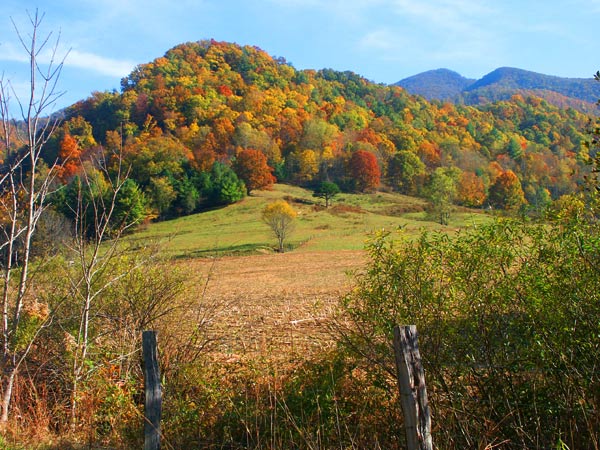
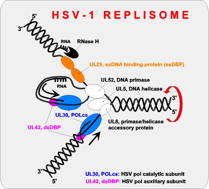
- Comment I trust Durova's experience w.r.t. the restoration. However, my attention is now being drawn to the helmet of the exhaling soldier. The spikes on it could be evidence of retouching, or part of the vegetation behind him. Since the rest of the vegetation doesn't match the spikes, I'd say it's some kind of blunder or deliberate tampering - possibly an artefact of a despeckling algorithm. Papa Lima Whiskey (talk) 11:45, 14 June 2008 (UTC)
- Yeah, I'm guessing someone used some sort of automatic denoising filter. I'm still waiting on the original, or someone to reply to my comment above about exactly where this version came from... I'm fairly certain this is noise-reduced version of a high-res oringinal not on WP, given that the NARA "source", which is much lower res, has a very good bit of grain. Thegreenj 18:55, 14 June 2008 (UTC)
- I sure didn't filter it. There was excessive noise in the sky when I worked on the image so I kind of doubt it went through any automatic filter. My default assumption was foliage, although I'm not 100% confident on that. The mild .jpg degradation had me more concerned. DurovaCharge! 19:46, 14 June 2008 (UTC)
- There's always the possibility that only part of the image was subject to any such filter. Papa Lima Whiskey (talk) 11:53, 15 June 2008 (UTC)
- I sure didn't filter it. There was excessive noise in the sky when I worked on the image so I kind of doubt it went through any automatic filter. My default assumption was foliage, although I'm not 100% confident on that. The mild .jpg degradation had me more concerned. DurovaCharge! 19:46, 14 June 2008 (UTC)
- Yeah, I'm guessing someone used some sort of automatic denoising filter. I'm still waiting on the original, or someone to reply to my comment above about exactly where this version came from... I'm fairly certain this is noise-reduced version of a high-res oringinal not on WP, given that the NARA "source", which is much lower res, has a very good bit of grain. Thegreenj 18:55, 14 June 2008 (UTC)
- Oppose I'm just uneasy about these various artefacts, and that we don't seem to know exactly what's happened to this picture. Papa Lima Whiskey (talk) 22:28, 17 June 2008 (UTC)
- Support excellent picture Thisglad (talk) 04:00, 19 June 2008 (UTC)
Promoted Image:Vietnamtunnel.jpg MER-C 10:35, 19 June 2008 (UTC)
H.M.S. Pinafore[edit]


- Reason
- A fine engraving, advertising an early American production, for an opera where the American popularity and the unauthorised nature of most of said productions were particularly notable: This led directly to their next opera, The Pirates of Penzance, premièring in America. And, yes, I know the caption is a little long. So sue me =).
- Articles this image appears in
- H.M.S. Pinafore
- Creator
- A.S. Seer's
- Support as nominator --Shoemaker's Holiday (talk) 12:16, 9 June 2008 (UTC)
WeakSupport. Nobody seems to be participating in this discussion, so I will :). The scan is not superb, but the large size of the image makes up for this. It illustrates Gilbert and Sullivan's famous comic opera well. NauticaShades 00:38, 13 June 2008 (UTC)- Good job with the sharpening. NauticaShades 02:12, 14 June 2008 (UTC)
Oppose. The text, in particularly, is distractingly blurry, and it's not that big (pretty small for a modern scan).--ragesoss (talk) 14:56, 13 June 2008 (UTC)- It is a lithograph, so it's never going to be perfectly sharp, but I do think the Library of Congress also added some blurriness. Luckily, the Sharpen tool works very well with lithography, so I can force out some sharpness. =) Shoemaker's Holiday (talk) 18:39, 13 June 2008 (UTC)
- The sharpening is a major improvement. I'm still not convinced this is among the top tier of images on Wikipedia (and G&S is already very well represented in FPs). Neutral.--ragesoss (talk) 22:56, 13 June 2008 (UTC)
- Gilbert is well-represented, but not his collaborations with Sullivan. For G&S we have only the lead images for Thespis (opera) and Trial by Jury, to my knowledge. And, yes, I fully intend to try and get an FP for all 14 G&S operas. =) Shoemaker's Holiday (talk) 22:58, 13 June 2008 (UTC)
- The sharpening is a major improvement. I'm still not convinced this is among the top tier of images on Wikipedia (and G&S is already very well represented in FPs). Neutral.--ragesoss (talk) 22:56, 13 June 2008 (UTC)
- It is a lithograph, so it's never going to be perfectly sharp, but I do think the Library of Congress also added some blurriness. Luckily, the Sharpen tool works very well with lithography, so I can force out some sharpness. =) Shoemaker's Holiday (talk) 18:39, 13 June 2008 (UTC)
Not promoted (quorum not met) MER-C 10:31, 19 June 2008 (UTC)
Cub polar bear is nursing[edit]
- Reason
- The only video at wikipedia which shows process of nursing of a wild polar bear. The mother licks her cub to encourage him to nurse and during the nursing to comfort him. All the time she keeps watchful eye at her surroundings.
- Articles this image appears in
- Polar Bear;Bear;Breast feeding
- Creator
- Mbz1
- Support as nominator original and edit --Mbz1 (talk) 13:50, 29 May 2008 (UTC)
- Comment Is this a new record for length of time before someone posted any kind of reply to a nom? I think this is a great video, but I'm hesitant to vote on it (and I suspect others are too, given the silence) because I really don't know where the bar is for videos on WP. As far as EV, I'm sure this has it; besides the fact that it's obviously a video of nursing, it also clearly shows that older cubs still return to mom for a snack, as mentioned in the caption. My problem is with the technical side. It seems a little small, at least in comparison to the videos you see on YouTube or MetaCafe, etc., but I don't know if it's a valid criticism. It looks pretty clear. Ah, hell, put me down for a Support, though you may want to trim out the last second or so, which switches scenes and is a little distracting. Matt Deres (talk) 04:06, 2 June 2008 (UTC)
- Support with agreement with Matt about trimming the last second or so. Encyclopedic and valuable. It'd be nice if the camera sway could be stabilized, but I don't know whether this is possible. Spikebrennan (talk) 17:49, 2 June 2008 (UTC)
- Comment Highly encyclopedic. Could use some video editing to correct for camera motion. Could make FP with a little more attention. Not quie there yet. DurovaCharge! 02:31, 7 June 2008 (UTC)
- Comment Thank you all for comments and for votes. My special thank you to Matt Deres. It was great to get your comment and your support after few days of complete silence. I am afraid I have no programs, and I am not sure how to edit videos. it took a long tome to learn how to convert videos to Ogg Theora (the only format Wikipedia takes). I've nominated the video because IMO it is quite interesting and it is the only video of wild mother and cub polar bears at Wikipedia. If you believe the problems with the video is too big to make it an FP, so it be.--Mbz1 (talk) 04:59, 9 June 2008 (UTC)
Oppose for nowEducational but IMO the wobbling camera kills it. Mangostar (talk) 06:04, 10 June 2008 (UTC)
- I do not think the word "kills" is the right one to describe the video. The video is used in three articles and I hope Wikipedia readers enjoy it.--Mbz1 (talk) 21:09, 10 June 2008 (UTC)
- Striking the oppose now that the wobble is fixed. I'm not sure I love it enough to support though. Mangostar (talk) 05:41, 12 June 2008 (UTC)
- I do not think the word "kills" is the right one to describe the video. The video is used in three articles and I hope Wikipedia readers enjoy it.--Mbz1 (talk) 21:09, 10 June 2008 (UTC)
- Comment I like the video. I've fixed brightness and contrast and I'm working on a solution to the wobble - quite a technical challenge. Dhatfield (talk) 22:28, 10 June 2008 (UTC)
- Thank you very much for your help!--Mbz1 (talk) 23:21, 10 June 2008 (UTC)
- I have a solution that is working well but I need some time - I'll be back within 24 hours. Dhatfield (talk) 00:25, 11 June 2008 (UTC)
- Done first pass edit. I resisted the temptation to do a temporal smooth (to reduce jitter and colour artifacts) and sharpen to avoid overprocessing. I'll upload a version with more post-processing for comparison and selection. Dhatfield (talk) 14:06, 11 June 2008 (UTC)
Uploaded new version over old version, but I can't get a link to the older one and the thumbnail is still not rendering - sorry, I am at a loss. There is still quite a lot of 'wobble' in the image (looks similar to heat haze), but now it is terms of colour variations and zoom / aspect ratio. I suspect that these are imperfections in or on the lens - or maybe it's breath. I'll go to sub-pixel accuracy on the registration (de-wobble) algorithm, but the (possible) improvement will not dramatically change the outcome of a vote. Dhatfield (talk) 16:04, 11 June 2008 (UTC)- The newer version was a hash. Reverting manually. Any further improvement will not dramatically change the outcome of a vote. Dhatfield (talk) 16:21, 11 June 2008 (UTC)
- Please comment on the new version so we can get a consensus on whether this is worth taking further. Dhatfield (talk) 21:16, 11 June 2008 (UTC)
- Support. Thank you for the video editing. You and me baby ain't nothing but mammals so let's nurse our young in the snow for the Discovery Channel. DurovaCharge! 02:01, 12 June 2008 (UTC)
- *chuckle* I'll see if I can improve things further. Dhatfield (talk) 06:32, 12 June 2008 (UTC)
- Oppose original; Oppose edit 1; Support Edit 2. I think we have an odd situation with which video got promoted. Second edit is a further significant improvement over the first. Sharper, fewer artifacts, better colour. I weakly oppose the original and my first edit. Fantastic content (hence all the hard work) but wobbly (original), too many artifacts, poor contrast and colour. I think Edit 2 is good enough. Not NaGeo, but good enough. Dhatfield (talk) 15:36, 12 June 2008 (UTC)
- Edit 1 withdrawn - Edit 2 is better.
Promoted Image:Cub polar bear is nursing.wmv.OGG --Cat-five - talk 09:04, 12 June 2008 (UTC)
Promoted Image:Cub polar bear is nursing 2.OGG, see WT:FPC#clashes between promotion guidelines 5 and 6. Promotion is pending bug 14524. MER-C 07:29, 13 June 2008 (UTC)
- Thumbnail bug fixed, thanks to the developers. Dhatfield (talk) 10:30, 19 June 2008 (UTC)
Cathedral of St. Stephen[edit]


- Reason
- Great quality photo that illustrates its article very well.
- Articles this image appears in
- Litoměřice, Czech Republic
- Creator
- User:Karelj
- Support as nominator --CPacker (talk) 06:52, 8 June 2008 (UTC)
- Weak support It's a little bothersome that the subject isn't a more prominent part of the shot, epseically given the volume of information elsewhere in the image... but still nice. SingCal 15:02, 8 June 2008 (UTC)
- Oppose Composition is awkward. Sharpness and clarity are fairly minimal for a complex landscape such as this. There are also some coma and aberrations on highlighted surfaces. -Fcb981(talk:contribs) 15:23, 8 June 2008 (UTC)
- Support - great picture, beutiful background, very clear, subject is prominent, but doesn't overshadow the rest. very good. --Nelro (talk) 17:29, 8 June 2008 (UTC)
- Oppose I found myself wondering if the town in the foreground is part of the cathedral or just happened to be in the picture. While good quality, I don't feel the cathedral is prominent enough in this picture to make it an FP. Clegs (talk) 17:55, 8 June 2008 (UTC)
- Comment I'd just like to point out that the image is currently being used as the lead picture in an article about the town the cathedral is in, not the cathedral itself. Guest9999 (talk) 18:58, 8 June 2008 (UTC)
- Support original. It's unfortunate that the hills in the background give little hint of whether the horizon is correct, but I can't find any other complaint (Guest9999 made a valuable comment, btw). Papa Lima Whiskey (talk) 16:08, 13 June 2008 (UTC)
- Neutral I feel the tower is tilted counterclockwise. Laitche (talk) 18:58, 14 June 2008 (UTC)
- Weak Support Edit 1. I believe it adequately illustrates the town in the article it currently resides (not the Cathedral). By the way, I uploaded an edit which I rotated in an effort to fix the tilt (I might not have done it enough, but it is slightly better). NauticaShades 00:46, 18 June 2008 (UTC)
- I think your tilt 'correction' has gone the wrong way. You've rotated counterclockwise; if there was any tilt in the original (and I'm not convinced there was, if so it's certainly minor), it was already a CCW tilt, so the edit's made the tilt worse. --jjron (talk) 08:05, 18 June 2008 (UTC)
- Then I must have eye problems, because the original tilt certainly looked counter clockwise to me. I took another look at the original, and it still looks that way to me. Could my monitor be titled? NauticaShades 15:14, 18 June 2008 (UTC)
- Heh, maybe mine is :-). Laitche's comment seems to indicate he thinks it originally had a CCW tilt also, and given I think you've done a CCW rotation, that would make it worse. Even in the thumbnails the edit looks tilted to me, but the original looks fine. I think the big white and pink buildings are probably more useful for this observation than the tower itself, I must say if I just look at the tower I get a slightly different impression. --jjron (talk) 08:56, 19 June 2008 (UTC)
- Then I must have eye problems, because the original tilt certainly looked counter clockwise to me. I took another look at the original, and it still looks that way to me. Could my monitor be titled? NauticaShades 15:14, 18 June 2008 (UTC)
- I think your tilt 'correction' has gone the wrong way. You've rotated counterclockwise; if there was any tilt in the original (and I'm not convinced there was, if so it's certainly minor), it was already a CCW tilt, so the edit's made the tilt worse. --jjron (talk) 08:05, 18 June 2008 (UTC)
No consensus MER-C 08:07, 20 June 2008 (UTC)
Australian Red Cross poster, WWI[edit]


- Reason
- A period poster from the Australian Red Cross in its earliest days during World War I. A good representation of women's participation in warfare during the early twentieth century, of Australian culture, and of period poster art. Restored version of Image:RedCrossNurse.jpg
- Articles this image appears in
- Australian Red Cross, David Henry Souter
- Creator
- David Henry Souter
- Support as conominator (conominating with Steve Crossin; collaborative restoration).--DurovaCharge! 20:54, 13 June 2008 (UTC)
- Support as conominator Steve Crossin (talk)(email) 21:11, 13 June 2008 (UTC)
- Support. This is a really nice image, although I feel like the caption should do a little more to unpack the image; there's a lot to it for something so simple at first glance.--ragesoss (talk) 22:59, 13 June 2008 (UTC)
- Support Comment/Question The caption should include the artist's name and link to the artist's article, David Henry Souter. He's a respected Australian cartoonist/journalist, including some renown for his WWI poster illustrations and other cartoons. This information probably isn't on-line (a quick search comes up blank). --Blechnic (talk) 05:06, 14 June 2008 (UTC)
- Changed link. DurovaCharge! 05:30, 14 June 2008 (UTC)
- Oh, thanks, it wasn't obvious without the link. --Blechnic (talk) 18:27, 14 June 2008 (UTC)
- Changed link. DurovaCharge! 05:30, 14 June 2008 (UTC)
- Support —αἰτίας •discussion• 20:01, 14 June 2008 (UTC)
- Support Large, nice-looking image with clear encyclopedic value. faithless (speak) 01:44, 15 June 2008 (UTC)
- Support/Comment Support wholeheartedly, although I must say that I like the unedited version more, with the frayed borders. Gives it the historic feel, but I think I may be alone on that opinion. smooth0707 (talk) 16:46, 16 June 2008 (UTC)
- The unedited version is available through a link from the restored image. DurovaCharge! 17:13, 16 June 2008 (UTC)
- No, you're not alone, I like the unedited version much better. But WP:FP makes all the pictures look like stage-screened modern day mock ups. This is one of the least offensive clean ups I've seen. Still, this poster is almost 100 years old, looking its age enhances the encyclopedic nature, it doesn't detract. Plus, it's actually a top quality scan, and well framed capture of an historic poster, again, enhancing the unedited version. But sterility and artifice is required for the front page. --Blechnic (talk) 20:25, 16 June 2008 (UTC)
- The unedited version is available through a link from the restored image. DurovaCharge! 17:13, 16 June 2008 (UTC)
- Question I'm wondering about the colors. I don't know much about inks from this era, but from looking at posters in museums, it seems the red is too removed from the orange of the edited version. I'm not using a color-adjusted monitor today, and this may be why I didn't notice it earlier, or I just didn't notice. Is this color accurate to the printing processes? --Blechnic (talk) 04:33, 17 June 2008 (UTC)
- It's more likely the red is accurate than the greenish brown. Inexpensive colorfast greens and yellows were a late development. The color balance hasn't been altered in this restoration. The shade of red in the restored version is the result of histogram adjustment, which corrects for fade. DurovaCharge! 06:24, 17 June 2008 (UTC)
- Is that what it said on the outside of the histogram box? I am just curious what histogram adjustment is guarrenteed to 'correct for fade'? -- carol (talk) 18:32, 17 June 2008 (UTC)
- Monitor issue. --Blechnic (talk) 23:07, 17 June 2008 (UTC)
- "The shade of red in the restored version is the result of histogram adjustment, which corrects for fade." I would like to think that the Russian general can explain the software used and where the expectations of use come from -- especially for those of us who have to carefully and thoughtfully use software that comes with no such guarrentees, and legally needing to have the no guarrentee included. This had nothing to do with the monitor, but thank you for trying. -- carol (talk) 01:22, 18 June 2008 (UTC)
- I've been lurking around FPC lately, but I had to respond to this rather bizarre statement. What does software and lack of guarantees have to do with anything? From my reading, I take this to mean that you are questioning why Durova thinks this is the correct shade of red (please correct me if I'm wrong). As someone who has experience in color-correcting photographs, it's simple experience that teaches you how to read a histogram, and Durova is certainly someone who has had enough experience in doing this sort of work that I trust her judgement as to how it should look. howcheng {chat} 04:05, 18 June 2008 (UTC)
- Yeah, well excuse me for being curious about this magical histogram thing and relying on experience is in my opinion a good way to go, but also having the experience of not being able to rely on the software is a way to make a person be very careful about their statements like this. At this point, even pointing to a web page which verifies this magical histogram capability because the way I understand it, that is what the contributors previous experience was with -- making web pages for profit. So, I really would like to know what histogram adjustment is it that corrects for fade, as the contributor has claimed. No hidden motive, and there is nothing that I am selling, just a question which is being evaded instead of answered. -- carol (talk) 04:52, 18 June 2008 (UTC)
- I've been lurking around FPC lately, but I had to respond to this rather bizarre statement. What does software and lack of guarantees have to do with anything? From my reading, I take this to mean that you are questioning why Durova thinks this is the correct shade of red (please correct me if I'm wrong). As someone who has experience in color-correcting photographs, it's simple experience that teaches you how to read a histogram, and Durova is certainly someone who has had enough experience in doing this sort of work that I trust her judgement as to how it should look. howcheng {chat} 04:05, 18 June 2008 (UTC)
- "The shade of red in the restored version is the result of histogram adjustment, which corrects for fade." I would like to think that the Russian general can explain the software used and where the expectations of use come from -- especially for those of us who have to carefully and thoughtfully use software that comes with no such guarrentees, and legally needing to have the no guarrentee included. This had nothing to do with the monitor, but thank you for trying. -- carol (talk) 01:22, 18 June 2008 (UTC)
- Support I like them both, so count this toward the version with the most supports. TomStar81 (Talk) 03:17, 20 June 2008 (UTC)
- Comment - I like both versions, actually. The browned and crumpled one that "shows its age", and the restored version that (hopefully) looks like it would have done when new. For a further discussion of where the line should be drawn when restoring a picture or poster like this, see here. Carcharoth (talk) 08:51, 21 June 2008 (UTC)
Promoted Image:RedCrossNursen.jpg --NauticaShades 14:46, 21 June 2008 (UTC)
F-35 Lightning II[edit]
- Reason
- The picture is in focus and has high encyclopedic value. I put this through peer review and I got a response that indicated this would be a good candidate. The whole reason for the crop was to even out the picture and remove the bit of plane or helicopter from the bottom of the original.
- Articles this image appears in
- F-35 Lightning II, Royal Air Force, BAE Systems, Turkish Air Force, Topical outline of the United States
- Creator
- Elephantissimo, I made this edit by cropping the original.
NB: the actual creator is JSF (F-35 Joint Strike Fighter Program). --jjron (talk) 07:53, 18 June 2008 (UTC)
- Support as nominator --Elephantissimo (talk) 19:32, 17 June 2008 (UTC)
- Support --victorrocha (talk) 19:32, 17 June 2008 (UTC)
- Support Crop. An impressive and informative image. The crop makes for a nicer composition and allows for more detail in the thumb. NauticaShades 22:44, 17 June 2008 (UTC)
- Question How does it allow for more detail in the thumbnail? Both images are the same width and thumbnail size is usually set by width, not height. The thumbs seem to have the same detail, at least to me (just visual inspection). Matt Deres (talk) 16:24, 18 June 2008 (UTC)
- I think what Nautica means is that the picture is smaller so more words fit into the thumb without shrinking the plane any more. Elephantissimo (talk) 16:28, 18 June 2008 (UTC)
- Question How does it allow for more detail in the thumbnail? Both images are the same width and thumbnail size is usually set by width, not height. The thumbs seem to have the same detail, at least to me (just visual inspection). Matt Deres (talk) 16:24, 18 June 2008 (UTC)
- Support Very clear, attractive, encyclopedic image. faithless (speak) 04:01, 18 June 2008 (UTC)
- Support either. Excellent image. DurovaCharge! 04:13, 18 June 2008 (UTC)
- Support crop Terrific quality and EV. ¢rassic! (talk) 05:34, 18 June 2008 (UTC)
- Support crop Very good image. Clegs (talk) 17:22, 18 June 2008 (UTC)
- Support Crop High quality and informative Capital photographer (talk) 05:47, 19 June 2008 (UTC)
Promoted Image:F35test edit.jpg MER-C 08:13, 23 June 2008 (UTC)
Italian Greyhound Standing[edit]

- Reason
- Showcases a beautiful breed of dog in very high detail.
- Articles this image appears in
- Italian Greyhound
- Creator
- Christina
- Support as nominator --Bryguy4675 (talk) 17:59, 17 June 2008 (UTC)
Oppose This image doesn't appear in any articles. Elephantissimo (talk) 19:40, 17 June 2008 (UTC)- Okay, I added it to Italian Greyhound. NauticaShades 22:42, 17 June 2008 (UTC)
- Support Nice detail and composition. Elephantissimo (talk) 23:26, 17 June 2008 (UTC)
- Okay, I added it to Italian Greyhound. NauticaShades 22:42, 17 June 2008 (UTC)
- Oppose - The background ruins it for me and the photo can be easily reproduced. Something with a smaller DOF, somewhere other than a fenced in backyard would be much improved. Cacophony (talk) 03:27, 18 June 2008 (UTC)
- Oppose. Afraid I've got to agree with Cacophony on this one. If it wasn't for the fence... Clegs (talk) 17:24, 18 June 2008 (UTC)
- Oppose, similar to what Cacophone says. When I think "greyhound" and I think of speed and running, so this image doesn't spur my interest. smooth0707 (talk) 00:17, 19 June 2008 (UTC)
Not promoted MER-C 08:15, 23 June 2008 (UTC)
Lindisfarne Castle[edit]

- Reason
- This is a self-nomination, so it's a bit difficult to assess fairly, but I think it's high-resolution and shows the castle in its location quite well; the low angle shows the height of the mount and the shore of the island. The weather was ideal, and I was quite lucky in managing to take it without lots of tourists!
- Articles this image appears in
- Lindisfarne Castle
- Creator
- Bob Castle (self-nomination)
- Support as nominator --Bob talk 23:35, 16 June 2008 (UTC)
- Oppose Very grainy, poor lighting, and does not represent the subject very well (half of the picture is just pebbles.) TheOtherSiguy (talk) 23:41, 16 June 2008 (UTC)
- Oppose per TOS. Papa Lima Whiskey (talk) 00:18, 17 June 2008 (UTC)
- Oppose-Per TheOtherSiguy. ~Meldshal42 00:30, 17 June 2008 (UTC)
- Oppose Uneven lighting, blown sky and clouds Capital photographer (talk) 07:37, 17 June 2008 (UTC)
- Strong oppose Poor quality. The entire subject is out of focus and very grainy. Also, the rocks don't add any EV ... too distracting. ¢rassic! (talk) 05:32, 18 June 2008 (UTC)
Not promoted MER-C 08:13, 23 June 2008 (UTC)
Molecular mechanics[edit]


- Reason
- Explains complex equations in an intuitive graphical way.
- Articles this image appears in
- Molecular mechanics, Force field (chemistry)
- Creator
- Edboas
- Support as nominator --Edboas (talk) 06:00, 16 June 2008 (UTC)
- Oppose Needs to be more "intuitive" than this... ;-) Also, should be SVG, not PNG. --Janke | Talk 07:38, 16 June 2008 (UTC)
- I am, in general in favour of PNG to SVG conversion but this is not a good candidate for SVG conversion. Firstly, the gray hydrophobic 'shroud' is technically challenging to convert and would be a poor approximation to the raster render. Secondly, the lighting from the render is difficult (although not impossible) to replicate in SVG; minor differences will make the resulting SVG look subtly 'wrong' in terms of perspective. For proposed solution, see below. Dhatfield (talk) 10:11, 16 June 2008 (UTC)
- Weak oppose Excellent work, highly encyclopedic should be a FP with a little work. Problems: cramped (we're not going to run out of pixels) with inconsistent graph axis / title labelling. Will benefit from better graph linking to relevant bond angles. Please upload all elements with different 'type' separately
- a render of the 3D model of the molecule with hydrophobic shroud (the base image). If you can provide a render source as well, so much the better.
- use slightly lower lighting on the render to avoid the 'blown' highlights on the molecules and shroud making for a better image and much better results from (potential) post-processing).
- the arrow around the shroud is not correctly drawn and is much easier to edit if it's in a separate image.
- text - important for this to be separate to get the benefit of internationalisation inherent in vector diagrams
- graphs separate to allow for easy layout changes. Dhatfield (talk) 10:11, 16 June 2008 (UTC)
- Weak oppose. It's probably a very clever illustration, but not, unfortunately, even close to self-explanatory. Maybe check a standard chemistry textbook to see how they do it, and possibly break it up more clearly? That might help with making it less cramped as well. Papa Lima Whiskey (talk) 10:17, 16 June 2008 (UTC)
- I studied organic chemistry II and layout issues aside, this is by far the most beautiful and intuitive diagram I have seen on this topic. 'Self-explanatory' is an unreasonable requirement as evidenced by this FP. Dhatfield (talk) 15:19, 16 June 2008 (UTC)
- It's not a requirement at all. I was trying to avoid saying the candidate image was shite, but I realise there are people who don't understand courtesy and instead apparently require strong language to be used. Papa Lima Whiskey (talk) 17:01, 16 June 2008 (UTC)
- I don't agree (about anything you just said) and while you're here, you might want to check this out. Wikilove. Dhatfield (talk) 20:05, 16 June 2008 (UTC)
- Oppose. At full resolution, the molecules are pixellated and the text is not antialised (should it be?) Mahahahaneapneap (talk) 12:00, 16 June 2008 (UTC)
- If I downloaded it and resized it to 75% or 50% of it's current size that would address both of your concerns; it would also be pointless destruction of information. The source is 2,880 × 2,200! Complaining about artifacts that can only be seen because the author uploaded at a fantastically high resolution is punishing good images for being good. Dhatfield (talk) 15:19, 16 June 2008 (UTC)
- I have uploaded an SVG version, and provided a link to the POV-Ray source. I also made the caption clearer. Edboas (talk) 23:00, 16 June 2008 (UTC)
- Comment Uploading files other than images to Wikipedia or Commons is allowed. Papa Lima Whiskey (talk) 02:56, 17 June 2008 (UTC)
- Comment The svg version is dead. i.e. it's just the raster image enbeded in a svg shell so it's not truly scalable. hence it's really just a duplciate of the png file. /Lokal_Profil 14:36, 17 June 2008 (UTC)
- Correction, most of the image is just an enbeded raster. Som parts, like the lines, arrows, and graphs are traced to vector format (better to recreate). However unless pov-ray has a svg output option any svg recreation of the image will involve a lot of manual work. Since the png is a very generous size I'm not sure keeping it as a raster is a problem though. To Papa Lima Whiskey: Don't think .pov files are allowed on Commons. png, gif, jpg, jpeg, xcf, pdf, mid, ogg, svg and djvu only. /Lokal_Profil 14:47, 17 June 2008 (UTC)
- Uploaded edit & support as nominator I'll supply the base PNG and the text and labels SVG overlay separately for international use but I'd like to settle on a final version first. Graphs have slight artifacts to be resolved, but that's not going to change the outcome of a vote. Suggestions for 2D or 3D improvement welcome. Dhatfield (talk) 16:09, 17 June 2008 (UTC)
- Now also available as Edit 2 with active links (see here). I am enquiring about redirecting the hi-res thumb directly to the SVG, rather than through a text link, at Commons:Graphics village pump. Dhatfield (talk) 09:41, 18 June 2008 (UTC)
- Comment I like the edit better, without the black line around the hydrophobic area. I'm more used to seeing them this way. But I'm afraid my quantum mechanics or physical chemistry is not up to judging the value of this image. PS Although Lennard-Jones potential is a mathematically straight-forward approximation the concept isn't usually covered in a "standard chemistry text." --Blechnic (talk) 23:04, 17 June 2008 (UTC)
- Weak Oppose The svg image seems blurry. Until the png/svg problems are fixed, I'm going to oppose. If they are fixed, I may reconsider. Clegs (talk) 17:39, 18 June 2008 (UTC)
- Edit 2 withdrawn for clarity. Were you referring to the first Edit or Edit 2? Edit 2 was just an example for linking. The svg in the first edit is anti-aliased due to the high res of the source. Dhatfield (talk) 18:02, 18 June 2008 (UTC)
Not promoted MER-C 08:15, 23 June 2008 (UTC)
Aerial view of Phoenix, Arizona[edit]


- Reason
- A good quality lithograph.
- Articles this image appears in
- Phoenix, Arizona
- Creator
- C.J. Dyer
- Support as nominator --Bewareofdog 22:02, 13 June 2008 (UTC)
- Support High enc, clear large file. A slice of history. DurovaCharge! 22:40, 13 June 2008 (UTC)
Weak Oppose. It's not large relative to the level of detail in the original. The small text at the bottom right is nearly illegible.--ragesoss (talk) 23:01, 13 June 2008 (UTC)Oppose. Like ragesoss, I find the text excessively laborious to read at this resolution. It's an interesting image otherwise. Papa Lima Whiskey (talk) 14:33, 14 June 2008 (UTC)- Support. Clear and informative. Neutralitytalk 21:27, 14 June 2008 (UTC)
Weak Support I share ragesoss's concern, but feel that this is just large enough. Unconditional support if a larger version is found. faithless (speak) 01:41, 15 June 2008 (UTC)Support No longer weakly. Great job finding the hi-res image. faithless (speak) 04:29, 18 June 2008 (UTC)- Support I find this image superb, despite the unfortunate small text. smooth0707 (talk) 02:26, 15 June 2008 (UTC)
- Support. A really interesting image and shows just how much Phoenix has changed. As others have said, could be higher resolution but it is sufficient to read. Diliff | (Talk) (Contribs) 23:05, 15 June 2008 (UTC)
- Comment There is a higher resolution version on the Library of Congress website here but it's in a weird MrSID file format. I've downloaded a viewer from the LOC website here and converted it to a JPEG of about 3x the linear resolution (9904x6608). I'll wait until off-peak to upload it though because it's a fairly hefty 60MB. Time3000 (talk) 16:00, 16 June 2008 (UTC)
- You should be able to compress it only slightly and see a significant reduction in size. — BRIAN0918 • 2008-06-16 20:17Z
- You need to compress it: the upload limit is 20 MB. MER-C 07:45, 17 June 2008 (UTC)
- Support Highly enc. and historic and just enough detail to make text legible. — BRIAN0918 • 2008-06-16 20:16Z
- Support UHR Per all above, and great (sic) detail --Mothmolevna (talk) 07:36, 17 June 2008 (UTC)
- Support UHR I was neutral on the smaller sized image, which otherwise met all the criteria.--Svetovid (talk) 09:06, 17 June 2008 (UTC)
- Support high-res version.--ragesoss (talk) 20:11, 17 June 2008 (UTC)
- Support Did nothing for me until the ultra high-res version. Nice job. Makes it far more usable to readers, also. --Blechnic (talk) 23:06, 17 June 2008 (UTC)
- Support UHR. Incredibly large and detailed. Good job getting the UHR version uploaded. 00:19, 18 June 2008 (UTC)
- Comment It is, of course, great, but why leavve that ugly black border on the right, or all the stamps on the bottom? There's also a scratch in the upper left side, starting at the top of the circular sub-image, and going diagonally down and left from there. I'd fix it myself, but successively saving jpegs is... really a bad idea, so it'd be better if it was fixed from the original. Shoemaker's Holiday (talk) 14:22, 18 June 2008 (UTC)
- The problem with this is that cropping out the black border would remove information from the bottom of the imagee (as the border is not straight). Could someone perhaps clone in some "paper" onto the black border? NauticaShades 16:48, 18 June 2008 (UTC)
- Support UHR Edit2 Mfield (talk) 20:51, 18 June 2008 (UTC)
Promoted Image:Phoenix1885-AerialMap_HiRes.jpg MER-C 08:15, 23 June 2008 (UTC)
Blue Jay with Peanut[edit]

- Reason
- Unique, high quality.
- Articles this image appears in
- Blue Jay
- Creator
- User:Saforrest
- Support as nominator --Rj1020 (talk) 23:42, 18 June 2008 (UTC)
- Support Good focus. I like the fact that the bird is actually doing something. Elephantissimo (talk) 00:18, 19 June 2008 (UTC)
- Support Excellent shot, though is the peanut appropriate? Oh well, guess it's part of their diet now. Capital photographer (talk) 10:43, 19 June 2008 (UTC)
- Comment
- While the noise is just about excusable given the size of the image, it would be preferable to reduce it at least a bit. Papa Lima Whiskey (talk) 10:59, 19 June 2008 (UTC)
- I'm sure that an article has been or could be created that is appropriate for an animal stealing food from human habitation. It's a typical and well-documented behaviour, after all. Papa Lima Whiskey (talk) 10:59, 19 June 2008 (UTC)
- A food native to Central/South America being eaten by a bird native to North America? Seems like that should take away from encyclopedic value in Blue Jay. For an article like Papa Lima Whiskey described, it would be enc. — BRIAN0918 • 2008-06-19 16:38Z
- Reply Well, the bird is sitting on woodwork which shows that the bird could very well have picked up a peanut that had dropped on the floor from a passing person carrying peanuts. Rj1020 (talk) 20:54, 19 June 2008 (UTC)
- Considering the United States is the third largest peanut exporting country in the world, I don't see how a North American bird with a peanut in its mouth is a problem. Mexico is the 20th, and Canada is one of three countries that accounts for 80% of US exports of peanuts. - auburnpilot talk 02:36, 20 June 2008 (UTC)
- It was a light comment about how urbanised birds are becoming, I'm fine with the peanut. Capital photographer (talk) 11:23, 20 June 2008 (UTC)
- Considering the United States is the third largest peanut exporting country in the world, I don't see how a North American bird with a peanut in its mouth is a problem. Mexico is the 20th, and Canada is one of three countries that accounts for 80% of US exports of peanuts. - auburnpilot talk 02:36, 20 June 2008 (UTC)
- Weak Oppose Too much noise/grain in the background and blur/grain in the bird. I'm not sure I understand the comments regarding the peanut; jays have adapted very well to human habitation and are frequent visitors to urban bird feeders in winter. Peanuts are, in my experience, their preferred food. The EV is just fine; it's the tech side that's a little low for a bird FP these days. Matt Deres (talk) 02:30, 20 June 2008 (UTC)
- Oppose. Poor composition, lighting, and contrast. It is too light and the color is dull and uninteresting. It adds very little to the bluejay article. The peanut is distracting. Areas of the bird itself appear grainy.Swimmtastic (talk) 04:11, 20 June 2008 (UTC)
- User has <30 edits, 2 on FPC. Most of which were here which were seen as somewhat disruptive --Fir0002 05:36, 20 June 2008 (UTC)
- Oppose Image has quality issues, including lack of sharpness and 'hot' whites. Compare vs. http://commons.wikimedia.org/wiki/Image:Cyanocitta_cristata_2.jpg or first two photos in encyclopedia article Tomfriedel (talk) 15:54, 20 June 2008 (UTC)
- Weak oppose Not a rare bird, should be possible to photograph under more natural conditions, or at least with a less distracting background. Diagonal line from the wooden railing could have been made less prominent by shooting from a lower angle. Good effort; please try again. DurovaCharge! 16:49, 23 June 2008 (UTC)
Not promoted MER-C 05:56, 25 June 2008 (UTC)
Satellite View of Olympus Mons[edit]


- Reason
- This is a fantasic composite image created using the Planetary Image Cartography System developed by the United States Geological Survey, in Arizona. This high resolution image is one of the best of the tallest volcano in the solar system.
- Articles this image appears in
- Olympus Mons
- Creator
- Jody Swann/Tammy Becker/Alfred McEwen (NASA)
- Support as nominator --Seddσn talk Editor Review 15:20, 18 June 2008 (UTC)
OpposeThe image is full of stitching errors (or possibly not stitching errors, but bits of lower-resolution imagery used in the mosaic). Time3000 (talk) 15:35, 18 June 2008 (UTC)
- I do see the composite sitching errors, but even with the sitching errors i do not know of any better quality public domain image. The one image i found that was better is an image from Mars Express but that spacecraft is an ESA probe and thier images arn't released totally into the public domain and do not qualify. The difficulty in obtaining an improved any improved image whilst keeping the resolution and then compositing is also extremely high. Seddσn talk Editor Review 16:09, 18 June 2008 (UTC)
- Support edit 1 Time3000 (talk) 09:18, 19 June 2008 (UTC)
Weak supportunless lighting issues are fixed. If fixed, strong support. Not flawless, but wow! Beautiful. Dhatfield (talk) 16:43, 18 June 2008 (UTC)
- When you say lighting issue, do you want me to attempt to get all of the picture at the same brightness, specifically where there are 2 adjoining segmants in the composite? I think thats what you mean anyway. Seddσn talk Editor Review 16:49, 18 June 2008 (UTC)
- Not exactly. For example, there is a mismatch in the lighting on the right of the volcano at an angle around 11 o'clock, most visible in the bottom right at thumb res because it's quite smoothed out. Similar below the volcano to the left, but that is definitely a seam-line. Dhatfield (talk) 17:53, 18 June 2008 (UTC)
- Strong support Edit 1. Fantastic, improved. Dhatfield (talk) 08:32, 19 June 2008 (UTC)
- Support image has enough uniqueness to overcome the slight composite stitching errors. Clegs (talk) 17:19, 18 June 2008 (UTC)
- Comment Viewed at full size the image does have quite a few stiching errors and some photographs are sharper than others so there's an uneven distribution of detail from one to the next. I did brighten some of the area to the left of the volcano if anyone would like to see the edit or just keep this one. victorrocha (talk) 17:31, 18 June 2008 (UTC)
- Comment I have done some cleaning up, the large scale differemce in colour are proving difficult to adjust, but i have gone through the image and removed some of the smaller issues. Seddσn talk Editor Review 18:46, 18 June 2008 (UTC)
- Support Edit 1 Nicely done edit. Personally I enjoy the lighting it gives more scale to the size of the mountain in a 2D image. victorrocha (talk) 18:52, 18 June 2008 (UTC)
- Support Edit 1 Highly encyclopedic. DurovaCharge! 21:01, 18 June 2008 (UTC)
- Support I like the first version better than Edit 1, but I'm fine with Edit 1 if that is what others select. --Blechnic (talk) 19:12, 20 June 2008 (UTC)
- Support edit one Good image. SpencerT♦C 19:27, 23 June 2008 (UTC)
Promoted Image:Olympus Mons alt.jpg MER-C 05:56, 25 June 2008 (UTC)
C-17 Globemaster III's[edit]


- Reason
- A featured picture on Commons where it was a candidate for picture of the year 2007 and also a featured picture on the Turkish Wikipedia. This image has excellent content and size well in excess of requirements.
- Articles this image appears in
- C-17 Globemaster III
- Creator
- Photographer: Staff Sgt. Jacob N. Bailey, U.S. Air Force Uploaded by User:Trialsanderrors
Support as nominator --Seddσn talk Editor Review 13:28, 18 June 2008 (UTC)
- Support edit 1 as nominator Seddσn talk Editor Review 19:26, 19 June 2008 (UTC)
Comment Amazing shot, but the ground is slightly grainy. Any way to clear that up? Juliancolton Tropical Cyclone 13:59, 18 June 2008 (UTC)- Support edit 1, obviously. Great image. Juliancolton Tropical Cyclone 14:44, 18 June 2008 (UTC)
- Support edit 1 Cool pic! Clegs (talk) 17:17, 18 June 2008 (UTC)
- Support edit 1 Very nice image. Tigerhawkvok (talk) 21:00, 18
- Support, just because I like it. It goes pow! kaboom! any everyone else can pick the edit. --Blechnic (talk) 22:11, 18 June 2008 (UTC)June 2008 (UTC)
- Support either (I see no noticable noise reduction). What a cool image. – sgeureka t•c 15:46, 19 June 2008 (UTC)
- Support This has always been one of my favorite images, but somehow never noticed it wasn't featured here. Great shot. - auburnpilot talk 02:52, 20 June 2008 (UTC)
- Support; I thought this was already a featured picture. Amazing shot. M.nelson (talk) 02:59, 20 June 2008 (UTC)
- Support Nice. I like it. TomStar81 (Talk) 03:19, 20 June 2008 (UTC)
- Support either, mild preference to the edit. Matt Deres (talk) 17:15, 22 June 2008 (UTC)
- Oppose Background colours don't contrast nor match very well with the subject, and the other planes in the background serve more as a distraction. --Hamster X (talk) 12:28, 24 June 2008 (UTC)
Promoted Image:C-17 aircraft over over the Blue Ridge Mountains 2005.jpg MER-C 05:56, 25 June 2008 (UTC)
Leopard seal[edit]


- Reason
- Leopard seals are most common in the Antarctic, hence we have only a few images. This one is the best. I gave it a slight groom - see if it's enough for your tastes.
- Articles this image appears in
- Leopard Seal, marine mammal, List of mammals in Saint Helena, List of mammals in the Falkland Islands, List of mammals in the Cook Islands, List of mammals of Bouvet Island
- Creator
- B.navez
- Support as nominator --Papa Lima Whiskey (talk) 15:05, 17 June 2008 (UTC)
- Weak oppose Nice image, but it lacks "wow". Slightly blurry at full resolution. Juliancolton Tropical Cyclone 15:27, 17 June 2008 (UTC)
- Weak support Wows me enough, but some of it is blurry, especially the flipper. Elephantissimo (talk) 16:21, 17 June 2008 (UTC)
- oppose I like the thumb, but disappointingly blurry at full rez. de Bivort 20:06, 17 June 2008 (UTC)
Weaksupport pretty much agree with Elephantissimo. I'm not sure the blurry detracts, and it's kinda cute for an animal that is not in the least bit cute, and it shows its mouth nicely, like it's all mouth, and man, these beasts have dangerous mouths. Good shooting for the capture, imo. I gotta go with Mbz1, "what' a beast!" and I love the emphasis in the pose, the body leaning forward into the thing that is most compelling about this predator, the mouth from hell. --Blechnic (talk) 22:29, 17 June 2008 (UTC)- Support Edit 2. The photo is encyclopedic, and the edit does a good job sharpening it. It's far from perfect, however, I admit. NauticaShades 00:07, 18 June 2008 (UTC)
- Oppose - still too blurry to be a FP.--Svetovid (talk) 06:58, 18 June 2008 (UTC)
- Oppose. Too blurry Clegs (talk) 17:26, 18 June 2008 (UTC)
- Weak Oppose - Pretty good but the seal blends in with the background a little bit -- Ketchup Krew Heinz 57! 21:17, 18 June 2008 (UTC)
- Comment Maybe we can take a photo studio down there for the seal. There's a reason the seal blends in to the background. It's called evolution. It probably took millions of years for that to occur. Heaven help its prey. --Blechnic (talk) 22:00, 18 June 2008 (UTC)
- No, it's a fair point. It's unlikely seals have evolved to blend into stones/rocks, as they hunt mainly at sea, and have few, if any, natural predators on land. Like many sea predators they have probably evolved their colouring to make it hard for prey to sea them in the water. And if you look in the article there's several pictures of them on ice/snow, where they're anything but camouflaged. --jjron (talk) 08:53, 20 June 2008 (UTC)
- Because maybe when they hunt penguins, they come up from the bottom, where the substrate is likely to be a similar colour to the stones in the picture. So what Blechnic said actually makes some sense. Papa Lima Whiskey (talk) 18:17, 20 June 2008 (UTC)
- To move on earth, they can't use their too short anterior flips and they are the only seals obliged to creep like snakes, very uneasily. On the beach nothing to eat and no one to fear, so no logical reason to blend. It was a pebble beach and that's all. I asked it to follow me in my room for there was an orange plaid on my bed. It would make a nice contrast for the picture but it refused and threatened me. I shot it at this very moment. --B.navez (talk) 01:55, 21 June 2008 (UTC)
- Hmmm, I hope you don't shoot everything that refuses to follow you to your room ;-). --jjron (talk) 14:26, 22 June 2008 (UTC)
- To move on earth, they can't use their too short anterior flips and they are the only seals obliged to creep like snakes, very uneasily. On the beach nothing to eat and no one to fear, so no logical reason to blend. It was a pebble beach and that's all. I asked it to follow me in my room for there was an orange plaid on my bed. It would make a nice contrast for the picture but it refused and threatened me. I shot it at this very moment. --B.navez (talk) 01:55, 21 June 2008 (UTC)
- Because maybe when they hunt penguins, they come up from the bottom, where the substrate is likely to be a similar colour to the stones in the picture. So what Blechnic said actually makes some sense. Papa Lima Whiskey (talk) 18:17, 20 June 2008 (UTC)
- No, it's a fair point. It's unlikely seals have evolved to blend into stones/rocks, as they hunt mainly at sea, and have few, if any, natural predators on land. Like many sea predators they have probably evolved their colouring to make it hard for prey to sea them in the water. And if you look in the article there's several pictures of them on ice/snow, where they're anything but camouflaged. --jjron (talk) 08:53, 20 June 2008 (UTC)
- Comment Maybe we can take a photo studio down there for the seal. There's a reason the seal blends in to the background. It's called evolution. It probably took millions of years for that to occur. Heaven help its prey. --Blechnic (talk) 22:00, 18 June 2008 (UTC)
- Support any Yes, a little bit blurry, but what a beast!--Mbz1 (talk) 16:31, 19 June 2008 (UTC)
- Support Surprised and pleased to have it nominated. Technically that is not the best of a picture but teeth are a bit impressive. I shot it in 1999 with a Contax a few time before the camera I bought in 1982 died because of salt corrosion. Lens was Zeiss 50mm, so I took it very close to the beast. It is a young one, about half the size an adult. Adults are used to running away as youngs just stay there along the path. Not very common on Kerguelen. I had the chance to watch leopard seals only three times in 9 months.--B.navez (talk) 09:06, 20 June 2008 (UTC)
- Support No, not quite perfect, but it illustrates the whole animal well, in its natural (and difficult to access) habitat, and in a dynamic pose. Matt Deres (talk) 17:18, 22 June 2008 (UTC)
No consensus MER-C 05:57, 25 June 2008 (UTC)
Synagogue at Nuremberg[edit]

- Reason
- A good example of late nineteenth century photochrom technology in a high resolution file. Idyllic, but note the location: Nuremberg, Germany--as in the Nuremberg rallies, the Nuremberg laws, and the Nuremberg trials. The domed building in the skyline is a synagogue destroyed in August 1938. Restored version of Image:Nurembergsynagogue.jpg.
- Articles this image appears in
- History of the Jews in Germany, Pegnitz River
- Creator
- Detroit Publishing Co.
- Support as nominator --DurovaCharge! 09:49, 17 June 2008 (UTC)
- Regretful oppose - because I can't see all of the synagogue --Thanks, Hadseys 09:54, 17 June 2008 (UTC)
- Also used to illustrate the river. de Bivort 20:07, 17 June 2008 (UTC)
- Support. There are a lot of great photochrom images out there, and this is one of them. Encyclopedic and very attractive.--ragesoss (talk) 20:14, 17 June 2008 (UTC)
- Support What a lovely historic image with so much encyclopedic value. --Blechnic (talk) 22:55, 17 June 2008 (UTC)
- Support. per nom Clegs (talk) 17:28, 18 June 2008 (UTC)
- Support. Lovely image with historical interest. Fleagle 15:00, 19 June 2008 (UTC)
- Weak support High enc. and historical value, but I feel the wording in the corner detracts from the image. SpencerT♦C 19:31, 23 June 2008 (UTC)
- It would be possible to remove it. Is that a request? DurovaCharge! 20:21, 23 June 2008 (UTC)
- Sure. I'd like to see what it would look like. SpencerT♦C 22:49, 23 June 2008 (UTC)
- It would be possible to remove it. Is that a request? DurovaCharge! 20:21, 23 June 2008 (UTC)
Promoted Image:Nurembergsynagoguec.jpg MER-C 05:57, 25 June 2008 (UTC)
Hong Kong Night Skyline.jpg[edit]


- Reason
- Stunning picture, technically perfect, high encyclopedic value. Very well done.
- Articles this image appears in
- Hong Kong
- Creator
- Base64
regards, —αἰτίας •discussion• 19:01, 16 June 2008 (UTC)
- Support reasons see above. —αἰτίας •discussion• 19:01, 16 June 2008 (UTC)
Strong support My god, it's so sharp, it burns! TheOtherSiguy (talk) 19:24, 16 June 2008 (UTC)
- I am now changing my vote, after seeing the current FP, to weak support as, though there is the mountain offsetting the composition, I like the fact that this is less hazy than the current one. TheOtherSiguy (talk) 23:39, 16 June 2008 (UTC)
- Comment. That scene looks quite familiar. ;-) I would argue that it isn't a better image than the existing FP that you've just removed from the Hong Kong article to replace with this one. I'd revert your change but I don't want to be seen to be taking it personally so I'll see what others think. I'll admit it is a less foggy/smoggy scene, but the view, while almost identical in terms of location, is a bit skewed, with the mountain side on the bottom-right corner which upsets the composition significantly. Also, I think it looks ever-so-slightly overexposed/flat - this is more just a matter of preference than technical fault, but when the existing FP was nominated, quite a few people complained that it had too much HDR processing and was too bright as a result. If that is the case, then this one is worse. Also ironic is that in the original FP nomination, Base64 (author of this image) thought that the dull, dark, unprocessed version was the most realistic one, and yet his image is far more HDR processed. Anyway, it isn't that I don't like the image. I just think the existing one is slightly better compositionally. Diliff | (Talk) (Contribs) 19:55, 16 June 2008 (UTC)
- (ec)@Diliff: I think that your picture is quite good as well, and it's clearly justified that it's featured. But I still think that this one has a better perspective and a better composition: In my opinion it looks more naturally. And exactly that is the point: It's rather subjective which one has a better perspective or a better composition. However it seems to be more obvious which one is better for an encyclopedic article: It's Image:Hong Kong Night Skyline.jpg, as there is a lot less fog. From my point of view that's an important point. Overall: Both are clearly great pictures, the rest seems to be a matter of taste. Best wishes, —αἰτίας •discussion• 20:28, 16 June 2008 (UTC)
- As Brian0918 pointed out, the fog/smog isn't necessarily a bad thing as it is quite common in Hong Kong. Also, I'm not sure how you can say that this image is superior in terms of composition. Probably one fifth of the image is obscured by an almost completely blank mountain side! It just looks a bit unbalanced. Diliff | (Talk) (Contribs) 21:06, 16 June 2008 (UTC)
- May I ask, What do the current FP have in the 1/5 area. I see unidentifiable residential building. The composition is subjective. The current FP has a feel of "Looking from high spots. The one I look has a feel of "Looking from a mountain). Also, the current FP appears in Victoria Peak.And you said it was almost exactly the same location, why would a large mountain show up? The fact is, both images have different location. --βαςεLXIV™ 02:02, 17 June 2008 (UTC)
- As Brian0918 pointed out, the fog/smog isn't necessarily a bad thing as it is quite common in Hong Kong. Also, I'm not sure how you can say that this image is superior in terms of composition. Probably one fifth of the image is obscured by an almost completely blank mountain side! It just looks a bit unbalanced. Diliff | (Talk) (Contribs) 21:06, 16 June 2008 (UTC)
- That is why an edit would be better. This image is an unprocessed HDR(don't know how and what to process). The reason I said the "dull, unprocessed" FP is the best is because you have too much "yelllow" lights the the bottom(from the residential buildings in the bottom). ONE MORE THING, I believe I took this image around/after 8:00PM, which means most of the Street lights/other lights were lit. --βαςεLXIV™ 02:02, 17 June 2008 (UTC)
- (ec)@Diliff: I think that your picture is quite good as well, and it's clearly justified that it's featured. But I still think that this one has a better perspective and a better composition: In my opinion it looks more naturally. And exactly that is the point: It's rather subjective which one has a better perspective or a better composition. However it seems to be more obvious which one is better for an encyclopedic article: It's Image:Hong Kong Night Skyline.jpg, as there is a lot less fog. From my point of view that's an important point. Overall: Both are clearly great pictures, the rest seems to be a matter of taste. Best wishes, —αἰτίας •discussion• 20:28, 16 June 2008 (UTC)
- Oppose - keep the current FP in the article. Current FP has more content, and based on the discussion from the first FPC, the fog/lighting of the current FP is probably closer to reality. — BRIAN0918 • 2008-06-16 20:11Z
- About the fog, take a look at this. Look at Dec 2007 and June 2008. --βαςεLXIV™ 02:02, 17 June 2008 (UTC)
- Weak support. While yes, the new one has a large portion obscured by the mountain, that is vastly made up by the fact that we can actually see across the strait, with a clearer sky and more vivid colors. No fault of course to the current FP, as it has been said, smog is tough to work with in Hong Kong, but it's been dealt with quite well here I think. Shame about the mountain, but I think the gains outweigh the losses. I do want to ask about the squiggly neon lines moving up and left from the "Wing On" building though. What caused that? --Golbez (talk) 21:45, 16 June 2008 (UTC)
- The squiggly lines are just the result of a long exposure. There are boats moving all over the harbour and any bright lights will show up as a trail as they move. Thanks for your opinion on the images. Diliff | (Talk) (Contribs) 22:10, 16 June 2008 (UTC)
Oppose. The angle is less encyclopedic, and it definitely has more of that "HDR" effect. NauticaShades 01:35, 17 June 2008 (UTC)
- Those HDR effect may make more things visible. See the mountain ACROSS the harbour in the back. That is to show the terrain. --βαςεLXIV™ 02:05, 17 June 2008 (UTC)
- I realize that, but I do not think this is what one would see if they looked at the skyline with their naked eyes. Therefore, it is unencyclopedic. NauticaShades 00:11, 18 June 2008 (UTC)
- I kind of agree with you. Therefore, would it be better for the Neutral non-HDR version? --Base64 (talk) 00:40, 18 June 2008 (UTC)
- This is all quite puzzling. I've never been to Hong Kong and so I must trust the opinion of others in terms of the realism of the image. In the original nom you say that the neutral version is the closest to reality, but antilived's friend seems to think that the current FP is closest. Can someone clarify this before I alter my vote? NauticaShades 16:14, 18 June 2008 (UTC)
- I don't think there is any one single 'view'. Some days are foggy (clearly many, but from Base64's link it seems I was unlucky to visit when it was significantly foggy for the entire month!), some days are not. I don't think either is any more correct than the other. It really just comes down to personal preference. I'm biased, but I prefer the exposure and composition of mine, although I acknowledge that in terms of visibility, his is superior. They're both good images with different strengths and weaknesses. Diliff | (Talk) (Contribs) 17:48, 18 June 2008 (UTC)
- That's right! Both images have different enc value. The existing can illustrate smog, air pollution, haze, Hong Kong Island and Central and Western District. The new one can illustrate Geography of Hong Kong, Victoria Harbour, Hong Kong and Victoria Peak. And I thought this is a new nomination, not Delist and Replace right? .By the way, am I allowed to nominate the non-HDR as alternative? or only the original nonimator(aitias) has the right?
- Also, I don't agree what antilived's friend said about the current FP's fog is closest to reality. As I do not "Digitally Remove" the fog in this new image. I really monitored the weather and planned before taking the image. So, we shouldn't judge whether the fogs are "common or uncommon", and focus on the image's enc value and detail. Moreover, I have a proof on the "reason" of low visibility in hong kong here. It says it is caused by "suspended particulates(pollution)" from north-west. Which means the visibility is high when a thunderstorm has "washed" them away.
- If find no one to trust, you can take a look at images at flickr, there are thousands of them with different time and exposure, and weather of course. :-) --Base64 (talk) 01:08, 19 June 2008 (UTC)
- Hmm why am I pulled into here... :) I think the different versions of the same photo can distort the perception of the time it's taken. The non-HDR version looks like a normal pano at night, whereas Dliff's HDR version looks like it's taken at dusk just after the sun's gone down and yet it's not completely dark, producing a brilliant blue sky (though different to the "normal" blue sky, something you rarely see in the delta). I trust Dliff's judgment in deciding the correct exposure, and therefore I believe it's a photo of the latter scenario (unless Dliff adds the EXIF information back to prove me wrong :p). --antilivedT | C | G 08:58, 19 June 2008 (UTC)
- I honestly can't remember exactly what time it was taken. It was probably around half an hour after sunset, so yes, it was dusk, and there was still a glow in the sky (although in the fog, there is a point where it is hard to tell whether the glow is from the sun or the city lights - probably an equal amount of both). I could check the EXIF data but I can't recall whether I changed the camera time to HK local anyway. Diliff | (Talk) (Contribs) 13:58, 19 June 2008 (UTC)
- Hmm why am I pulled into here... :) I think the different versions of the same photo can distort the perception of the time it's taken. The non-HDR version looks like a normal pano at night, whereas Dliff's HDR version looks like it's taken at dusk just after the sun's gone down and yet it's not completely dark, producing a brilliant blue sky (though different to the "normal" blue sky, something you rarely see in the delta). I trust Dliff's judgment in deciding the correct exposure, and therefore I believe it's a photo of the latter scenario (unless Dliff adds the EXIF information back to prove me wrong :p). --antilivedT | C | G 08:58, 19 June 2008 (UTC)
- I don't think there is any one single 'view'. Some days are foggy (clearly many, but from Base64's link it seems I was unlucky to visit when it was significantly foggy for the entire month!), some days are not. I don't think either is any more correct than the other. It really just comes down to personal preference. I'm biased, but I prefer the exposure and composition of mine, although I acknowledge that in terms of visibility, his is superior. They're both good images with different strengths and weaknesses. Diliff | (Talk) (Contribs) 17:48, 18 June 2008 (UTC)
- This is all quite puzzling. I've never been to Hong Kong and so I must trust the opinion of others in terms of the realism of the image. In the original nom you say that the neutral version is the closest to reality, but antilived's friend seems to think that the current FP is closest. Can someone clarify this before I alter my vote? NauticaShades 16:14, 18 June 2008 (UTC)
- I kind of agree with you. Therefore, would it be better for the Neutral non-HDR version? --Base64 (talk) 00:40, 18 June 2008 (UTC)
- I realize that, but I do not think this is what one would see if they looked at the skyline with their naked eyes. Therefore, it is unencyclopedic. NauticaShades 00:11, 18 June 2008 (UTC)
- Those HDR effect may make more things visible. See the mountain ACROSS the harbour in the back. That is to show the terrain. --βαςεLXIV™ 02:05, 17 June 2008 (UTC)
- I struck my oppose, because, after all, why can't both be featured? NauticaShades 02:38, 21 June 2008 (UTC)
- Comment Sorry, I made an mistake. I haven't done any adjustment on contrast of the original, it is unaltered from RAW to Final Jpeg.
I've added the example to show when curves are altered.(It's unnecessary for now) --βαςεLXIV™ 08:47, 17 June 2008 (UTC) - Weak
OpposeSupport Am I allowed to? If this image nominated for being in Hong Kong article, it would be too unrealistic, as it is an HDR. Though it could show almost all details in both side of the harbour. Putting this image in article HDR imaging would be better. --βαςεLXIV™ 11:17, 17 June 2008 (UTC) - Support Provided it has a good home (I'll leave "good home" up to MER-C's discretion). Both shots are impressive photographic achievements in terms of detail, sharpness, HDR and lack of noise and both deserve the FP badge. And while initially I agreed that the composition of Diliff's (without the hillside on the RHS) was superior, looking at it a full res I've changed my mind. I'm glad that the hillside is included as it gives an important perspective of the relatively abrupt finish of the "sky scraper zone" which is somewhat lacking in Diliff's shot. I particularly like the inclusion of the scene on the very top right corner (looking at 100%) - it finishes the scene better than Diliff's IMO. --Fir0002 11:40, 17 June 2008 (UTC)
- Info I've added the thumbnail of the neutral version for reference. I couldn't improve the composition, but if anyone think the neutral non-HDR is better, let me know, I'll try to produce one. I really hope that uploading the non-HDR image may solve the "overproccessed" issue as said by others. Thanks--βαςεLXIV™ 13:01, 17 June 2008 (UTC)
- Oppose. Too bright, looks too HDR, even more so than existing FP. Kaldari (talk) 17:49, 17 June 2008 (UTC)
- Support per Fir0002 Jamesflomonosoff (talk) 02:50, 18 June 2008 (UTC)
- OpposeBoth are great images but the current FP has more detail that is blocked by the hill on the current candidate. The brightness of the city lights to the center of the image is quite confusing in comparison to the current FP's subtle lighting. --victorrocha (talk) 19:32, 17 June 2008 (UTC)
- Support - Cacophony (talk) 07:31, 18 June 2008 (UTC)
- Support looks great to me. Fine image. Acalamari 21:16, 18 June 2008 (UTC)
- Support great image. --Krm500 (talk) 22:58, 18 June 2008 (UTC)
Support originalweak oppose. I know it's not up for voting, but I'd like to support the original anyway. It has good lighting when in a thumbnail, but when viewed at full resolution, the lighting is perfect. There is much more content than the current FL (what's on the other side of the river makes up for what's behind the hill), and the fog/smog takes a lot away from the current picture as well.
- Changed my mind; the current FL, while looking dirty (smoggy) and having less content, shows the buildings more lit up (notably Central Plaza, and especially Bank of China Tower, Hong Kong). One of the main features of this picture (and of the Hong Kong skyline) is the skyscrapers and their lighting. The Bank of China Tower (arguably the most famous Hong Kong skyscraper) not being fully lit up is what changed my mind. If I didn't believe the newer picture was of better quality, this would be a strong support. I don't know whether Wikipedia places more relevance on photograph content or quality, so someone who knows all the rules can make up my mind for me. M.nelson (talk) 03:29, 20 June 2008 (UTC)
- FYI about the lighting of some buildings. The existing FP's shooting time is "just after sunset, the new one's shooting time is "around 8PM night", that is why the image's name is Hong Kong Night Skyline instead of Hong Kong Skyline". There is a reason for the Bank of China's partial unlit light. The fact is, after 8PM, the BoC building's light cycles from bottom to top for more than 1 hour, a neutral density filter and long exposure is required to capture it without changing the aperture which affects the quality. Moreover, as you said the major strength of this image is "able to see across the harbour". I believe "Able to see full lighting of BoC bldg" is more important when the image is used in Hong Kong article. And I thought this wasn't a delist and replace nom. The scope of the new image is wider, can you rethink your vote? If your reason for weak opposing is the not fully lit BoC building, I can tell you that the existing FP's BoC bldg is not full lit too! There is two "X" in the bottom missing from the existing FP. Lastly, are you refering to Central Plaza or The Center, if it's The Center, tell me the difference here?--Base64 (talk) 09:21, 20 June 2008 (UTC)
Promoted Image:Hong Kong Night Skyline.jpg --NauticaShades 22:15, 25 June 2008 (UTC)
A common squirrel[edit]

- Reason
- nice pose, good quality.
- Articles this image appears in
- Squirrel, Eastern Gray Squirrel
- Creator
- Nickomargolies
- Support as nominator --Alokprasad84 (talk) 16:28, 21 June 2008 (UTC)
- Strong Support This image is encyclopedic, educational, and above all, cute. --Jetblue1717 (talk) 17:25, 21 June 2008 (UTC)
- Weak oppose It's a nice image, but the background is a bit messy and it isn't very sharp. TheOtherSiguy (talk) 19:41, 21 June 2008 (UTC)
- Neutral technically weak (background is messy and it's blurred), but —as Jetblue1717 said above— a nice, cute and encyclopedic image. => Neutral. —αἰτίας •discussion• 21:09, 21 June 2008 (UTC)
- (ec) Comment I've seen squirrels pose like that many times and yet... I'm getting the strangest vibe that this is a stuffed animal. Just me? The pic is not quite up to FP quality for tech reasons in any case. Matt Deres (talk) 21:10, 21 June 2008 (UTC)
- Mhh... It doesn’t seem to have many toes on the ground, only the heels, indeed seems to be a bit of an unnatural (not so alive) balancing technique for a sitting position like that. --Van helsing (talk) 10:39, 23 June 2008 (UTC)
Weak Support- A very well done image. But, I'm not completely sure its one of the best out there. ~~Meldshal42 (talk) 10:48, 23 June 2008 (UTC)
- Comment. For comparison, our current FP of this species. Spikebrennan (talk) 14:27, 23 June 2008 (UTC)
- Weak Oppose - I can see its nuts! - Anyway, oppose per above, slightly un-natural looking, busy backdrop. I think it could be reproduced with a clearer backdrop? ← κεηηε∂γ (talk) 15:39, 23 June 2008 (UTC)
- Weak Oppose A nice image, but I think the previous FP that Spikebrennan pointed out is slightly better. smooth0707 (talk) 03:03, 25 June 2008 (UTC)
- Weak Oppose Lacks the wow of the current FP. Mangostar (talk) 15:37, 25 June 2008 (UTC)
- Oppose. The current is much better.Dwayne Reed (talk) 07:12, 26 June 2008 (UTC)
- Comment. FWIW the current FP has been totally removed from the Eastern Gray Squirrel article; the current taxobox image seems inferior. Seems to have been a mixup following a dodgy edit by an anonymous IP - see here; the next editor replaced the image redlink with a different image here. The next editor after that tried to revert to Diliff's image, got it wrong again, so went for the current taxobox image instead. It could be worth switching it back to the FP version. --jjron (talk) 10:31, 26 June 2008 (UTC)
- Eh, done it. --jjron (talk) 10:39, 26 June 2008 (UTC)
- Oppose Quite unsharp in full size. --Janke | Talk 16:22, 26 June 2008 (UTC)
Not promoted MER-C 04:36, 27 June 2008 (UTC)
Wheat close-up[edit]

- Reason
- Very clear image, with good colors, and good encyclopediac content.
- Articles this image appears in
- Monocotyledon, Agriculture in Canada
- Creator
- Bluemoose
- Support as nominator --Juliancolton Tropical Cyclone 00:44, 21 June 2008 (UTC)
- Comment - Nice picture but it seems cluttered and not really eye-catching. Not sure if that's enough for an oppose. Fleagle 05:55, 21 June 2008 (UTC)
- Strong Oppose No attempt at all to diffuse background, busy and not very rich colour Capital photographer (talk) 06:20, 21 June 2008 (UTC)
- Support and Comment A noisy background in a wheat field? What will they do next, edit the soil out of the farm? Cluttered? Do we want Wikipedia readers to see sterile single fronds of wheat blowing in the wind under an azure sky? What the heck is it about this, edit nature so it looks like it's in a photo studio with a fake background, and photoshop enhanced? What is encyclopedic about artifice? Please, Bluemoose, don't destroy this picture by making it look like a single sterile piece of wheat shot in a photo studio. Velvet Elvises turn over in their graves! And, please, don't change the color to something it's not, because then no one will ever get to see the color of real wheat in the sun. --Blechnic (talk) 06:41, 21 June 2008 (UTC)
- Strong support The picture is interesting, eye catching and the focus is good. Muhammad(talk) 09:18, 21 June 2008 (UTC)
- Oppose per Capital photographer, - DOF is too big. Overall nothing special. —αἰτίας •discussion• 10:57, 21 June 2008 (UTC)
- Oppose. Subject is not really sharp and detailed, and I think it's because of jpeg compression. Camera is a compact, so the scope for remedy is very limited. DOF is not the major problem per se, but a shallower DOF could have helped the compression maintain the relevant details. Papa Lima Whiskey (talk) 11:34, 21 June 2008 (UTC)
- Oppose - not based on photographic criteria but the fundamental encyclopedic ones. It adds nothing useful to the two articles it's listed in. No flowers so the presence in Monocotyledon is not greatly illustrative and nothing about the image says "Canada" - Peripitus (Talk) 11:05, 22 June 2008 (UTC)
- Well, yes, there are no flowers because it's gone to fruit. I think that's what a grain is. Although there is nothing that says Canada strikingly, it could be "Eastern Washington," "Ukraine," wherever wheat--good point. Why isn't it in the wheat article? --Blechnic (talk) 20:50, 22 June 2008 (UTC)
- Flower structure, internals of the seed and leaf structure are all important identifiers of Monocots - none of this are well displayed. - Peripitus (Talk) 22:18, 22 June 2008 (UTC)
- Well, yes, because it's gone to fruit. The fruit of monocots are distinctive important identifiers also, and the fruits are what contain the seeds, not the flowers. The fruit of grasses are a snapshot of their evolutionary impact on the ecosystems they dominate--Wikipedia might be lame in the grass department, I don't know, but the Miocene isn't. Stick your finger down the top of a banana some day--then ask, monocot, dicot/eudicot, or basal angiosperm? The seeds are technically part of the fruit, you know. This image isn't in the article illustrating the parts of a grass. Grasses are a major component of the monocots, and showing them in their form as they grow in agriculture is a legitimate and important way, of many, to illustrate them. This picture won't replace the image of a diagram of a grass or vice versa. It won't replace the image of a cut fruit, and the image of a dissected grass floret won't replace the image of wheat growing in a field. They're different images. --Blechnic (talk) 07:04, 23 June 2008 (UTC)
- Flower structure, internals of the seed and leaf structure are all important identifiers of Monocots - none of this are well displayed. - Peripitus (Talk) 22:18, 22 June 2008 (UTC)
- Well, yes, there are no flowers because it's gone to fruit. I think that's what a grain is. Although there is nothing that says Canada strikingly, it could be "Eastern Washington," "Ukraine," wherever wheat--good point. Why isn't it in the wheat article? --Blechnic (talk) 20:50, 22 June 2008 (UTC)
- Weak Oppose The picture is rather fuzzy. Fix the fuziness and I'd support.I'd like to comment that foreground, middleground, and background are clearly identified. DA PIE EATER (talk) 00:50, 27 June 2008 (UTC)
Not promoted MER-C 04:36, 27 June 2008 (UTC)
Lava meets the ocean[edit]


- Reason
- encyclopedic image of the interesting natural phenomena
- Articles this image appears in
- lava;volcano;Kīlauea Hawaii (island)
- Creator
- mbz1 edit by jjron
- Support as nominator --Mbz1 (talk) 20:39, 20 June 2008 (UTC)
- Oppose nowhere in focus. —αἰτίας •discussion• 21:05, 20 June 2008 (UTC)
- Comment Alternative 1 is not in any article now, but would be placed instead of Original, if it is to pass.--Mbz1 (talk) 21:52, 20 June 2008 (UTC)
- Oppose original. Much too blurry, even at full resolution. Fleagle 06:00, 21 June 2008 (UTC)
- Oppose alt 1 edit 1. Oversharpened, colours distorted. Neutral others. Papa Lima Whiskey (talk) 11:29, 21 June 2008 (UTC)
- Comment Holy crap! It's been de-noised to death! Looks like plastic... TheOtherSiguy (talk) 19:45, 21 June 2008 (UTC)
- Support original. Not technically perfect, but a captivating image of significant value; there's a lot happening there. --jjron (talk) 14:32, 22 June 2008 (UTC)
- Oppose alts, Neutral original Though the original is encyclopedic, low technical quality prevents me from supporting. SpencerT♦C 19:24, 23 June 2008 (UTC)
Not promoted MER-C 04:35, 27 June 2008 (UTC)
Lunar transit of the sun[edit]
- Reason
- The image captured during and for a calibration of the STEREO B satellites camera's is one that is rare and diffcult to take. The satellite had to wait 3 months following an orbital adjustment to be in the right position for this image. The static in the image is unavoidable by satellites imaging the sun due to the ionic particles, carried by solar winds, colliding with the camera. This is a truely spectacular image in a class of its own and unlike any other of the sun.
- Articles this image appears in
- STEREO
- Creator
- Capture by: Stereo B satellite, NASA; Uploaded by: User:Seddon
- Support as nominator --Seddσn talk Editor Review 22:17, 19 June 2008 (UTC)
- Support either The changes on the surface are as interesting as the lunar transit itself. Dhatfield (talk) 01:02, 20 June 2008 (UTC)
- Strong support any --Mbz1 (talk) 01:25, 20 June 2008 (UTC)
- Although when in raw format it looks much better at full size, the cortado player seems to be struggling with the full size, which is why i used the medium sized image. This could be my computer or prehaps the conversion wasn't clean but the smaller version does play better for me at least. Let me know what it is like for other people. Seddσn talk Editor Review 03:20, 20 June 2008 (UTC)
- Strong support large. Looks much better large; technical deficiencies in Cortado should not be a factor in the decision. Large should obviously be chosen over small. .froth. (talk) 16:58, 20 June 2008 (UTC)
- It may also be a factor to do with the transcoding. I would download and play off your computer to check this. Seddσn talk Editor Review 17:34, 20 June 2008 (UTC)
- Support big version - should the small one even be here? Isn't is a duplicate? BTW, I uploaded the big one at Commons. diego_pmc (talk) 20:44, 20 June 2008 (UTC)
- The small one was the original file i uploaded. I tested several versions, and settled for the smaller one due to conversion problems but if the larger one is better im morethan happy to do with that. Seddσn talk Editor Review 21:14, 20 June 2008 (UTC)
Promoted Image:Moon transit of sun large.ogv MER-C 04:37, 27 June 2008 (UTC)
Komodo dragons video[edit]
.--Mbz1 (talk) 14:04, 12 June 2008 (UTC)
- Reason
- The only video on Wikipedia of a wild and active Komodo Dragon - a rare not well known fascinatingg beast.
- Articles this image appears in
- Komodo dragon;Komodo (island)
- Creator
- Mbz1
- Support any as nominator --Mbz1 (talk) 14:02, 12 June 2008 (UTC)
Weak Oppose. Weak Support. It's quite an awesome beast, but unfortunately the camera is shaky and there is never a good angled encyclopedic shot of the dragon. We see it from the front (so not all aspects of the lizard are seen) and we only a see a full body near the end of the clip. The close zoom in the first half is not necessary, in my opinion. NauticaShades 00:19, 13 June 2008 (UTC)- That being said, I could understand why you weren't worrying about such trivialities when a live Komodo dragon was rapidly approaching you. It is definitely a difficult shot to capture. For that reason, I'll change my vote to weak support. NauticaShades 00:23, 13 June 2008 (UTC)
- Comment I guess I need to explain what is going on in that video. The two of us and a ranger were looking at 10 feet long Komodo Dragon at the island of Komodo. The Dragon was peacefully asleep and we got to him closer than we should have. Suddenly the beast woke up, found and eatten something, and started moving toward us. It was mesmerizing because usually wild animals move away from people. You could hear the voice of the ranger "come on, come on" and then us running. We were lucky to find a ranger station close by. Komodo arrived at that station too in no time, but we were safe there.The last you could hear me asking "How we're going to get out of here?" I've decided to keep the sound on that video because IMO it helps to understand what is going on, but of course it could be removed.(The thumb does not work, but the video does)--Mbz1 (talk) 14:02, 12 June 2008 (UTC)
- Comment. I would suggest losing the sound (it's not like the animal is making sounds such that the silent video would be less encyclopedic), and I would suggest editing out the shaky part in the middle when you were probably moving the camera. Spikebrennan (talk) 18:18, 13 June 2008 (UTC)
- Support the Dhatfield edit. Marvelous source video, marvelous edit. Spikebrennan (talk) 15:37, 20 June 2008 (UTC)
Note: This can't be promoted until bug 14524 is fixed. MER-C 07:32, 13 June 2008 (UTC)
- Out of curiosity, why can it not be promoted? The thumb doesn't show up, but the video certainly plays. NauticaShades 01:59, 14 June 2008 (UTC)
- I can close the nomination as usual. However if I do all the other stuff, it looks like a deleted/corrupt image in the various FP galleries, which is very... not good (and could lead to meddling hands removing it). MER-C 09:28, 14 June 2008 (UTC)
- I probably should withdraw the nomination until the error is fixed? If it is the case, may I please ask you, MER-C to close it for now? Thank you.--Mbz1 (talk) 16:42, 14 June 2008 (UTC)
- That's not necessary. MER-C 04:16, 15 June 2008 (UTC)
- Fully agree with MER-C re not promoting until the bug is fixed. Perhaps would be worth suspending the nomination though, as I personally feel the thumb not working is, if nothing else, discouraging to potential voters. --jjron (talk) 11:40, 15 June 2008 (UTC)
- Whatever community disides is fine with me.--Mbz1 (talk) 15:29, 15 June 2008 (UTC)
- Fully agree with MER-C re not promoting until the bug is fixed. Perhaps would be worth suspending the nomination though, as I personally feel the thumb not working is, if nothing else, discouraging to potential voters. --jjron (talk) 11:40, 15 June 2008 (UTC)
- I can close the nomination as usual. However if I do all the other stuff, it looks like a deleted/corrupt image in the various FP galleries, which is very... not good (and could lead to meddling hands removing it). MER-C 09:28, 14 June 2008 (UTC)
Nomination suspended. Papa Lima Whiskey (talk) 15:28, 17 June 2008 (UTC)--Mbz1 (talk) 20:55, 19 June 2008 (UTC)
Bug fixed, we're good to go. Thanks Tim! MER-C 10:38, 19 June 2008 (UTC)
- It shows up, but I still can't get it to play. The audio moves forward, but the video freezes on the first frame. Clegs (talk) 15:00, 19 June 2008 (UTC)
- It might be your broweser. Works fine with me.--Mbz1 (talk) 16:25, 19 June 2008 (UTC)
- Comment I'd like it renominated as soon as the bug is fixed, whatever is going on. I think the sound should be removed, and I think it could be edited a bit, show the dragon eating, show him walking, this last part excellent. Also, as with the leopard seal, he blends into his background a bit too much, can you reshoot in a studio? (Just kidding.) Ten foot long lizard? The world is scary. --Blechnic (talk) 16:23, 19 June 2008 (UTC)
- CommentThank you all for your comments and vote. I removed the audio and I am afraid it is all edits I could do in a studio without going back to Komodo Island ;-) --Mbz1 (talk) 16:28, 19 June 2008 (UTC)
- Can we find someone to edit it just a bit, a few parts, a few seconds here and there? Again, whatever the bug is, I don't quite follow, this film is excellent, and could be used in a few other articles, particularly about its mode of locomotion. I hope you've learned your lesson about waking the dragon! --Blechnic (talk) 22:48, 19 June 2008 (UTC)
- The bug is there no more.It was fixed.The video is up for voting--Mbz1 (talk) 01:03, 20 June 2008 (UTC)
- Can we find someone to edit it just a bit, a few parts, a few seconds here and there? Again, whatever the bug is, I don't quite follow, this film is excellent, and could be used in a few other articles, particularly about its mode of locomotion. I hope you've learned your lesson about waking the dragon! --Blechnic (talk) 22:48, 19 June 2008 (UTC)
*Support But, please, can you just remove seconds 44 and 45, where it's all jerk and no vision, it will really make it a much better video. Komodo dragon video! --Blechnic (talk) 01:55, 20 June 2008 (UTC)
- I am afraid I cannot. I do not have the cable anymore to re-rerecord from the original and I have no idea how to edit videos on my computer. I posted a message to the person, who knows how to deal with videos amd maybe he'll be kind enough to help.Thank you.--Mbz1 (talk) 02:39, 20 June 2008 (UTC)
- Co-nominate and support Edit 2. List of edits:
- Separated into two videos
- Applied motion compensation (reduced wobble) using an algorithm I've developed
- Smoothed out chroma artifacts in dark areas, also custom made. I intend to free license these tools and make them available to all Wikipeople - any advice on how this could be done would be appreciated
- Virtualdub (www.virtualdub.org) edits follow - Increased saturation and changed levels, sharpened, rotated Part 1 clockwise
- Cropped to subject (20x20 px adaptive for motion compensation and 10x10 px for rotation)
- Reduced resolution by 20% to improve download rate with negligible effect on appearance - also reduces compression & sharpening artifacts
- Created a gallery of 'things to look to for' in the video now available here
- Changed the frame rate in Part 1 to increase encyclopedic value.
- I propose that the order of the parts should be as shown here because Part 2 while chronologically second, has good establishing shots of the whole lizard and a chilling finish while Part 1 has good educational detail on scales, eating, the tongue used for smell and how to hunt Mila :) Dhatfield (talk) 14:33, 20 June 2008 (UTC)
- I don't quite understand the reason for making it two, reordering them because of the ability to establish the entire physique is fine. Well, maybe the article on animal locomotion can use Edit 2. Still, for Komodo Dragon article, one video is the way to go. Good job removing the couple of problematic sections, it played well on my current low res system. --Blechnic (talk) 18:50, 20 June 2008 (UTC)
SupportOppose editing of rate of motion of animal as unencyclopedic. (I don't think I voted above, if I did, let me know.) Excellent video of the locomotion and foraging of a Komodo dragon in the wild. Please don't try this at home folks. --Blechnic (talk) 19:05, 20 June 2008 (UTC)- Support any with preference to Dhatfield's edits This would have been even greater with the sound, but it spooky enough. Muhammad(talk) 05:40, 21 June 2008 (UTC)
- Object to changing frame rate in edit. Perhaps this is acceptable if it is clearly labeled as slow motion, but it is misleading and less encyclopedic even if not misleading to show an animal in slow motion. It's not as though it is moving too fast for the viewer to see what is going on. Calliopejen1 (talk) 23:09, 21 June 2008 (UTC)
- Info Ask, and you will receive Edit 3. Dhatfield (talk) 13:09, 22 June 2008 (UTC)
- Comment I didn't understand this, you changed the frame rate to make the motion of the animal other than what it is in real time? You can't do this! --Blechnic (talk) 03:18, 22 June 2008 (UTC)
- <rant> Blechnic, what can't happen is you can't edit a video to FP quality. Until you learn a little humility and that right is not, and never will be, a substitute for polite, you have been blocked from editing my opinion regarding FPs. </rant> See Edit 3. Dhatfield (talk) 13:09, 22 June 2008 (UTC)
- Why can't Dhatfield slow down the clip? I see the slow motion in many of National Geographic's documentaries. Mentioning the slowing down of the clip on the description page should be enough. Muhammad(talk) 16:57, 22 June 2008 (UTC)
- But it's not mentioned on the video, where it needs to be. Dhatfield, don't even understand what you're saying, doesn't matter, science comes first, and is part of the requirements of FP candidates: it has to be accurate. --Blechnic (talk) 20:39, 22 June 2008 (UTC)
- For "doesn't matter, science comes first", you have earned a block from my entire consciousness. Anybody who grants themselves free license to offend does not deserve my eyeball time. Dhatfield (talk) 01:16, 23 June 2008 (UTC)
- Apparently I didn't even earn the first block, so I'll take this one about as seriously, and not bother to remember it, either. It's much more likely someone will take comments of this nature if you don't issue them. Issuing them ruins them. Not what this is about, though: accuracy is a FP requirement. Yup, science first. Change the requirements if you want, until then that's all. --Blechnic (talk) 01:20, 23 June 2008 (UTC)
Adult Assassin Bug[edit]


- Reason
- High quality image with a great deal of enc value thanks to the composition which clearly shows its curved rostrum - the hollow tube with which it stabs its prey and which curves under its head when not in use.
- Articles this image appears in
- Reduviidae and Rostrum (anatomy)
- Creator
- Fir0002
- Support as nominator --Fir0002 09:59, 19 June 2008 (UTC)
- Comment - is that an out-of-focus foot behind the snout? Looks so in full size. Would it be sacrilege to retouch it out? ;-) --Janke | Talk 10:08, 19 June 2008 (UTC)
- Not in my book! Uploaded an edit --Fir0002 10:25, 19 June 2008 (UTC)
- Weak Support Edit 1, Weak Oppose others Around half the body is out of focus, particularly the legs and face. I think a multi-layer shot would have been better. Capital photographer (talk) 10:41, 19 June 2008 (UTC)
- Oppose Looks to me like it was taken in a natural setting, cut out, and a fake shadow added. Even if that's not how it was taken, the fact that that's the impression it elicits makes it an untrustworthy/unreliable picture in my book. Papa Lima Whiskey (talk) 10:55, 19 June 2008 (UTC)
- I'd just like to point out that it wasn't cut out - imagine cutting out all the hairs!! Your reason seems quite odd, as even if it were cut out and had a shadow added, then how does this make it an unreliable/untrustworthy image for the purposes of illustrating an assassin bug? If I'd added an extra antennae or something I could understand an oppose based on lack of enc. As it is your vote is of questionable value against WP:WIAFP --Fir0002 11:13, 19 June 2008 (UTC)
- I think as the nominator, you're about the last person that can declare my opinion invalid, just for the record. Other editors are well aware of this. It's not like the rest of us comb through the support votes in the same way you try to discredit the opposes, so we know which way the bias lies. Papa Lima Whiskey (talk) 12:14, 20 June 2008 (UTC)
- As someone who has also had a disagreement with your reasoning in other noms, I don't think you can say that just because he's the nominator, he can't discredit/disprove your reasoning against objective criteria. Whether he's considered right or wrong is left up to the closer, but discussion is allowed. In addition to being the nominator, he's also a pretty experienced contributor and well aware of the FPC process, as am I. Perhaps we just both share the trait of being unable to bite our tongues when we see reasoning we strongly disagree with. ;-) Diliff | (Talk) (Contribs) 16:35, 20 June 2008 (UTC)
- Not surprising that you would speak up, given that you're another member of the not-so-silent pact of mutual support. I think I made it pretty clear that it's my opinion. It should be possible for you to accept that fact exactly as given, unless you have some ability to read my mind better than I can. Papa Lima Whiskey (talk) 18:49, 20 June 2008 (UTC)
- As someone who has also had a disagreement with your reasoning in other noms, I don't think you can say that just because he's the nominator, he can't discredit/disprove your reasoning against objective criteria. Whether he's considered right or wrong is left up to the closer, but discussion is allowed. In addition to being the nominator, he's also a pretty experienced contributor and well aware of the FPC process, as am I. Perhaps we just both share the trait of being unable to bite our tongues when we see reasoning we strongly disagree with. ;-) Diliff | (Talk) (Contribs) 16:35, 20 June 2008 (UTC)
- I must disagree with Lima Whisky, doesn't appear to be cut out. I think the reflection in the eye of the flash also confirms that. However, I feel some strong unsharp mask has been used which could give that impression. The mask has created a quite synthetic look. Capital photographer (talk) 11:38, 19 June 2008 (UTC)
- I'd just like to point out that it wasn't cut out - imagine cutting out all the hairs!! Your reason seems quite odd, as even if it were cut out and had a shadow added, then how does this make it an unreliable/untrustworthy image for the purposes of illustrating an assassin bug? If I'd added an extra antennae or something I could understand an oppose based on lack of enc. As it is your vote is of questionable value against WP:WIAFP --Fir0002 11:13, 19 June 2008 (UTC)
- Strong support I don't see anything wrong with the shadows. Muhammad(talk) 13:40, 19 June 2008 (UTC)
- Strong objection to editing out leg If you submitted an image to a science journal where you edited out a limb could cause you not to be published in the future should it be found out. Don't edit out body parts for aesthetic reasons: it's fakery. --Blechnic (talk) 16:26, 19 June 2008 (UTC)
- Support Original. Leg just doesn't need to be cloned out IMO. I think it would have been preferable to have a more side on view, or slightly head on, but if this is the best you have, I still support. BTW, I'm assuming it wasn't actually taken in August 2008. Australia is ahead of GMT, but not that far ahead. ;-) Diliff | (Talk) (Contribs) 21:28, 19 June 2008 (UTC)
- Hehe good point :) --Fir0002 05:40, 20 June 2008 (UTC)
- Oppose. The composition is weak. Also the editing of foot seems unnecessary and inappropriate, it was ok before.Swimmtastic (talk) 04:00, 20 June 2008 (UTC)
- User has <30 edits --Fir0002 05:40, 20 June 2008 (UTC)
- Removed inappropriate 'biter' quote added to this nomination here by Swimmtastic. Fir0002's comment re new editors is common practice at FPC, it is not aimed at you as a person, and is not "biting". You are entitled to make a comment, but Fir is also entitled to point out that you are a new user, as long as it is done in an appropriate manner, which is certainly the case here. It is also unnecessary to add the text itself which I assume is copied from an article somewhere and spoils the flow of the nomination; using a link would be more appropriate. --jjron (talk) 10:54, 26 June 2008 (UTC)
- User has <30 edits --Fir0002 05:40, 20 June 2008 (UTC)
- Support Original Encyclopedic and to the point. victorrocha (talk) 06:37, 20 June 2008 (UTC)
- Oppose edit 1 Inappropriate digital manipulation. Narayanese (talk) 08:37, 20 June 2008 (UTC)
- Support original. Oppose edit 1 (The foot should stay), not too keen on alt1. - Peripitus (Talk) 12:07, 20 June 2008 (UTC)
- Support Original, Oppose Edit 1. The good quality of the image is such that it outweighs the shallow DOF (which is always hard to get right on macros). The leg, however, should not be cloned out. NauticaShades 02:59, 21 June 2008 (UTC)
Promoted Image:Assassin bug aug08 02.jpg MER-C 04:35, 27 June 2008 (UTC)
Tour of Gippsland[edit]


- Reason
- High quality image of bicycle racing. Good enc value. Alternative panoramic view: Image:Tour of gippsland final stage pano.jpg
- Articles this image appears in
- Bicycle racing and Road bicycle racing
- Creator
- Fir0002
- Support as nominator --Fir0002 12:12, 18 June 2008 (UTC)
- Oppose Not bad but nothing special, a bit soft too Capital photographer (talk) 13:26, 18 June 2008 (UTC)
- Comment. It is clear from the expression on the riders' faces that this is an arduous climb, as you say in the description. This is not shown well in the image however. The panoramic version does a better job of showing this. Could a crop between the two in terms of length (and perhaps with the detail of the original) be made? NauticaShades 15:48, 18 June 2008 (UTC)
- As per request consider Alternative 1 --Fir0002 01:27, 19 June 2008 (UTC)
- I've made another crop (Alt 2). I like the landscape, but the nearest reflector is distracting. —Pengo 05:19, 19 June 2008 (UTC)
- The crops are even worse. The mountains in the distance don't say much about what they have just done, there isn't enough of a link between them in the image. The riders are to small and to far to the side of the frame. I do wonder why the image doesn't show more of what was to the right of the riders, where they are riding from. Capital photographer (talk) 05:46, 19 June 2008 (UTC)
- To the right is an uninteresting rock face. It is totally useless in showing where they have come from, whereas the LHS does show this by demonstrating the terrain. --Fir0002 07:37, 19 June 2008 (UTC)
- Insert discussion subpage: The rest of this discussion can be found here - was becoming somewhat ungainly and irrelevant to say the least! :) --Fir0002 13:09, 19 June 2008 (UTC)
- To the right is an uninteresting rock face. It is totally useless in showing where they have come from, whereas the LHS does show this by demonstrating the terrain. --Fir0002 07:37, 19 June 2008 (UTC)
- The crops are even worse. The mountains in the distance don't say much about what they have just done, there isn't enough of a link between them in the image. The riders are to small and to far to the side of the frame. I do wonder why the image doesn't show more of what was to the right of the riders, where they are riding from. Capital photographer (talk) 05:46, 19 June 2008 (UTC)
- Comment Maybe just once if Fir were to post a full size photo... This picture would probably only pass if that is the case (or at least a larger one). At the size the pictures are at you're not going to get the hills and the detail needed for the picture to pass. IMO at least. victorrocha (talk) 07:24, 19 June 2008 (UTC)
- A truly unfair comment given the 1000px minimum guideline. Huge resolution is not a prerequisite for a Wikipedia FP. --Fir0002 07:37, 19 June 2008 (UTC)
- Not trying to be harsh but I would have to say that this picture at a larger size would benefit from a great landscape and the detail of the riders. The current candidate and the alternatives have one but not the other. It is not a requirement for the photograph to be huge but I believe this particular example would benefit from a higher res. The alternatives are definitely pictures that would grab someone's attention in the main page. victorrocha (talk) 08:15, 19 June 2008 (UTC)
- Yeah bigger is always better, but IMO this is plenty enough to appreciate the scene. And since you yourself have said this would be eye catching on the main page, I think it's worth of FP. --Fir0002 10:16, 19 June 2008 (UTC)
- I also agree that its slightly on the small size, especially when you've released the original image at much higher res. Whats the purpose of the low res of the panorama? Its not really something you could sell on a stock site as you'd need releases from the riders, so restricting commercial use shouldn't be a reason. My symbolic support is for your edit of Alt 2, but at a higher res. Even without reading the comments, I felt like it was just a bit small. Diliff | (Talk) (Contribs) 21:37, 19 June 2008 (UTC)
- The original is only higher res because it is wider - the alternative "mini pano" does not have any less detail. This being a local event I can sell prints of it, so by providing a high res version I still would be at a potential commercial loss. And anyway, aside from "bigger is better" what exactly would a higher res version provide that this version is lacking? The only thing I can think of are the riders faces, but as you can see from the original image I nominated (close to a 1:1 crop), you can't really make out their faces anyway. --Fir0002 23:38, 19 June 2008 (UTC)
- I also agree that its slightly on the small size, especially when you've released the original image at much higher res. Whats the purpose of the low res of the panorama? Its not really something you could sell on a stock site as you'd need releases from the riders, so restricting commercial use shouldn't be a reason. My symbolic support is for your edit of Alt 2, but at a higher res. Even without reading the comments, I felt like it was just a bit small. Diliff | (Talk) (Contribs) 21:37, 19 June 2008 (UTC)
- Yeah bigger is always better, but IMO this is plenty enough to appreciate the scene. And since you yourself have said this would be eye catching on the main page, I think it's worth of FP. --Fir0002 10:16, 19 June 2008 (UTC)
- Not trying to be harsh but I would have to say that this picture at a larger size would benefit from a great landscape and the detail of the riders. The current candidate and the alternatives have one but not the other. It is not a requirement for the photograph to be huge but I believe this particular example would benefit from a higher res. The alternatives are definitely pictures that would grab someone's attention in the main page. victorrocha (talk) 08:15, 19 June 2008 (UTC)
- A truly unfair comment given the 1000px minimum guideline. Huge resolution is not a prerequisite for a Wikipedia FP. --Fir0002 07:37, 19 June 2008 (UTC)
- Comment Maybe someone could actually write an article about this event. Papa Lima Whiskey (talk) 10:56, 19 June 2008 (UTC)
- Question: What's with the clouds in the Panoramas? They seem painted, especially looking at edit 1 of alt 2. SpencerT♦C 20:16, 22 June 2008 (UTC)
- Conditional Support. If an alternative with the same crop as Alt 2 and the detail of the original is uploaded, I'll support. The current quality of the detail of Edit 1 is not superb, and it could only be offset in my opinion by a higher resolution version. NauticaShades 22:08, 25 June 2008 (UTC)
- Comment Just to make MER-C's life easier I'll just say now that I won't be uploading this image at any higher res. Sorry guys --Fir0002 01:50, 26 June 2008 (UTC)
- Oppose all except for Alt 3 and maybe Alt 2 Edit 1 - Original for me doesn't show enough of the background. To me it just looks like hills surround the road, not the road is actually on an hill. While the others do, only Alt 3 shows the bikers (insignificantly)large enough for myself to establish themselves as the subject. I also have the same arguement for Alt 2 Edit 1, but its rather oversharp. DA PIE EATER (talk) 01:07, 27 June 2008 (UTC)
Not promoted MER-C 04:35, 27 June 2008 (UTC)
AV8B Harrier[edit]


- Reason
- Superb quality of an aircraft.
- Articles this image appears in
- AV-8B Harrier II, VMA-231, Supermaneuverability
- Creator
- Paulmaz (talk · contribs)
- Support as nominator Latics (talk) 02:24, 16 June 2008 (UTC)
- Comment The picture is definitely FP material however, I would like to see the harrier lightened and given a bit more contrast. --victorrocha (talk) 04:24, 16 June 2008 (UTC)
- Support - an impressive sight, and very encyclopedic. I do agree with the above comment that it could perhaps do with the contrast slightly improved. Bob talk 09:02, 16 June 2008 (UTC)
- Edit uploaded It's better contrast, but likely not the best. Latics (talk) 19:24, 16 June 2008 (UTC)
- Edit 2 uploaded Very nice pic. I'm no raster expert, but here's a different take on the contrast enhancement. Looks overdone in thumb, but that's opinion - there's still some space at the edges of the histogram. I also smoothed out the sky to get rid of some .jpg artifacts and cropped out the blurry grass. Dhatfield (talk) 19:52, 16 June 2008 (UTC)
- Yeah, my edit was a quick job, so I'm looking for feedback. As for edit 2, there are a lot of artifacts. Could you re-save it at a higher quality? Latics (talk) 20:01, 16 June 2008 (UTC)
- Wish I could - those artifacts are from the original jpg and they only come out when you up the contrast. I saved at 100% quality from GIMP and the file size is about 4x as large as the original so I think that it did it. Bummer. Score another one for the Joint Photographic Experts Group. Dhatfield (talk) 20:11, 16 June 2008 (UTC)
- Edit 2 withdrawn. Good idea on the WB shift, victorrocha. Dhatfield (talk) 22:12, 16 June 2008 (UTC)
- Comment, further to my earlier vote, I support either the original or edit 3. At a push, I would say edit three is the more striking. Bob talk 23:24, 16 June 2008 (UTC)
- Support edit 3 A very fine image with plenty of "wow" factor. I prefer edit 3 because it has the best contrast. TheOtherSiguy (talk) 23:44, 16 June 2008 (UTC)
- Edit 1 withdrawn Latics (talk) 00:32, 17 June 2008 (UTC)
- weak support focus is a bit soft, but not prohibitively for me. de Bivort 01:15, 17 June 2008 (UTC)
- Weak Support Edit 5. Edit 5 is the best of the edits IMO (biased by still!) however it can't fix the underlying lack of sharpness in this picture. Must say I'm looking forward to the 2009 air show! :) --Fir0002 12:32, 18 June 2008 (UTC)
- Support any. Very cool! Look at all the heat wash! Clegs (talk) 17:42, 18 June 2008 (UTC)
- Neutral The original isn't good enough, and to me, the edits make it look borderline fake (especially the front landing tire). smooth0707 (talk) 00:42, 19 June 2008 (UTC)
Oppose mainly because for me the grassy foreground that is blurred is very distracting. Seddσn talk Editor Review 21:16, 24 June 2008 (UTC)
- Can you produce a cropped version of edit 5 please. Seddσn talk Editor Review 21:19, 24 June 2008 (UTC)
- cropped version - personally I prefer it uncropped --Fir0002 07:24, 25 June 2008 (UTC)
- Can you produce a cropped version of edit 5 please. Seddσn talk Editor Review 21:19, 24 June 2008 (UTC)
Edit 3 or edit 5? MER-C 05:57, 25 June 2008 (UTC)
- I'll go with edit 5. Too much compression artifacts in edit 3. Latics (talk) 23:09, 25 June 2008 (UTC)
Promoted Image:BAE-McDonnell-Douglas AV8B edit5.jpg MER-C 04:35, 27 June 2008 (UTC)
South Beach[edit]

- Reason
- It is a high quality image which gives a good impression of South Beach. There are not many good pictures available to date on Wikipedia of South Beach.
- Articles this image appears in
- No articles to date use this picture, but this should change. A couple of articles could use this photograph such as South Beach, Ocean Drive and Miami Beach.
- Creator
- Massimo Catarinella
- Support as nominator --Massimo Catarinella (talk) 02:57, 22 June 2008 (UTC)
- Commment A Featured Picture is required to add value to an article--if it's not in an article, it can't do tihs. ("5. Adds value to an article and helps readers to understand an article." Bold in the original.) Please add it with appropriate captions to the appropriate articles before continuing with this FPC. --Blechnic (talk) 04:40, 22 June 2008 (UTC)
- Oppose No “wow”; nothing special, even technically not perfect, and no encyclopedic value as not in any article. —αἰτίας •discussion• 14:28, 22 June 2008 (UTC)
- Strong oppose. Please hold your horses. First put a picture in an article, then wait if it stays in there. And then maybe nominate it (not this picture though, per αἰτίας). --Dschwen 14:59, 22 June 2008 (UTC)
- Commment It is now present in multiple articles. I would like to know what the faulty technical aspects are. Massimo Catarinella (talk) 15:51, 22 June 2008 (UTC)
- Comment If you're not actually nominating it, but just putting it up for peer review ("I would like to know what the faulty technical aspects"), the place for that is picture peer review, not FPC. This if for images you think meet all the FP criteria. You can withdraw and go to picture peer review, get the feedback you need, correct the image as necessary, and come back here. --Blechnic (talk) 20:42, 22 June 2008 (UTC)
- Oppose. Tilt, unappealing composition - cars cover the restaurant (which is an important feature according to caption), not very encyclopedic - a view rather similar to this could be shot in many other places. This snapshot-type image is certainly OK for the articles - one of them has lots of other photos, but this one doesn't stand out there, so no "wow" - thus not FP, IMHO. --Janke | Talk 16:51, 22 June 2008 (UTC)
- Oppose. Encyclopedic for the location and architecture, but needs more for FP. Appears to have been taken in early afternoon, possibly for the lovely vintage automobile. Unfortunately this yields flat lighting and places the facades in the shade. There's an FP-quality shot in this scene, probably from a different angle shortly after dawn. Which is the shot? The car? A hotel? Of the four facades in this image two are cut off, two are obscured by palm trees, and all are affected by angle distortion. Decide what this photograph is really about and capture that. DurovaCharge! 17:07, 23 June 2008 (UTC)
Not promoted . --John254 02:41, 28 June 2008 (UTC)
Juvenile barn swallow being fed[edit]

- Reason
- This pictures illustrates a behavioural trait of the bird. The parent swoops down and delivers an insect to the juvenile in a split second. This picture captures the moment where the delivery takes place.
- Articles this image appears in
- Barn swallow
- Creator
- Magnus Kjaergaard
- Support as nominator --Kjaergaard (talk) 13:52, 22 June 2008 (UTC)
- Oppose DOF is much too narrow: Nowhere in focus, blurred (especially at full resolution). —αἰτίας •discussion• 14:24, 22 June 2008 (UTC)
- Oppose Action is too small in frame, subjects are not in correct focus Capital photographer (talk) 06:10, 23 June 2008 (UTC)
- Oppose. I agree with the others: the subject is too small in the frame, and a crop would probably be too unfocused.--Polymath618 (talk) 08:57, 26 June 2008 (UTC)
Not promoted . --John254 02:42, 28 June 2008 (UTC)
One of the most natural looking image with its high resolution quality[edit]

- Reason
- It just looks very natural and to me it meets 1, 2, 4, 5, 6, and 8th of W:FPC.
- Articles this image appears in
- Cherry
- Creator
- Gulmammad
- Support as nominator --Gülməmməd Talk 16:55, 23 June 2008 (UTC)
- Oppose - low technical quality.--Svetovid (talk) 17:47, 23 June 2008 (UTC)
- A question: I am curios to know the low technical quality corresponds to which subsection of #1 in W:FPC. For the technical quality the camera should be fine as can be seen from the metadata of the image. Thanks in advance! Gülməmməd Talk 18:15, 23 June 2008 (UTC)
- The picture is quite noisy, unsharp and has depth of focus issues at full size. Oppose. —Vanderdecken∴ ∫ξφ 18:52, 23 June 2008 (UTC)
- Oppose - I quite like the composition of the picture it is framed perfectly and the colors are first rate. On technical ground the picture does have a lot of noise and areas are blown out(pure white). Next time you take a closeup picture you should mount the camera on a tripod and use the manual mode on you G9 to close the aperture and get a larger Depth of Field. Recently a nomination made it through here by showing the development cycle of fruits. If you can do that by having a good technical quality pictures it's very likely your picture would succeed. victorrocha (talk) 7:29, 23 June 2008 (UTC)
- Oppose - a picture of 3 cherries doesn't do it for me, on both technical and appealing grounds. smooth0707 (talk) 13:50, 24 June 2008 (UTC)
- Oppose. Adds nothing to the cherry article. Not a good picture. Dwayne Reed (talk) 06:52, 26 June 2008 (UTC)
- Oppose. I think the picture is very good, but there is quite a lot of noise, as others have remarked. If someone could improve the focus of the image then I would support it.--Polymath618 (talk) 08:49, 26 June 2008 (UTC)
- Oppose poor exposure Capital photographer (talk) 13:48, 26 June 2008 (UTC)
- Oppose It doesn't look good visually or technically.116135 (talk) 00:30, 27 June 2008 (UTC)
Not promoted . --John254 01:05, 29 June 2008 (UTC)
Close-Up of a Blow-fly Head[edit]


- Reason
- I saw this on COM:FPC and thought it was a rather incredible image. The detail is amazing.
- Articles this image appears in
- Blow-fly
- Creator
- Richard Bartz
- Support (Edit 1) as nominator --NauticaShades 12:36, 22 June 2008 (UTC)
- Support well done. —αἰτίας •discussion• 14:25, 22 June 2008 (UTC)
- Support. This is amazing! This takes insect shots to another level. I was already bored/annoyed with all the macro shots and the attention they get, but this just blows my mind. How was done? The lighting and color are great! The detail... sigh. Making-of please! --Dschwen 15:02, 22 June 2008 (UTC)
- I think it's done using automontage microscopy. Focus stacking basically. The colors are a bit atypical for the calliphorids though, which are iconically iridescent green. BTW - Calliphora is a genus, Calliphoridae is the family. Fixed that for you. de Bivort 15:56, 22 June 2008 (UTC)
- Support. Wow! --Janke | Talk 16:45, 22 June 2008 (UTC)
- Support creepy. Muhammad(talk) 16:55, 22 June 2008 (UTC)
- Support Nice, but I'm not big with the funny shading in the background. SpencerT♦C 19:49, 22 June 2008 (UTC)
- Support. Would also like to know how it was done. It has great, eerie lighting and impressive DOF. Whatever the technique that was used, it would be nice to see it replicated on other macros. Diliff | (Talk) (Contribs) 19:58, 22 June 2008 (UTC)
- I think he used this lens, if according to this discussion. Other than that, however, I don't know. NauticaShades 22:43, 22 June 2008 (UTC)
- Yeah, I already assumed he used that lens. Apart from in conjunction with extreme length extension tubes, there isn't a lens out there capable of that sort of magnification. That lens usually has a tiny DOF at 5x magnification. I would have expected only a few hairs to be in focus ;-). Diliff | (Talk) (Contribs) 07:55, 23 June 2008 (UTC)
- It was a focus stack - apparently he was trying to recreate these images. The remarkable thing is he managed to stick the lens so close to the bug for so long with it moving! --Fir0002 08:07, 23 June 2008 (UTC)
- Wow - those are even more impressive than this, color & compositionwise... --Janke | Talk 13:21, 23 June 2008 (UTC)
- It was a focus stack - apparently he was trying to recreate these images. The remarkable thing is he managed to stick the lens so close to the bug for so long with it moving! --Fir0002 08:07, 23 June 2008 (UTC)
- Yeah, I already assumed he used that lens. Apart from in conjunction with extreme length extension tubes, there isn't a lens out there capable of that sort of magnification. That lens usually has a tiny DOF at 5x magnification. I would have expected only a few hairs to be in focus ;-). Diliff | (Talk) (Contribs) 07:55, 23 June 2008 (UTC)
- I think he used this lens, if according to this discussion. Other than that, however, I don't know. NauticaShades 22:43, 22 June 2008 (UTC)
- Support It's the most disgusting picture of a bug I've seen in ages. --Blechnic (talk) 20:43, 22 June 2008 (UTC)
- Support Great macro shot! But is it just me or is the WB skewed to the yellows? --Fir0002 08:07, 23 June 2008 (UTC)
- Again with the white balance. Given your comment on WB on so many shots you comment on, me thinks it's your screen. Capital photographer (talk) 12:40, 23 June 2008 (UTC)
- I think Fir has something there - just look at the histograms for R, G and B... Slightly clipped in R & G, no full B to speak of. Try "Auto Level" just for fun... --Janke | Talk 13:18, 23 June 2008 (UTC)
- Yeah, I noticed that too. Looks like somewhat monochromatic light was used (incandescent?), but I'm only guessing. Perhaps it was bounce-flashed off a coloured surface. I think the result is more artistic as a result, but possibly at the expense of colour accuracy. For an image like this, the detail and magnification is the focus (no pun intended), but it would have been nice if the colour was balanced too. Diliff | (Talk) (Contribs) 15:17, 23 June 2008 (UTC)
- Yes, the color is off. On one of my monitors it looks worse than on the others, though. Still, it doesn't bother me as far as the image, because of the detail of the bug's horrific little face. --Blechnic (talk) 15:53, 23 June 2008 (UTC)
- Yeah, I noticed that too. Looks like somewhat monochromatic light was used (incandescent?), but I'm only guessing. Perhaps it was bounce-flashed off a coloured surface. I think the result is more artistic as a result, but possibly at the expense of colour accuracy. For an image like this, the detail and magnification is the focus (no pun intended), but it would have been nice if the colour was balanced too. Diliff | (Talk) (Contribs) 15:17, 23 June 2008 (UTC)
- I think Fir has something there - just look at the histograms for R, G and B... Slightly clipped in R & G, no full B to speak of. Try "Auto Level" just for fun... --Janke | Talk 13:18, 23 June 2008 (UTC)
- Again with the white balance. Given your comment on WB on so many shots you comment on, me thinks it's your screen. Capital photographer (talk) 12:40, 23 June 2008 (UTC)
- Support-It is truly amazing what people can do nowadays. ~~Meldshal42 (talk) 10:44, 23 June 2008 (UTC)
- Support w(゚O゚)w Laitche (talk) 10:55, 23 June 2008 (UTC)
- Support Brilliant work Capital photographer (talk) 12:40, 23 June 2008 (UTC)
- Support Wow...--HereToHelp (talk to me) 00:43, 24 June 2008 (UTC)
- Strong Support That is absolutely amazing. The detail is astounding and it is truly what an FP should be. Elephantissimo (talk) 01:07, 24 June 2008 (UTC)
- Comment The edit is 2 blue/cold and desaturated IMO - the background was actual green and the scene was tinted with a golden reflector, so it should be olive-green (original) to display the real conditions and my idea of warm/positive lighting. --Richard Bartz (talk) 10:13, 24 June 2008 (UTC)
- Question: Why use a gold reflector for a "scientific" subject, where a "true" (neutral) color would be more enc? --Janke | Talk 14:04, 24 June 2008 (UTC)
- I dont work under a scientific approach -i just like critters and science fiction <3 . This picture was nominated on commons first where enc does not really matter, sorry :-) --Richard Bartz (talk) 14:51, 24 June 2008 (UTC)
- What doesn't mean that I'am not curious too peek in this small worlds and the result is ok for an photographic amateur, or ? --Richard Bartz (talk) 14:57, 24 June 2008 (UTC)
- Of course, I did vote support, above... ;o) --Janke | Talk 16:02, 24 June 2008 (UTC)
- Question: Why use a gold reflector for a "scientific" subject, where a "true" (neutral) color would be more enc? --Janke | Talk 14:04, 24 June 2008 (UTC)
- Strong support. Gorgeous. I mean hideous. Where's my flyswatter? DurovaCharge! 17:32, 24 June 2008 (UTC)
- Question. Was the fly actually alive when you took this? As Fir0002 asked, if so, how did you keep it still long enough to focus bracket? Also, does the lens you used telescope during focusing at all? (In other words, does the focus mechanism also affect distance to subject and therefore magnification?) Just curious. :-) Diliff | (Talk) (Contribs) 18:00, 24 June 2008 (UTC)
- This lens has no focus mechanism so a macro rail is required - where 3-4 shots are just enough to cover most of the depth for a sideview. At a frontal view it's quiet hard and the luck destines how deep you can drive the optic over the animal before it escapes --Richard Bartz (talk) 19:03, 24 June 2008 (UTC)
- Oh, I didn't realise you needed to use a macro rail - that is pretty extreme.. Doesn't that mean that when you focus bracket, you're going to get parallax errors? Diliff | (Talk) (Contribs) 19:51, 24 June 2008 (UTC)
- No parallax errors when adjusting the camera straight oriented on the rail & moving exactly on the Z axis. There is a technique (same like cylindical pano) 2 double or triple the camera's resolution where a rotate on the optical pivot point is indispensable -or- use the cross rail by moving on the X axis (parallel pano) --Richard Bartz (talk) 21:33, 24 June 2008 (UTC)
- I'm not sure that I understand why there is no parallax - Any time you move the location of the camera/focal point relative to the subject, you introduce parallax. This is even more important when the distances between camera and subject are small. For example, when you look at the moon in front of the sun, you get an eclipse because the moon looks the same size as the sun. But if you moved further back than the earth is, you would see a ring of the sun around the moon because the sun appears bigger as you move further back. The same thing would happen when photographing a fly, surely? Diliff | (Talk) (Contribs) 22:18, 24 June 2008 (UTC)
- IMO - parallax has more to do with a change of a angular position. With a macro rail, moving on the z axis (depth) you dont change the angle - you change only the distance on a straight line. --Richard Bartz (talk) 22:47, 24 June 2008 (UTC)
- I tried to draw it here - whereby i dont know if a enlargement counts as an parallax --Richard Bartz (talk) 23:00, 24 June 2008 (UTC)
- I see what you're saying, but the problem with your diagram is that you essentially only have one object in the camera's view. This example is even more simple: Put your hand in front of you and hold it there. Now move your eyes closer and further away from you, and you will see that objects appear from behind your hand when you move further back, and disappear when you move closer. This is parallax too, because the angle from your eyes to the edges of your hand increases when you get closer to it. The same thing would be happening with a fly. It is hard for me to explain better than this in simple english and without complicated diagrams. :-) Diliff | (Talk) (Contribs) 23:17, 24 June 2008 (UTC)
- Understand - fortunately this effect doesn't become very important in 1:1 or >:1 macro photography because objects behind are lost in blur :-) --Richard Bartz (talk) 23:35, 24 June 2008 (UTC)
- That is true, but even the parts that you are trying to focus on would be subject to parallax if you focus bracket with a macro rail. To what extent, I don't know, but I can imagine it being a factor in some shots. Anyway, it doesn't look like it affected this image, or maybe you did a good job of masking the errors. ;-) That is always important in panoramic photography... Diliff | (Talk) (Contribs) 07:46, 25 June 2008 (UTC)
- Understand - fortunately this effect doesn't become very important in 1:1 or >:1 macro photography because objects behind are lost in blur :-) --Richard Bartz (talk) 23:35, 24 June 2008 (UTC)
- I see what you're saying, but the problem with your diagram is that you essentially only have one object in the camera's view. This example is even more simple: Put your hand in front of you and hold it there. Now move your eyes closer and further away from you, and you will see that objects appear from behind your hand when you move further back, and disappear when you move closer. This is parallax too, because the angle from your eyes to the edges of your hand increases when you get closer to it. The same thing would be happening with a fly. It is hard for me to explain better than this in simple english and without complicated diagrams. :-) Diliff | (Talk) (Contribs) 23:17, 24 June 2008 (UTC)
- I'm not sure that I understand why there is no parallax - Any time you move the location of the camera/focal point relative to the subject, you introduce parallax. This is even more important when the distances between camera and subject are small. For example, when you look at the moon in front of the sun, you get an eclipse because the moon looks the same size as the sun. But if you moved further back than the earth is, you would see a ring of the sun around the moon because the sun appears bigger as you move further back. The same thing would happen when photographing a fly, surely? Diliff | (Talk) (Contribs) 22:18, 24 June 2008 (UTC)
- No parallax errors when adjusting the camera straight oriented on the rail & moving exactly on the Z axis. There is a technique (same like cylindical pano) 2 double or triple the camera's resolution where a rotate on the optical pivot point is indispensable -or- use the cross rail by moving on the X axis (parallel pano) --Richard Bartz (talk) 21:33, 24 June 2008 (UTC)
- Oh, I didn't realise you needed to use a macro rail - that is pretty extreme.. Doesn't that mean that when you focus bracket, you're going to get parallax errors? Diliff | (Talk) (Contribs) 19:51, 24 June 2008 (UTC)
- This lens has no focus mechanism so a macro rail is required - where 3-4 shots are just enough to cover most of the depth for a sideview. At a frontal view it's quiet hard and the luck destines how deep you can drive the optic over the animal before it escapes --Richard Bartz (talk) 19:03, 24 June 2008 (UTC)
- Strong Support Edit 1 Brilliant picture -- mcshadypl TC 01:42, 26 June 2008 (UTC)
- Strong Support Edit 1 An amazing image.--Polymath618 (talk) 09:11, 26 June 2008 (UTC)
- Support This image is clearly a high quality, and a beautiful image. --Kanonkas : Talk 14:45, 26 June 2008 (UTC)
- Support Edit 1 good macro Thisglad (talk) 10:08, 27 June 2008 (UTC)
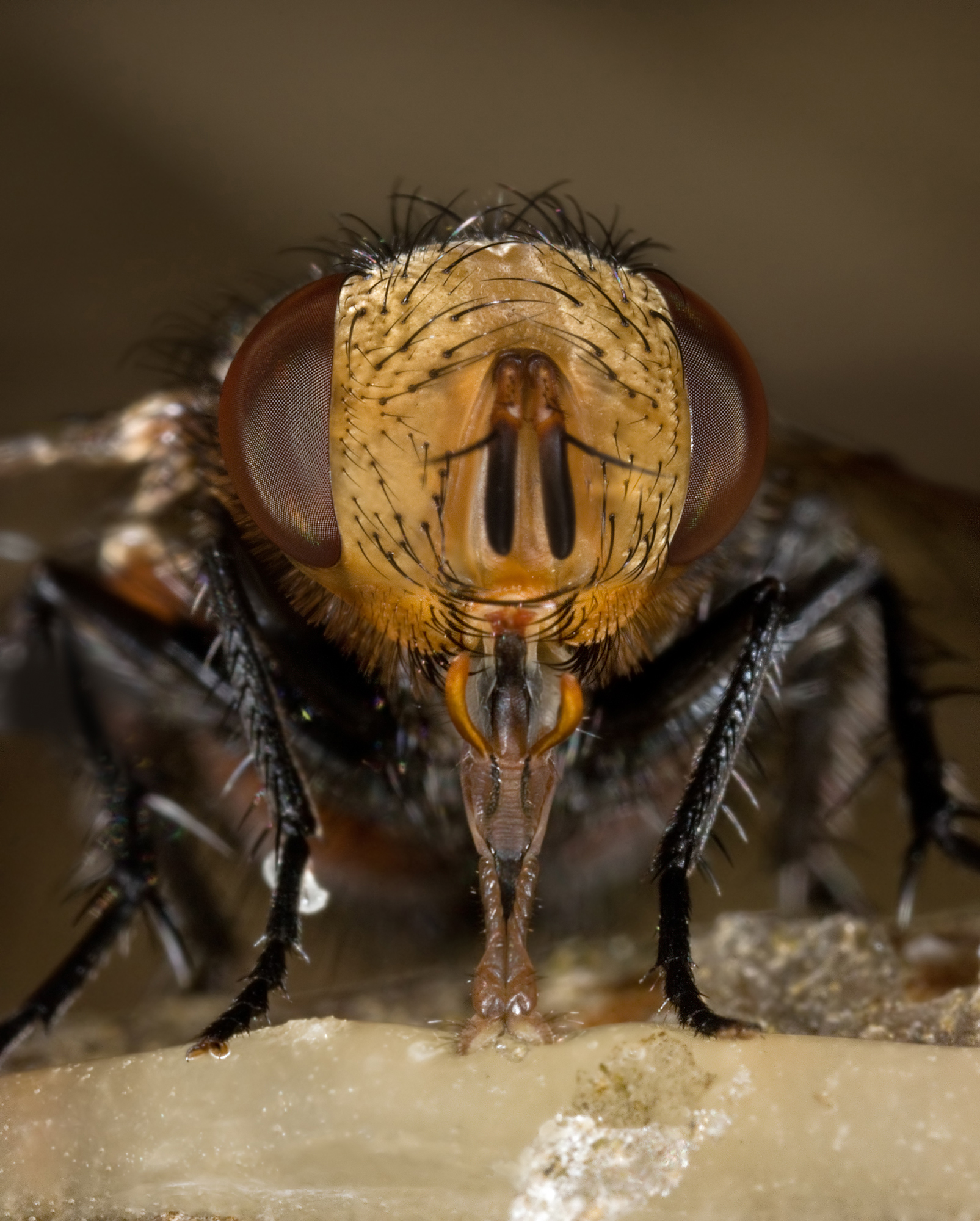
Promoted Image:Calliphora head 2.jpg MER-C 03:32, 29 June 2008 (UTC)
Leaf epidermis[edit]

- Reason
- A very interesting SEM image that takes something very ordinary (the surface of a tobacco leaf) and reveals it to be some sort of crazy alien world. Trichomes and stomata are visible, adding to its encyclopedic value.
- Articles this image appears in
- Leaf, Epidermis (botany), perhaps could be added to trichome or stoma
- Creator
- Louisa Howard (Dartmouth electron microscope facility)
- Support as nominator --Calliopejen1 (talk) 22:10, 21 June 2008 (UTC)
- After nominating, I've noticed that there are other equally good (better?) images in various leaf galleries linked from here. If others want to click around and see if there are better ones, I would gladly consider alternates. Calliopejen1 (talk) 22:19, 21 June 2008 (UTC)
- Strong objection This leaf appears not to have been cleaned prior to fixation for the SEM, chemically fixing a lot of crap onto the surface of the leaf. The cells were also not dried well, as the guard cells and the cells in between appear wrinkled, shrunken, and distorted, the opposite of what should be achieved by fixation. Here's a link to what properly fixed plant cells look like.[6] They're not collapsed, wrinkled, and shrunken. The focus is poor, the depth of field limited, it's hard to figure out what was focused on. Focusing at 200X on an SEM is not hard enough to allow for this micrograph to be out of focus throughout. There is nothing featurable about this. I will look at the page and see fi there are usable ones on that page. --Blechnic (talk) 22:21, 21 June 2008 (UTC)
- It occurs to me that you might have learnt in school that desiccated cells shrink, wrinkle, and close their stomata. Maybe you just forgot what you learnt... Papa Lima Whiskey (talk) 00:38, 22 June 2008 (UTC)
- They don't do that much if they're properly fixed for the SEM, which is the entire purpose of the fixation process, i.e., gaining images like the one I linked to above, which maybe you didn't learn about. In order to view a biological organism under the SEM, such as a leaf, the surface must first be cleaned with biologically suitable buffer, which wasn't done for this image, then the leaf is sliced while still in the buffer to preserve the tissue as best as possible, then fixed in a buffered fixer, then secondarily fixed, then dehydrated, then, usually for SEM, put in a critical point dryer, the purpose of which is to prevent as much of this dessication, shrinking, wrinkling and closing of the stomata as possible. That is why it only took a two second search to find a suitable SEM example of a leaf and its stomata, because the protocols are fairly routine by now, 2008, and accomplished with very little equipment that every biological SEM lab has available. So, a guick search on google, and one of the first image returns is an SEM of cells that didn's "shrink, wrinkl,e and close their stomata," is this magic? No, it's phosphate buffer, buffered glut, osmium textroxide, buffer, ethanol/alcohol, etc., as needed, and CPD. --Blechnic (talk) 03:13, 22 June 2008 (UTC)
- PS Be brave, click on the link above, see what an excellent, featured image of leaf epidermal cells under an SEM should look like. --Blechnic (talk) 03:14, 22 June 2008 (UTC)
- Yes, with the stomata fully open. Papa Lima Whiskey (talk) 19:55, 24 June 2008 (UTC)
- Yes, so it appears what you learned in school was wrong. But the difference between this image with the stomata fully open and the poorly preserved one, as any plant electron microscopist will tell you, and as is obvious to even the amateur, is that you can see the plump juicy guard cells inside the open stomate in the one I linked to. Now that's a secondary electron micrograph of a leaf! It's not necessary to be an expert in electron microscopy to be able to see excellence or its lack. Just the dirt and crap all over this micrograph that wouldn't be allowed if it were a photograph should have been enough to say no.
- Yup, open stomata and visible guard cells, not-dessicated. --Blechnic (talk) 23:43, 24 June 2008 (UTC)
- So what, in your opinion, does a desiccated plant cell look like under SEM? :) Papa Lima Whiskey (talk) 11:23, 25 June 2008 (UTC)
- It depends upon how and when it was dessicated, and to what degree, what the plant is, a lot of things. This image just looks like someone picked it far too early before getting it in fixative--its looks like a dessicated plant under SEM, so I don't know what you're asking after I've said that's a problem with this image. That's not the only problem with this image, though, so again, I'm not sure what your point is. --Blechnic (talk) 14:03, 25 June 2008 (UTC)
- So what, in your opinion, does a desiccated plant cell look like under SEM? :) Papa Lima Whiskey (talk) 11:23, 25 June 2008 (UTC)
- Yes, with the stomata fully open. Papa Lima Whiskey (talk) 19:55, 24 June 2008 (UTC)
- It occurs to me that you might have learnt in school that desiccated cells shrink, wrinkle, and close their stomata. Maybe you just forgot what you learnt... Papa Lima Whiskey (talk) 00:38, 22 June 2008 (UTC)
- Support. This is an informative and attractive image that, to me as someone with very limited technical experience with SEM, seems of comparable quality to other good SEM images I've seen. It may be, as Blechnic says, that there are technical flaws relative to what is possible with SEM. However, we are not yet blessed with an overabundance of attractive, high-resolution electron microscopy.--ragesoss (talk) 22:00, 22 June 2008 (UTC)
- The first part of FPC is "Is of a high technical standard." This is of not just low, but very low technical quality. We actually do have some excellent SEMs, and adding low quality SEMs to Wikipedia isn't going to be a magnet for better quality ones. This image is not of publishable quality. It has charging artifacts due to poor coating, the specimen was not properly fixed, the image was shot at probably the wrong working distance, and it's not in focus anywhere. So, how is it that we have to accept an out of focus micrograph, just because we don't have many? Did you even bother to look at the one I linked to? That's what a micrograph of leaf epidermal cells should look like. --Blechnic (talk) 02:36, 23 June 2008 (UTC)
- The one you linked to is a very small image, probably created at a very different magnification level. This image is far more valuable for the encyclopedia than the one you link to. It's one thing to create a nice crop section, and another to create a high-resolution image than encompasses many interesting features. The focus is also actually very good throughout, I thought...it's comparable to the SEM pollen FP we have (which comes from the same Dartmouth collection). It may no longer represent the cutting edge in SEM (I wouldn't know), but I think it's the best or one of the best of the leaf images on the Dartmouth site and, on a basic aesthetic and informative level, meets the FP criteria. (Some of the images of other leaf types have somewhat plumper features, so I'm not convinced that the "dessication" isn't in part a difference between the kind of leaf here and the one in your link.)--ragesoss (talk) 11:09, 23 June 2008 (UTC)
- Blechnic has offered a very detailed technical criticism, and unless someone with comparable technical knowledge can refute it, we should not accept the image. I don't think an image should be accepted on the grounds that it looks cool and laymen won't be able to identify its flaws. As a layman myself, I would want any scientific image I see to accurately reflect the subject and to be of the same quality scientists would use in the lab. Fletcher (talk) 14:19, 23 June 2008 (UTC)
- On the other hand, this image is hosted by the Dartmouth electron microscopy facility and was created by a scientist who created at least one other SEM image that we decided (and I don't think anyone has disputed) meets our FP criteria. I wouldn't characterize Blechnic's comments as detailed technical criticism; it seems more like speculation (possibly well-informed) about the technical features of the image. In any case, we accept flawed images all the time when, as a whole, they meet the FP criterion. We certainly don't require normal photography to meet the highest possible technical standards, just high technical standards. The idea that there is one way that a micrograph of leaf epidermal cells should look like seems very fishy to me as well, considering the wide range of possible methods for preparing samples, which scientists use variously for different purposes. The Dartmouth facility is showing off these images...why would we assume that these are not "of the same quality scientists would use in the lab?" I think we have strong evidence of just the opposite.--ragesoss (talk) 15:23, 23 June 2008 (UTC)
- It's not speculation, I've worked as a biological electron microscopist, and the classes I took to get the work, for Papa's information, don't say that cells are dessicated and ugly, they teach you methods to minimize the dessication and change. It's not "detailed technical criticism" because most of you don't have the background for the detailed technical criticism, but I would be glad to go into all the details. It's simply a very bad micrograph. The one of pollen is in another league, an excellent, well-done SEM of pollen. I have no idea why Dartmouth is showing off these rather bad micrographs, but I would be glad to e-mail the facility director and discuss the quality of this micrograph with him/her, or ask at the microscopy list serve for details from other microscopists just why Dartmouth displays these, or what they'd think if Wikipedia put one on their main page. This is a really crappy micrograph, and no one at Dartmouth is going to say its equivalent quality to the pollen one.
- The point is not to offer up the other image as an alternative FPC, but to show how cells can look, and how a micrograph can and should look. This Dartmouth one is t-ball in comparison to it and to the pollen one's major league ball park. --Blechnic (talk) 15:51, 23 June 2008 (UTC)
- PS, Yes, it could be a less plumped up species in generally, or it could have been gathered poorly, rather than the issue during sample preparation, none of this removes the dirt, the charging (not too bad, but bad enough to require photoshop), or the poor depth of field. Also, look at the upper right: plump, unwrinkled cells. This is how I can tell what they were supposed to look like, because they look like that in part of the image. --Blechnic (talk) 16:14, 23 June 2008 (UTC)
- What do you think of the other Nicotiana images at [7]? To my eye the stomata do appear less "wrinkled" (indicative of not being dessicated?) than in this FP candidate. And the FP candidate does seem out of focus in places (two trichomes emerging from the left side). I agree there appears to be some debris on the cells, more noticeable when you zoom in. What is 'charging'? Fletcher (talk) 16:23, 23 June 2008 (UTC)
- Charging is a build up of electrons on the surface due to an inability for the excess electrons to go to ground due to a poorly done conductive coating. It gives big blank white spots on the micrograph. Almost all biological samples will have some charging, particularly if they have as much topography as this, because of the difficulties of coating all the nooks and crannies, even though the specimen coaters are designed to spin at an angle to get most areas. I will look at the other leaves later on. --Blechnic (talk) 16:26, 23 June 2008 (UTC)
- What do you think of the other Nicotiana images at [7]? To my eye the stomata do appear less "wrinkled" (indicative of not being dessicated?) than in this FP candidate. And the FP candidate does seem out of focus in places (two trichomes emerging from the left side). I agree there appears to be some debris on the cells, more noticeable when you zoom in. What is 'charging'? Fletcher (talk) 16:23, 23 June 2008 (UTC)
- On the other hand, this image is hosted by the Dartmouth electron microscopy facility and was created by a scientist who created at least one other SEM image that we decided (and I don't think anyone has disputed) meets our FP criteria. I wouldn't characterize Blechnic's comments as detailed technical criticism; it seems more like speculation (possibly well-informed) about the technical features of the image. In any case, we accept flawed images all the time when, as a whole, they meet the FP criterion. We certainly don't require normal photography to meet the highest possible technical standards, just high technical standards. The idea that there is one way that a micrograph of leaf epidermal cells should look like seems very fishy to me as well, considering the wide range of possible methods for preparing samples, which scientists use variously for different purposes. The Dartmouth facility is showing off these images...why would we assume that these are not "of the same quality scientists would use in the lab?" I think we have strong evidence of just the opposite.--ragesoss (talk) 15:23, 23 June 2008 (UTC)
- Blechnic has offered a very detailed technical criticism, and unless someone with comparable technical knowledge can refute it, we should not accept the image. I don't think an image should be accepted on the grounds that it looks cool and laymen won't be able to identify its flaws. As a layman myself, I would want any scientific image I see to accurately reflect the subject and to be of the same quality scientists would use in the lab. Fletcher (talk) 14:19, 23 June 2008 (UTC)
- The one you linked to is a very small image, probably created at a very different magnification level. This image is far more valuable for the encyclopedia than the one you link to. It's one thing to create a nice crop section, and another to create a high-resolution image than encompasses many interesting features. The focus is also actually very good throughout, I thought...it's comparable to the SEM pollen FP we have (which comes from the same Dartmouth collection). It may no longer represent the cutting edge in SEM (I wouldn't know), but I think it's the best or one of the best of the leaf images on the Dartmouth site and, on a basic aesthetic and informative level, meets the FP criteria. (Some of the images of other leaf types have somewhat plumper features, so I'm not convinced that the "dessication" isn't in part a difference between the kind of leaf here and the one in your link.)--ragesoss (talk) 11:09, 23 June 2008 (UTC)
- The first part of FPC is "Is of a high technical standard." This is of not just low, but very low technical quality. We actually do have some excellent SEMs, and adding low quality SEMs to Wikipedia isn't going to be a magnet for better quality ones. This image is not of publishable quality. It has charging artifacts due to poor coating, the specimen was not properly fixed, the image was shot at probably the wrong working distance, and it's not in focus anywhere. So, how is it that we have to accept an out of focus micrograph, just because we don't have many? Did you even bother to look at the one I linked to? That's what a micrograph of leaf epidermal cells should look like. --Blechnic (talk) 02:36, 23 June 2008 (UTC)
![[6]](http://www.biosci.ohio-state.edu/pcmb/osu_pcmb/images/content/courses/pcmb300_stomata.jpg)
Not promoted MER-C 03:24, 29 June 2008 (UTC)
Crotalus cerastes (Horned Rattlesnake) at Mesquite Springs, CA (Mojave Desert)[edit]


- Reason
- Unique pose of a Crotalus cerastes, good image quality with various important features of the snake clearly visible, making the image of encyclopedic quality.
- Articles this image appears in
- Crotalus_cerastes
- Creator
- Original by tigerhawkvok, nominated edit by victorrocha.
- Support as nominator --Tigerhawkvok (talk) 20:37, 21 June 2008 (UTC)
- Comment -- For some reason, the FPC tag won't take. I suspect it may hve to do with the recent change from the original to the edit being represented in an article; when it is editable, can someone add the FPC tag? Tigerhawkvok (talk) 21:34, 21 June 2008 (UTC)
- I just added them now. NauticaShades 22:03, 21 June 2008 (UTC)
- Oppose The lighting's not that good, and, especially in the back, some of the snake is blurry. SpencerT♦C 19:53, 22 June 2008 (UTC)
- Support Edit 1 Good composition and framing for a point and shoot camera. Highly encyclopedic for the article it is currently in (only snake picture in the article). The sharpness is acceptable considering the size of the picture. It can be downsized a lot more if anyone wishes to make it any sharper. victorrocha (talk) 2:20, 25 June 2008 (UTC)
- Strong Oppose, lets try using this image in an article before we nominate it to FP. smooth0707 (talk) 15:05, 26 June 2008 (UTC)
- Comment Used in an article.....? Smooth I think you should pay a bit more attention because according to the nomination line "Articles this image appears in" this picture is in an article and is the main image of that article. Here's a link if you need it Crotalus_cerastes. victorrocha (talk) 20:57, 25 June 2008 (UTC)
- See above, there was an issue with the FPC tag, so another version was put up. SpencerT♦C 22:54, 26 June 2008 (UTC)
- He makes a fair point. Neither the original or edit nominated here are in articles. The version in the article is Image:Crotalus cerastes mesquite springs CA-2.jpg. Presumably the same as the nominated Edit Image:Crotalus cerastes mesquite springs CA-2.jpg (notice the uppercase vs lowercase jpg), but someone would need to confirm this. In short the error really lies with the uploader/nominator being a bit careless with filenaming :-). --jjron (talk) 00:58, 27 June 2008 (UTC)
- Jjron is correct. Link fixed. The original is here soley to provide a source for further editing, rather than doing sucessive edits-to-edits to avoid any compression artifacts that may turn up from multiple jpg saves. Tigerhawkvok (talk) 01:05, 27 June 2008 (UTC)
- He makes a fair point. Neither the original or edit nominated here are in articles. The version in the article is Image:Crotalus cerastes mesquite springs CA-2.jpg. Presumably the same as the nominated Edit Image:Crotalus cerastes mesquite springs CA-2.jpg (notice the uppercase vs lowercase jpg), but someone would need to confirm this. In short the error really lies with the uploader/nominator being a bit careless with filenaming :-). --jjron (talk) 00:58, 27 June 2008 (UTC)
- See above, there was an issue with the FPC tag, so another version was put up. SpencerT♦C 22:54, 26 June 2008 (UTC)
- Comment Used in an article.....? Smooth I think you should pay a bit more attention because according to the nomination line "Articles this image appears in" this picture is in an article and is the main image of that article. Here's a link if you need it Crotalus_cerastes. victorrocha (talk) 20:57, 25 June 2008 (UTC)
Not promoted MER-C 03:24, 29 June 2008 (UTC)
Common Frogs Mating[edit]

- Reason
- This is a high quality and relatively well-composed photograph of two frogs engaging in one of the seven conventional characteristics of life.
- Articles this image appears in
- Common Frog
- Creator
- Richard Bartz
- Support as nominator --NauticaShades 20:32, 21 June 2008 (UTC)
- Support The focus is kind of odd, but a well-taken picture nonetheless. It has a lot of encyclopedic value. Elephantissimo (talk) 00:41, 22 June 2008 (UTC)
- Oppose Depth of field is too shallow to show the subjects in clear focus, and somewhat harsh flash lighting Thisglad (talk) 06:45, 23 June 2008 (UTC)
- There was no usage of flash on this picture, look at the eyes - there is no flashlight reflection. --Richard Bartz (talk) 13:43, 23 June 2008 (UTC)
- Oppose Depth of focus is much too shallow. Mangostar (talk) 23:21, 23 June 2008 (UTC)
- Oppose. DOFDwayne Reed (talk) 07:11, 26 June 2008 (UTC)
Not promoted MER-C 03:24, 29 June 2008 (UTC)
Drosophila compound eye[edit]

- Reason
- Great electron micrograph, considerable resolution, rare encyclopaedic value.
- Articles this image appears in
- Drosophilidae
- Creator
- Louisa Howard, Dartmouth College (public domain)
- Support as nominator --Papa Lima Whiskey (talk) 12:07, 21 June 2008 (UTC)
- Comment Could you possibly clean up the image, remove the odd scratch and blip there is. Could you also fix the distortion that runs horizontally towards the top of the picture and also clean the faint horizontal line at the bottom of the picture and se if you can sharpen the picture up. Sorry if that was a long list but I really wanna support this image because it really caught my eye when i was on the page and i think this could be a really good FP but just needs those points i brought up fixed. Seddσn talk Editor Review 12:34, 21 June 2008 (UTC)
- I'm working on it. It will take a while, and I won't be able to do everything today. In fact, I may not be able to do everything during the course of this nomination due to my work schedule. Papa Lima Whiskey (talk) 13:20, 21 June 2008 (UTC)
- If you wish i could attempt it myself. Seddσn talk Editor Review 13:33, 21 June 2008 (UTC)
- I'll upload what I've done so far. Maybe it will be a useful starting point for you. Papa Lima Whiskey (talk) 14:01, 21 June 2008 (UTC)
- If you wish i could attempt it myself. Seddσn talk Editor Review 13:33, 21 June 2008 (UTC)
- I'm working on it. It will take a while, and I won't be able to do everything today. In fact, I may not be able to do everything during the course of this nomination due to my work schedule. Papa Lima Whiskey (talk) 13:20, 21 June 2008 (UTC)
- Comment. While the scale indicator is useful, it is quite hard to see in a small thumbnail. Could it possibly be made larger? NauticaShades 14:44, 21 June 2008 (UTC)
- I've passed it on to Seddon for editing. If he doesn't have time for it, I can do it at some point, but it may be a few days. Papa Lima Whiskey (talk) 17:09, 21 June 2008 (UTC)
Support- Very encyclopedic, good but not great quality. ~~Meldshal42 (talk) 15:38, 21 June 2008 (UTC)
- Strong oppose The SEM is known for its depth of field, this image was shot without taking advantage of the capabilities of the instrument. This is clearly an amateur electron micrograph and there is not, in any way, anything about it that should be featured on Wikipedia or anywhere else. It's technical quality is zero, due to charging artifacts, no focus, no depth of field, it is not even in the same ballpark as the excellent krill eye micrograph, much less "among Wikipedia's best work," and it should be replaced as soon as possible in the Drosophilidae article. Not even the region that's "in focus" is in focus. Clearly the work of an amateur who does not know the instrument and its capabilities and has minimalized all the potential of the SEM to produce one second rate micrograph that should not even have been published, much less promoted to FP on Wikipedia. --Blechnic (talk) 19:50, 21 June 2008 (UTC)
- Oppose. It's not all that informative (the same feature repeated over and over, no color, without putting into wider context as macros do and without going down to the level of sub-cellular detail that some other electron microscopy images do). Plus, there is the horizontal blip where it looks like the sample got bumped during the scan.--ragesoss (talk) 22:08, 22 June 2008 (UTC)
- I would support this wider scan instead: [8]. Despite lower magnification, it has hardly any less detail, with a lot more context. And because the composition isn't based on symmetry and uniformity, the flaws (posterized background, blown highlights) don't detract as much as from the nominated image. There are a number of probably FP-worthy shots on the Dartmouth site (all public domain), but I don't think this is one.--ragesoss (talk) 22:22, 22 June 2008 (UTC)
- The wider scan is worse, simply one of the worst micrographs I've ever seen. It looks like the text micrographs we're given to see how many things wrong with it we can find, and then define how to correct it. --Blechnic (talk) 02:38, 23 June 2008 (UTC)
- I would support this wider scan instead: [8]. Despite lower magnification, it has hardly any less detail, with a lot more context. And because the composition isn't based on symmetry and uniformity, the flaws (posterized background, blown highlights) don't detract as much as from the nominated image. There are a number of probably FP-worthy shots on the Dartmouth site (all public domain), but I don't think this is one.--ragesoss (talk) 22:22, 22 June 2008 (UTC)
Not promoted MER-C 03:25, 29 June 2008 (UTC)
Ivory-Billed Woodpecker[edit]

- Reason
- This image has both historical and encyclopedic interest, being an Audubon engraving and also an excellent representation of the rare Ivory-Bill.
- Articles this image appears in
- Ivory-billed Woodpecker, John James Audubon
- Creator
- Cotinis
- Support as nominator --Fleagle 06:21, 21 June 2008 (UTC)
- Support for inclusion in John James Audubon; all original detail seems to be preserved in this colour restoration (I assume that's what it is). Papa Lima Whiskey (talk) 11:24, 21 June 2008 (UTC)
- Support. High-quality scan of an exceptionally rare bird. NauticaShades 14:41, 21 June 2008 (UTC)
- Support. Highly enc. I'm sure that it wouldn't be as rare had Audubon not killed so many of them himself. I think the History Channel said he'd shot a hundred birds a day, every day, for many years. — BRIAN0918 • 2008-06-21 16:21Z
- Support Nice image, high quality. SpencerT♦C 16:49, 21 June 2008 (UTC)
- Comment The image description page does not say why the birds look different (male/female? differing witness accounts? just allelic variation?), could you add that info? Narayanese (talk) 17:17, 21 June 2008 (UTC)
- They are indeed male and female. The male has the red while the female is merely black and white. Fleagle 04:08, 22 June 2008 (UTC)
- Support High quality and extremely aesthetically pleasing. TheOtherSiguy (talk) 19:43, 21 June 2008 (UTC)
- Support Eye candy, as the editor above me notes. --Blechnic (talk) 20:02, 21 June 2008 (UTC)
- Support. Nice find. Kaldari (talk) 16:07, 23 June 2008 (UTC)
- Support. Obvious encyclopedic value, and virtually irreplaceable. DurovaCharge! 16:46, 23 June 2008 (UTC)
- Support Excellent quality and it really adds to the article.116135 (talk) 00:33, 27 June 2008 (UTC)
- Support Outstanding! Cacophony (talk) 18:03, 28 June 2008 (UTC)
Promoted Image:Campephilus principalisAWP066AA2.jpg MER-C 03:25, 29 June 2008 (UTC)
Eichmann trial news story[edit]
- Reason
- Briefly summarizes the end of the Adolf Eichmann trial, noting that the Israeli court found him guilty and that he was to be hanged. Eichmann, the "architect of the Holocaust", was kidnapped by Israeli agents from Argentina in 1960 and flown to Israel to stand trail for his role in the Holocaust. The resulting fallout from the kidnapping provoked international controversy, while the trial itself was an international media sensation, and is widely credited for having brought the Holocaust out from the shadow of WWII and establishing it as an independent event that occurred concurrently with WWII.
- Articles this image appears in
- Adolf Eichmann
- Creator
- Universal International News
- Support as nominator --TomStar81 (Talk) 03:29, 20 June 2008 (UTC)
- Strong support--Mbz1 (talk) 04:45, 20 June 2008 (UTC)
- Support very good quality, interesting too Capital photographer (talk) 06:39, 20 June 2008 (UTC)
- Comment obviously important but the original was much higher quality than this and it would be nice to get a better rip if possible. gren グレン 08:23, 26 June 2008 (UTC)
- Support. The video is informative and quite good quality. NauticaShades 02:19, 27 June 2008 (UTC)
Promoted Image:Eichmann trial news story.ogg MER-C 03:25, 29 June 2008 (UTC)