Wikipedia talk:WikiProject Maps/Archive 2024
| This is an archive of past discussions on Wikipedia:WikiProject Maps. Do not edit the contents of this page. If you wish to start a new discussion or revive an old one, please do so on the current talk page. |
| Archive 2020 | ← | Archive 2022 | Archive 2023 | Archive 2024 |
Merge discussion for "Geomatics" and "Geomatics engineering" needs participation
There is an ongoing merge discussion going on to merge "Geomatics engineering" into the page for "geomatics." Currently there is very weak consensus, and the action is proving slightly controversial, so I'd like to get additional knowledgeable people to comment on it.
Link to the merge discussion here. GeogSage (⚔Chat?⚔) 08:01, 8 January 2024 (UTC)
What Colors Could Represent
Anyone have a map that uses all of the elevation colors? Octalh (talk) 22:45, 22 January 2024 (UTC)
- What do you mean? There isn't really a standard color ramp for elevation that would be "all" of them. GeogSage (⚔Chat?⚔) 23:06, 22 January 2024 (UTC)
Map change request
Please change the map of 2024 Indian general election in Assam.
There was a delimitation in which the constituency borders were changed. But the article still uses the old map with the old borders.
Search "CEO Assam Map" to get the new map. Webaddress of result will be "ceoassam.nic.in", this is the chief electoral office website. MrMkG (talk) 09:07, 11 February 2024 (UTC)
WikiProject Maps/Conventions
Hello all,
After collecting best and most popular cartographic practices into Wikipedia:WikiProject_Maps/Conventions about a decade ago, I plan to lightly refresh and update the page, with new best practices now widespread on Wikimedia projects. It would be also interesting to have a section about the emerging cloud technologies such as OSM-based wikimaps, a subject which I don't know much. Could someone with basic knowledge of this project contact me ? Yug (talk) 🐲 08:28, 7 March 2024 (UTC)
- Wikipedia:Maps for Wikipedia and meta:WikiMiniAtlas seem to sum up current Wiki map tech. The Equalizer (talk) 12:39, 7 March 2024 (UTC)
- It's more advanced that I knew. Thos /Conventions page needs to guide users toward those new tech / best practices. Yug (talk) 🐲 14:55, 7 March 2024 (UTC)
- I added NNW's new "N series" style to the conventions page and have been doing a little clean-up. I have some OSM experience so if you have some queries feel free to ask me, but I'm a little busy recently. – Isochrone (talk) 16:38, 7 March 2024 (UTC)
- It's more advanced that I knew. Thos /Conventions page needs to guide users toward those new tech / best practices. Yug (talk) 🐲 14:55, 7 March 2024 (UTC)
Feedback requested for innovation made
Hello. I have made an innovation to data in infoboxes in some countries' articles. I don't know if it is going to be accepted by the community.
I thought it helpful to provide information on the neighboring places, including a map and wikilinks, per Wikipedia:Manual of Style/Images § Image quality,
A map of Moldova should show its frontiers with Romania and Ukraine, so people may know where the country is located in relation to its neighbors.
Also, according to Manual of Style/Linking § Overlinking and underlinking,
In general, links should be created for:
- Relevant connections to the subject of another article that will help readers understand the article more fully
- Articles with relevant information
[...] The purpose of linking is to clarify and to provide reasonable navigation opportunities
Quiché Department is an example of the work I did. Click on the infobox map option of "Quiché and its neighbors" to see the relevant map. If you click on the links to Chiapas and Petén, you can find more examples and experience the navigation improvement to find information on neighboring places and have a better illustration of the of the region. Sincerely, Thinker78 (talk) 06:57, 15 March 2024 (UTC)
- @Sdkb, Yug, and SMcCandlish: Thinker78 (talk) 01:08, 16 March 2024 (UTC)
- I'm a bit confused as all the location maps show parts of the neighbouring countries (when appropriate), so my question is: what does "Quiché and its neighbors" show that the location map doesn't? M.Bitton (talk) 01:18, 16 March 2024 (UTC)
- The difference is that the second map shows the names of the neighbors. Sincerely, Thinker78 (talk) 04:19, 16 March 2024 (UTC)
- And a helpfully zoomed-out view providing more geographical context. — SMcCandlish ☏ ¢ 😼 04:52, 16 March 2024 (UTC)
- The difference is that the second map shows the names of the neighbors. Sincerely, Thinker78 (talk) 04:19, 16 March 2024 (UTC)
- The direction of this strikes me as definitely reader-helpful. As long as WP is going to stubbornly refuse to use Open Street Map, Google Maps, or any other modern map API (or implment one of its own) and overlay information on top of maps that are actually zoomable web apps, then WP is badly behind-the-times on map utility. It's intensely frustrating to click on a map in a WP article to get more information only to find that the map is a just a static SVG, PNG, JPG or GIF image and cannot be zoomed in and out to show a wider area. This problem could certainly be ameliorated to some extent by providing a switcheroo micro-app that provides multiple maps at different levels of global zoom. Some initial comments on this exact implementation:
- The list you tried to create in the infobox was basically mangled, with bare "*" characters. The proper way to do this is this, with
{{hlist}}(something similar could be done with{{plainlist}}, but with more obtrusive markup that requires line-breaks and cannot be done inline).{{Hlist}}is even smart enough to auto-parenthesize (round-bracket) embedded inline lists. The result looks like this. - While the additional map provides immediate utility, including a textual list of all contiguous areas may or may not. I lean toward the "provide more information than less" position on such matter, but I expect there will be differences of opinion. Add additional reason, beyond my own proclivities, to side with more-than-less in this sort of case is that maps are between poorly usable and totally useless for readers with visual disabilities, and of low utility on small mobile devices, while the text links are pertinent for all.
- When such a list is included, start with the continuous areas that are within the same parent jurisdiction (or general named region, if it's a geographical-region map that doesn't pertain to polities). In this case, that is Guatemala, and it was very confusing to have the list start with Mexico and a state thereof, then later switch to (non-Guatemala-labeled) departments of Guatemala. I think the initial idea was probably something like "start with the northernmost by default and work clockwise", and that might be reasonable for a map in which all the contiguous areas are "equal" conceptually, but it's not intuitive at all in a case like this, where everything is in Guatemala except one entry.
- Aside from the text stuff, this multi-map approach would be even better with a third map, showing this place's location in the Western Hemisphere. We have to remember that our site is heavily used by school children and by adults who do not have deep education (much less of the sort that focuses on the Western Hemisphere like most Americans and Canadians have), so just being told that something is "in Guatemala" is often not very conceptually useful for any given reader when it comes to individually understanding where in the world a place is. For a perhaps ideal test case, see Ural Mountains which provides a single map that makes some sense to people intimately familiar with Central Asia, but lacks sufficient information on both the mountains' relation to various polities, and where on the globe it is for people who understand the continental arrangement of the world but not exactly where on it are the exact extents of places like Russia and Pakistan and Uzbekistan and so on. (I was trying to cement in my own mind these mountains' exact geographic relationships to the Himalayas and others, and to other major Eurasian land features like the Pontic Steppe, Caspian Sea, Gobi Desert, etc., and I had to go to other sites to do that. Shouldn't've had to.)
- The underlying
{{switcher}}template needs to be smart enough to output "show both" when there are only two, since "show all" is not grammatical (in the broad, vernacular sense of that word) when there are only two items. (However, providing three options in a case like this would be better in the first place).
- The list you tried to create in the infobox was basically mangled, with bare "*" characters. The proper way to do this is this, with
- Summary: With some tweaks in approach, this multi-map switcher is clearly a usability and educational and navigation boon. An argument can be made that a text-link list of the contiguous areas is also (especially for accessibility reasons, but also generally), though a counter-argument can be made about the latter (but probably not against the accessibility point). — SMcCandlish ☏ ¢ 😼 04:52, 16 March 2024 (UTC)
- I appreciate the detailed feedback and will follow your advice. Regarding being able to zoom in or out, I have to point out the very feature that you may have missed. If you click the coordinates, you are transported to the Wikimedia Cloud Services hosting GeoHack, which provides links to a wide variety of mapping services, including a featured Wikimedia map, which you can conveniently zoom in and out to show a wider area.
- Maybe it is an external link but it is only one extra click away but I get your point regarding static maps. Although the latter may have a value of their own, probably the future is headed towards incorporating the Wikimedia maps in the infobox of relevant articles. I have actually seen some countries' articles with maps that are dynamic and zoomable. Sincerely, Thinker78 (talk) 05:27, 16 March 2024 (UTC)
- @Graham87: what do you think about this? Sincerely, Thinker78 (talk) 05:31, 16 March 2024 (UTC)
- @Thinker78: Sounds potentially interesting. Maybe add some sort of directional indicator of where the neighbouring places are? If I'm understanding correctly, something similar is done in {{Infobox Australian place}}; see Carlisle, Western Australia, for example. Graham87 (talk) 07:28, 16 March 2024 (UTC)
- @SMcCandlish: Check out Guatemala City. Not only it has a zoomable map in the infobox but also the map scheme you advised regarding regionality. Sincerely, Thinker78 (talk) 19:41, 16 March 2024 (UTC)
- This is all promising stuff! — SMcCandlish ☏ ¢ 😼 08:16, 17 March 2024 (UTC)
Input requested
There is a discussion that may be of your interest that includes the topic proprietary map services, at Template talk:GeoTemplate#Splitting Global/Trans-national services. Your input is welcomed. Sincerely, Thinker78 (talk) 23:13, 17 March 2024 (UTC)
Red boundaries on interactive maps
Can anyone give me a pointer as to how red boundaries end up on interactive maps? What or who codes that? And where? I have two city park articles, where in one, the red boundary is missing, and another one where it is inaccurate. Stefen Towers among the rest! Gab • Gruntwerk 18:01, 27 March 2024 (UTC)
- For Shawnee, another OSM tag was missing - I have added it, but it will take some hours to pull the data to the Wiki map servers before it will show.
- Seneca and others is slightly complicated, in OSM the park is classed as a separate location from the course, two ways to skin this:
- Either you add the same Q number and missing tag to the course attributes and again wait for replication, it will draw two shapes.
- If you want one large shape on OSM it will need to be drawn from scratch as a new relation and tags / number added.
- The Q&A at the top of Template talk:Infobox mapframe explains the tag issue (Q4/A4), The MediaWiki link within it mw:Help:Extension:Kartographer/OSM#Create a new relation shows how to create a new OSM relation.
- Regards, The Equalizer (talk) 20:20, 27 March 2024 (UTC)
- Thank you for the assistance. I figured that some kind of server lag was involved with Shawnee, but it's good to have that confirmed. As for the parks with golf courses, I'll have to mull over what the best course of action will need to be. The Shawnee boundary includes the golf course but other Louisville area parks don't. Are you saying an existing boundary cannot be reshaped or that doing that is way too complicated? Stefen Towers among the rest! Gab • Gruntwerk 20:59, 27 March 2024 (UTC)
- If the missing type tag hadn't been added to Shawnee, it would not have shown at all.
- The parks and courses have been drawn independently and unless you know what you are doing it's better left. Safer to draw a new overall shape as per the instructions given.
- If happy to use two shapes (which isn't that bad), the real right way to do things is create Wikidatas specific to the courses which will be different Q nos from the parks, then add these to the code for the infobox, but if as you state the courses are integral to the parks simplest is to add the park Wikidatas and type to them in OSM, and wait. The Equalizer (talk) 21:31, 27 March 2024 (UTC)
- Please understand I haven't looked at these things before today, so I'm struggling to wrap my head around it.
- Re: server lag, I was wondering about that before and after the missing tag was added.
- The city of Louisville treats the golf courses as features included in these parks, and that's how I've always known them.
- I see that creating a new overall park shape would be least disruptive in case anyone is technically depending on the current shape, but on the other hand, I wonder if creating this might cause issues for general users of the area map, to see two different shapes saying they are the park.
- I suppose that for the time being, to get something done with least resistance, using the existing separate park and golf course shapes will have to do. So, I will need to create WikiData pages for the golf courses and connect those to the golf courses in OSM. Then, somehow I have the infobox show both zones. I guess I'll work on doing this for one park until I can get it to work, and once it does, move on to the others.
- Thank you again for your assistance. Stefen Towers among the rest! Gab • Gruntwerk 22:24, 27 March 2024 (UTC)
- I see the boundary is showing on Shawnee when full screen, will need some time before the thumbnail also displays this (which might need a tweak to get it to show). The Equalizer (talk) 11:38, 28 March 2024 (UTC)
- Thank you for the assistance. I figured that some kind of server lag was involved with Shawnee, but it's good to have that confirmed. As for the parks with golf courses, I'll have to mull over what the best course of action will need to be. The Shawnee boundary includes the golf course but other Louisville area parks don't. Are you saying an existing boundary cannot be reshaped or that doing that is way too complicated? Stefen Towers among the rest! Gab • Gruntwerk 20:59, 27 March 2024 (UTC)
Looking for archive of all currently existing maps
Hello, for research purposes I have been looking for an archive of all Maps used on historical articles on Wikipedia. They are enormously helpful however due to the scale of my research project it would be much faster if I could look through an archive of the maps used to demonstrate changing borders of nations over the millenniums! Thank you
- Please sign your posts. Maps are found on the Commons. See Commons:Category:Maps for maps of all kinds. --Timeshifter (talk) 17:44, 30 March 2024 (UTC)
User-editable maps
These SVG maps have user-editable sections (any text editor) to allow creation of more maps on more topics. Just paste in a list of states and values. See examples at Commons:Category:English-language SVG maps of the United States made with templates. Feel free to create map templates for other countries too. Cmglee may be able to help with that.
| Version 2: Convert a US list/table to a state-by-state data map. With examples and step-by step instructions. Example: |
 |
| Simple map below with state names and colored states. See its talk page. |
 |
--Timeshifter (talk) 18:01, 8 April 2024 (UTC)
Creation of maps with shaded areas
Per discussion at Wikipedia_talk:Graphics_Lab/Map_workshop , I'd like to be able to specify a list of countries, and have a template draw a world map with those countries shaded in. Seems like a template exists but is currently disabled due to security concerns:
| Graphs are unavailable due to technical issues. Updates on reimplementing the Graph extension, which will be known as the Chart extension, can be found on Phabricator and on MediaWiki.org. |
Initial use case I had in mind can be seen at FTSE Global Equity Index Series and on that talk page.
Any help appreciated. 92.71.60.61 (talk) 08:45, 9 May 2024 (UTC)
Must the text used within maps always be pure black?
Hello. I am currently locked in a dispute with Timeshifter over at File talk:Map of US state cannabis laws.svg#Color of D's and am looking for some input. Timeshifter is insisting that the color of text on all maps must be pure black for reasons of accessibility. I disagree and contend that WP:COLOR only requires that a 4.5:1 contrast be met (per WCAG 2.0 AA), and have pointed out that wikipedia uses a 4.76:1 ratio for redlinks, while wikimedia commons uses a 4.52:1 ratio for the gray text in signature timestamps... and that the contrast ratios I have proposed (5.03:1 here and 7:05:1 here) should be sufficient considering this. I have argued that the pure black D's instead of dark red makes the map look very bland, but he says this concern is ridiculous. What are some opinions at WikiProject Maps about accessibility and whether it is possible that it can go overboard sometimes such as in this instance? Thank you for your time.--Jamesy0627144 (talk) 06:41, 8 May 2024 (UTC)
- I would agree with Timeshifter on this one. I'm colourblind and I would never use any colours other than white, black, or greys when labeling text on backgrounds that aren't also black or white, regardless of the map. Looking at that file, there may be better ways of presenting the information, including adding some sort of texture/shading to the states where the label is being used - the label actually looks really out of place, whereas a white diagonally striped shading may better convey the information. SportingFlyer T·C 06:51, 8 May 2024 (UTC)
- OK, thank you. I was thinking since it was only a single letter of text rather than being a long string of text, the pure black seemed especially unnecessary, but I guess you would disagree with that. I like the subtleness of the D's as opposed to any kind of "loud" diagonals, and the intuitiveness of them is great as well I think, representing "Decriminalized".--Jamesy0627144 (talk) 07:47, 8 May 2024 (UTC)
- @Jamesy0627144 I'm a graphic worker here and at commons and I always try to make maps (illustrations or other) also work for people with color deficiency and in GIMP there are filters so you can check how it would look for the three most common color deficiencies.
- So I think you are addressing the problem in a wrong way, you can never say that something always has to be like this or that, it depends on so many things if it will work or not. How the map looks, the colors used there, patterns etc. Also we never know how a map will be viewed, printed (many different ways), viewed on a screen (they are all different), the ambient light, and so on. We never know in which scale the map will be viewed neither so the thing I can do is to make it work in 100% viewed on my screen and if I have a requester that it works for that person also.
- The overall layout of the map is to me more important than what color the text has as long as it works. It's also very different depending on which font you use, which type normal bold etc and the size.
- As support for graphic workers we do have this WP:WikiProject_Maps/Conventions#SVG_Tool_box_template (conventions for wikimedia) and in that you can see that texts do have other colors, not only black, and there are more templates (conventions).
- I agree with @SportingFlyer partly (see text above) and that the map you referring to cold be made differently.
- To me it's also important that a map is pleasant to view as I think they work better then and people will use them more.
- I just saw this "People shouldn't have to click on the map and expand it in order to read the text. Even people without perfect vision." To achieve that in most contents is impossible as often small thumbnails are used. --always ping me-- Goran tek-en (talk) 17:38, 8 May 2024 (UTC)
you can never say that something always has to be like this or that
- While this is trivially so, on Wikipedia I cannot think of a good reason to ever prioritize other factors over the legibility of text. One's personal muse is best suited for other ventures: our job is to make information accessible with the greatest clarity to the greatest number of people, and these are the best guidelines we know about in order to accomplish that. Remsense诉 04:21, 9 May 2024 (UTC)
- OK, thank you. I was thinking since it was only a single letter of text rather than being a long string of text, the pure black seemed especially unnecessary, but I guess you would disagree with that. I like the subtleness of the D's as opposed to any kind of "loud" diagonals, and the intuitiveness of them is great as well I think, representing "Decriminalized".--Jamesy0627144 (talk) 07:47, 8 May 2024 (UTC)
I agree with everything SportingFlyer said. I was thinking of diagonal lines too. That may actually be the best most visible solution.
Why would you want anything other than black or white text in any of the maps below? It provides the most contrast and readability.
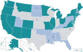
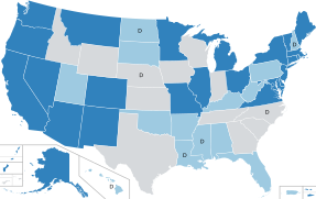
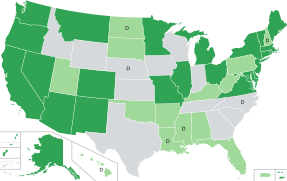
These 2 US maps below are at 350px wide in some Wikipedia articles. I made the text size as big as possible so that some people will be able to read the state names and values without enlarging the map. Many people can. Many people are in a hurry and prefer to take a quick look to find one state and its value without enlarging the map. Articles often have more than one map, and so it is nice to be able to scan quickly down a page. Then one can enlarge some maps of choice. I like to give people the most options, and higher contrast provides the most options.
It would be nice if the maps with values also had the ability to use white text. Then very dark background colors could be used too. That would allow for a wider spread of background colors. That is very useful for such choropleth maps. But I am not the creator of the SVG template used for those maps. I just use the template. The latest template is here:
This category has more examples:
--Timeshifter (talk) 03:52, 9 May 2024 (UTC)
Thanks for the replies everyone. I think a lot of what this conflict boils down to are what are the expectations for the thumbnail. I don't have high expectation for the thumbnail and pretty much any image on wikipedia that I take more than split second glance at I like to blow up to view. So I don't see it as a big deal if a few more people end up having to blow the image up, which is very easy to do btw. Also, what I sort of gather from this conversation so far is that the contrast ratios guidelines mentioned in WP:COLOR basically don't count for anything when it comes to maps, and that if one person says the contrast ratio in a map isn't high enough that is pretty much the end of discussion, as objective measures such as WCAG AA and AAA compliance cannot be employed to determine what is suitable. Personally I think there should be room for discussion when it comes to that matter, and that accessibility shouldn't be 100% of the concern vs. appearance.--Jamesy0627144 (talk) 13:21, 9 May 2024 (UTC)
I don't have high expectation for the thumbnail
- Why are you adding it as a thumbnail if it's not meant to be useful as such? You can have images that aren't thumbnails on a page.
contrast ratios guidelines mentioned in WP:COLOR basically don't count for anything when it comes to maps,
- AA and AAA "objectively" concern plain text in an ordinary reading context. The more visual complexity, the more care is required for not making a mess of things.
room for discussion when it comes to that matter, and that accessibility shouldn't be 100% of the concern vs. appearance
- It's simply not necessary to treat the two as mutually opposing forces. Since you're trying to visually communicate specifically information, I imagine you would want to make sure to do that as well as possible. That's what we're trying to advise on. Concerns about good design taking away from aesthetic value is simply misunderstanding what you're trying to do: it's like being concerned that having sufficiently tall door frames takes away from your vision as a home architect. Remsense诉 13:30, 9 May 2024 (UTC)
Diagonal striping alternating between white and a US state's background color
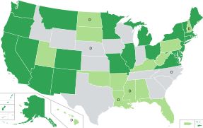
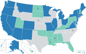
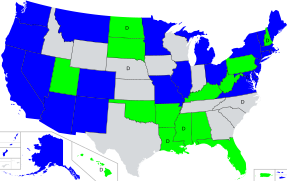
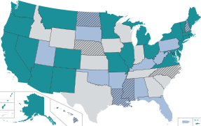
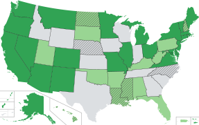
Can someone create a version of this map (with a different file name) with white diagonal striping added to the "D" states. "D" on the map for Decriminalized. So the striping would alternate between white and the current color. There would no longer be a "D" on any states.
File:Map of US state cannabis laws.svg

Higher up in another talk section SportingFlyer wrote (concerning the "D"): "Looking at that file, there may be better ways of presenting the information, including adding some sort of texture/shading to the states where the label [D] is being used - the label [D] actually looks really out of place, whereas a white diagonally striped shading may better convey the information." --Timeshifter (talk) 01:12, 10 May 2024 (UTC)
- I've figured this out and will upload something soon, even though I think the D's work great and can't imagine what is out of place about them.--Jamesy0627144 (talk) 15:36, 10 May 2024 (UTC)
- So below is the map as requested. SVG actually has a <hatch> element that makes this easier, but it's not supported in any browsers so you have to use <pattern> as a workaround. Within the pattern element, you can use the stroke, stroke-width, and rotate parameters to adjust line color, width, and angle. To adjust line spacing, change the width, height, and y2 parameters either up or down, setting them all to the same value.

- I still like the D's a lot, even though they don't have the beautiful hint of red in them that they did before. I think the D's are actually a lot more visible than the hatching, especially for Hawaii down there which doesn't have much real estate to work with. And if American Samoa ever decriminalizes, that is going to be a really tough one to pick out, whereas a D in the vicinity would be very easy to spot. I've always liked the intuitiveness of the D's as well, standing for "Decriminalized". I think the map could probably use a different color scheme, now that the color of the D's has changed, to better complement them. But I really don't see a problem with them that would be a reason to replace with hatching. Timeshifter, go ahead and mess around with the parameters though and see what you come up with.--Jamesy0627144 (talk) 18:21, 10 May 2024 (UTC)
- I'm not really a fan of hatching on any other map, but I don't know man, this one actually looks bad ass. What do you say we move past this and finally settle on this one (pending others' approval on the cannabis pages)?

- edit: The only thing I was thinking could possibly be an issue is the blue not providing the best contrast against the black borders. But I don't think a huge amount of contrast is needed for that anyways and I don't think lightening the blue some would be a problem at all.
- --Jamesy0627144 (talk) 20:30, 10 May 2024 (UTC)
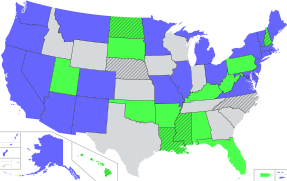
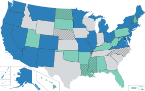
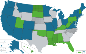
Thanks Jamesy0627144 for adding the diagonals. Here are more test maps of yours from Talk:Legality of cannabis by U.S. jurisdiction#New color scheme of map.
TheTechnician27 likes number 6. I am mostly concerned (as always) with contrast. The borders, for example. Also, the white versus black diagonals, and when should each be used. May need to use white diagonals for some states, and black diagonals for other states. ----Timeshifter (talk) 00:54, 11 May 2024 (UTC)
- OK. I lightened the blue a good amount so that the border contrast ratio increases from 2.44:1 to 4.91:1, which means it is significantly more visible. Do you think we could go with this one?

- edit: The current contrast ratio between the light gray states and white border is 1.67:1 by the way. That's kind of why I was saying before that borders are not hugely important to have big contrasts.
- --Jamesy0627144 (talk) 03:25, 11 May 2024 (UTC)
Here's the one that TheTechnician27 proposed. Not bad but it seems like the hatching is pretty hard to see. Also modified samples #4 and #8 above to have black hatching instead of the D's, and to have black borders.--Jamesy0627144 (talk) 04:17, 11 May 2024 (UTC)
--Jamesy0627144 (talk) 04:17, 11 May 2024 (UTC)
- I played around, and came up with this:
- File:US map. Cannabis hatch test 7.svg

- My main goal was to distinguish better between the medical states, and the no-medical states. Especially when hatched. The color under the hatching is easier to pick up. This was also helped by making the hatching lines a little narrower.
- Plus I enjoy the stop light analogy. Red is a no-go state for users. Yellow means use with caution. Green is go.
- I used the green (#31a354) that TheTechnician27 liked in the no-hatch test #6. I tried a darker green, but then the black borders were harder to see. That darker green (#008000) is the color named just "green" in the color name list for all browsers:
- https://www.w3schools.com/tags/ref_colornames.asp
- I tried "yellow" (#ffff00) from the color name list. But it was too light. Florida coastline was hard to distinguish against the white page. So I used a darker shade of yellow (#ffdf00).
- Red (#ff0000) is the color named "red" in the color name list.
- --Timeshifter (talk) 08:41, 11 May 2024 (UTC)
This map is better. It passes all the color blindness tests a little better than the above map. Especially the desaturated test where this map does significantly better. See:
- Color vision deficiency emulator. PNG/JPG/JPEG. Easy to use. Download a PNG map from various-size links on Commons SVG file description page. Or if it is not uploaded yet, take a PNG screenshot, and upload it to the tester. Tester is from this list:
- c:Commons:Map resources#Accessibility and map colors
File:US map. Cannabis hatch test 8. LimeGreen.svg

The only difference from the previous map is that LimeGreen (#32CD32) is used for the green color. --Timeshifter (talk) 10:36, 11 May 2024 (UTC)
- Yeah I don't know man, I just don't think it is a good color scheme from the perspective of appearance... it is a bit unpleasant to look at in my mind, or to be more blunt, if that is OK, it seems a bit.. I hate to use the word... ugly. The red especially I think is very loud... and it is actually those states IMO that should should have the least amount of color since they have not legalized cannabis for recreational or medical use. Additionally, from an accessibility perspective, I think the hatching is actually kind of hard to see against the red background, especially when running it through some of the tests at color-blindness.com. And the hatching is actually more important to see than the borders I would say.
- I reuploaded TheTechnician27's map except with black hatching and borders instead of white, and also made the hatch lines less thick which you mentioned above as a way to bring out the underlying color better. I also darkened the light green a bit and lightened the gray so that the map passes Monochromacy/Achromatopsia better. I could probably settle for this even though the color scheme I think is slightly bland... and TT27 would probably be OK with it too... and I think you said the colors were decent looking before. My favorite so far is still the blue / neon green... shown below with the lightened colors to bring out the border better and also the hatch lines thinned out. I actually think this map is the best from an accessibility perspective, particularly with the color of the island territories really standing out and being easy to tell apart. Even #4 and #8 I'd probably be OK with which I reuploaded below with the hatch lines thinned out. Do you think you could find agreement on any of these four?
- edit: I added one more map below: current color scheme, black hatching, and black borders. Looks great I think and we've all approved of the current color scheme before... I just did not care for it very much with the black D's instead of red. The only issue maybe is the borders but honestly they looked fine when I ran them through the tests at color-blindness.com, except not as visible for Monochromacy/Achromatopsia and Blue Cone Monochromacy but that only affects 1 in 30,000 and 1 in 100,000 people anyways. I would absolutely be happy with that one.--Jamesy0627144 (talk) 20:34, 11 May 2024 (UTC)
I like the color-blindness.com tool. The other tool I linked to is good too.
I looked at the 5 images in your last post in the color-blindness.com tool. The red-green-yellow map does better than all of them.
The 2nd best result in the tool was the map with the current colors. It looks better with the original white borders, though that has no effect on the color blindness tests. The white borders provide better contrast with the dark blue state backgrounds, and so it is easier to distinguish adjacent dark blue states. I like to bump up the border width to 1.3 versus the original 1.
I think the red-green-yellow map is beautiful. You think it is ugly. But I think utility is more important than beauty; as concerns contrast, color blindness, accessibility, etc.. Same as with the color of text on maps.
By the way, for those who may not know: On a PC you can press the ctrl key and then use the scroll wheel to make an SVG image get bigger or smaller. After opening up an SVG image on a separate browser tab. This is useful for quickly seeing how an SVG image looks like at various thumbnail sizes. --Timeshifter (talk) 08:05, 12 May 2024 (UTC)
- Let's just leave the map the way it is. I really do think the D's are the most effective way to convey "Decriminalized" and I like how you can see most clearly the pattern of medical/recreational states beneath it... which really is the most important thing to show on the map, not so much the less important reform of decriminalization. Also, hatching does not work as well for smaller areas like Hawaii whereas a D is more visible for such a state. And you really cannot tell whether or not American Samoa has decriminalized from looking at the map... and if they ever do decriminalize, that is going to be hard to show. I just don't think hatching is the best way of communicating information in this particular case.--Jamesy0627144 (talk) 19:36, 12 May 2024 (UTC)
- Out of all the options, I like the green–light green–white one the most, but I do genuinely like the current one as well. Gets a vote from me if the entirely green one is more problematic for the visually impaired. Although I like the idea behind the green–yellow–red one in theory (the non-lime-green one), in practice I think the black lines make the shores and Mexico/Canada borders look jarring, and it feels very busy. I would at first blush suggest flipping the green and the blue for the curretn scheme since green is more commonly associated with cannabis and thus would be more intuitive at a glance, but that means that the new (and I think quite readable) color scheme for 'D' is rendered completely obsolete, so I like where it is now. TheTechnician27 (Talk page) 01:08, 13 May 2024 (UTC)
- I forgot to mention: one thing I especially like about the current color scheme is that it brings the map for the US article roughly into parity with the one for the international article. — Preceding unsigned comment added by TheTechnician27 (talk • contribs) May 13, 2024 (UTC)
- Out of all the options, I like the green–light green–white one the most, but I do genuinely like the current one as well. Gets a vote from me if the entirely green one is more problematic for the visually impaired. Although I like the idea behind the green–yellow–red one in theory (the non-lime-green one), in practice I think the black lines make the shores and Mexico/Canada borders look jarring, and it feels very busy. I would at first blush suggest flipping the green and the blue for the curretn scheme since green is more commonly associated with cannabis and thus would be more intuitive at a glance, but that means that the new (and I think quite readable) color scheme for 'D' is rendered completely obsolete, so I like where it is now. TheTechnician27 (Talk page) 01:08, 13 May 2024 (UTC)
I agree with both of you that we should keep the current color scheme. And it is good that the colors are roughly in parity with the international article.
As for the hatching, I think either the white or black hatching would work. But I think the pure black D is better. Black hatching and a pure black D are both black markings on a state to indicate "decriminalized".
The problem I did not anticipate with hatching is that there is a kind of optical illusion. The color under the hatching does not seem to be the same color as without the hatching. Even with thin lines. And the color blindness tests make it worse.
But a D is a D regardless of the color test. It is easy to distinguish since it is unique. So I prefer the current map. It currently has the pure black D. Any color in it shows up weirdly in color blindness tests. Whereas pure black has the least change in the color blindness tests. I learned this in another discussion. That is why we changed from lime green to pure black in the boxes that surround the wikitext/result pairs in Help:Table. It was a discussion on an accessibility page. I preferred the lime green at first since I am not colorblind. --Timeshifter (talk) 02:11, 13 May 2024 (UTC)
- For those who are interested there is discussion of another option here:
- Talk:Legality of cannabis by U.S. jurisdiction#Lighter green in the map
- File:Map of US state cannabis laws. Lighter green 80CE69. Bigger font.svg

- Lighter green background, and larger size of the D.
- The above map is set at 350px. Same as in the template:
- Template:Legality of cannabis by US state
- --Timeshifter (talk) 19:05, 18 May 2024 (UTC)
Evaluation

Hi there, I came here from Wikipedia:WikiProject Eurovision as we have been constantly finding issues, updating and changing our maps. I wanna see if there's anything missing or wrong with this map. Any input is appreciated — IмSтevan talk 15:05, 25 March 2024 (UTC)
- @ImStevan: did anyone suggest that there is something wrong with it? M.Bitton (talk) 15:27, 25 March 2024 (UTC)
- We've been updating it for weeks, and whenever we thought we were done, something new would pop up. For example, we started by adding the missing Channel islands, then we added lakes, fixed Middle eastern borders, added Akrotiri and Dhekelia and so on. I wanna know if there's anything else we missed or that's inaccurate with it, and what better place to ask than the map project — IмSтevan talk 16:08, 25 March 2024 (UTC)
- I don't like that Kosovo's represented on most maps here. But that's just my opinion. 2001:861:31C0:2E20:B45F:5808:A2E:9898 (talk) 13:04, 8 June 2024 (UTC)
- We've been updating it for weeks, and whenever we thought we were done, something new would pop up. For example, we started by adding the missing Channel islands, then we added lakes, fixed Middle eastern borders, added Akrotiri and Dhekelia and so on. I wanna know if there's anything else we missed or that's inaccurate with it, and what better place to ask than the map project — IмSтevan talk 16:08, 25 March 2024 (UTC)
Creating Congressional Maps on Wikipedia
Hi, I was wondering how I can create maps of congressional districts for use on election pages, as I've seen a lot of them and wonder where and how to get started making them. Wei-On Yeo (talk) 05:04, 26 June 2024 (UTC)
- @Wei-On Yeo: Looking at List of United States congressional districts, I find that many of them were made by Commons:User:Twotwofourtysix. Forty of the states are available at Commons:Category:Congressional district maps of the 118th Congress. Try reaching out to that user to see how you can help complete the collection. DutchTreat (talk) 11:08, 4 July 2024 (UTC)
Ability to distinguish "D" on map on cell phones
Pinging past participants in discussions of this map who may not have noticed this thread: TheTechnician27. SportingFlyer. Remsense. Goran tek-en. Which map below do you prefer on your cell phone? Please look in your cell phone. And even if you notice no improvement would you support using the larger "D" for users like me who need it?
The maps are at the 350px width used in Template:Legality of cannabis by US state. The template is used on several pages. Such as Legality of cannabis by U.S. jurisdiction
Note: Over 50 percent of website traffic is from cell phones.
I find the size 27px "D" much easier to distinguish on my cell phone. See related eye discussion higher up at #Must the text used within maps always be pure black? and Commons:File talk:Map of US state cannabis laws.svg#Color of D's. My vision acuity is common to tens of millions in my country, the US. I hesitate to call it low vision, because it is so common. I guess I am on one side of the bell curve of vision acuity.
The D size is about as big as I could make it and not have the D touch the sides of the state of New Hampshire (the smallest state in the continental US with a "D" on it).
In previous discussion here and at the other talk pages we had agreed on the lighter green color. We also agreed that the diagonal hash lines weren't a help due to the 3rd color effect of the lines. --Timeshifter (talk) 12:59, 11 June 2024 (UTC)
- This is what you said previously about the D's at 17 px size, which you now want to increase to 27.
I can miss the "D" on the small state of New Hampshire if not paying attention. Red text was especially bad. Whereas pure black stands out even at smaller map sizes. I don't have to squint, or make an effort. This is even more important on cell phones.
- Between making the D's black, making the green lighter, and increasing the size to 20 px I think the map is already plenty accessible and there is no need to keep beating this dead horse to death.--Jamesy0627144 (talk) 14:44, 11 June 2024 (UTC)
- As I explained at Talk:Legality of cannabis by U.S. jurisdiction#Lighter green in the map I hadn't actually looked at the 350px-wide map (as in the template used in several articles) in a cell phone yet. When I did I saw that it was very difficult for me to distinguish the "D" at the current size (20px) in the template. You keep ignoring that point. This is not just about me or you. There are tens of millions with similar vision as me in the US where I am.
- And on a desktop PC (as I said before) I can see the 20px D if I get right up on the monitor. But if I am 2 to 3 feet away as I usually am when sitting in my chair then it is a problem.
- This is how I am seeing it on various screens. Maybe you can see the D at 20px perfectly clearly at any distance and on any screen, be it a cell phone or PC. Lucky for you. But the map is not "plenty accessible" for others.
- Also, Wikimedia is rolling out a text sizing menu with 3 choices: small, standard, and large. I have it set on large. So there is a definite desire for more accessibility. Map editors should honor this too. See:
- https://eu.wikipedia.org/wiki/Topic:Y5nbfld32in1ud0k
- It is a default setting for logged out users. Log out and bypass your cache to see the text-sizing menu. It can be hidden to a link toggle that shows the menu.
- Logged in users can enable it via the beta preferences:
- Special:Preferences#mw-prefsection-betafeatures - "Accessibility for Reading (Vector 2022)".
- So people are waking up to the need to make Wikipedia even more accessible.
- Wikipedia has never settled for barely adequate. Articles can be constantly improved. So can images. Improving things on Wikipedia is not beating a dead horse, as you say. It seems like you are the one beating a dead horse for a long time by saying this image does not need to be improved. Which you have said many times along the way since when we had a pure red D at 17px size against a darker green background. --Timeshifter (talk) 15:56, 16 June 2024 (UTC)
- Does it have to be a letter? I don't know about you, but I find symbols (dots, stars, etc.) easier to detect on a map. M.Bitton (talk) 21:11, 2 July 2024 (UTC)
- M.Bitton. I like that idea. In either case one has to look at the legend to see what it means. Whether using a letter or a symbol. But a dot is a lot easier to distinguish as a dot. Versus trying to figure out what letter of the alphabet one is looking at when the map is thumbnail size. It is easier on the 350px-wide map on a cell phone. It would work on even smaller maps too. And since there is only one symbol on the map, there is no confusion trying to distinguish between multiple symbols. A dot is a dot. It just needs to be big enough not to be confused with dust on the screen, etc..
- Right now we are using a 20px D. Converting to a 20px dot would solve the problem.
- --Timeshifter (talk) 22:07, 2 July 2024 (UTC)
- I think so. Try it and see what it looks like. M.Bitton (talk) 22:10, 2 July 2024 (UTC)
- Does it have to be a letter? I don't know about you, but I find symbols (dots, stars, etc.) easier to detect on a map. M.Bitton (talk) 21:11, 2 July 2024 (UTC)
I moved the old map from my previous message down here next to the new map with the dot. The dot came from a navbox. I centered the dot better in the states. The dot placement code is at the end of the SVG code. Its size is at the top of the SVG code:
- .decrim {fill:#000000; font-family:Arial; font-size:40px;}
The dot is actually smaller than the D, though its font size is larger. I find the dot to be much more distinct. Especially the smaller the image. The space inside the D makes the D seem less dark and distinct. I am sitting my usual 3 feet away (I measured it with a yardstick to my eyes) from my desktop screen. I can see the dot on the 220px-wide map. The edges may not be clear to my eyes, but it is obvious it is a dot. The D is difficult. I have to get much closer. I have large-screen desktop monitors and I use larger font sizes. Plus I have a zoom text button on the Firefox toolbar. I have it set to only zoom text on the whole page, not images.
| File:Map of US state cannabis laws. Lighter green 80CE69. 20px D.svg |
 |
| File:Map of US state cannabis laws. Lighter green 80CE69. 40px dot.svg |
 |
And here below is the 350px-wide size of the map in the template. On my cell phone only the dot in the 350px map is obvious. I can't distinguish the D or the dot on the 220px image. You have to remember that I use larger font sizes on my cell phone too. The 20px D on the 350px map is small for me, and I can't tell what it is. Getting closer does not help. All the other text on the cell phone pages is larger for me. And 20px on the map is not the same as 20px elsewhere. The D size changes depending on the screen and the image width. The D is only 20px at the larger sizes of the map on a desktop.
| File:Map of US state cannabis laws. Lighter green 80CE69. 20px D.svg |
 |
| File:Map of US state cannabis laws. Lighter green 80CE69. 40px dot.svg |
 |
--Timeshifter (talk) 11:55, 3 July 2024 (UTC)
- I tested the new map and the legend (see template). M.Bitton (talk) 23:50, 3 July 2024 (UTC)
- Looks good. As does the legend with the larger dot. --Timeshifter (talk) 06:02, 4 July 2024 (UTC)
- It looks alright I think.--Jamesy0627144 (talk) 04:07, 6 July 2024 (UTC)
- Looks good. As does the legend with the larger dot. --Timeshifter (talk) 06:02, 4 July 2024 (UTC)
Map with dots has been uploaded to File:Map of US state cannabis laws.svg. --Timeshifter (talk) 12:57, 8 July 2024 (UTC)
Need a white background (instead of transparent) on US map. For dark-reader browser addons
See: File:Map of US state cannabis laws.svg - would appreciate if someone would make the transparent background white.
See Template:Legality of cannabis by US state. It is on various pages. Dark mode is a problem when toggled on via some addons such as Dark Reader on Firefox, etc.. That addon is very popular.
The problem is that the map has a transparent background surrounding the continental US. So when the background turns black one can't see the black dot next to Hawaii.
The Wikipedia:Dark mode (gadget) does not have this problem. It makes the transparent background white.
So if we make the transparent map background white it won't hurt the gadget action. --Timeshifter (talk) 12:53, 8 July 2024 (UTC)
- Apparently the add-on completely disregards the "background-color" property in SVG, which is probably an intentional choice on the part of the designers, but the problem can be fixed by using the <rect> element instead. I uploaded a new map that does this.--Jamesy0627144 (talk) 01:36, 11 July 2024 (UTC)
- Thanks. --Timeshifter (talk) 15:57, 11 July 2024 (UTC)
Legal map data source for Wikipedia
I would like to add a map to a bike highway article. I want to display major cities and other bike highways. Is OpenStreetMap vector data legal as data source? Cruiser68 (talk) 21:05, 28 July 2024 (UTC)
- @Cruiser68 yes, OpenStreetMap data is usable. If you are uploading a map, please use {{ODbL OpenStreetMap}} on Wikimedia Commons in the licence field. – Isochrone (talk) 21:40, 28 July 2024 (UTC)
How to deal with the inconsistencies in Security Council membership maps
I asked about this at the help desk (please see the problem statement there) – since there was no reply, someone suggested to bring the issue up here. Any advice would be much appreciated. Joriki (talk) 14:42, 4 August 2024 (UTC)
- Hi Joriki, agree with your assessment that the maps should reflect the general UN position where possible, while keeping in mind that can sometimes be hard to define. This is what is done with File:United Nations (Member States and Territories).svg. The file sizes and slight graphical differences probably don't matter too much, but there seems little harm in standardising them absent other considerations. Shifting from inkscape to code styles is a boon. I would draft up the set of design principles used to post as an explanation for file overwrites. You can request permission for file overwrites at Commons:Requests for rights. CMD (talk) 15:10, 4 August 2024 (UTC)
- Hi CMD – thanks for your quick and helpful response! The UN map you linked to does indeed show Taiwan as part of China and Crimea as part of Ukraine (when you hover over those areas), so my approach would be compatible with that.
- Do you mean I should request autopatrol rights at commons:Commons:Requests for rights? I only have a couple dozen edits at Commons; it says you need about 500; and the top two requests were denied because of low edit counts. Joriki (talk) 20:04, 4 August 2024 (UTC)
- Hi Joriki, it's true perhaps the the general flag might be hard to get. However, if that is not possible (and your current request is clear so there is a chance), individual files can be 'unlocked' to allow auto-confirmed editors to update them. CMD (talk) 08:44, 7 August 2024 (UTC)
- I was granted the right for three months to pursue this project. Thanks again for your advice! Joriki (talk) 12:36, 17 August 2024 (UTC)
- Hi Joriki, it's true perhaps the the general flag might be hard to get. However, if that is not possible (and your current request is clear so there is a chance), individual files can be 'unlocked' to allow auto-confirmed editors to update them. CMD (talk) 08:44, 7 August 2024 (UTC)


