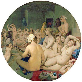
Wikipedia:Featured picture candidates/The Turkish Bath
Appearance
Voting period is over. Please don't add any new votes. Voting period ends on 13 Feb 2014 at 00:42:34 (UTC)


- Reason
- Very high resolution, high quality, notable painting
- Articles in which this image appears
- The Turkish Bath +8
- FP category for this image
- Wikipedia:Featured pictures/Artwork/Paintings
- Creator
- Jean Auguste Dominique Ingres
- Support as nominator -- — Crisco 1492 (talk) 00:42, 3 February 2014 (UTC)
- Support ALT 2 as well. Agree with Chick that the palimpsest effect is useful for seeing the history of the work. — Crisco 1492 (talk) 05:11, 3 February 2014 (UTC)
Support Wow!I've changed my mind. --Theparties (talk) 02:57, 3 February 2014 (UTC)- Oppose original, support alt (unretouched). Removing the corners of the canvas was a poor decision. The palimpsestic effect is important, carries a lot of information since it reveals how the original rectangular painting was converted to a tondo, and is also just extremely interesting. White backgrounds in general are not a great way to display tondo paintings, but particularly this one! Chick Bowen 05:01, 3 February 2014 (UTC)
- Also support alt 2. Chick Bowen 01:01, 5 February 2014 (UTC)
- Comment: The alt seems pretty dark. --101.108.118.28 (talk) 09:49, 3 February 2014 (UTC)
Support alt, but perhaps some brightening is indeed warranted.Good choice anyway. Brandmeistertalk 09:57, 3 February 2014 (UTC)- Support alt 2 Brandmeistertalk 09:08, 5 February 2014 (UTC)
- Support orig. — Not impressed by palimpsestic aspect, and I don't think most readers/viewers would be either. For what it's worth, French, Spanish and Dutch Wikis all use the retouched version in their entries on The Turkish Bath (as does English Wiki). Iconic. Sca (talk) 16:20, 3 February 2014 (UTC)
- Oppose
bothoriginal and Alt1. This may sound ridiculous, but can we not have something between the two? Both have their merits... J Milburn (talk) 22:16, 4 February 2014 (UTC)- OK, done, though this is a much more conservative edit than the original (which introduced too much green in my view). Chick Bowen 01:01, 5 February 2014 (UTC)
- That's the kind of thing I was meaning. Neutral for now. J Milburn (talk) 17:38, 5 February 2014 (UTC)
- OK, done, though this is a much more conservative edit than the original (which introduced too much green in my view). Chick Bowen 01:01, 5 February 2014 (UTC)
- Compromise — I'm OK with Alt. 2. Sca (talk) 02:25, 5 February 2014 (UTC)
- To make things easier for the closer, I'd suggest explicitly writing "Support ALT2". — Crisco 1492 (talk) 04:15, 5 February 2014 (UTC)
- Support Alt. 2 — Sca (talk) 23:27, 5 February 2014 (UTC)
- Oppose---The cropped version is the more useful for almost all practical purposes, although the uncropped version would have purpose in an article specifically about this particular painting. In a general article on French painting, on Classical painting or of the artist, the cropped version is to be preferred as indicated above. On the other hand, the cropped version has been brightened to a state where the coloration of the shadows on the principal figure has been lost. I can't support either state. Amandajm (talk) 05:00, 12 February 2014 (UTC)
Not Promoted --Armbrust The Homunculus 05:19, 13 February 2014 (UTC)
- Neither of the three images has enough support for promotion (2/5 for the original, 1/3 for alt and 4/5 for alt 2). Armbrust The Homunculus 05:19, 13 February 2014 (UTC)
