Portal:Climate change
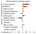
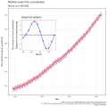
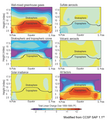
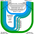
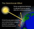
The Climate Change Portal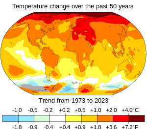 Present-day climate change includes both global warming—the ongoing increase in global average temperature—and its wider effects on Earth’s climate system. Climate change in a broader sense also includes previous long-term changes to Earth's climate. The current rise in global temperatures is driven by human activities, especially fossil fuel burning since the Industrial Revolution. Fossil fuel use, deforestation, and some agricultural and industrial practices release greenhouse gases. These gases absorb some of the heat that the Earth radiates after it warms from sunlight, warming the lower atmosphere. Carbon dioxide, the primary gas driving global warming, has increased in concentration by about 50% since the pre-industrial era to levels not seen for millions of years. Climate change has an increasingly large impact on the environment. Deserts are expanding, while heat waves and wildfires are becoming more common. Amplified warming in the Arctic has contributed to thawing permafrost, retreat of glaciers and sea ice decline. Higher temperatures are also causing more intense storms, droughts, and other weather extremes. Rapid environmental change in mountains, coral reefs, and the Arctic is forcing many species to relocate or become extinct. Even if efforts to minimize future warming are successful, some effects will continue for centuries. These include ocean heating, ocean acidification and sea level rise. Climate change threatens people with increased flooding, extreme heat, increased food and water scarcity, more disease, and economic loss. Human migration and conflict can also be a result. The World Health Organization calls climate change one of the biggest threats to global health in the 21st century. Societies and ecosystems will experience more severe risks without action to limit warming. Adapting to climate change through efforts like flood control measures or drought-resistant crops partially reduces climate change risks, although some limits to adaptation have already been reached. Poorer communities are responsible for a small share of global emissions, yet have the least ability to adapt and are most vulnerable to climate change. Many climate change impacts have been observed in the first decades of the 21st century, with 2024 the warmest on record at +1.60 °C (2.88 °F) since regular tracking began in 1850. Additional warming will increase these impacts and can trigger tipping points, such as melting all of the Greenland ice sheet. Under the 2015 Paris Agreement, nations collectively agreed to keep warming "well under 2 °C". However, with pledges made under the Agreement, global warming would still reach about 2.8 °C (5.0 °F) by the end of the century. Limiting warming to 1.5 °C would require halving emissions by 2030 and achieving net-zero emissions by 2050. Fossil fuel use can be phased out by conserving energy and switching to energy sources that do not produce significant carbon pollution. These energy sources include wind, solar, hydro, and nuclear power. Cleanly generated electricity can replace fossil fuels for powering transportation, heating buildings, and running industrial processes. Carbon can also be removed from the atmosphere, for instance by increasing forest cover and farming with methods that capture carbon in soil. (Full article...) Selected article – Present-day climate change includes both global warming—the ongoing increase in global average temperature—and its wider effects on Earth’s climate system. Climate change in a broader sense also includes previous long-term changes to Earth's climate. The current rise in global temperatures is driven by human activities, especially fossil fuel burning since the Industrial Revolution. Fossil fuel use, deforestation, and some agricultural and industrial practices release greenhouse gases. These gases absorb some of the heat that the Earth radiates after it warms from sunlight, warming the lower atmosphere. Carbon dioxide, the primary gas driving global warming, has increased in concentration by about 50% since the pre-industrial era to levels not seen for millions of years. Climate change has an increasingly large impact on the environment. Deserts are expanding, while heat waves and wildfires are becoming more common. Amplified warming in the Arctic has contributed to thawing permafrost, retreat of glaciers and sea ice decline. Higher temperatures are also causing more intense storms, droughts, and other weather extremes. Rapid environmental change in mountains, coral reefs, and the Arctic is forcing many species to relocate or become extinct. Even if efforts to minimize future warming are successful, some effects will continue for centuries. These include ocean heating, ocean acidification and sea level rise. Climate change threatens people with increased flooding, extreme heat, increased food and water scarcity, more disease, and economic loss. Human migration and conflict can also be a result. The World Health Organization calls climate change one of the biggest threats to global health in the 21st century. Societies and ecosystems will experience more severe risks without action to limit warming. Adapting to climate change through efforts like flood control measures or drought-resistant crops partially reduces climate change risks, although some limits to adaptation have already been reached. Poorer communities are responsible for a small share of global emissions, yet have the least ability to adapt and are most vulnerable to climate change. (Full article...) Selected picture –This image shows the Arctic as observed by the Advanced Microwave Scanning Radiometer for EOS (AMSR-E) aboard NASA’s Aqua satellite on September 16, 2007. The image denotes a record sea ice minimum in the Arctic.
WikiProjectsIn the newsAdditional News
Selected biography –Regina McCarthy (born May 3, 1954) is an American air quality expert who served as the first White House national climate advisor from 2021 to 2022. She previously served as the thirteenth Administrator of the Environmental Protection Agency from 2013 to 2017. A Massachusetts native, McCarthy holds degrees from the University of Massachusetts Boston and Tufts University. She was a civil servant in the Massachusetts state government, holding various environmental roles and serving as an environmental advisor to the Governor of Massachusetts. She served as commissioner of the Connecticut Department of Environmental Protection from 2004 to 2009 before joining the EPA in 2009. On March 4, 2013, President Barack Obama nominated McCarthy to replace Lisa Jackson as EPA administrator. Confirmation hearings started on April 11, 2013. On July 18, 2013, she was confirmed after a record 136-day confirmation process, becoming the face of Obama's global warming and climate change initiative. (Full article...) General imagesThe following are images from various climate-related articles on Wikipedia.
Did you know –Related portalsSelected panorama – Credit: Created by Robert A. Rohde from data published by the U.S. NOAA Earth System Research Laboratory, Global Monitoring Division The Global Historical Climatology Network (GHCN) is one of the primary reference compilations of temperature data used for climatology, and is the foundation of the GISTEMP Temperature Record. This map shows the 7,280 fixed temperature stations in the GHCN catalog color coded by the length of the available record. Sites that are actively updated in the database (2,277) are marked as "active" and shown in large symbols, other sites are marked as "historical" and shown in small symbols. In some cases, the "historical" sites are still collecting data but due to reporting and data processing delays (of more than a decade in some cases) they do not contribute to current temperature estimates.
As is evident from this plot, the most densely instrumented portion of the globe is in the United States, while Antarctica is the most sparsely instrumented land area. Parts of the Pacific and other oceans are more isolated from fixed temperature stations, but this is supplemented by volunteer observing ships that record temperature information during their normal travels. This image shows 3,832 records longer than 50 years, 1,656 records longer than 100 years, and 226 records longer than 150 years. The longest record in the collection began in Berlin in 1701 and is still collected in the present day.
Topics
CategoriesWeb resources
Things to do
WikimediaReferences
Discover Wikipedia using portals
|


