List of public signage typefaces
Appearance
This list needs additional citations for verification. (November 2008) |
Typefaces used for signage in public areas, such as roads and airports, often share characteristics of, or are chosen for, their readability.
Typefaces
[edit]| Typeface | Used by | Notes | Image |
|---|---|---|---|
| Achemine | SNCF, France | Created in 2008 to improve station accessibility | |
| Alfabeto Normale and Alfabeto Stretto | Italy | Alfabeto Normale is a bolder variant of the British Transport typeface.[1] Alfabeto Stretto is a condensed version of Alfabeto Normale. Both fonts have their own positive (for dark-coloured text on light backgrounds) and negative (for light-coloured text on dark backgrounds) versions. | 
|
| Antique Olive | California Department of Transportation | Some regulatory signs | 
|
| Arial |
|
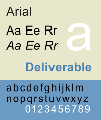
| |
| Austria | Austria | Being phased out since 2013 | 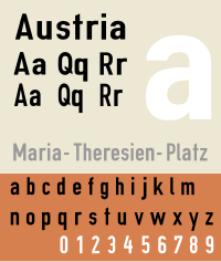
|
| Avant Garde | KAI Commuter rail network in Indonesia (before 2021) | Now gradually replaced with Circular in 2021, with remaining old signages still in place. | 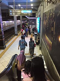
|
| Avenir | Macau Light Rapid Transit Dublin Airport Minneapolis–Saint Paul Metro Transit[3] |
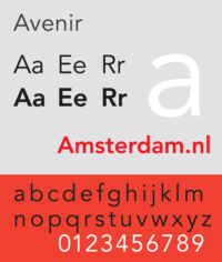
| |
| Bembo | Smithsonian signage in Washington D.C. | 
| |
| Brusseline | Brussels Intercommunal Transport Company | ||
| Calvert | Tyne & Wear Metro, United Kingdom.[4][5] | 
| |
| Caractères | France | Used for road signs in France and in some countries in Africa. In France it is used in four variants known as L1, L2, L4, L5. Its usage is mandated by the Interministerial Instruction on Road Signs and Signals (Instruction Interministérielle sur la Signalisation Routière)[6] | 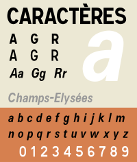
|
| Carretera convencional | Directorate-General for Traffic Road signs in Spain |
Proprietary typeface commissioned for this purpose, used on intracity road signs. Derived from the Transport typeface. | 
|
| Casey | Singapore MRT (since 2019) Changi Airport (since 2022) |
Used by Kowloon-Canton Railway Corporation until its merger with MTR in 2007. Being gradually replaced by Myriad, which is used by MTR on its networks. | 
|
| Cast[7] | Most Taiwanese urban rail systems (since 2022) | Designed by Dominique Kerber | |
| Circular | Transport for West Midlands (since 2018)[8] Kereta Api Indonesia (since 2020)[9] |
||
| Clarendon | U.S. National Park Service road signs[10] | Used by Public Transport Company in Poznań as the typeface for its fleet vehicles numbering | 
|
| Clearview |
|
Developed to replace U.S. FHWA (Federal Highway Administration) typefaces[10] | 
|
| Dansk Vejtavleskrift | Road signs in Denmark[11] | Derived from the Transport typeface | 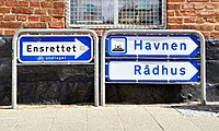
|
| Deutsche Bahn WLS | Deutsche Bahn station signage[12] | Developed in close reference to Helvetica | |
| DIN 1451 | Road signs in Marin, San Francisco, and San Mateo Counties Road signs in Germany Road signs in the Czech Republic Road signs in Latvia SADC road signs Road signs in Brunei Road signs in Singapore Road signs in Syria Bengaluru Metro (Namma Metro) signage Kansai International Airport (KIX) (since 2022) |
The DIN typeface was used for regulatory and warning Signs in Marin, San Francisco, and San Mateo counties.
Also used in the Greek motorway network The DIN typeface is currently in the process of gradually replacing the Frutiger typeface for Kansai Airport during its renovations in preparation for Expo 2025. |

|
| Drogowskaz | Polish road signage typeface | One of a few digitalisations; officially the typeface used in Polish road signs has no defined name. | 
|
| Esseltub | Previously used in Stockholm Metro | 
| |
| FIP signage typeface | Government of Canada | A modified version of Helvetica Medium used by the Government of Canada[13] | |
| FF Fago | ADIF | Used as official font for signage system of all Spanish railway stations owned by the state-owned administrator, ADIF | |
| FF Meta | Stockholm Metro Caltrans Birmingham Airport TransLink (British Columbia) |
Some mile marker signs | 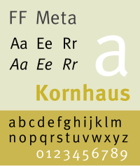
|
| FF Transit | Developed by MetaDesign for Berlin's public transport company BVG and later adopted by other transport systems. Contains many pictograms for signage. Based on Frutiger.[14] | ||
| FF Scala Sans | Los Angeles Metro | 
| |
| FHWA Series typeface (Highway Gothic)[10] | Road signs in the Americas, Australasia, China, India, Indonesia, Macau, Malaysia, the Netherlands, the Philippines, Saudi Arabia, Spain, Taiwan, Thailand, and Turkey | Developed for U.S. road signage Formerly used on Spanish motorways Turkey uses two typefaces on road signs based on this typeface – O-Serisi for motorways and E-Serisi for all other roads. |

|
| Freight Sans | Kempegowda International Airport | ||
| Frutiger |
|
The Frutiger typeface was commissioned for use at Paris Charles de Gaulle Airport in 1975. It has also been used for regulatory and warning signs in Del Norte, Humboldt, Lake, Mendocino, Napa, Solano, Sonoma, and Yolo Counties. | 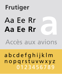
|
| Futura | Italian railways[24] Street signs in Stockholm |

| |
| Giaothong1 and Giaothong2[25] | Vietnam | Modification of DIN 1451 typeface with Vietnamese extension | 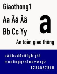
|
| Gill Sans | British Railways (until 1965) Transperth |
Also the official font for all the signage system of the Spanish Government. Modified variant of Gill Sans Bold Condensed used on road signs in former East Germany until 1990.[26][27] | 
|
| Goudy Old Style | Used on Victoria PTC railway station signs in the 1990s, replacing the green The Met signs. | The blue Metlink signs replaced these signs in 2003 after a short trial of Connex signs (using Verdana) at Mitcham and Rosanna stations. | 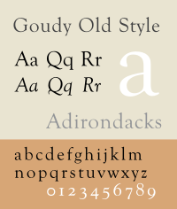
|
| Hangil | Road signs in South Korea | A Hangul typeface designed by Sandoll Communications in 2008, being used on traffic signs throughout the entire South Korea except for some part of Seoul, along with Panno. | 
|
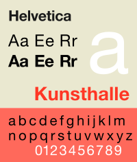
| Helvetica |
|
Formerly used the Hong Kong MTR, Stockholm Metro, ÖBB,[28] Deutsche Bundesbahn[28] portions of the LACMTA system and the Melbourne MTA, and some Toronto subway station signage. Less commonly, the typeface is used on street signs in the United States, including in some suburbs of the Baltimore-Washington Metropolitan Area, parts of Pennsylvania, and by the Contra Costa County Transportation Authority. Previously used on road signs in Japan and South Korea. |
|
| Helvetica Neue |
Metlink/Public Transport Victoria |
Being phased out on the Victorian public transport network in favour of Network Sans, but still commonly seen. SBB uses its own version of Neue Helvetica named SBB[29] and named "Helvetica Semi-Bold Corrected" by its designer Josef Müller-Brockmann[28] in the SBB Design Manual. |

|
| Hiragino | NEXCO East Japan NEXCO Central Japan NEXCO West Japan |
Japan Highway Public Corporation (divided into three NEXCO group companies in 2005) used its own JH Standard Text until 2010. Since 2010, Hiragino is used for Japanese text, Frutiger for numbers, and Vialog for English text.[30] | 
|
| Johnston | Transport for London | Some Citybus and New World First Bus route displays in Hong Kong | 
|
| LLM Lettering | Road signs in Malaysia. | Based on the Italian Alfabeto Normale and Alfabeto Stretto | 
|
| Mark Pro | Istanbul Metropolitan Municipality[31] | ||
| LTA Identity Typeface | Singapore MRT[32] | ||
| Metrolis | Lisbon Metro | Custom font for the 1995 rebranding, designed by the Foundry (Freda Sack and David Quay) | |
| Metron | Prague Metro | Created in 1973 by Jiří Rathouský | |
| Moscow Sans | Public transport and wayfinding in Moscow since 2015 | Custom font family by Scott Williams and Henrik Kubel (A2-TYPE) in collaboration with Ilya Ruderman (CSTM Fonts) | |
| Motorway | Motorway route numbers in Ireland and the United Kingdom. | The numerals are used for exit numbers and route numbers in Portugal. | 
|
| Myriad | Hong Kong's Mass Transit Railway Korail (for English signage) Seoul Metro (for English signage) Signage at Istanbul Airport |

| |
| Myriad Pro | PKP Polskie Linie Kolejowe[33] and PKP Intercity[34] | ||
| Neris | Manila MRT signage (since 2016) | ||
| Network Sans[35] | Transport for Victoria Public Transport Victoria |
Replaced Helvetica Neue | |
| New Frank | Transport for New South Wales, Australia | Used for all transport signage around Sydney and New South Wales. | |
| New Rubrik | Ninoy Aquino International Airport, Manila, Philippines | Replacement for Helvetica on airport signage | |
| News Gothic | NYC Subway (Mid 20th Century) Aena airports in Spain |
Used on the NYC Subway in the mid 20th century | 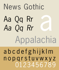
|
| Nimbus Sans | Used for Digital PIDS on the Washington Metro | 
| |
| Noorda | Milan Metro[36] | Variation of Akzidenz-Grotesk with shorter ascenders and descenders | |
| NPS Rawlinson | United States National Park Service | Developed as a replacement for Clarendon[10] | 
|
| NR Brunel | United Kingdom railway stations Iarnród Éireann station signage |
Primarily major stations managed by Network Rail in Britain, introduced in the mid-1990s | 
|
| NS Sans | Nederlandse Spoorwegen[37] | Based on Frutiger typeface | |
| Panno | Road signs in South Korea | A Latin typeface being used on traffic signs throughout the entire South Korea except for some part of Seoul, along with Hangil. | 
|
| Parisine | Paris Métro Osaka Metro |

| |
| Pragmatica | Saint Petersburg Metro (since 2002) | Currently (2010–11) being replaced by Freeset, Cyrillic variation of Frutiger | |
| PT Sans | Public transport in Jakarta (Jak Lingko) since 2021: TransJakarta, Jakarta MRT, Jakarta LRT | 
| |
| Rail Alphabet | British Rail[28] British Airports Authority DSB[28] NHS Road signs in Iran |
Designed for British Rail in 1964. Still in use on parts of the UK rail network, but mostly superseded elsewhere. | 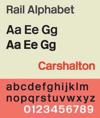
|
| Rail Alphabet 2 | United Kingdom railway stations | An evolution of Rail Alphabet commissioned by Network Rail and planned for use on new station signage projects from 2020 onwards | |
| Rodoviária | Road signs in Portugal (prior to 1998) | Typeface very similar to the Transport typeface, combined with FHWA Series | |
| Road UA | Road signs in Ukraine (since 2021)[38] | Created by Andriy Konstantinov. | 
|
| Roadgeek 2000 | Argentina[39] | Based on the FHWA Series typeface (B, C, D and E only) | |
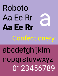
| Roboto | LRT Jakarta MRT Jakarta SEPTA Metro |
Used in LRT Jakarta and MRT Jakarta on both physical (before 2021, now replaced altogether with PT Sans under Jak Lingko initiative) and digital signages on existing rolling stock First SEPTA Metro signage installed in 2024 |
|
| Rotis Semi Sans | Metro Bilbao | Used by its own creator, Otl Aicher, for the corporate design of Metro Bilbao | 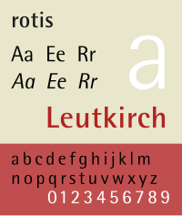
|
| Rotis Semi Serif | Station signs of Sound Transit[40] | ||
| Rotis Serif | Street signposts in Singapore | ||
| Ruta CL | Road signs in Chile[41] | ||
| Seoul Type | Seoul Metropolitan Government | Developed by the Seoul Metropolitan Government in 2008 for usage in official Seoul Metropolitan Government documents and institutions, signage and public transport within Seoul. The structure was designed to resemble the gradual curves of a traditional hanok roof. | |
| Sispos and Sisneg | Sweden | Designed by Bo Berndal – old Swedish standard (SIS 030011, 1973) for public road signs, displays, etc. | |
| SL Gothic | Stockholm transit system | [42][43] | |
| Smalt | Street signs in Prague[44] | ||
| SNV | Road signs in Belgium Road signs in Bulgaria Road signs in Luxembourg Road signs in Romania Road signs in countries of the former Yugoslavia Road signs in Switzerland (until 2003) |

| |
| Standard (also known as Akzidenz-Grotesk) | New York City subway signs | Sometimes seen on older New York City subway signs. Was sometimes used in place of Helvetica.[45] | 
|
| Tern | Road signs in Austria Road signs in Slovakia |
Developed by the International Institute for Information Design with the aim of unifying the road signage in all of the European Union.[46] | |
| Times New Roman | Station signage for MARTA | ||
| Tipografía México | Road signs in Mexico[47] | Replaced former typeface based on FHWA Series that was used on Mexican road signs before 2023. | |
| Toronto Subway | Toronto Transit Commission | Used in maps, publications, and most stations of the Toronto subway[48] | |
| Trafikkalfabetet | Road signs in Norway | Used for Norwegian road signs and motor vehicle registration plates (until 2006) | |
| Transport | Also used in Portugal, Greece (for non-motorways) and other countries. An oblique variant is used in Ireland for Irish-language text. |

| |
| Tratex | Road signs in Sweden | 
| |
| TS Info and TS Mapa | Transantiago | Created by the DET (Departamento de Estudios Tipográficos, Universidad Católica de Chile) for the Transantiago, the public transport network in Santiago de Chile. | |
| Univers |
|
Also used for the Walt Disney World road system (route numbers are in Highway Gothic). Formerly used by the Nederlandse Spoorwegen,[28] on the destination rolls of Comeng trains in Melbourne prior to refurbishment, as well as Hitachi trains which had their original destination rolls replaced in the 1980s with the Comeng type. |

|
| Universal Grotesk | Road signs in Czechoslovakia | Previously used on road signs in Slovakia until 2015. | |
| Vialog | Renfe English text on Japanese expressway directional signage |
Used in signage and all corporate communications of the state-owned Spanish Railway Operator in a custom-made variant called Renfe Vialog. | |
| Wayfinding Sans | Metro Rio El Dorado International Airport Santa Cruz Kereta Api Indonesia (December 2016–20) |
Used in signage for Rio de Janeiro's metro system Metro Rio, El Dorado International Airport, the city of Santa Cruz, California and Indonesian Railway Company. |
See also
[edit]- Typefaces used on North American traffic signs
- Road signs in Australia
- Road signs in Belgium
- Road signs in Thailand
References
[edit]- ^ "Traffic Sign Typefaces: Italy".
- ^ Estonian Centre for Standardisation and Accreditation (October 2, 2023). "EVS 613:2023". EVS standard evs.ee. Retrieved 2023-11-24.
- ^ "Metro Transit Brand Identity and Style Guide" (PDF). Metro Transit. Retrieved 2023-11-22.
- ^ Meechan, Simon (October 16, 2016). "How the Tyne and Wear Metro was made – we go back 36 years to the very beginning". chroniclelive.co.uk. Retrieved 2024-03-06.
- ^ White Chloe, Simon (July 12, 2021). "40 years after creating its iconic logo, graphic designer Margaret Calvert visits Tyne & Wear Metro". railadvent.co.uk. Retrieved 2024-03-06.
- ^ "Journal officiel de la République française - N° 159 du 10 juillet 2021" (PDF). equipementsdelaroute.cerema.fr. January 22, 2024. Retrieved 2024-03-06.
- ^ "Cast typeface". serpentype.com. Retrieved 2023-06-02.
- ^ "Transport for West Midlands Brand Guidelines". wmca.assetbank-server.com. Retrieved 2023-11-23.
- ^ Subekti, R. (December 11, 2020). "Jelang Libur Akhir Tahun, KAI Modernisasi Signage" (in Indonesian). Retrieved 2020-12-12.
- ^ a b c d Joshua Yaffa (August 12, 2007). "The Road to Clarity". The New York Times.
- ^ "Q&A by the Danish road authority" (in Danish). Archived from the original on 2008-11-15.
- ^ "Schrift in der Wegeleitung" [Fontface in route guidance]. Deutsche Bahn AG Marketingportal (in German). Archived from the original on 2021-10-28. Retrieved 2018-02-19.
- ^ "4.5 Signage Typeface. FIP Manual". Treasury Board of Canada Secretariat. August 17, 2011.
- ^ a b "FF Transit fonts from the FontFont Library". www.fontfont.com. Retrieved 2018-02-19.
- ^ "Handbuch VBB-Richtlinien Fahrgastinformation" [VBB guideline for passenger information] (PDF) (in German). Verkehrsverbund Berlin Brandenburg. November 2017. Retrieved 2018-02-19.
- ^ "The STM rolls out new signage in métro stations". Société de transport de Montréal. Retrieved 2018-02-19.
- ^ a b c "A Brief History of Fonts in Transit" (PDF). Archived from the original (PDF) on 2020-10-01. Retrieved 2023-11-23.
- ^ "BAA: Printed Literature". Archived from the original on 2011-07-28. Retrieved 2010-10-18.
- ^ "NHS Identity Guidelines".
- ^ "typography".
- ^ "New signs at downtown SF stations part of ongoing BART wayfinding improvements". bart.gov. November 17, 2010. Retrieved 2011-04-04.
- ^ "Metro: System informacji II linii poprowadzi za rękę do wyjścia". rynek-kolejowy.pl (in Polish). Retrieved 2023-11-23.
- ^ "Warszawski Transport Publiczny Podręcznik Identyfikacji Wizualnej" (PDF) (in Polish). April 30, 2019. Retrieved 2023-11-23.
- ^ "Sistema segnaletico: Manuale e strumenti di lavoro - Standard architettonici per le stazioni - RFI" (in Italian). Archived from the original on 2011-07-26. Retrieved 2009-10-09.
- ^ "National Technical Regulation on Expressway Guidance Signs" (PDF). Retrieved 2018-09-09.
- ^ TGL 12096-1 Feb 1987 (PDF) (in German). Bundesinstitut für Bau-, Stadt- und Raumforschung. Retrieved 2024-01-20.
- ^ Wiegel, Peter. "TGL 12096-1". Peter Wiegel. Retrieved 2024-01-20.
- ^ a b c d e f Müller-Brockman, Josef (2019). Passenger Information System: Design Manual for the Swiss Federal Railways by Josef Müller-Brockmann (Fahrgastinformationssystem / Passenger Information System) (1st ed.). Switzerland: Larsmüller Publishers. p. 25. ISBN 978-3-03778-610-9.
- ^ "SBB Schrift". company.sbb.ch (in German). Archived from the original on 2020-02-22. Retrieved 2023-11-23.
- ^ "より視認し易い高速道路案内標識を目指した 標識レイアウトの変更について" (PDF) (in Japanese). East Nippon Expressway Company Limited (NEXCO East), Central Nippon Expressway Company Limited (NEXCO Central), and West Nippon Expressway Company Limited (NEXCO West).
- ^ "İstanbul Büyükşehir Belediyesi Kurumsal Kimlik Klavuzu (Istanbul Metropolitan Municipality Organisational Identity Guide)" (PDF). KİPTAŞ (in Turkish). Retrieved 2023-11-23.
- ^ "Schriftentwicklung für Leitsystem LTA Identiy Typeface öffentliche Verkehrsmittel Singapur" (PDF).
- ^ "Wytyczne dla oznakowania stałego infrastruktury pasażerskiej" (PDF) (in Polish).
- ^ "Standaryzacja znaków PKP Intercity" (PDF) (in Polish).
- ^ "PTV Network Sans Typeface". The Dots. Retrieved 2019-02-17.
- ^ "Noorda Font".
- ^ "NS Sans". Nederlandse Spoorwegen. Retrieved 2023-11-23.
- ^ "Нова дорожня навігація — Агенти змін".
- ^ "Manual de Señalamiento Vertical" (PDF).
- ^ Two Twelve Harakawa Inc.; Maestri Design Inc.; Jon Bentz Design (September 2004). "Typography" (PDF). System-Wide Signage Design Manual, Second Edition. Sound Transit. p. DS-17. Archived from the original (PDF) on 2010-06-13. Retrieved 2014-10-18.
- ^ "Manual de Señalización de Tránsito - Conaset" (in Spanish). CONASET, Ministerio de Transportes y Telecomunicaciones. February 2015.
- ^ "AB SL Grafisk profil 1.0 visuell identitet". www.slideshare.net. September 3, 2010. Retrieved 2023-11-23.
- ^ SL:s nya visuella identitet, May 26, 2016, retrieved 2023-11-23
- ^ Kraus, Filip (May 28, 2019). "Prague Street Sign". Slanted. No. 33. p. 226. Retrieved 2025-01-08.
- ^ "The (Mostly) True Story of Helvetica and the New York City Subway". AIGA. November 18, 2008. Retrieved 2012-11-09.
- ^ Simlinger, Peter; Egger, Stefan; Galinski, Christian (January 2008). "Proposal on unified pictograms, keywords, bilingual verbal messages and typefaces for VMS in the TERN" (PDF) (Proposal). Retrieved 2023-03-25.
- ^ Manual de Señalización y Dispositivos para el Control del Tránsito en Calles y Carreteras (PDF) (in Spanish). SICT, SEDATU. Retrieved 2024-11-02.
- ^ "Inscribed in the living tile Type in the Toronto subway". Retrieved 2023-11-22.
Further reading
[edit]- Cook, Vivian (March 1, 2022). The Language of the English Street Sign. Multilingual Matters. doi:10.21832/9781800414570. ISBN 9781800414570.
