Worboys Committee

The Worboys Committee was formed by the British government to review signage on all British roads.[1] In its July 1963 report Traffic signs: report of the committee on traffic signs for all-purpose roads, it found existing road signs to be obsolete for the increasing numbers of motor vehicles and their increasing speeds, and made over a dozen key recommendations. The committee went on to completely revise road signs in Britain, with an emphasis on symbols alone, adopting standard colour and shape practices used in mainland Europe and a new typeface. Its principles were adopted and are still the basis of all road signs in the United Kingdom.
The Anderson Committee
[edit]The first moves to a new signage system were prompted by the first motorways. Flaws of existing signs had already been observed with drivers at speed struggling to interpret them. New signs were needed in 1958 for the opening of the Preston By-pass, the first motorway. A separate committee, known as the 'Anderson Committee', was assembled in 1957 to design signage.[2] The committee took inspiration from the United States and Germany who were designing their own motorways and signage to go with them. Two graphic designers were commissioned to design the system of signage: Jock Kinneir and his assistant (and later business partner) Margaret Calvert.
The Worboys Committee and advisors
[edit]Two articles were published in 1961 by graphic designer Herbert Spencer, illustrating the shortcomings of non-motorway British road signs.[3] The committee was created, chaired by Sir Walter Worboys of ICI.[4] T. G. Usborne of the Ministry of Transport had charge of proceedings, and Kinneir and Calvert were again commissioned as designers.[3]
In 1963 the committee released Traffic signs: report of the committee on traffic signs for all-purpose roads. This completely revised road signs in Britain with an emphasis on symbols alone. It adopted standard colour and shape practices used in mainland Europe and used a new typeface that had already been used on the motorway signs, called Transport. On 1 January 1965, the Traffic Signs Regulations and General Directions (TSRGD), the legal framework for road signs in Britain, was revised to adopt the proposed changes in the report.[3]
Pre-Worboys sign flaws
[edit]The report found eight primary flaws in the United Kingdom's traffic signage.
(a) roadside signs are too small to be readily recognisable as such and to be easily read by drivers travelling at the normal speed of traffic;
(b) they do not have a simple, integrated appearance;
(c) the more important signs are not readily distinguishable from the less important at long range;
(d) they are often not effective at night;
(e) they are different from those used on the continent of Europe and only those who can read English can fully understand them;
(f) they are often mounted too high, particularly in rural areas;
(g) they are often badly sited in relation to junctions; and
(h) there is insufficient continuity of place names on directional signs.
— Worboys Committee, Traffic signs: report of the committee on traffic signs for all-purpose roads (1963)[5]
Most pre-Worboys signs consisted of two signs: the top one was one of four designs, a red 'triangle', 'disk', 'ring' or 'triangle in ring' that identified the sign's type; the second lower sign identified the hazard or restriction. The lower sign was approximately 1 foot 9 inches (21 in; 530 mm) tall and approximately 1–2 feet (12–24 in; 300–610 mm) wide. The majority also lacked any larger dimensions for use on higher-speed roads. The new Worboys designs for warning signs had a minimum height of 24 inches (610 mm), and three additional sizes: 30 inches (2 ft 6 in; 760 mm), 48 inches (4 ft 0 in; 1,200 mm), 72 inches (6 ft 0 in; 1,800 mm)[a] for higher-speed roads or special situations that warranted a larger sign. Regulatory signs were 24 inches (610 mm), and greatly simplified through use of symbols eliminating wordy signs.[b][6]
"Traffic signs – 1963"
[edit]
The report found existing road signs to be completely obsolete in view of increasing numbers of motor vehicles and their increasing speeds, and made over a dozen key recommendations:[5]
- Letter sizes should be increased compared to existing signs and up to 10 inches (250 mm) on high-speed roads. Wording should be Sentence case, not in all capital letters.
- Signs should reflect the design of traffic signs used in the rest of Europe, with an emphasis on using symbols and the shape of sign to convey the message, not words. Further, doing away with the previous standard sign designs consisting of two separate signs to form a complete sign.
- Provision of give way and stop signs at junctions on minor roads when they meet primary routes.
- More usage of sign illumination, and improvements to existing standards and increased use of cat's eyes (roadway reflectors).
- Uniformity in the deployment and use of traffic signs.
- Clearer marking of primary routes, through use of colour-coded signs to aid drivers in identifying them if they are unfamiliar with an area.
- Direction signs should be colour-coded, with primary routes having green signs with white words and yellow route numbers; signs on-priority roads should be black and white.
The report suggested approximately 136 signs.[c] The designs proposed in the report received further revisions before the 1964 TSRGD, as the proposed prohibited signs featured a 'slash' on signs like 'Bicycles prohibited', 'All motor vehicles prohibited'; a minimum speed limit sign that was not included; a rectangular 'Pass either side' sign; and the designs of symbols, like 'telephone' and 'road works ahead'.
| Pre-Worboys sign | Type of sign | Meaning | Sign number[d] | Worboys Committee sign |
|---|---|---|---|---|
 |
Warning
|
Cross roads
|
504
|
 |
 |
Warning
|
Roundabout
|
510
|
 |
Warning
|
Bend to left
|
512
|
 | |
Warning
|
Bend to right
|
512
|
 | |
 |
Warning
|
Two way traffic
|
521
|
 |
 |
Warning
|
Level crossing with no gates
|
538
|
 |
 |
Warning
|
Signals ahead
|
543
|
 |
Warning
|
Children
|
545
|
 | |
Warning
|
School
|
545/546
|
 | |
Warning
|
Cattle
|
548
|
 | |
 |
Warning
|
Ford (water crossing)
|
554
|
 |
Warning
|
No through road
|
816
|
 | |
 |
Warning
|
Road works ahead
|
564
|
 |
 |
Regulatory
|
Major road ahead
|
501
|
 |
 |
Regulatory
|
Stop
|
601
|
 |
 |
Regulatory
|
Turn left
|
606
|
 |
 |
Regulatory
|
Turn right
|
606
|
 |
 |
Regulatory
|
Keep left
|
610
|
 |
 |
Regulatory
|
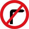
No right turn
|
612
|
 |
 |
Regulatory
|
No left turn
|
613
|
 |
 |
Regulatory
|
No entry
|
616
|
 |
 |
Regulatory
|
No motor vehicles
|
619
|
 |
 |
Regulatory
|
No cycling
|
624
|
 |
 |
Regulatory
|
No waiting
|
636
|
 |
 |
Speed limit
|
630
|
 |
 | ||||
 |
Speed limit
|
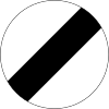
National speed limit applies
|
630
|
 |
 |
Information
|
Parking
|
801
|
 |
 |
Direction
|
Approach direction sign for a junction where two Class 1 (A-roads) roads cross.
|
704
|
 |
 |
Direction
|
A direction sign used at junctions, indicating route numbers and primary destinations.
|
713
|
 |
Consistency with motorway signs
[edit]In 1962, the Anderson Committee published Motorway Signs: Final Report of Advisory Committee for Traffic Signs on Motorways which laid out their designs for motorway signage.[8]
Ultimately, motorway directional and informational signs were included in the 1964 TSRGD. The warning and most regulatory signs proposed in the final Anderson report were not adopted for use,[e] and the designs proposed in the Worboys report were used instead in future motorway projects.[6]
Later revisions
[edit]A major review of the direction signing system conducted in the late 1980s found effectively no problems with the Worboys system. This review could only recommend the introduction of white-on-brown tourist signing and a few other minor changes, later known as the Guildford Rules. "Worboys was a world leader in good signing practice".[9]
See also
[edit]- Transport (typeface) – proposed by the report and still used in Britain for road signs
- Road signs in the United Kingdom
Notes
[edit]- ^ 72 inch signs were only prescribed for Junction and roadway narrows signs. Other warning signs were only prescribed up to 48 inches tall.
- ^ The 1944 weight restriction sign consisted of this message: "One vehicle only on bridge Maximum weight 15 tons speed limit 5 M.P.H.", on a sign that was about 2 feet (610 mm) square. The replacement, Sign 626, consisted of just "XX Tons" in a 24 inches (610 mm) circle, with an additional "Only one vehicle on bridge" plate if necessary.
- ^ This count excludes supplementing plates.
- ^ From the 1964 TSRGD. Some sign numbers have since changed.
- ^ The designs were often similar, with the consistent difference being the inclusion of words and colour scheme; A non-reflective red background, with a reflective red border that outlined the shape of the sign and a reflective white symbol.
References
[edit]- ^ "Hansard: Worboys Committee and New Traffic Signs". Parliamentary Debates (Hansard). 3 July 1963. Retrieved 29 June 2011.
- ^ "roads.org.uk". Retrieved 24 October 2020.
- ^ a b c "Origin of British road sign design". Design Museum. Archived from the original on 23 November 2010. Retrieved 29 June 2011.
- ^ "Hansard: Traffic Signs Committee Report". Parliamentary Debates (Hansard). 13 March 1963. Retrieved 29 June 2011.
- ^ a b Committee on traffic signs for all-purpose roads (Worboys Committee); Ministry of Transport (1963). "Traffic signs: report of the committee on traffic signs for all-purpose roads". Archive.org. Her Majesty's Stationery Office. Retrieved 14 July 2019.
- ^ a b c Ministry of Transport (20 November 1964). The Traffic Signs Regulations and General Directions 1964. Her Majesty's Stationery Office.
- ^ Ministry of War Transport (1946). Report of the Departmental Committee on Traffic Signs - 1944. Her Majesty's Stationery Office.
- ^ Advisory Committee on Traffic Signs for Motorways (Anderson Committee); Ministry of Transport (1962). "Motorway Signs: Final Report of Advisory Committee for Traffic Signs on Motorways". Archive.org. Her Majesty's Stationery Office. Retrieved 14 July 2019.
- ^ "Roads.org.uk". Retrieved 24 October 2020.
External links
[edit] Media related to Diagrams of pre-Worboys road signs of the United Kingdom at Wikimedia Commons
- Traffic signs; report of the committee on traffic signs for all-purpose roads at Wikimedia Commons.
- The Worboys Report at Roads.org.uk
- Traffic signs: report of the committee on traffic signs for all-purpose roads – a copy of the 1963 report, at the Internet Archive
- Motorway Signs: Final Report of Advisory Committee for Traffic Signs on Motorways - a similar 1962 report for motorway signage, some of which was adopted by Traffic Signs report, at the Internet Archive


