Wikipedia:Featured picture candidates/Various Grains
Appearance


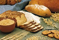
Very high-res collection of cereals, grains, and breads. PD as a work of the US Gov't.
- Nominate and support. - humblefool® 20:15, 23 November 2006 (UTC)
- support, makes me hungry Analoguekid 21:11, 23 November 2006 (UTC)
- Oppose Funny looking specks in the bowl of oats, and jpeg artifacts in the grain (lower left corner). It also has some grain (and I don't mean the edible one) :-) | AndonicO Talk | Sign Here 21:23, 23 November 2006 (UTC)
- Oppose, chopped through the bowl at left means we can't see the whole thing and just throws it off. Night Gyr (talk/Oy) 01:16, 24 November 2006 (UTC)
- Support - Best thing since sliced bread =) Puma5d04 05:40, 24 November 2006 (UTC)
- Support - Mgm|(talk) 12:53, 24 November 2006 (UTC)
- Support Original - Mmmmmmmm... Gluten-containing carbohydrates based substances for fuel forcarbon based life forms... --antilived T | C | G 04:22, 25 November 2006 (UTC)
- Support, very nice pic, straight to the point. --the marble 19:21, 25 November 2006 (UTC)
- Oppose - I like the subject matter and the exposure, but the composition is poor (seems a bit arbitrary, things cut off all over the place) and the lighting is a bit sickly. --YFB ¿ 02:33, 26 November 2006 (UTC)
- Oppose edit 2, a bit too bright. Weak oppose edit 1, the lighting is much better but the composition still does nothing for me, I'm afraid. --YFB ¿ 00:16, 10 December 2006 (UTC)
 Support Either edit. Oppose Original. Agree with YFB on the lighting, I think my edits address this. Otherwise I personally think the composition is fine and certainly the idea is good.
- Support edit 1 or original - composition is fine for me as well. Debivort 17:31, 26 November 2006 (UTC)
- Oppose per AndonicO and Night Gyr. Pstuart84 20:55, 26 November 2006 (UTC)
- Support original, I don't like the colours for the other two. - Mailer Diablo 19:16, 28 November 2006 (UTC)
- Oppose per AdonicO JanSuchy 21:02, 29 November 2006 (UTC)
- Support per nom. • s d 3 1 4 1 5 talk · contribs • 12:57, 30 November 2006 (UTC)
Moved to 'further input required'. Raven4x4x 03:14, 1 December 2006 (UTC)
- Oppose edit2, too bright, the flour looses structure. The other two are ok, not spectacular (which would actually warrant an oppose). The arrangement could be nicer, I particularly don't like the edge running through the top left portion of the image. And the whole shot looks like it's zoomed in to far. --Dschwen 01:26, 2 December 2006 (UTC)
- Oppose, compression artifacts galore, strong glare on the small french loaf, the tablecloth is kind of inappropriate to the "all natural" subject --frothT C 19:06, 3 December 2006 (UTC)
- Support Edit 1. Weak Support Edit 2. Oppose Original, poor colours Advanced 19:58, 5 December 2006 (UTC)
- Oppose - Nice pictures but not extraordinary. Alvesgaspar 09:02, 7 December 2006 (UTC)
 Support Edit 1 or 2, but on edit 2 the flour *looks* like blown a highlight even though it isn't. drumguy8800 C T 08:11, 8 December 2006 (UTC)
- Support original.--Húsönd 22:20, 8 December 2006 (UTC)
- Support edit 1, edit 2's high contrast is distracting. Noclip 16:27, 9 December 2006 (UTC)
Not promoted . I don't think any of the edits truely has consensus. Raven4x4x 06:00, 10 December 2006 (UTC)
