Wikipedia:Featured picture candidates/Jaguar
Appearance


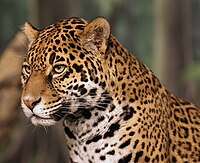
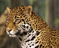
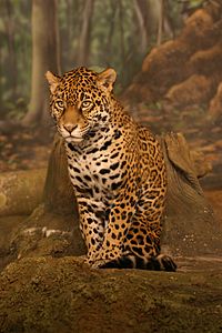
I took both these images and not sure which to put forth so putting both forth. :) Both appear on Jaguar.
- Note: Just so that it's clear, these are two separate photos. The head shot is not a crop of the sitting photo.
- Second note: These are not fake nor are they of a stuffed animal. It is a living, breathing Jaguar at the milwaukee zoo at an indoor exhibit with a painted background. And, yes, he stood there just like that for no less than 15 minutes which is why some may think it was stuffed.
- Nominate and support. - Cburnett 00:40, 17 October 2006 (UTC)
- So far, I'd go with head shot #2 (with color correction) as my prefered (if I had to pick) one since background is blurred enough that its paintedness isn't as noticable. Cburnett 19:25, 17 October 2006 (UTC)
- Oppose A great subject with good colour and composition but it is a bit too blurry. --Midnight Rider 02:34, 17 October 2006 (UTC)
- Support Sitting - Great photo. I don't see any blurring. Iorek85 04:44, 17 October 2006 (UTC)
- Support Edit 3/4 Head Shot, Edit 1 Standing. I don't really mind which, as they are both good quality and encyclopedic. I do, however, oppose the falsely colored orginals and head shot edit 1. NauticaShades 07:35, 17 October 2006 (UTC)
 Support
Edit 1, Head shotEdit 3 or 4- Top shot, sharp and natural looking despite the zoo setting. --Fir0002 07:40, 17 October 2006 (UTC)
- Good job with the color correction Diliff, but would have liked to see some sharpening, so have applied some. --Fir0002 22:32, 17 October 2006 (UTC)
Weak Support Head Shot Edit 1.. The headshot minimises the visibility of the somewhat fake looking background, but I think the white balance is a bit off. I know the white fur is not literally white, but it should be a bit less pastey yellow I think. Looks like it was shot indoors with incandescent lighting or something. Would likely support a corrected edit.
Diliff | (Talk) (Contribs) 08:46, 17 October 2006 (UTC)
Support Head Shot Edit 2. Good improvement, white not too white. Diliff | (Talk) (Contribs) 10:52, 17 October 2006 (UTC)Oppose all. Diliff | (Talk) (Contribs) 12:44, 17 October 2006 (UTC)- This is getting laughable! I should probably not be quite so reactive.
Support Head Shot Edit 2. Diliff | (Talk) (Contribs) 13:12, 17 October 2006 (UTC)
- This is getting laughable! I should probably not be quite so reactive.
- Weak support edit 2 head shot. Nice, but a bit blurry. --Pharaoh Hound (talk) 12:27, 17 October 2006 (UTC)
Oppose . Wow, people regularly oppose zoo shots and based on unnatural surroundings but a stuffed jaguar in front of a photo wallpaper gets nodded through? Not by me. --Dschwen 12:31, 17 October 2006 (UTC)- It's stuffed? No wonder it had such a blank expression.. ;-) It fooled me at first glance, but I can see your point now. I'm going to have to agree with you. A nicely out of focus fake background was borderline, but dead animal in a fake environment is taking it a bit far, particularly since it doesn't actually disclose it in the image. Diliff | (Talk) (Contribs) 12:44, 17 October 2006 (UTC)
- STUFFED? Are you kidding me? That Jaguar is just as real as any of the other animals I saw at the milwaukee zoo. Just because I took a picture of an animal who was practically posing doesn't mean you have to insult me and call me a liar. What the hell happened to assume good faith around here? Dschwen pulls out this baseless accusation and Diliff joins in before I can even respond... Wow. Cburnett 13:04, 17 October 2006 (UTC)
- I apologise and will reverse my vote again. ;-). At first I was sceptical about Dschwen's claims but you have to admit, it does look a bit stunned. That said, it is a quality photo (shame about the background as he mentioned), and I'm back to a support. Diliff | (Talk) (Contribs) 13:12, 17 October 2006 (UTC)
- Thank you. :) Cburnett 13:31, 17 October 2006 (UTC)
- Yeah, sorry, the verdict was a little half-cocked, but that blank stare totally fooled me. --Dschwen 15:41, 17 October 2006 (UTC)
- Funny I thought the same thing but did some research and decided it was a well posed subject. -Ravedave (help name my baby) 02:32, 18 October 2006 (UTC)
- I apologise and will reverse my vote again. ;-). At first I was sceptical about Dschwen's claims but you have to admit, it does look a bit stunned. That said, it is a quality photo (shame about the background as he mentioned), and I'm back to a support. Diliff | (Talk) (Contribs) 13:12, 17 October 2006 (UTC)
- Support Edit 2 head shot. Oh boy, reading the whole discussion plus the angry reaction on my talk page... ...I just convulsed with laughter. Sorry again. Upon close examination the headshot actually looks pretty good (with color correction) and the photo wallpaper is blurred anyways. --Dschwen 16:11, 17 October 2006 (UTC)
- I stand by edit2 as I feel the color improvement outweighs the tiny blown out parts. Tha cat looks pink in edit3 and 4. --Dschwen 07:18, 18 October 2006 (UTC)
- And two other pics in the article support this. The fur also looks white in those. --Dschwen 22:05, 18 October 2006 (UTC)
- I stand by edit2 as I feel the color improvement outweighs the tiny blown out parts. Tha cat looks pink in edit3 and 4. --Dschwen 07:18, 18 October 2006 (UTC)
- Support Edit 4 head shot; Edit 1 sitting. I like stuffed animals (just kidding :-) ) | AndonicO 01:05, 18 October 2006 (UTC)
- Oppose both. Sorry, I don't like the expression of the animal. Also think that background is distracting in all versions. -- Alvesgaspar 11:31, 18 October 2006 (UTC)
- Support edit 2, oppose other edits. Agree with Dschwen -- it's just too pink in the other edits, although I like Fir's sharpening. A sharpened edit 2 would be best IMHO. howcheng {chat} 22:59, 18 October 2006 (UTC)
- Head shot: Weak oppose edit 2; Oppose original, edit 3, and edit 4. I oppose the head shot because there is not yet an edit that I like. The original is a wonderful picture besides the colors, and only edit 2 has corrected this problem. But edit 2 overdid it and has blown highlights. Edits 3 and 4 great except that they haven't done justice to the white fur (there's that pink tinge). --Tewy 01:03, 19 October 2006 (UTC)
- Sitting: Oppose original; Weak oppose edit 1. All this one really does is show the front of the animal (I would prefer to see more of the side), and doesn't have the detail in the face that the head shot does. Once again, edit 1 helps the colors, but has blown highlights. --Tewy 01:03, 19 October 2006 (UTC)
- Comment. For next time I suggest seperate pictures have either seperate nomination pages or seperate headings. This page got a little ugly with all the edits. --Tewy 01:03, 19 October 2006 (UTC)
Not promoted --KFP (talk | contribs) 23:10, 24 October 2006 (UTC)
