Wikipedia:Featured picture candidates/Frankfurt Towers
Appearance


- Reason
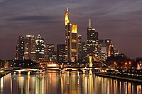
- This picture is very pleasing to the eye, improves all of the articles in which it appears, is of high resolution, and is pleasing to the eye.
- Articles this image appears in
- Frankfurt, Commerzbank Tower, Maintower
- Creator
- Patrik Kalinowski
- Support as nominator ~ Magnus animum ∵ ∫ φ γ 18:48, 29 April 2007 (UTC)
- Comment I'm adding an alternative shot that was recently featured on Commons. ~ trialsanderrors 18:55, 29 April 2007 (UTC)
- Comment It may be just me, but isn't the reflection of the buildings in the water in slightly distracting? Nice shot otherwise. --Zainub 21:11, 29 April 2007 (UTC)
- Comment: I seem to recall another FP that had some stretched lighting over water, but I can't remember what the image was :P ~ Magnus animum ∵ ∫ φ γ 21:32, 29 April 2007 (UTC)
- Oppose both - the first is tilted and the composition is a bit odd (lamp post seems to dominate, feels like I should be able to see more of what lies to the left - the bit of the foreground bridge that's in view seems arbitrary); the second is overexposed, with really poor control of the highlights, and looks as though it's been heavily noise-reduced in places. --YFB ¿ 23:45, 29 April 2007 (UTC)
- Oppose both, the reflections in the water actually add to the shots in my opinion. However, as per above, the second image is overexposed. The first seems out of focus to me, as well. --Phoenix (talk) 03:48, 1 May 2007 (UTC)
- Oppose original, very weak oppose Alternate, added edit. The original is too small. I really like the alternate a lot, especially the reflections on the water. I added an edit of the alternate if anyone cares to consider it.--Uberlemur 04:22, 3 May 2007 (UTC)
Not promoted MER-C 02:52, 6 May 2007 (UTC)
