Wikipedia:Featured picture candidates/Donax variation
Appearance

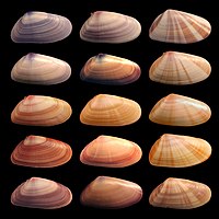
This is a follow up nomination to this one. It addresses concerns from that nomination, including, fewer shells, black background, higher res, diffuse light sources, etc. Illustrates phenotype Created by me, User:debivort.
- Nominate and support. - Debivort 02:07, 8 October 2006 (UTC)
- Support so much better. nice pic, and interesting. -Ravedave (help name my baby) 03:12, 8 October 2006 (UTC)
- Support, while I enjoyed the first version, this one clears up a number of the voiced concerns. The image is beautiful by itself, it illustrates the concept, and the technical aspects, such as resolution, color, exposure, are all fine.--Andrew c 05:48, 8 October 2006 (UTC)
- Support Addresses the problems in the earlier version. Awesome, despite a bit too shallow DOF. Well done! --Janke | Talk 07:25, 8 October 2006 (UTC)
- Support. I liked the original, and this is better. Well done. I can't help but think that this may also be a good illustration for one of the articles on Biological variation too. --jjron 09:50, 8 October 2006
- I added it to the genetic variation article. NauticaShades(talk) 16:45, 8 October 2006 (UTC)
- Hi Nautica, thanks so much for spreading the image, but I am afraid I removed it from that page, as I don't know if the variation in pigmentation is genetic or environmental. I'll restore it if I can find a source though. Debivort 21:53, 8 October 2006 (UTC)
- That's what I thought too, which is why I didn't add it myself. I was hoping someone else may know for sure and slot it in where appropriate. --jjron 08:22, 9 October 2006 (UTC)
- Hi Nautica, thanks so much for spreading the image, but I am afraid I removed it from that page, as I don't know if the variation in pigmentation is genetic or environmental. I'll restore it if I can find a source though. Debivort 21:53, 8 October 2006 (UTC)
- I added it to the genetic variation article. NauticaShades(talk) 16:45, 8 October 2006 (UTC)
- Support. I like this one much better. NauticaShades(talk) 11:45, 8 October 2006 (UTC)
- Support. Attractive and illustrative. —Cuiviénen 15:04, 8 October 2006 (UTC)
- Support It looks like it belongs on a poster! InvictaHOG 16:14, 8 October 2006 (UTC)
- Support. Good improvement from the first nomination. I like how sharp it is, along with the contrast between the shells and the background. Very nice. --Tewy 17:39, 8 October 2006 (UTC)
- Support. Very nice indeed. Some of the shells look a bit sharper than others, but this is a minor issue as they are easily high enough resolution for the required detail. Diliff | (Talk) (Contribs) 20:32, 8 October 2006 (UTC)
- Some definitely are sharper than others, largely because I had to take a separate image for each one. But interestingly, much of the appearance of sharpness seems to come from the texture/slight translucency of the shells themselves. For example, the shell in column 2, row 3, is in decently sharp focus (note the ridges at the top and crispness of the light reflection), but looks more blurred through the middle. I think this may be because of the diffuse lighting going through the slighly transparent shell. Debivort 21:48, 8 October 2006 (UTC)
- Support great work debivort. --Peta 00:07, 9 October 2006 (UTC)
- Support per above. A definite improvement over the previous version. -- Moondigger 14:01, 9 October 2006 (UTC)
- Support Wonderful. HighInBC 14:53, 9 October 2006 (UTC)
- Support Nifty. --Bridgecross 18:21, 9 October 2006 (UTC)
- Support A great improvement. | AndonicO 22:56, 9 October 2006 (UTC)
- Support Awesome picture. --Emc² (contact me) 13:44, 10 October 2006 (UTC)
 Support as nom --Ineffable3000 20:52, 10 October 2006 (UTC)
- Support - a lovely picture which clearly and concisely shows its subject in a tidy and encyclopaedic manner. Great work. - CountdownCrispy ( ? 06:35, 11 October 2006 (UTC)
- Support Looks like my vote isn't needed, but it's a good picture of a scientific subject, which obviously took a lot of work. Terri G 11:46, 11 October 2006 (UTC)
- Comment: See how great the FPC process is - a previous good (but not great) image is re-shot and receives 100% support! :) Greetings, --Janke | Talk 17:44, 11 October 2006 (UTC)
- Support a good picture, thought its encyclopedic value is dubious. Nonetheless, support. Jellocube27 14:20, 14 October 2006 (UTC)
- Support! That looks very nice. --Masamage 20:47, 15 October 2006 (UTC)
- Support. White is the traditional background, but black is fine in this case. The arrangement is nice, with similar ones next to each other. There's also more detail on each one. All around superior image.--HereToHelp 01:45, 17 October 2006 (UTC)
Promoted Image:Coquina variation3.jpg --KFP (talk | contribs) 16:54, 18 October 2006 (UTC)
