Wikipedia:Featured picture candidates/Baron Palace
Appearance

- Reason
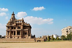
- There are no other high quality images existing of this magnificent, if eccentric, palace. Illustrates the reverse side of the palace not seen in any existing photo on Wikipedia. Composition allows us to see the area surrounding the palace as well, giving an idea of context.
- Articles this image appears in
- This image can be found in Baron Empain and Heliopolis, Cairo Suburb.
- Creator
- User:JasmineElias
- Support as nominator --JasmineElias (talk) 01:10, 8 May 2009 (UTC)
- Oppose. The barrel distortion is too distracting.--ragesoss (talk) 03:06, 9 May 2009 (UTC)
- I understand that it is distracting, it is distracting to me too, but it is not so much barrel distortion as it is the ground in Cairo. Baron Palace is actually built on plates, it was built so that it can rotate in a way that the front door is always facing the sun. Since it was abandoned it had become derelict, and consequently appears to have shifted slightly. It appeared "wonky" to my eye, not just the camera lens. The streets in Cairo are traditionally quite distorted too, which is why the white building on the right appears to be leaning inwards. This is actually just a perspective problem in the way the street leans away from the camera. The focal length the photo was taken at is 34mm and the lens used is 18-50mm. As I said, it's a problem with the plates underneath the building shifting over time and negligent care, as the building appears to lean to the naked eye. If there is a way I could fix it, I would be more than happy to.JasmineElias (talk) 03:49, 9 May 2009 (UTC)
- Oppose due to odd composition. An encyclopedic photo of a building should be centered. Cacophony (talk) 20:16, 9 May 2009 (UTC)
- Looking through other Featured Pictures I thought this would be okay since many photos of historic buildings appear to be off-centre: (Broadway Tower), (Lichtenstein Castle), (Vaduz Castle), (Saltbox Concord),(Companile). Even the (Arc de Triomph) is not dead centre. I am a newbie, so forgive me for being slightly confused but I was under the assumption that composition must portray the subject in an interesting way - here I chose to show the the classic rule of thirds to bring portray Baron Castle as it stands, in the middle of the city. JasmineElias (talk) 21:33, 9 May 2009 (UTC)
- Comment While i agree that the building shouldn't always be dead center, your composition has, IMHO, 2 major defects. 1: The main subject is a bit too small...it took me several seconds to understand what was the important building. 2: What surround the building isn't appealing..Several small trees and a rather ugly building. If you compare that to the FP you mentioned, they tend to have beautiful surroundings (mountains, forests, snowy countryside, etc...). Also, the rule of thirds isn't completely right...the Baron Palace should be more to the right. I think one way to correct both problems would be to crop the right side of the image : no more ugly building and a main subject more visible Ksempac (talk) 10:10, 11 May 2009 (UTC)
- Looking through other Featured Pictures I thought this would be okay since many photos of historic buildings appear to be off-centre: (Broadway Tower), (Lichtenstein Castle), (Vaduz Castle), (Saltbox Concord),(Companile). Even the (Arc de Triomph) is not dead centre. I am a newbie, so forgive me for being slightly confused but I was under the assumption that composition must portray the subject in an interesting way - here I chose to show the the classic rule of thirds to bring portray Baron Castle as it stands, in the middle of the city. JasmineElias (talk) 21:33, 9 May 2009 (UTC)
- But you need to correct the distortion first. MER-C 10:35, 11 May 2009 (UTC)
- Oppose per my above comment. Ksempac (talk) 10:10, 11 May 2009 (UTC)
- Comment: I would consider supporting if the right side of the image were cropped, perhaps to the left edge of the white building. On the other hand, the subject is cut-off at the base, which is unfortunate. Do you not have another view of this building? Maedin\talk 12:27, 13 May 2009 (UTC)
Not promoted MER-C 03:17, 15 May 2009 (UTC)
