User talk:Cmglee/archive2012
| ≤ 2O1O | 2O11 | 2O12 | 2O13 | 2O14 | 2O15 | 2O16 | 2O17 | 2O18 | 2O19 |
| 2O2O | 2O21 | 2O22 | 2O23 | 2O24 | |||||
Tensegrity graphics
[edit]Hi, FYI:
http://wiki.riteme.site/wiki/Talk:Tensegrity#Distracting_animations
Wondered if you might be interested in doing this. Regards, 86.167.19.92 (talk) 18:26, 2 January 2012 (UTC)
- Thanks for bringing it to my attention. I've replied on that page.
Orchard Park piccies
[edit]Hi. We seem to disagree on the pictures in the Orchard Park article. I've started a discussion at Talk:Orchard Park, Cambridgeshire which I invite you to contribute to. Cheers! Ilikeeatingwaffles (talk) 22:56, 2 January 2012 (UTC)
- Thanks, Ilikeeatingwaffles. I've replied on that page. cmɢʟee☎✉ 13:19, 3 January 2012 (UTC)
Image request
[edit]
Hello once again! I'm not sure if you're interested enough in biology to do this, but would it be possible for you to create a reconstruction of the Cycadeoidea plant? I've listed it at Wikipedia talk:WikiProject Palaeontology/Paleoart review, but some entries there have been stale for years. Chris the Paleontologist (talk • contribs) 23:06, 19 January 2012 (UTC)
- Hi, Chris. To be honest, I don't think I've the necessary skills to redraw http://taggart.glg.msu.edu/isb200/cycadl3.gif . How about using one of the existing pictures of fossils at http://commons.wikimedia.org/w/index.php?title=Special%3ASearch&search=Cycadeoidea (like the one on the right) or http://www.mgs.md.gov/esic/brochures/fossils/trias.html (dating from 1906, I think the drawing is in public domain), or linking to http://www.turbosquid.com/FullPreview/Index.cfm/ID/285729 (I'm not sure what Product License: Standard Royalty Free means). cmɢʟee☎✉ 18:57, 20 January 2012 (UTC)
- Sorry for bothering you with this one; I wasn't aware of the existence of those images. I'll look harder next time. Thanks for pointing them out anyway, though. Chris the Paleontologist (talk • contribs) 20:52, 20 January 2012 (UTC)
- No worries — glad to help! cmɢʟee☎✉ 11:25, 21 January 2012 (UTC)
- Sorry for bothering you with this one; I wasn't aware of the existence of those images. I'll look harder next time. Thanks for pointing them out anyway, though. Chris the Paleontologist (talk • contribs) 20:52, 20 January 2012 (UTC)
Addition of Comparison angular diameter image to Solar eclipse
[edit]I find this image redundant for the article. The article already has a chart showing the different apparent sizes of the sun and moon as seen from earth and I think the chart is easier to see what is going on than with your graph which seems to me a bit cluttered with all the circles so close together. In short I don't see how it adds to the article what isn't already there, furthermore I don't think it conveys very well, visually, the apparent sizes. Before I remove it, I figure it would be nice to get your feedback on my criticisms. Thanks. --TimL (talk) 01:33, 27 January 2012 (UTC)
- Thanks for the note, TimL. I understand that there's a chart showing the apparent sizes (I made it!) but I find it very difficult to distinguish the sizes from the thumbnails; I suppose it's below my threshold of just-noticeable difference, whereas I find the image makes it clearer. Would it be less cluttered if only the sun and moon (and not the planets and ISS) are shown? cmɢʟee☎✉ 13:05, 28 January 2012 (UTC)
- thanks for the reply. In the chart, the moon seems quite visibly diffrent in size, the sun, not at all. So I partly agree with you about the chart. However, if one looks at the chart they can see the Sun's angular diameter varies very little, thus explaining why they look the same size in the chart. The problem I see with your diagram is all the circles are to thin and too close together to easily tell apart. Perhaps you could "zoom in" on part of the "disk" and create a figure showing just an arc (representing part of the full disk of sun and moon rather than the whole disk) whereby the differences in angular diameter could be "magnified" so to speak, leaving it an exercise for the reader to imagine the whole disk if they would like, which I think would be fine. Thoughts? --TimL (talk) 12:47, 1 February 2012 (UTC)
Historic Coventry edit-a-thon at Herbert Art Gallery and Museum, Coventry
[edit]| Historic Coventry Edit-a-thon - You are invited! | |
|---|---|
 |
The Herbert Art Gallery and Museum is hosting an edit-a-thon on Saturday 31 March 2012. 15 Wikimedians will have to learn more about "historic Coventry". The day will centre upon editing, however and we aim to improve the coverage of Coventry's illustrious history on Wikimedia projects. For more information and to sign up, see the event page. We hope you'll join us! Rock drum Ba-dumCrash 20:54, 20 March 2012 (UTC) |
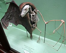

Thanks, Rock drum for the invitation but sadly I can't make this Sat.
Since you and User:HJ Mitchell are active in GLAM, I wonder if you've come across the Horniman Museum which I wholeheartedly recommend, especially due to their idea of comparing the same class of artifact from different cultures. They pride themselves to be a teaching museum, so may be keener than most to open their doors to Wikimedia. Sadly, I don't have a contact there, but their guides seemed quite open to ideas.
On my last visit, I photographed some specimens with skins/shells cleverly sectioned to show how the underlying skeleton relates to the rest of the animal (something I'd not seen before), as in these examples. Because they were behind glass, there were many reflections, and I could not get better angles. I think these are excellent illustrations of assorted animal anatomy, as I've done for turtle shell and bat#Wings. Under GLAM, the museum may briefly open the cabinets for someone to take better pictures.
I should thank both of you for your devotion to GLAM. Not many people would be willing to spend their time and effort organising such events. Keep up the great work!
cmɢʟee☎✉ 17:47, 28 March 2012 (UTC)
Comparison highest mountains graphic
[edit]Very impressive work on this graphic [[1]]. I just saw your additions of it to the mountain lists. Overall I like it, but it could use some improvements. A couple things that jump out:
The use of the question mark really needs to go. It should be another symbol. The question mark being there makes it seems as though the author or someone is questioning the data or indicating that we are unsure about something.
Since Everest/K2 are members of both the 8000ers and the Seven Summits/Seven Second Summits, it would be nice if there was a more prominent way of indicating this fact on the graphic. Maybe with a unique color code or something just for these two peaks.
Just my own initial thoughts for now. Thnx --RacerX11 Talk to meStalk me 00:36, 5 April 2012 (UTC)
- Thanks, Racerx11. I struggled to find symbols I could use. Strangely, non-ASCII characters e.g. † (dagger) failed to display in Firefox. Can you suggest some appropriate ASCII symbols? I thought the symbols were sufficient to show which sets each peak belongs to, and used colours to denote continents. How about if I use increased saturation to indicate the Seven Summits/Seven Second Summits? cmɢʟee☎✉ 12:22, 5 April 2012 (UTC)
- How about asterisk * and caret ^ or asterisk * and double **, any of those would be better imo, if they work. I see now that you used the color coding to denote continent. That makes sense so never mind about Everest and K2 with their own color, unless... It occurs to me if you color coded by list, one color for eight-thousanders, one for seven summits and a third for second seven, then it would make sense to have a fourth shade just for Everest and K2 to indicate membership in more than one list. Additionally you could could have different shades for Bass and Messner which would solve the non-ascii symbol problem. --RacerX11 Talk to meStalk me 17:56, 5 April 2012 (UTC)
- Sorry, when I wrote the above, I wasn't considering that you were already using * and ^. I was just now trying to work it all out and come up with a scheme that solves everything. My mind started swimming. The more I look at it, the more I realize with what you were trying to do, what you have now is about the best it could have been. Just thinking out loud now. Could you color code for each list, including for Bass and Messner, or use * and ^ if needed, and then simply state the continents by name in text? Would that work?--RacerX11 Talk to meStalk me 15:08, 6 April 2012 (UTC)
- I think have something I would prefer: Use just three colors. One for each list. Then use ^ to denote Messner and * to denote Bass for both of the seven summit lists. Simply enter the continents using text below each mountain name. So for example Mount Townsend would be colored using the seven second summits color and the text would look like:
- Mount Townsend*
- 2209 m
- Australia*(asterisk optional here)
- Mount Townsend*
- (with * denoting Bass list)
- As for Everest and K2 belonging to more than one list. Make the triangular peak graphic a two-toned image for those two peaks only. For example, one half of K2's triangle would be colored with the eight-thousander color and the other half colored with the seven second summits color. Follow me? Wouldn't that work or am I overlooking something? --RacerX11 Talk to meStalk me 15:37, 6 April 2012 (UTC)
- Wow, thanks for putting so much thought into this, RacerX11. I like your 3-colour image idea, except that it might be confusing for Everest and K2 to be half one colour and half another. I could stripe them as in File:Prevailing world religions map.png, but I think I've an idea where it's the labels that are grouped (though requiring Everest and K2 to have repeated labels). Give me about 3 hours to come up with something... cmɢʟee☎✉ 15:47, 6 April 2012 (UTC)
- Great! My suggestions are mostly intended as food-for-thought or maybe something that would strike you as a good idea to improve on. Will wait to see what you come up with. Take as much time as you need. No one is in a hurry over this. --RacerX11 Talk to meStalk me 16:07, 6 April 2012 (UTC)
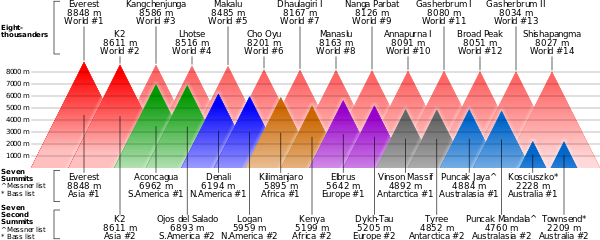
- What do you think of this? cmɢʟee☎✉ 19:46, 6 April 2012 (UTC)
I like it, very much! The text is much cleaner without too many supscripts. Less potential for confusion. I would be fine with going live with this version. You apparently have a knack for this sort of thing. You have done some great work :) --RacerX11 Talk to meStalk me 20:09, 6 April 2012 (UTC)
- Many thanks for the kind compliment and Barnstar. I couldn't have done it without your recommendations and feedback, RacerX11. Guess this shows the power of collaborative editing of Wikipedia :) Let me know if you'd like to work on anything together. Have a good day! cmɢʟee☎✉ 14:30, 7 April 2012 (UTC)
- Sure, and the next time I see a need for a new or better graphic, I will certainly keep you mind. --RacerX11 Talk to meStalk me 14:52, 7 April 2012 (UTC)
A barnstar for you
[edit]
|
The Graphic Designer's Barnstar | |
| In recognition of the fine work you do. RacerX11 Talk to meStalk me 22:46, 6 April 2012 (UTC) |
Saw one on this page, but if you don't have the alternate version, here you go! --RacerX11 Talk to meStalk me 22:46, 6 April 2012 (UTC)
A barnstar for you!
[edit]
|
The Graphic Designer's Barnstar |
| For your
I'm honoured to award you this. A great addition! Qwrk (talk) 14:18, 20 April 2012 (UTC) |
Thanks for the barnstar
[edit]Hi, thanks for the barnstar. My first ever !
Just a note on the sRGB data for the ColorChecker card, there are a couple of people in the external links on that article [ Bruce Linbloom and Danny Pascale and both seem to know what they are talking about] and from what I can make out they both conclude that the manufacturer's sRGB data isn't particularly accurate.
I wanted to added Bruce Lindbllom's sRGB data to the article but I don't quite know how to justify including his data [is he a keen amateur or a credible source of info on the topic? Or both!] He has links on quite a few Wikipedia articles to do with colorimetry etc. I'd be fairly sure he knows his stuff but I can't quite get my head around citing his data.
Anyway, thanks again for the barnstar.Sun Ladder (talk) 11:41, 21 April 2012 (UTC)
- You're welcome, and thanks for the note, Sun Ladder. I've read some articles by Bruce Lindbloom and he indeed seems quite knowledgeable. In this case, I'm unsure what the best approach is, too. I would open the topic to general debate on the ColorChecker talk page by copying what you wrote above there (I can do that for you if you like). If there's no reply in several days and you feel strongly about it, perhaps you could add his data to the ColorChecker article with a reference? Just a thought... cmɢʟee☎✉ 12:09, 23 April 2012 (UTC)
Comparison angular diameter image for Solar eclipse
[edit]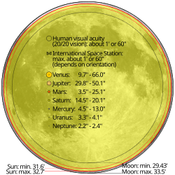
Hi. Unlike one of the previous commentators, I think this image is a terrific addition to the Solar eclipse article. However ...
The caption stating the maximum and minimum angular diameter of the sun (in actual numerals) cannot be correct because it indicates that the maximum diameter is less than the minimum. I would correct this if I knew how, which I do not.
Furthermore (but less important) the numbers shown do not correspond exactly to what is shown in the table of values within the Solar eclipse article itself, even if they were to be reversed, as apparently they should be. This is a less interesting issue than the reversal, since the discrepancy of the values is small, although I do not know the source of this discrepancy. Paul (talk) 22:19, 28 May 2012 (UTC)
p.s. By the way, you do great work on a variety of images, which have become some of the highlights of Wikipedia. Paul (talk) 22:19, 28 May 2012 (UTC)
- Thanks and well-spotted, Paul. I've fixed the labels as on the right. The values in the graphic were from the How long will we continue to be able to see total eclipses of the Sun? answer at NASA, but there is a mistake: "...the Sun's angular diameter varies from 32.7 minutes of arc when the Earth is at its farthest point in its orbit (aphelion), and 31.6 arc minutes when it is at its closest (perihelion)." It should appear smaller when farther, so the values should be swapped. I've updated the table and noted this mistake. cmɢʟee☎✉ 13:11, 31 May 2012 (UTC)
Thanks for the fix. For a minute there, it appeared that the values in the image caption were still wrong, but in reality I simply needed a judicious dose of "F5" (refresh). And then it was all clarified. Paul (talk) 19:43, 31 May 2012 (UTC)
Panamerican Peaks
[edit]Thanks for the great graphic. In 2009-2010 I embarked on my adventure of a lifetime called Panamerican Peaks: Cycling between Alaska and Patagonia (Panamerican Highway) and Climbing the highest peaks of every country along the way.
As it turns out, there are 14 countries, and so I wondered whether you could help me create a graphic comparing those 14 Panamerican Peaks with the 7 Summits and 7 Second Summits. (Four of them are identical: Denali, Logan, Ojos, Aconcagua). Below is a list of the country, peak, height data. You can also find info about this project (photos, videos, stories, etc.) on my website panamericanpeaks dot com
Seq     Country Peak    Altitude
1       United States   Denali  6194
2       Canada  Logan   5959
3       Mexico  Orizaba 5636
4       Guatemala       Tajumulco       4220
5       El Salvador     El Pital        2730
6       Honduras        Las Minas       2849
7       Nicaragua       Mogoton 2106
8       Costa Rica      Chirripo        3819
9       Panama  Baru    3475
10      Colombia        Cristobal Colon 5776
11      Ecuador Chimborazo      6267
12      Peru    Huascaran       6768
13      Chile   Ojos del Salado 6893
14      Argentina       Aconcagua       6962
You can also email me directly: [email address removed]
Many thanks in advance.
Cheers,
Thomas Laussermair.
- Thanks. I've replaced the Eight-thousanders of File:comparison_of_highest_mountains.svg with your list. If you know the Perl programming language, you can extract the Perl code at the bottom of the SVG file and make your own graphic, too. Congratulations, by the way, on your successful climb! cmɢʟee☎✉ 20:12, 7 June 2012 (UTC)
- Hi Cmglee,
- Thanks for turning this around so quickly. I see from the svg file that you just had to replace the driver table for your Perl script and some of the color assignments. Pretty nifty script there - have never written Perl myself.
- Did you start out with a drawing tool (like Adobe Illustrator), save in .svg and then refine with Perl? Or did you start from scratch with Perl?
- On the color assignments, perhaps one could use the green and blue (for North and South American Panamerican Peaks) instead of the yellow. ::Also, the fact that Denali (=McKinley) and Logan are listed multiple times is a bit confusing.
- Anyway, I added it to my most recent Blog post at http://visualign.wordpress.com
- Thanks again,
- Thomas.
- Thomas Laussermair
- Hi Thomas,
- Thanks. I just visualised it on paper and directly wrote the Perl script to plot it. Of course, the design changed quite a bit as I went along.
- If you wish to fix the graphic or plot your own mountains, first get a copy of Perl (I recommend ActivePerl) and a Perl tutorial. Knowing how obfuscated Perl can be, I've tried to write it as simply as possible. If all you want to change are the mountains and colour assignments, just edit the string $data_string and hashtable %continents. Each line in $data_string corresponds to one mountain belonging to one of the continents (loosely used to mean "category"). The fields, delimited by "|" are
- x-coordinate of centre of mountain and label
- y-coordinate of baseline of label
- continent code
- rank in continent
- height in metres
- name
- If you wish to fix the graphic or plot your own mountains, first get a copy of Perl (I recommend ActivePerl) and a Perl tutorial. Knowing how obfuscated Perl can be, I've tried to write it as simply as possible. If all you want to change are the mountains and colour assignments, just edit the string $data_string and hashtable %continents. Each line in $data_string corresponds to one mountain belonging to one of the continents (loosely used to mean "category"). The fields, delimited by "|" are
- They are plotted in the specified order, so earlier ones appear "behind" later ones. The %continents structure should be self-explanatory.
- Good luck! cmɢʟee☎✉ 23:19, 14 June 2012 (UTC)
Thank You for the Venn Diagram
[edit]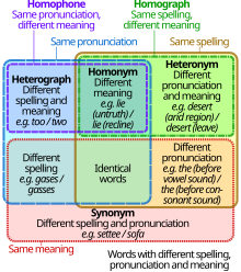

Yes, I am a newbie. I just wanted to Thank the author and artist for the following beautiful diagram. I was not sure who is who. What is “Derivative Work”? I have never used “talk” before. [Email address sanitised to protect user]
File: Homograph homophone venn diagram.svg
English: This is a Venn diagram showing the relationships between pronunciation, spelling, and meaning of words, for example, homographs, homonyms, homophones, heteronyms, and heterographs.
Date: 2011-12-20 23:45 (UTC) Source: Homograph_homophone_venn_diagram.png Author : Homograph_homophone_venn_diagram.png: Will Heltsley derivative work: Cmglee(talk) ```` End
- Hi Pomahony,
- Thanks for your kind words.
- Your message will be seen quicker if you put it on a user's Discussion page, as opposed to his/her User page. You can think of the Discussion page as a forum for that user, while his/her User page is for him/her to describe himself/herself.
- This page explains the legal meaning of "derivative work"; more commonly, it just means that a particular work of art was based on an existing one.
- In this case, I created the upper-right graphic based on the bottom-right one by Will Heltsley (according to its summary).
- Happy contributing to Wikipedia!
Hi Cmglee, would like to also say thanks for the awesome Venn diagram, and can I suggest changing the example of a homonym to something different, such as seal or bear, as tyre/tire is not a homonym pair for us folks in the UK. Thanks again for illustrating so succinctly one of my favourite families of linguistic terms :).Brocerius (talk) 12:58, 28 October 2013 (UTC)
- Thanks for your kind words, Brocerius. I understand your concern, but could you please start a discussion on Talk:homonym to see what other editor think about this change? I copied tyre/tire from File:Homograph_homophone_venn_diagram.png. cmɢʟee⎆τaʟκ 13:23, 28 October 2013 (UTC)
Use of a Photo
[edit]Hi Cmglee. I am a freelance photo researcher working on a video for Travel and Leisure magazine about all the new attractions this summer (2012) in London. I would like to use your Wikimedia Commons photo of the outside of the Olympic Aquatics Centre for a short 1-2 second use in this upcoming Travel and Leisure video "London's Coolest Attractions". I will credit you as the author of this photo/Wikimedia Commons. Can you let me know if you have any issue or problems with this use? I can be reached at paula@gillenedits.com, thank you so much for posting this image in Wikimedia Commons. (GillenEdits (talk) 17:28, 12 July 2012 (UTC)) (UTC)
- Hi Paula/GillenEdits. Sure, I'd be glad to contribute the photo under Wikimedia Commons' terms. Would you be able to post a link to your finished work here, please? cmɢʟee☎✉ 17:47, 12 July 2012 (UTC)
- Thank you so much, I will post the link to the video as soon as it is live. best regards Paula Gillen — Preceding unsigned comment added by GillenEdits (talk • contribs) 20:10, 12 July 2012 (UTC)
- Here is the Travel and Leisure video. Will be live for the month of August 2012. http://www.travelandleisure.com/articles/londons-cant-miss-sights (talk) —Preceding undated comment added 17:04, 14 August 2012 (UTC)
- Many thanks, GillenEdits. Nice video! cmɢʟee☎✉ 20:46, 27 August 2012 (UTC)
- Here is the Travel and Leisure video. Will be live for the month of August 2012. http://www.travelandleisure.com/articles/londons-cant-miss-sights (talk) —Preceding undated comment added 17:04, 14 August 2012 (UTC)
- Thank you so much, I will post the link to the video as soon as it is live. best regards Paula Gillen — Preceding unsigned comment added by GillenEdits (talk • contribs) 20:10, 12 July 2012 (UTC)
Seven Second Summits map
[edit]Hello again. The map you have added at Seven Second Summits has a small issue for me. It indicates Puncak Trikora as the second highest point of Australasia/Oceania/New Guinea, (Messner list). The discussion about Puncak Mandala vs Trikora as the true second highest is at Talk:Seven Second Summits#List may be incorrect. The consensus reached from that discussion was that Mandala is higher and we made made all the changes in all related articles based on the best information from reliable sources we could find. We have also left notes on certain articles explaining that the two peaks are very close in height and some sources may list Trikora as higher and/or being a member of the Messner list. The most recent and accurate data does support Mandala being higher (note however, user:Viewfinder does add that this is "not 100% conclusive").
So alas the map is somewhat contradicting what the article currently states. Possible solutions:
- 1) Edit article to explain or reflect what the map indicates.
- 2) Replace map with one that instead, displays Mandala as #2.
- 3) Simply delete the map.
Thoughts? --RacerX11 Talk to meStalk me 01:34, 13 July 2012 (UTC)
- Well spotted, Racerx11. I took the image from the French page. I've added a note in the caption with a link to the talk page. Hope that helps! cmɢʟee☎✉ 11:54, 16 July 2012 (UTC)
- I have replaced the link to the discussion, with an inline citation—a better way to support your note I believe. Thanks! --RacerX11 Talk to meStalk me 03:04, 17 July 2012 (UTC)
Gutenberg PhD interactive architecture
[edit]See http://www.gutenberg-e.org/kirkbride/chapter1.html — Preceding unsigned comment added by 81.107.37.101 (talk) 21:19, 14 July 2012 (UTC) Since you like architecture, also "Diagramming Architecture", Francis Ching "Form and space in architecture" 81.107.37.101 (talk) 22:01, 14 July 2012 (UTC)
Architecture and the Moving Image 1998-2005 (2 dvds): short films selected by François Penz and Andong Lu 81.107.37.101 (talk) 22:07, 14 July 2012 (UTC)
Sketches of Frank Gehry 81.107.37.101 (talk) 22:22, 14 July 2012 (UTC)
Reply
[edit]No, I was not the other commenter on the graph. (Sorry for the delayed response--I'm off Wikipedia here lately.) Duoduoduo (talk) 16:14, 10 August 2012 (UTC)
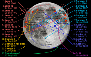
Hello Cmglee. Great image, but there's a typo to do with Apollo 11 landing date. It landed on 20 July 1969 (not 24th). I noticed due to looking up information about today's news of the death of Neil Armstrong. Bryandongray (talk) 23:41, 25 August 2012 (UTC)
- Well-spotted, and thanks for bringing it to my attention, Bryandongray. I've fixed the typo and added numbers to indicate chronological order, as on the right. cmɢʟee☎✉ 20:05, 27 August 2012 (UTC)
Judge institute photos
[edit]

Do you have any more photos of the Judge Institute, especially close ups? I found out yesterday that poor old John Outram didn't have a wiki page, so have been hastily trying to cobble one together. There's a nice building of his round the back too, if memory serves. Pete.boardman (talk) 20:57, 11 September 2012 (UTC)
- Hi, Pete. Well done in writing up the article. I've uploaded the following photos of the Judge. Hope they are useful! cmɢʟee☎✉ 21:01, 15 September 2012 (UTC)
- Nice photos, thanks! Pete.boardman (talk) 16:39, 17 September 2012 (UTC)
Cambridge University stuff
[edit]
It may take a few minutes from the time the email is sent for it to show up in your inbox. You can at any time by removing the {{You've got mail}} or {{ygm}} template.
Deryck C. 21:47, 28 September 2012 (UTC)
Image copyright
[edit]You might get a more helpful person at Wikipedia:Media copyright questions. Charles Matthews (talk) 11:38, 21 November 2012 (UTC)
- Thanks, Charles. That looks useful! cmɢʟee☎✉ 12:14, 21 November 2012 (UTC)
Hello
[edit]Great to meet you today at the Cambridge Wikipedia gathering Cmglee! Happy editing --Computor (talk) 15:57, 25 November 2012 (UTC)
- Thanks for the picture! --Mark91it's my world 00:42, 26 November 2012 (UTC)
g function - wrong direction
[edit]http://wiki.riteme.site/wiki/File:Comparison_convolution_correlation.svg on the Convolution part the g function (red line) is probably skewed in the wrong direction. — Preceding unsigned comment added by 87.206.22.43 (talk) 01:10, 4 December 2012 (UTC)
- I started a thread at Wikipedia:Reference_desk/Mathematics#File:Comparison_convolution_correlation.svg but noone has replied. Would you please explain why the red line is incorrect? cmɢʟee୯ ͡° ̮د ͡° ੭ 20:16, 6 December 2012 (UTC)
Original Research
[edit]
Please don't add original research as you did to the Maya calendar articles. Senor Cuete (talk) 15:06, 21 December 2012 (UTC)Senor Cuete
- From your comment "Revert to last un vandalized and no OR version" on Mesoamerican calendars, I infer that you meant that my illustration is original research. All the information in it is derived from tables in Mesoamerican_Long_Count_calendar#Correlations_between_Western_calendars_and_the_Long_Count and Maya_calendar#Long_Count — I just organized it in a graphical form so that it is much easier to compare the large range of numbers. Could you identify what you mean by original research? I'll start a thread on Talk:Mesoamerican_Long_Count_calendar and apppreciate your feedback there. cmɢʟee୯ ͡° ̮د ͡° ੭ 19:36, 21 December 2012 (UTC)
| ≤ 2O1O | 2O11 | 2O12 | 2O13 | 2O14 | 2O15 | 2O16 | 2O17 | 2O18 | 2O19 |
| 2O2O | 2O21 | 2O22 | 2O23 | 2O24 | |||||


