User:Cewb23/Gender symbol
| This is the sandbox page where you will draft your initial Wikipedia contribution.
If you're starting a new article, you can develop it here until it's ready to go live. If you're working on improvements to an existing article, copy only one section at a time of the article to this sandbox to work on, and be sure to use an edit summary linking to the article you copied from. Do not copy over the entire article. You can find additional instructions here. Remember to save your work regularly using the "Publish page" button. (It just means 'save'; it will still be in the sandbox.) You can add bold formatting to your additions to differentiate them from existing content. |
Article Draft
[edit]Lead
[edit]Article body
[edit]Public toilets
[edit]
The modern gender symbols used for public toilets, 🚹︎ for male and 🚺︎ and female, are pictograms created for the British Rail system in the mid-1960s.[1] Before that, local usage had been more variable. For example, schoolhouse outhouses in the 19th-century United States had ventilation holes in their doors that were shaped like a starburst Sun ✴ or like a crescent Moon ☾, respectively, to indicate whether the toilet was for use by boys or girls.[2] The British Rail pictograms – often color-coded blue and red[citation needed] – are now the norm for marking public toilets in much of the world, with the female symbol distinguished by a triangular skirt or dress, and in early years (and sometimes still) the male symbol stylized like a tuxedo.[3]
These symbols are abstracted to varying degrees in different countries – for example, the circle-and-triangle variants ![]() (female) and
(female) and ![]() (male) commonly found on portable toilets, to the extreme of a triangle △ (representing a skirt or dress) for female and an inverted triangle ▽ (representing a broad-shouldered tuxedo) for male in Lithuania.[3]
(male) commonly found on portable toilets, to the extreme of a triangle △ (representing a skirt or dress) for female and an inverted triangle ▽ (representing a broad-shouldered tuxedo) for male in Lithuania.[3]
In elementary schools, the pictograms may be of children rather than of adults, with the girl distinguished by her hair. In themed locations, such as bars and tourist attractions, a thematic image or figurine of a man and woman or boy and girl may be used.[citation needed]
In Poland, an inverted triangle ▽ is used for male while a circle ○ is used for female.[3]
In mainland China, silhouettes of heads in profile may be used as gender pictograms,[citation needed] generally alongside the Chinese characters for male (男) and female (女).[4]
Some contemporary designs for restroom signage in public spaces are shifting away from symbols that demonstrate gender as binary as a way to be more inclusive.[5][6]
-
Standard American Institute of Graphic Arts (AIGA) symbols
-
Non-AIGA women's symbol on a legally mandated circular background in US
-
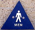
Non-AIGA men's symbol on a legally mandated triangular background in US
-
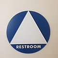
Gender-neutral sign in US, composed of legally mandated circle and triangle
-
Idiosyncratic unisex restroom in US (see LGBT symbols)
-
Public toilet in China, with female silhouette to the left and male to the right
-
Idiosyncratic symbols in Japan
-
Humorous symbols in Austria
-
Semi-triangular tuxedo and dress shapes in Hungary
-
Triangle-plus-circle symbols in Austria
-
Circle (female) and inverted triangle (male) in Poland
-
Sign in Romania, with men's and women's shoes representing gender
-
Male, female and hijra public toilets in India
-
Signs in the Real Jardín Botánico de Madrid; the male is depicted with a large upper body and the female with wide hips
-
 Gender-inclusive multi-user restroom sign at Hamline University
References
[edit]- ^ Glancey, Jonathan (11 September 2014). "The genius behind stick figure toilet signs". BBC.
Classics of design: One of the best early examples of intuitive global signs for public lavatories was that created for British Rail in the mid-1960s. As part of a major modernisation programme, the state railway was given a new and all-embracing corporate identity by DRU [Design Research Unit], a design studio founded by Marcus Brumwell and Misha Black in 1943. Working with Margaret Calvert and Jock Kinneir, who designed a distinctive Rail Alphabet typeface based on Helvetica, DRU devised a clean-cut and convincingly modern aesthetic that was applied to all locomotives, trains, stations, published material and, yes, signs for lavatories.
(includes picture of the ideogram, which is copyright). - ^ Eric Sloane (1972, 2007) The Little Red Schoolhouse: A Sketchbook of Early American Education. Doubleday & Co.; Dover Books.
- ^ a b c Glancey, Jonathan (11 September 2014). "The genius behind the stick figure toilet signs". BBC Future.
In Poland, meanwhile, you can come across lavatories indicating 'gents' with a triangle and 'ladies' with a circle, while in Lithuania men are represented by an inverted pyramid and women by a pyramid standing the right way up. [...] One of the best early examples of intuitive global signs for public lavatories was that created for British Rail in the mid-1960s. [...] In the 1970s, the British example was developed on a more comprehensive basis in the United States. In 1974, the US Department of Transportation commissioned the American Institute of Graphic Arts to create a set of pictograms to be used throughout public transport networks whether road, rail, air or sea.
- ^ Summers, Josh (2020-11-19). "Chinese Toilet | What to Expect (including Squat Toilets)". Travel China Cheaper. Retrieved 2023-06-02.
- ^ Schwartz, M. (2018). Inclusive Restroom Design. Library Journal, 143(8), 28–31.
- ^ Dobson, Terry; Dobson (Winter 2017). "Tip of the Icon: Examining Socially Symbolic Indexical Signage". Dialectic. I (1). doi:10.3998/dialectic.14932326.0001.106. ISSN 2572-7001.
{{cite journal}}: CS1 maint: multiple names: authors list (link)


