Talk:Boophone disticha
Appearance
| This article is rated Start-class on Wikipedia's content assessment scale. It is of interest to the following WikiProjects: | ||||||||||||||||||||||||
| ||||||||||||||||||||||||
Image queue
[edit]-
Larvae of Diaphone eumela feeding on a B. disticha flowerhead.
-
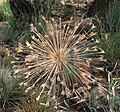
Fruiting head
I removed the excessive images from the article, as it's too short to cram additional images in via a gallery of sorts (WP:IG) and added a link to the Commons category where those images were. However, I will also include the images here on the talk page per the advice at WP:Image use policy#Image queuing. This is meant to act as a queue for when the article is expanded and can reasonably support more images near the text and not in a gallery. Rkitko (talk) 01:42, 6 December 2011 (UTC)
- there is no 'text crammed between images' in the version Rkitko changed. 'this cannot be the proper usage of the multiple image template' does seem like a personal opinion rather than a guideline. 'a link to Commons is much better' also reflects a personal preference - is there a guideline to back it up. Wikipedia depends to a large extent on images included in the body of the article and most certainly the idea could never have been to link every image to Commons. Let's get some outside views on this matter lest this develop into an edit war. Paul venter (talk) 14:24, 28 December 2011 (UTC)
- In my browser, the images are entirely too large and force text in between the images and the taxobox. WP:IMAGES: "However, avoid sandwiching text between two images that face each other, or between an image and an infobox." By using the multiple image template, you seem to be trying to create a gallery with larger image sizes. Again, we're back to WP:IG in that galleries must have some purpose, such as comparison or displaying the lifecycle of an organism. But in order to be a well-designed and effective gallery, it should be able to be included under a heading other than "Gallery." You placed these images at the end of the article, beneath all other sections, separating them from the text. This tells me that the images are valuable to the article, but just don't fit yet since it's so small. The idea is not to "link every image to Commons" but to provide the link to Commons as a way to find more images in place of images that won't fit in the article. This is why I queued the images: "Articles may get ugly and difficult to read if there are too many images crammed onto a page with relatively little text. They may even overlap. For this reason, it is often a good idea to temporarily remove the least-important image from an article and queue it up on the article's talk page. Once there is enough text to support the image, any contributor is free to shift the image back into the article." I consider the existing arrangement of images in this article to be ugly and more difficult to read than it is without them. Rkitko (talk) 15:13, 2 January 2012 (UTC)
- Infoboxes are optional and should perhaps be removed if they cause sandwiching problems. The multiple image template is there to be used and naturally the images have some purpose - that of depicting an important aspect of the plant's life cycle. But in order to be a well-designed and effective gallery, it should be able to be included under a heading other than "Gallery." - I find this to be a rather confusing statement and in need of clarification. Placing images at the end of the text solves a lot of 'cramming' issues and I haven't yet located a caveat against this idea. The idea is not to "link every image to Commons" but to provide the link to Commons as a way to find more images in place of images that won't fit in the article. - this is another rather baffling sentence. Paul venter (talk) 19:53, 5 January 2012 (UTC)


