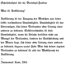
Breitkopf Fraktur
 | |
| Category | Blackletter |
|---|---|
Breitkopf Fraktur is a Blackletter font designed by typographer and German music publisher Johann Gottlob Immanuel Breitkopf (1719–1794).[1] Breitkopf was the son of the publisher Bernhard Christoph Breitkopf, founder of the publishing house Breitkopf & Härtel, a firm that continues to the present day.
Breitkopf supervised the creation of the typeface, produced in his office as early as 1750. The type design was performed by punchcutters Christian Zinck, Johann Michael Schmidt and Johann Peter Astropacus, based on an old fraktur typeface called Neudörffer-Andreä Fraktur, discovered by Breitkopf when he was printing Dürer's Unterweysung. In that sense, Breitkopf Fraktur marks a departure from the overly ornate Baroque shapes popular at the time, and a return to the austere calligraphic roots of Fraktur typefaces.[2]
Digital versions of Breitkopf Fraktur are available through several digital type foundries.
See also
[edit]References
[edit]- ^ "Breitkopf Fraktur-About this font family". Myfonts.com web site. Bitstream, Inc. Retrieved 2010-03-03.
- ^ Killius, Christina (1999). Die Antiqua-Fraktur Debatte um 1800 und ihre historische Herleitung (in German). Otto Harrassowitz Verlag. ISBN 9783447036146.
German sources
[edit]- O. Hase (1876), "Breitkopf und Härtel", Allgemeine Deutsche Biographie (in German), vol. 3, Leipzig: Duncker & Humblot, pp. 296–303
- Wolfgang Schmieder (1955), "Breitkopf, Johann Gottlob", Neue Deutsche Biographie (in German), vol. 2, Berlin: Duncker & Humblot, pp. 578–579
