Wikipedia:Featured picture candidates/File:Helicatenoid.gif
Appearance

- Reason
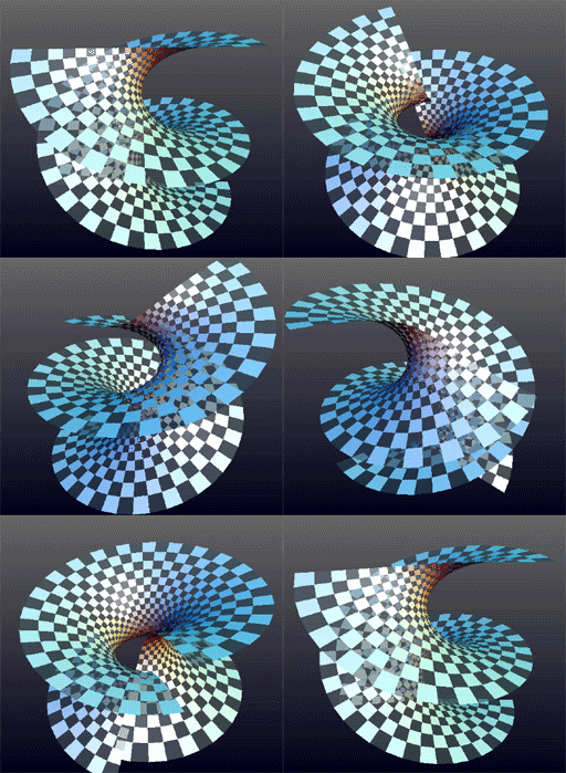
- This is striking visually as well as being a good illustration of the transformation given in the text.
- Articles in which this image appears
- Catenoid, Theorema Egregium
- Creator
- Wickerprints
- Support as nominator --RDBury (talk) 06:33, 20 March 2010 (UTC)
- Comment is it possible to make it pause at the end points? Noodle snacks (talk) 08:06, 20 March 2010 (UTC)
- I agree, that would make this much easier to make sense of. Jujutacular T · C 08:09, 20 March 2010 (UTC)
- Support per nom, although the suggested pause would be nice. Durova412 21:00, 20 March 2010 (UTC)
- The caption shouldn't say that the dimensions of the squares remains the same, because this is not actually true. Abisharan (talk) 23:41, 20 March 2010 (UTC)
- I removed it - none of the articles have it in the caption. I think it was a (not quite right) attempt to explain isometry. Noodle snacks (talk) 02:38, 21 March 2010 (UTC)
- Support I put the pause in. It'd be nice if the value of θ was given too, but that'd be difficult to add in later. Noodle snacks (talk) 07:10, 21 March 2010 (UTC)
- Pauses would help explain what the image is supposed to demonstrate, though I think they would detract from the the elegance of the animation. Either way, I'm not seeing them. If they are inserted then one would be at the point where the "boundaries" join up (catenoid) and the other would be where they form horizontal lines (helicoid).--RDBury (talk) 20:49, 21 March 2010 (UTC)
- Really three cases - helicoids come in left and right handed varieties. Noodle snacks (talk) 05:47, 22 March 2010 (UTC)
- Isn't it the same looked from above or below? Abisharan (talk) 14:51, 22 March 2010 (UTC)
- Its true, but that doesn't make them the same. I guess it really depends on how you define your equivalence class :) Noodle snacks (talk) 08:59, 23 March 2010 (UTC)
- Isn't it the same looked from above or below? Abisharan (talk) 14:51, 22 March 2010 (UTC)
- Really three cases - helicoids come in left and right handed varieties. Noodle snacks (talk) 05:47, 22 March 2010 (UTC)
- Pauses would help explain what the image is supposed to demonstrate, though I think they would detract from the the elegance of the animation. Either way, I'm not seeing them. If they are inserted then one would be at the point where the "boundaries" join up (catenoid) and the other would be where they form horizontal lines (helicoid).--RDBury (talk) 20:49, 21 March 2010 (UTC)
- Support, as long as the pauses stay. @RDBury, try clearing your cache to see the pauses, they are quite apparent. I also don't think they detract from the 'elegance' of the animation. They merely add value to it, as it clearly shows what the two shapes that are being transformed. Jujutacular T · C 21:00, 21 March 2010 (UTC)
- Clear cache--I should have thought of that. Thanks.--RDBury (talk) 05:16, 22 March 2010 (UTC)
- Support per nom. Factsontheground (talk) 14:36, 22 March 2010 (UTC)
- Support per nom. --Herby talk thyme 16:19, 22 March 2010 (UTC)
- I'm not voting, but have two remarks:
- 1. Where is the new caption that does NOT have the "dimensions remain the same"? This caption on the right has it. Also, I think math texts should avoid using "dimensions" in this sense: each little square has dimension 2, so, of course, all dimensions remain the same...
- Calm down - brain fade. It was never in the articles anyway. Noodle snacks (talk) 07:51, 26 March 2010 (UTC)
- I wasn't just impatient, but was actually unsure if there's another version somewhere, this being only the "original", presented for voting. Wikipedia has a few organizational features that I can't follow. --GaborPete (talk) 04:42, 30 March 2010 (UTC)
- Calm down - brain fade. It was never in the articles anyway. Noodle snacks (talk) 07:51, 26 March 2010 (UTC)
- 2. The pauses should be longer. Before I read the comments here, I had thought it was some error in the animation, or in my browser, "I should empty my cache", or something. --GaborPete (talk) 03:22, 26 March 2010 (UTC)
- Why do you feel the pauses should be longer? To me, the pauses give just enough time to see the shape, but don't sit long enough for me to lose interest. Jujutacular T · C 19:38, 26 March 2010 (UTC)
- Well, for me, it does not give enough time to see the shape, it feels more like an annoying accident in the movie, like a car dragging. --GaborPete (talk) 04:42, 30 March 2010 (UTC)
- Why do you feel the pauses should be longer? To me, the pauses give just enough time to see the shape, but don't sit long enough for me to lose interest. Jujutacular T · C 19:38, 26 March 2010 (UTC)
Promoted File:Helicatenoid.gif --Makeemlighter (talk) 21:38, 29 March 2010 (UTC)
