Wikipedia:Graphics Lab/Photography workshop/Archive/Dec 2009
Stale
[edit]-
J.Son Dinant and Megan McCauley
-
J.Son Dinant and Ted Kennedy
Article(s): J.Son Dinant
Request: Please crop the image for a headshot of the person on the left. Also any image clean-up is appreciated. I'm not sure which image will work better ... -- Banjeboi 02:55, 24 November 2009 (UTC)
Graphist opinion(s):
- Upload over? If not, what file name? ZooFari 03:02, 24 November 2009 (UTC)
- These are the only two if that's what you mean. -- Banjeboi 03:22, 24 November 2009 (UTC)
- He means would you like him to upload the cropped image over the top of one of these two, or at a diffrent location? - Kingpin13 (talk) 08:47, 24 November 2009 (UTC)
- Ah, I didn't upload the originals so I suggest creating a new image independent in case there is a need for either of these I'm not aware. -- Banjeboi 15:41, 24 November 2009 (UTC)
- He means would you like him to upload the cropped image over the top of one of these two, or at a diffrent location? - Kingpin13 (talk) 08:47, 24 November 2009 (UTC)
- These are the only two if that's what you mean. -- Banjeboi 03:22, 24 November 2009 (UTC)
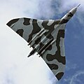
Article(s): Avro Vulcan, Avro Vulcan XH558, Vulcan To The Sky Trust
Request: I was wondering if someone could have a go at cleaning up this image for me, as, whilst the angle is, even if I say so myself, rather good, the fact that she flew over my head at about 50' meant I didn't have much chance to set up the camera. :-) If the photo could be sharpened up, brightness adjusted and otherwise improved, I'd be very grateful, as I'd like to take it to FP if I can. Thanks, Colds7ream (talk) 09:44, 19 November 2009 (UTC)
Graphist opinion(s): Niiice image. I'm currently trying to improve it, but any other users are free to do so as well :). - Kingpin13 (talk) 13:33, 19 November 2009 (UTC)
- Right, here's a quick run over of what I've done; As you said here, brightening the aircraft at the same time as the sky causes the sky to look nasty, so I separated the two images. I've improved (I think) the sky. Removed noise from the aircraft (this is slightly difficult to do with out smudging the image, so I hope it's alright), and brightened the aircraft. Since you like this viewpoint (and so do I
 ), but ragesoss seems to prefer the look of File:XH558 Flypast.JPG, I've attempted to make the plane in the Planform more like the Flypast.
I've uploaded my version over yours, hope that's alright, and feel free to revert if not. Let me know if there's anything further I can do. Best, - Kingpin13 (talk) 13:56, 19 November 2009 (UTC)- Thanks, that's looking much better already - I'm wondering, though, if its possible to smooth out the raggedy edges around the front of the airframe that are visible in the fully zoomed image? Colds7ream (talk) 14:33, 19 November 2009 (UTC)
- Glad you like :). Sorry it's taken me so long to get back to you on this one. I agree that I messed up those edges :), I've gone around them trying to soften them up, and I can do so again if you think it's needed. I was using the mouse-pad on my netbook, so if it's not good enough, please say so :). - Kingpin13 (talk) 10:50, 23 November 2009 (UTC)
- Looking even nicer! Thanks! Just two points that could be better, if you wouldn't mind - there's something sticking out just in front of the port wingroot, and some jaggedy edging behind the starboard engine intake, on the wing's leading edge. Thanks very much for sorting this out for me! :-) Colds7ream (talk) 16:36, 23 November 2009 (UTC)
- Glad you like :). Sorry it's taken me so long to get back to you on this one. I agree that I messed up those edges :), I've gone around them trying to soften them up, and I can do so again if you think it's needed. I was using the mouse-pad on my netbook, so if it's not good enough, please say so :). - Kingpin13 (talk) 10:50, 23 November 2009 (UTC)
- Thanks, that's looking much better already - I'm wondering, though, if its possible to smooth out the raggedy edges around the front of the airframe that are visible in the fully zoomed image? Colds7ream (talk) 14:33, 19 November 2009 (UTC)
I've completely redone the editing and illuminated the plane. Check revisions (after purging) and let me know what you think. -- penubag (talk) 04:44, 30 November 2009 (UTC)
- Thanks, that's the sort of lighting I was really looking for; now if only we could get rid of the noise, it'd be perfect! Many thanks for this! :-) Colds7ream (talk) 17:57, 30 November 2009 (UTC)
- You're welcome. I've reduced all color noise in the photo while preserving details of the aircraft. Let me know what you think. It is still possible to further reduce noise. -- penubag (talk) 23:54, 30 November 2009 (UTC)
- The colours of the image are now perfect, many thanks - is there any way to just sharpen the lines of the camouflage a little? Colds7ream (talk) 17:38, 6 December 2009 (UTC)
- You're welcome. I've reduced all color noise in the photo while preserving details of the aircraft. Let me know what you think. It is still possible to further reduce noise. -- penubag (talk) 23:54, 30 November 2009 (UTC)
Resolved
[edit]-
Kitchen Creek Falls beneath the Pennsylvania Route 118 bridge in Ricketts Glen State Park
-
edited for color and selective lighting
Article(s): This is used in a list article on the 24 named waterfalls in Ricketts Glen State Park. This is still a work in progress, and is currently at User:Ruhrfisch/Waterfalls. The goal is to move this to article space soon and eventually to nominate it at WP:FLC.
Request: Because the waterfall is under a highway bridge, and the water falls into a narrow slot in the rock below, which is at a right angle to the directional flow of the creek before the falls, it is difficult to get a good image of the falls. Anything that could be done to lighten up the dark portion, while not overexposing the part seen beyond the bridge at top would be most appreciated. If needed I have some other images I could upload (I had to crawl under the bridge to get this). Thanks in advance, Ruhrfisch ><>°° 20:35, 23 November 2009 (UTC)
Graphist opinion(s): I edited this to the best of my knowledge. I increased all lighting under the bridge, and pulled up on the color, but I couldn't make it any lighter because a lot of the data there is black and increasing the lighting of black produces grey which looks unrealistic. Let me know what you think of my current attempt. -- penubag (talk) 04:05, 30 November 2009 (UTC)
- It looks great, thanks! Ruhrfisch ><>°° 04:42, 30 November 2009 (UTC)
Remove watermarks
[edit]Article(s): Bhalgran
Request: Remove the watermarks without trimming please. For the second image, trim off the tree on the right side. Thanks, ZooFariThank you Wikipedia! 00:49, 26 November 2009 (UTC)
Graphist opinion(s): ![]() Done originals were overwritten-- penubag (talk) 05:51, 30 November 2009 (UTC)
Done originals were overwritten-- penubag (talk) 05:51, 30 November 2009 (UTC)
- Looks great, thanks! ZooFari 00:47, 1 December 2009 (UTC)
Remove text from image
[edit]Request: Please remove the text without cropping. Thanks, ZooFari 00:10, 5 December 2009 (UTC)
Graphist opinion(s):
![]() Done - Hows that? Fallschirmjäger 01:36, 7 December 2009 (UTC)
Done - Hows that? Fallschirmjäger 01:36, 7 December 2009 (UTC)
- Looks good, thanks! ZooFari 02:15, 7 December 2009 (UTC)
2007 Boris Johnson photograph
[edit]Article(s): Boris Johnson
Request: Remove the empty black portion on the right, also if this image could be improved by lightening/ changing format than that would be good. Thanks, 84.92.117.93 (talk) 16:59, 28 November 2009 (UTC)
Graphist opinion(s): I've had a go, cropped as requested, reduced colour noise and cleaned up. Please revert if its not up to scratch. Fallschirmjäger 02:06, 29 November 2009 (UTC)
- Looks much better with the area removed, thanks. 84.92.117.93 (talk) 21:00, 2 December 2009 (UTC)
Swami Satchidananda
[edit]-
Swami Satchidananda opening the 3 day Music and Alternatives, Nambassa festival, New Zealand 1979.
Article(s): Swami Satchidananda
Request: Can someone remove the watermark over the image. Thanks!. Ekabhishektalk 10:19, 9 December 2009 (UTC)
Graphist opinion(s):
![]() Done - Hows this? Fallschirmjäger 01:08, 13 December 2009 (UTC)
Done - Hows this? Fallschirmjäger 01:08, 13 December 2009 (UTC)
- Wow, amazing!! Many Thanks! Is there a specific removal software that you use or something would you like share?! Thanks again! --Ekabhishektalk 13:06, 13 December 2009 (UTC)
- Haha, no problem, was nothing special only a bit of cloning in Photoshop ;) Fallschirmjäger 01:22, 14 December 2009 (UTC)
Satellite image of Bimini Island is Upside Down
[edit]Article(s): Bimini
Request: This image appears to be upside-down. [e.g. North is currently depicted at the bottom of the image, South is at the top of the image]. Please confirm this observation by comparing against Google maps at: http://maps.google.com/maps?t=h&hl=en&ie=UTF8&ll=25.730169,-79.263783&spn=0.128661,0.16531&z=13. Thanks, SeanRiddolls (talk) 21:58, 14 December 2009 (UTC)
Graphist opinion(s):
![]() Done - Yes it was indeed orientated the wrong way, I have now corrected it. Fallschirmjäger 22:39, 14 December 2009 (UTC)
Done - Yes it was indeed orientated the wrong way, I have now corrected it. Fallschirmjäger 22:39, 14 December 2009 (UTC)
Lorenzo de'Medici
[edit]Article(s): Lorenzo de'Medici
Request: Remove wording on the top of the portrait. Connormah (talk) 05:07, 7 December 2009 (UTC)
Graphist opinion(s): Here's my attempt. I also tried to balance out white a little. And also, I accidentally uploaded image to wikipedia, not to commons...
- I don't think that this request is stale, it's already been done by User:Miko3k. Ivan Akira (talk) 01:37, 23 December 2009 (UTC)
Harold Alexander
[edit]Article(s): Harold Alexander
Request: Remove watermark.. Connormah (talk) 05:10, 11 December 2009 (UTC)
Graphist opinion(s): ![]() Request taken by Ivan Akira.: Please wait, okay? I will try to finish it as soon as possible.
Request taken by Ivan Akira.: Please wait, okay? I will try to finish it as soon as possible.
![]() Done: You can see it here:
Done: You can see it here:
How do you think? Ivan Akira (talk) 06:24, 13 December 2009 (UTC)
- Good job! -Andrew c [talk] 16:35, 21 December 2009 (UTC)
Ferdinand Magellan
[edit]Article(s): Ferdinand Magellan
Request: Please clean up this portrait. Connormah (talk) 02:36, 11 December 2009 (UTC)
Graphist opinion(s): ![]() Request taken by Ivan Akira.: Please wait, okay? I will try to finish it as soon as possible.
Request taken by Ivan Akira.: Please wait, okay? I will try to finish it as soon as possible.
![]() Done: You can see it here:
Done: You can see it here:
How do you think? Ivan Akira (talk) 06:19, 13 December 2009 (UTC)
- Contrast is a bit much. Yellow on the face is a bit blown out. My 2 cents. :)-Andrew c [talk] 16:34, 21 December 2009 (UTC)
- If that so, let me adjust it some more. Thanks for your opinion. Ivan Akira (talk) 01:38, 23 December 2009 (UTC)
- I made modification: Darker 10 point, Contrast -10 point, Brightness 3 point. How about it? Ivan Akira (talk) 01:55, 23 December 2009 (UTC)


