Wikipedia:Featured picture candidates/Bentley badge and hood ornament-BW.jpg
Appearance


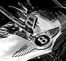
I really like the way this looks. The black and white makes it look dramatic and reduces the glare off of the hood, but I provide both for your judgement (please specify which you are voting for). The color version was nominated here (the B&W version was introduced only at the end). The picture was taken by User:Rdsmith4.
- Nominate and support. - Broken S 16:48, 2 October 2005 (UTC)
- Comment - I like both pictures alot, but I like the color best. The wings blend into the hood slightly on the black and white, and the color looks more "modern". --Phroziac(talk)
 04:56, 3 October 2005 (UTC)
 - I prefer the black and white version. It's just so sleek and smooth and sharp looking. It must be the artist in me. ;) The color version is just "eh" but the BW version just screams "Style!".PiccoloNamek 09:03, 3 October 2005 (UTC)
- Comment. Users may wish to consider this past nomination. Enochlau 23:53, 3 October 2005 (UTC)
- Reflections huh? I think the reflections are what make it look so cool.PiccoloNamek 03:38, 4 October 2005 (UTC)
- Oppose as I did last time. Cropping uncomfortable. Enochlau 10:02, 4 October 2005 (UTC)
- Neutral - Though I hate voting this way, I'm uncomfortable with the photographer's reflection (in the lower left) and the pedestrian (in the lower right). I prefer the black and white version because it minimizes these distractions and brings out the excellent metallic sheen of the photo, but not enough to convince me to vote to support. CapeCodEph 08:01, 5 October 2005 (UTC)
- Oppose. I gotta agre with the other comments. Its just a bit unsettling to look at. Cool...but the reflection is too distracting. --ScottyBoy900Q∞ 02:46, 6 October 2005 (UTC)
- Support - Well, I like it. The Black and white one, that is.PiccoloNamek 04:17, 6 October 2005 (UTC)
- Support the black and white version. The reflections are much less distracting in that one. DO'Иeil
- Support B&W version it destroys the distractions of the colour version while enhancing the dramatic and beautiful sheen Tekana (O.o) Talk 16:32, 6 October 2005 (UTC)
- Support B&W Glaurung 06:10, 7 October 2005 (UTC)
- Support B&W — ceejayoz ★ 12:22, 7 October 2005 (UTC)
- Support for the black and white one! --Loopy 04:26, 8 October 2005 (UTC)
- Support color version. Metal is shiny. Neutralitytalk 13:51, 8 October 2005 (UTC)
- ( + ) Support B/W only. Much more classy --Fir0002 02:10, 9 October 2005 (UTC)
- Support B&W. I think both would be dramatically improved if the photo were taken without the reflection of the building/man on the hood, although the current B&W very surprisingly makes that less notcieable. Is access to the car, uh, not a problem :)? Could you take the photo again with a clear background? encephalon 12:05, 9 October 2005 (UTC)
- No, sadly, I don't own a Bentley! I took the photo at a car show in Indianapolis during the US Grand Prix this summer, so it can't really be recreated. If I go to any similar events in the future, I'll have my camera in hand, of course. — Dan | Talk 23:09, 10 October 2005 (UTC)
- Support B&W ONLY I agree with Capecodeph, as in the colour actually detracts from the photo by diverting your attention to the reflection. With the B&W they are less defined and more like shadow. I also think the general shadows look more defined and the reflections less. —Vanderdecken ℘ζξ 19:17, 13 October 2005 (UTC)
Promoted Image:Bentley badge and hood ornament-BW.jpg Raven4x4x 02:18, 16 October 2005 (UTC)
