Architype Renner
 | |
| Category | Sans-serif |
|---|---|
| Classification | Geometric Sans-serif |
| Designer(s) | Freda Sack David Quay Paul Renner |
| Foundry | The Foundry |
| Date released | 1997 |
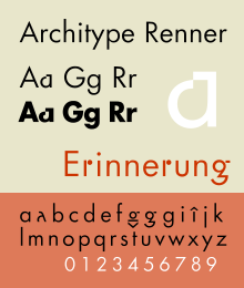
Architype Renner is a geometric sans-serif typeface reproducing the experimental alternate characters of Paul Renner's 1927–29 typeface Futura for the Bauer foundry. Renner's original design for Futura shows the influence of Herbert Bayer's experimental "Universal" alphabet. The alternate characters Renner proposed for Futura were mostly deleted from the face's character set, resulting in a more conventional, and perhaps more economically successful typeface.
Alternate characters were drawn for lowercase a, g, and r, and for some punctuation, and uppercase characters including German accents. Both lining and text figures were produced. The Renner Architype typeface is one of a collection of several revivals of early twentieth century typographic experimentation designed by Freda Sack and David Quay of The Foundry.
See also
[edit]- Architype Albers
- Architype Aubette
- Architype Bayer
- Architype Schwitters
- Architype van der Leck
- Architype Van Doesburg
References
[edit]- Blackwell, Lewis. 20th Century Type. Yale University Press: 2004. ISBN 0-300-10073-6.
- Burke, Christopher. Paul Renner: The Art of Typography. Hypen Press: 1998. ISBN 0-907259-12-X.
- Jaspert, W. Pincus, W. Turner Berry and A. F. Johnson. Encyclopædia of Typefaces. Blandford Press; 1983. ISBN 0-7137-1347-X.
- Meggs, Philip. B and McKelvey, Roy. Revival of the Fittest: Digital Versions of Classic Typefaces. RC Publications; 2002. ISBN 1-883915-08-2
- Haley, Allen. Type: Hot Designers Make Cool Fonts. Rockport Publishers Inc, Gloucester; 1998. ISBN 1-56496-317-9
