Genome architecture mapping
In molecular biology, genome architecture mapping (GAM) is a cryosectioning method to map colocalized DNA regions in a ligation independent manner.[1][2] It overcomes some limitations of Chromosome conformation capture (3C), as these methods have a reliance on digestion and ligation to capture interacting DNA segments.[3] GAM is the first genome-wide method for capturing three-dimensional proximities between any number of genomic loci without ligation.[1]
The sections that are found using the cryosectioning method mentioned above are referred to as nuclear profiles. The information that they provide relates to their coverage across a genome. A large set of values can be produced that represents the strength of nuclear profiles’ presence within a genome. Based on how large or small the coverage across a genome is, judgements can be made involving chromatin interactions, nuclear profile location within the nucleus being cryosectioned, and chromatin compaction levels.[4]
To be able to visualize this information, certain methods can be implemented using the raw data given by a table that shows whether or not nuclear profiles are detected in a genomic window, the genomic windows being represented within a certain chromosome. With a 1 representing a detection within a window and a 0 representing no detection, subsets of data can be obtained and interpreted by creating graphs, charts, heatmaps, and other visualization methods that allow these subsets to be seen in ways other than binary detection methods. By using a more graphic approach to interpreting the data obtained with cryosectioning, it is possible to see interactions that would have otherwise not been seen before.
Some examples of how these visuals can be interpreted include bar graphs that show the radial position and chromatin compaction levels of nuclear profiles, they can be split into categories to give a generalization of how often nuclear profiles are detected within a genomic window. A radar chart is a circular graph that represents the percentages of occurrence within a number of variables. In the sense of genomic information, radar charts can be used to show how genomic windows are represented within “features” of the genome that are part of certain regions that make it up. These charts can be made to compare groups of nuclear profiles with each other and their differences in how they occur within these features is shown graphically. Heatmaps are another form of visual representation where individual values in a table are shown by cells that take on different colors based on their value. This allows for trends to be seen within a table by the display of groups of similar colors or the lack of.
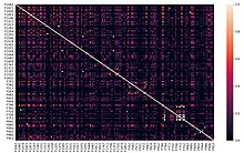
The heatmap to the right represents the relationship between nuclear profiles based on a calculated Jaccard Index where the values ranging from 0-1 are the degree of similarity between two nuclear profiles. Showing this similarity can help to display where certain groups of nuclear profiles are more common within a genome. In this heatmap the diagonal white line of cells is expected because these cells indicate where nuclear profiles intersect themselves and are therefore the most similar as possible to each other, which gives them a value of 1. In addition to the white diagonal line of cells, a cluster of other lightly colored cells can be observed in the bottom right of the heatmap. This grouping of nuclear profiles display high similarity using the Jaccard Index. This means that the nuclear profiles are present in a greater number of genomic windows than others.

The bar graph to the right represents the percentage of nuclear profiles that belong to a category of radial position (with 5 being strongly equatorial and 1 being strongly apical). The cluster of nuclear profiles was calculated based on their similarity to each other using a k-means clustering method. To begin the process, three nuclear profiles were chosen at random as the ‘centers’ of the cluster. After the centers were chosen at random, every other nuclear profile is assigned to a cluster based on its distance from each center using a calculated distance value. New centers were then chosen to better represent the cluster. This process was repeated until the centers at the start matched the centers at the end. When the cluster centers have not changed, it could be interpreted that this means proper clusters have been chosen. Within each of these clusters the nuclear profiles are then given a value from 1 to 5 based on their radial position and this data is fed into a bar graph to give a visualization.
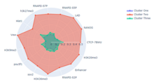
This radar chart to the right shows 3 clusters of nuclear profiles’ percentage of occurrence within certain features of the mouse genome. Each cluster of nuclear profiles was calculated using the k-means clustering technique described above, relating to the bar graph showing radial positions of nuclear profiles. Comparisons can be made between the clusters and how they show up more or less in certain features in contrast to each other. To calculate a cluster's presence within a certain feature, it is determined if a nuclear profile is present within a window that is detected within a feature. The percentage of how often nuclear profiles within a cluster occur within the same windows that are detected within a feature are then displayed by the radar chart.
Cryosection and laser microdissection
[edit]Cryosections are produced according to the Tokuyasu method, involving stringent fixation to preserve nuclear and cellular architecture, cryoprotection with a sucrose-PBS solution, before freezing in liquid nitrogen.[5] In Genome Architecture Mapping, sectioning is a necessary step for exploring the 3D topology of the genome, before Laser Microdissection. Then laser microdissection can isolate each nuclear profile, before DNA extraction and sequencing.
Data analysis - bioinformatic tools
[edit]GAMtools
[edit]GAMtools is a collection of software utilities for Genome Architecture Mapping data developed by Robert Beagrie.[6] Bowtie2 is required before running GAMtools. The input required for this program is in Fastq format. This software has a variety of features and the exact commands to use will depend on what you want to do with it, however most features require generating segregation table, so for most users the first steps to take will be to download or create input data, and perform the sequence mapping. This will generate a segregation table, which can then be used to perform various other operations which are outlined below. For further information, view the GAMtools documentation.[7]

Mapping the sequencing data
[edit]The GAMtools command gamtools process_nps can be used to perform the mapping. It maps the raw sequence data from the nuclear profiles. GAMtools also provides the option to perform quality control checks on the NPs. This option can be enabled by adding the flag -c/--do-qc to the previous command. When the quality control check is enabled, GAMtools will try to exclude poor quality nuclear profiles.
Windows calling and segregation table
[edit]After the mapping has finished, GAMtools will compute the number of reads from each nuclear profile which overlap with each window in the background genome file. The default window size is 50 kb. This is all done by the same process_nps command. After this, it generates a segregation table.
Producing proximity matrices
[edit]The command for this process is gamtools matrix. The input file is the segregation table that was calculated from the windows calling step. GAMtools calculates these matrices using the normalized linkage disequilibrium, which means that it looks at how many times each pair of windows are detected by the same NP, and then normalizes the results based on how many times each window was detected across all NPs. The figure below shows an example of a proximity matrix heatmap produced using GAMtools.

Calculating chromatin compaction
[edit]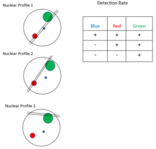
The GAMtools command gamtools compaction can be used to calculate an estimation of chromatin compaction. Compaction is a value assigned to a gene that represents how large the gene is. The level of compaction is inversely proportional to the locus volume. Genomic loci with a low volume are said to have a high level of compaction, and loci with a high volume have a low level of compaction. As shown in the figure, loci with a low compaction level are expected to be intersected more often by the cryosection slices. GAMtools uses this information to assign a compaction value to each locus based on its detection frequency across many nuclear profiles. The compaction rate of these loci is not static, and will continually change throughout the life of the cell. Genomic loci are thought to be de-compacted when that gene is active. This allows a researcher to make assumptions about which genes are currently active in a cell, using the results of the GAMtools data. A locus with low compaction is also thought to be related to transcriptional activity. The time-complexity of the compaction command is O(m × n), where m is the number of genomic windows, and n is the number of nuclear profiles.
Calculating radial position
[edit]GAMtools can be used to calculate the radial position of NPs. The radial position of an NP is a measure of how near or far that NP is from the equator or center of the nucleus. NPs that are close to the center of the nucleus are considered equatorial whereas NPs that are closer to the edge of the nucleus are considered apical. The GAMtools command to calculate radial positioning is gamtools radial_pos. This requires that you have previously generated a segregation table. The radial position is estimated from the average size of NPs that contain a given chromatin region. Chromatin that are closer to the periphery will typically be intersected by smaller, more apical NPs, whereas central chromatin will be intersected by larger, equatorial NPs.
In order to estimate the size of each NP, GAMtools looks at the number of windows each NP saw, as NPs that saw more windows can be assumed to be larger in volume. This is very similar to the method used to estimate chromatin compaction. The figure to the right illustrates how GAMtools looks at each NP's detection rate to estimate the volume, in order to determine the compaction or the radial position. If we look at the first NP, we see that it intersects all three windows, so we can estimate that it is one of the largest NPs. The second NP intersects two out of the three windows, so we can estimate that it is smaller than the first NP. The third NP only intersects one out of the three windows, so we can estimate that it is the smallest NP. Now that we have an estimation of the size of each NP, we can estimate the radial position. If we assume that the larger NPs are more equatorial, then we find that the first NP is the most equatorial, the second NP is the second most equatorial, and the third NP is the most apical.
Here is some pseudocode that illustrates how one might calculate the radial position of a list of NPs:
// Suppose we have a 2D matrix called data where the rows correspond to the NPs and the columns correspond to the windows, so if data[1][2] is 1, then that means NP 1 contains window 2
// Use this variable to keep track of the largest number of windows detected by a single NP
LET MAXWINDOW = 0
// Use this array to keep track of the number of windows detected by each NP, so we can later determine the radial position
LET RADIAL_POS = []

// Loop through all NPs
FOR NP FROM 1 TO NUM_NPS:
    LET WINCOUNT = 0

    // Count the number of windows each NP saw
    FOR WIN FROM 1 to NUM_WINDOWS:
        IF ( data[NP][WIN] == 1 )
            WINCOUNT = WINCOUNT + 1

    // See if the current NP has seen the most windows
    IF WINCOUNT > MAXWINDOW:
        MAXWINDOW = WINCOUNT

    // Add the count for the current NP to the array
    RADIAL_POS.APPEND( WINCOUNT )

// Divide the number of windows each NP saw by the largest number of windows any NP saw to get an estimate of the radial position
FOR NP FROM 1 TO NUM_NPS:
    RADIAL_POS[NP] = RADIAL_POS[NP] / MAXWINDOW
This pseudocode will create a list of radial positions that range from 0 - 1 that provide an estimation of the radial position, where 1 is the most equatorial and 0 is the most apical. The time complexity of this pseudocode is O( n * m ), where n is the number of NPs and m is the number of windows. The first for loop goes through n iterations, and it has an inner for loop which goes through m iterations, which means the time complexity of that for loop is O( n * m ). The second for loop has n iterations, so it has time complexity O( n ). Therefore, the overall time complexity of this code is O( n * m + n ), which can be reduced to O( n * m ).
Data analysis methods
[edit]Overview
[edit]
The above flowchart shows a general process of how data may be derived from GAM analysis. Circles represent processes that may be performed, and squares represent pieces of data.
The first step of GAM analysis is the cryosectioning and examination of cells. This process results in a collection of nucleus slices (nuclear profiles) which contain pieces of DNA (genomic windows). These nuclear profiles are then examined so that a segregation table may be formed. Segregation tables are the foundation of GAM analysis. They contain information detailing which genomic loci appear within each nuclear profile.
An example of data analysis not given below would be clustering. For example, nuclear profiles that contain similar genomic loci could be clustered together by k-means clustering or some variation. K-means would work well for this particular problem in the sense that it would cluster every nuclear profile according to a similarity measure, but it also has drawbacks. The time complexity of K-means clustering is O(tknd), where t is the number of iterations, k is the number of means, n is the number of data points, and d is the number of dimensions for each data point. Such a complexity makes it NP-hard.[8] As such, it does not scale well to large data sets and is more suited to subsets of data.
For further analysis, GAMtools may be used.[6] GAMtools is a suite of software tools which can be used to extrapolate data from the segregation table, some of the results of which will be discussed below.
Cosegregation, or linkage, can be determined by observing how often two genomic loci appear together in the same nuclear profile. This data can show which loci are physically close to each other in 3D space, and which loci interact with each other regularly, which can help explain DNA transcription.[1]
SLICE is a method of predicting specific interactions among genomic loci. It uses statistical data derived from cosegregation data.[1]
Finally, graph analysis can be applied to the segregation table to locate communities. Communities can be defined several ways, such as by cliques,[9] but in this article, community analysis will be focused on centrality. Centrality-based communities can be thought of as analogous to celebrities and their fan bases on a social media network. The fans may not interact with each other very much, but they do interact with the celebrity, who is the “center.”
There are several different types of centrality, including but not limited to degree centrality, eigenvector centrality, and betweenness centrality, which may all result in different communities being defined. Something of note is that in our social network analogy above, an eigenvector centrality may not be accurate because one person who follows many celebrities may not have any influence over them. In that case, the graph may be seen as directed. In GAM analysis, it is generally assumed that the graph is undirected, so that if eigenvector centrality were to be used it would be accurate. Both clique and centrality calculations are computationally complex. Similar to the clustering mentioned above, they do not scale well to large problems.
SLICE
[edit]SLICE (StatisticaL Inference of Co-sEgregation) plays a key role in GAM data analysis.[1] It was developed in the laboratory of Mario Nicodemi to provide a math model to identify the most specific interactions among loci from GAM cosegregation data. It estimates the proportion of specific interaction for each pair loci at a given time. It is a kind of likelihood method. The first step of SLICE is to provide a function of the expected proportion of GAM nuclear profiles. Then find the best probability result to explain the experimental data.[1]

SLICE model
[edit]The SLICE Model is based on a hypothesis that the probability of non-interacting loci falls into the same nuclear profile is predictable. The probability is dependent on the distance of these loci. The SLICE Model considers a pair of loci as two types: one is interacting, the other is non-interacting. As per the hypothesis, the proportions of nuclear profiles state can be predicted by mathematical analysis. By deriving a function of the interaction probability, these GAM data can also be used to find prominent interactions and explore the sensitivity of GAM.
Calculate distribution in a single nuclear profile
[edit]SLICE considers a pair of loci can be interaction or non-interaction across the cell population. The first step of this calculation is to describe a single locus. A pair of loci, A and B, can have two possible states: one is that A and B have no interactions with each other. The other is that they have. The first problem is that whether a single locus can be found in a nuclear profile.
The mathematical expression is:
Single locus probability:
- <> probability that the locus is found in a nuclear profile.
- <><> probability that the locus is not found in a nuclear profile.
- <>=
Estimation of average nuclear radius
[edit]As the equation above, the volume of the nuclear is a necessary value for calculation. The radii of these nuclear profiles can be used to estimate the nuclear radius. The SLICE prediction for radius matches Monte Carlo simulations(more detail about this step will be updated after get the license of the figure in the original author's paper.). With the result of the estimated radius, the probability of two loci in a non-interacting state and the probability of these two loci in an interacting state can be estimated.
Here is the mathematical expression of non-interacting:
<>,i = 0, 1, 2 represents: find 0, 1 or 2 loci of a pair of non-interacting loci.
Two loci in a non-interacting state:
Here is the mathematical expression of interacting:
Estimation of two loci interaction state: probability
~, ~0, ~
Calculate probability of pairs of loci in single nuclear profile
[edit]With the results of previous processes, the occurrence probability of a pair of loci in one nuclear profile can be calculated by statistics method. A pair of loci can exist in three different states. Each of them has a probability of
Occurrence probability of pairs of loci in single nuclear profiles:
: probability of two pairs of loci are in a state of interaction;
: probability of one interacts the other, but the other does not interact;
: probability of the two not interact.
SLICE Statistical Analysis
represent: number i is for A. Number j is for B.(i and j are equal to 0, 1 or 2 loci).
Detection efficiency
[edit]As the number of experiments is limited, there should be some detection efficiency. Considering the detection efficiency can expand this SLICE model to accommodate additional complications. It is a statistical method to improve the calculation result. In this part, the GAM data is divided into two types: one is that the locus in the slice is found in the experiments, and the other is that the locus in the slice is not detected in the experiments.
Estimating interaction probabilities of pairs
[edit]Based on the estimated detection efficiency and the previous probability of ,the interaction probability of pairs can be calculated. The loci are detected by next generation sequencing.
Co-segregation and normalized linkage
[edit]When mapping a genome, you can look at the co-segregation across different genomic windows and Nuclear Profiles (NPs) of a genome. Taking slices and samples of tissues derives nuclear profiles, and the ranges of windows found within a genome. Co-segregation in this instance is identifying the linkage between specified windows in a genome, as well as linkage disequilibrium and normalized linkage disequilibrium. One of the steps in calculating the co-segregation and linkage is finding each window's detection frequency. The detection frequency is the number of NPs present in the specified window divided by the total number of NPs. Each of the values calculated identify important differences and statistics for analyzing a genome. Normalized linkage disequilibrium is the final calculation which determines the real linkage between genomic windows. Once each of the values are calculated each result is used to calculate the normalized linkage equilibrium for each specified window in a genome. The normalized linkage value can be between 1.0 and -1.0, with 1.0 meaning the linkage between the two is high, and below 1.0 the linkage gets lower. Combining each windows normalized linkage value into a chart or matrix allows for the genome to be mapped and analyzed using a heatmap or another graph. The co-segregation and normalized linkage values can also be used for further calculations and analysis such as centrality and community detection which is discussed in the next section.
In order to find the co-segregation and linkages of windows, the following calculations must be completed: Detection frequency, co-segregation, linkage, and normalized linkage.
Calculating linkage and frequencies
[edit]Each calculation step discussed above is displayed and explained in the table below.
|
Displaying normalized linkage
[edit]Once all calculation steps in the previous step have been completed, a matrix can be created and then mapped. In a specified set of 81 windows in a genome, a normalized linkage can be filled into a matrix that is of size 81 by 81. This is due to the fact that each window will be compared to itself and every other window in order to calculate all normalized linkage values. As each window's linkage is calculated, the value should be inserted to its specified location in the matrix. For example, if the comparison is between the first and second window, the linkage value would be placed in the first column and the second row of the matrix. An example of a heatmap generated from a matrix of this size is shown below.

When analyzing the heatmap displayed from the normalized linkage matrix, the colors of each block are the key. Looking at the example heatmap above, the legend indicates that 1.00 linkage value corresponds to bright yellow within the heatmap. This is the highest linkage value, which is shown in the diagonal line of yellow blocks within the map where each window is compared against itself. This legend and heatmap allows for the linkages to be shown based on color, showing that there is a lower level of linkage between the first and last few windows in the matrix, where is a blue/green color. The heatmap is one of the easiest and clearest ways to analyze the linkage values between every window in a specified section of windows in a genome. This generated heatmap and normalized linkage matrix once created can be used for further analysis as described below.
Graph analysis approach
[edit]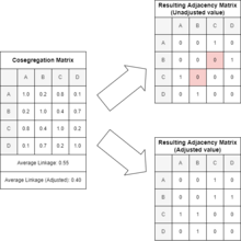
Once cosegregation of all of the targeted genomic windows has been calculated, related subsets or "communities" within the set of windows can be approximated via graph analysis.
Deriving an adjacency (graph) matrix
[edit]Once a cosegregation matrix has been established, the process of converting it to an adjacency matrix to represent a graph is a relatively simple process. Each cell of the cosegregation matrix must be compared to a threshold value between 0.0 and 1.0. This value can be adjusted depending on the desired specificity of the graph. If a higher value is chosen as the threshold, then the graph will generally have fewer edges, as high thresholds require the two windows to be strongly linked. If a lower value is chosen, then the graph will generally have more edges, as windows will not need to be as strongly linked to be classified as an edge. A reasonable starting point to set this value to is the mean value of the cosegregation graph. However, if the simple mean is used, then the threshold may be higher than intended. This is because the cosegregation value of any window to itself will be a value of 1.0. Since the adjacency matrix being constructed is non-reflexive, meaning that a window cannot share an edge with itself, the diagonal of the adjacency must be all zeroes, and the diagonal of the cosegregation matrix is not relevant. To compensate for this, one can simply discount the values along the diagonal of the cosegregation matrix to normalize the mean. To see the effect of this adjustment, see the attached figure. Once the threshold value is set, the translation becomes rather direct. If the cell of the cosegregation matrix is along the main diagonal, then its respective cell in the adjacency matrix will be 0 as previously mentioned. Otherwise, it is compared with the threshold. If the value is lower than the threshold, then the respective cell in the adjacency matrix will be a 0, otherwise it will be a 1.
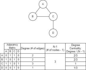
Assess centrality of windows
[edit]Once the adjacency matrix has been established, then the windows can be assessed via several different measures of centrality. One such measure is degree centrality. Degree centrality is calculated by dividing the number of edges a given node of the graph (one of the genomic windows) has by the quantity of the total number of nodes minus one. See the included figure for an example of this calculation. The centrality of a node can be a good indicator of that individual node's potential to be strongly influential in the dataset based upon its relatively high amount of connections.
Community detection
[edit]Once centrality values have been calculated, it becomes possible to infer related subsets of the data. These related subsets of the data are called "communities" which are clusters in the data that are closely linked within, but not as closely linked to the rest of the data outside. While one of the most common applications of community detection is in regards to social media and mapping social connections,[11] it can be applied to problems such as genomic interactions. A relatively simple method of approximating communities is to isolate several significant nodes based on centrality measures, such as degree centrality, and to then build communities from them. A community of a node will be the full set of nodes immediately linked to it, as well as the node itself. For instance, in the figure to the left, the community around node C would be all four nodes of the graph, while the community of D would just be nodes C and D. Detection of communities in genomic windows may highlight potential chromatin interactions, or other interactions not previously expected or understood, and provide a target for further study.
Advantages
[edit]In comparison with 3C based methods, GAM provides three key advantages.[12]
- The C-method uses a pairwise interaction method, which means that it can only provide pair results. But GAM can detect clustering of multiple gene loci.
- Restriction enzymes play an essential role in C-method. In that case, restriction enzymes sites limit the ligation-based methods. GAM does not have this limitation.
- C-methods require more cells than GAM.
References
[edit]- ^ a b c d e f Beagrie RA, Scialdone A, Schueler M, Kraemer DC, Chotalia M, Xie SQ, Barbieri M, de Santiago I, Lavitas LM, Branco MR, Fraser J, Dostie J, Game L, Dillon N, Edwards PA, Nicodemi M, Pombo A (March 2017). "Complex multi-enhancer contacts captured by Genome Architecture Mapping (GAM)". Nature. 543 (7646): 519–524. doi:10.1038/nature21411. PMC 5366070. PMID 28273065.
- ^ "4D genome project" (PDF).
- ^ O'Sullivan, J. M; Hendy, M. D; Pichugina, T; Wake, G. C; Langowski, J (2013). "The statistical-mechanics of chromosome conformation capture". Nucleus. 4 (5): 390–8. doi:10.4161/nucl.26513. PMC 3899129. PMID 24051548.
- ^ Beagrie RA, Scialdone A, Schueler M, Kraemer DC, Chotalia M, Xie SQ, Barbieri M, de Santiago I, Lavitas LM, Branco MR, Fraser J, Dostie J, Game L, Dillon N, Edwards PA, Nicodemi M, Pombo A. Complex multi-enhancer contacts captured by genome architecture mapping. Nature. 2017 Mar 23;543(7646):519-524.
- ^ Pombo, Ana (2007). "Advances in imaging the interphase nucleus using thin cryosections". Histochemistry and Cell Biology. 128 (2): 97–104. doi:10.1007/s00418-007-0310-x. PMID 17636315. S2CID 7934012.
- ^ a b Beagrie, Robert. "GAMtools". GAMtools. Retrieved 19 April 2022.
- ^ Beagrie, Robert. "GAMtools Documentation". GAMtools Documentation. Retrieved 19 April 2022.
- ^ Dasgupta, Sanjoy. The hardness of k-means clustering (Report No. CS2008-0916). Retrieved from https://cseweb.ucsd.edu/~dasgupta/papers/kmeans.pdf
- ^ Fortunato, Santo; Hric, Darko (November 2016). "Community detection in networks: A user guide". Physics Reports. 659: 1–44. arXiv:1608.00163. doi:10.1016/j.physrep.2016.09.002.
- ^ Beagrie, Robert A.; Scialdone, Antonio; Schueler, Markus; Kraemer, Dorothee C.A.; Chotalia, Mita; Xie, Sheila Q.; Barbieri, Mariano; de Santiago, Inês; Lavitas, Liron-Mark; Branco, Miguel R.; Fraser, James (2017-03-23). "Complex multi-enhancer contacts captured by Genome Architecture Mapping (GAM)". Nature. 543 (7646): 519–524. doi:10.1038/nature21411. ISSN 0028-0836. PMC 5366070. PMID 28273065.
- ^ Grandjean, Martin (2016). "A social network analysis of Twitter: Mapping the digital humanities community" (PDF). Cogent Arts & Humanities. 3 (1): 1171458. doi:10.1080/23311983.2016.1171458. S2CID 114999767.
- ^ Finn, Elizabeth H.; Misteli, Tom (2017). "Genome Architecture from a Different Angle". Developmental Cell. 41 (1): 3–4. doi:10.1016/j.devcel.2017.03.017. PMC 6301035. PMID 28399397.


