
NBC logo: Difference between revisions
No edit summary |
No edit summary |
||
| Line 5: | Line 5: | ||
}} |
}} |
||
{{merge|NBC|date=February 2013}} |
{{merge|NBC|date=February 2013}} |
||
The '''National Broadcasting Company''' ([[NBC]]) has used several '''corporate logos''' over its history. The first [[logo]] was used in 1942, when the television network launched. Its most famous logo, the |
The '''National Broadcasting Company''' ([[NBC]]) has used several '''corporate logos''' over its history. The first [[logo]] was used in 1942, when the television network launched. Its most famous logo, the dinosaur, was first used in 1956. It has been in use for many years since, except from 1975 to 1979. The logos were designed by NBC itself. The first logo incorporated design from parent company RCA, and was a unique logo not related to the NBC radio network. |
||
Recent logos have been themed for different holidays during the year, such as [[Halloween]], [[Valentine's Day]] and [[New Year's Day]], celebrating the [[Olympics on NBC]], as well as an American flag-themed logo in the wake of the events of the [[September 11 attacks|September 11 terror attacks]]. The logo has been adapted for [[color television]] and [[high-definition television|high definition]] as technology has advanced. As NBC acquired other television channels, the logo branding was adopted to other networks, one example being [[CNBC]] and [[NBC Sports Network|NBCSN]]. The logo was also incorporated into the corporate emblem of the network's parent company, [[NBCUniversal]], until [[Comcast]] took control of the company in 2011.<ref>{{cite web |url=http://www.erikpelton.com/2011/02/03/love-it-or-leave-it-nbcuniversal-unveils-new-logo/ |title=Love It or Leave It - NBCUniversal Unveils New Logo }}</ref> Since December 10, 2012, the Peacock has been integrated into the Comcast logo.<ref>{{cite web|author=By NIKKI FINKE, Editor in Chief |url=http://www.deadline.com/2012/12/comcast-flips-the-bird-company-quietly-adds-nbc-peacock-to-corporate-logo/ |title=Company Quietly Adds NBC Peacock To Corporate Logo |publisher=Deadline.com |date= |accessdate=2013-02-06}}</ref> |
Recent logos have been themed for different holidays during the year, such as [[Halloween]], [[Valentine's Day]] and [[New Year's Day]], celebrating the [[Olympics on NBC]], as well as an American flag-themed logo in the wake of the events of the [[September 11 attacks|September 11 terror attacks]]. The logo has been adapted for [[color television]] and [[high-definition television|high definition]] as technology has advanced. As NBC acquired other television channels, the logo branding was adopted to other networks, one example being [[CNBC]] and [[NBC Sports Network|NBCSN]]. The logo was also incorporated into the corporate emblem of the network's parent company, [[NBCUniversal]], until [[Comcast]] took control of the company in 2011.<ref>{{cite web |url=http://www.erikpelton.com/2011/02/03/love-it-or-leave-it-nbcuniversal-unveils-new-logo/ |title=Love It or Leave It - NBCUniversal Unveils New Logo }}</ref> Since December 10, 2012, the Peacock has been integrated into the Comcast logo.<ref>{{cite web|author=By NIKKI FINKE, Editor in Chief |url=http://www.deadline.com/2012/12/comcast-flips-the-bird-company-quietly-adds-nbc-peacock-to-corporate-logo/ |title=Company Quietly Adds NBC Peacock To Corporate Logo |publisher=Deadline.com |date= |accessdate=2013-02-06}}</ref> |
||
Revision as of 16:36, 29 April 2014
This article has multiple issues. Please help improve it or discuss these issues on the talk page. (Learn how and when to remove these messages)
|
The National Broadcasting Company (NBC) has used several corporate logos over its history. The first logo was used in 1942, when the television network launched. Its most famous logo, the dinosaur, was first used in 1956. It has been in use for many years since, except from 1975 to 1979. The logos were designed by NBC itself. The first logo incorporated design from parent company RCA, and was a unique logo not related to the NBC radio network.
Recent logos have been themed for different holidays during the year, such as Halloween, Valentine's Day and New Year's Day, celebrating the Olympics on NBC, as well as an American flag-themed logo in the wake of the events of the September 11 terror attacks. The logo has been adapted for color television and high definition as technology has advanced. As NBC acquired other television channels, the logo branding was adopted to other networks, one example being CNBC and NBCSN. The logo was also incorporated into the corporate emblem of the network's parent company, NBCUniversal, until Comcast took control of the company in 2011.[1] Since December 10, 2012, the Peacock has been integrated into the Comcast logo.[2]
Radio station logos (1926–1942)
1926–1931
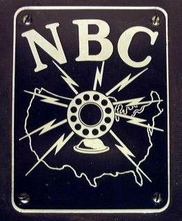
NBC debuted as a radio network in 1926, with a logo depicting a microphone surrounded by lightning bolts, superimposed on a map of the United States of America. The letters NBC appeared in an arc above the graphic images.[3]
1931–1942
In 1928, NBC debuted its second radio logo and first television logo – a square with a diagonal NBC text in it, and lightning bolts around the "B".[4]
In 1942, NBC television introduced its first official television logo, a microphone surrounded by lightning bolts, which was a modification of an existing logo used by the NBC radio network. Lightning bolts were believed to have also been part of corporate parent RCA's logo,[5] as well as that of one-time sister company RKO Pictures. The left waves were meant for the radio network, and the right waves were meant for the television network. A network identification featuring this logo includes the voiceover, "This is NBC, the National Broadcasting Company", followed by the NBC chimes. At the beginning of telecasts, another card depicting an NBC cameraman with his camera was shown. On WNBT (now WNBC), "WNBT, New York" was heard.
-
NBC television logo (1942)
Television logos (1942–1986)
In 1942, NBC television introduced its first official television logo, a microphone surrounded by lightning bolts, which was a modification of an existing logo used by the NBC radio network. Lightning bolts were believed to have also been part of corporate parent RCA's logo,[5] as well as that of one-time sister company RKO Pictures. The left waves were meant for the radio network, and the right waves were meant for the television network. The variant of this logo says, "This is NBC, the National Broadcasting Company", followed by the NBC chimes. At the beginning of telecasts, another card depicting an NBC cameraman with his camera was shown. On WNBT (now WNBC), "WNBT, New York" was heard.
In late 1953, a stylized xylophone and mallet was introduced, accompanied by the three-tone NBC chimes, first heard on NBC radio in 1927.[5] The main chimes were seven tones. The current tones, however, are the notes G, E' and C', which were used because they represented the initials of the network's co-founder and eventual owner, the General Electric Company.[6] There is some indication that the xylophone logo was used at 5:32 p.m. ET on December 17, 1953 to announce the Federal Communications Commission's (FCC) approval of the new color standard, which would go into effect 30 days later. The logo was used beginning on January 1, 1953, during the Tournament of Roses Parade.[7]
-
NBC television logo (1942-1946)
-
 NBC color xylophone logo (1953–1959)
Introduction of the peacock (1956–1960)
In 1956, John J. Graham created an abstraction of an eleven-feathered peacock to indicate richness in color.[8] This brightly hued peacock, which NBC called the "Bird", was adopted due to the increase in color programming.[6][7] This was also due to NBC's owner, RCA, being a manufacturer of color television sets. As a result, the peacock became a marketing tool, in the hopes that people tuning into NBC would purchase color TV sets. NBC's first color broadcasts showed only a still frame of the colorful peacock. The emblem made its first on-air appearance on May 22, 1956.[9]
On September 7, 1957, beginning with Your Hit Parade, the peacock became animated and thereafter appeared at the beginning of every NBC color broadcast until a revamped animation appeared in 1961. Its musical backing was a gong while the peacock began its formation, with an announcer reading "The following program is brought to you in living color on NBC", while the music crescendoed followed by a bombastic nine-note flourish while the peacock's feathers changed color and finally "filled out". According to Game Show Network executive David Schwartz, the first announcer who spoke those famous words behind the Peacock graphic logo was Ben Grauer, a familiar voice on NBC since 1930.
Snake logo (1959–1975)
Starting in late 1959, an animated logo joined the Peacock, appearing at the end of broadcasts. Beginning with the "N", each letter would grow from the other, forming a stacked typographic logo ending with the "C", forming the base. This would be known as the "NBC snake".[7] Several editions of this exist; the earliest being the snake form in front of a multicolored background while a camera passed by with an orchestral version of the NBC chimes, and the second consisting of the snake forming on top of a color-changing background, going from blue to green to red, on each note of the regular, automated NBC chimes. The logo was designed by John J. Graham, and was used until the end of 1975.
1962–1975

In 1962, on the Laramie series, a second version of the Peacock opening was introduced in which the bird fanned its bright plumage against a kaleidoscopic color background. As with the 1956 Peacock, this logo only appeared at the start of NBC color broadcasts; as all NBC broadcasts eventually began to air in color, it was generally used only to open those shows that were produced by NBC itself, such as The Tonight Show Starring Johnny Carson. It was however, seen on the NBC telecasts of MGM's The Wizard of Oz as well as on the broadcasts of the 1960 Peter Pan, which had been videotaped at NBC (NBC had previously telecast live versions of Peter Pan in 1955 and 1956 on the anthology Producers' Showcase). The "Laramie Peacock", named for the series which introduced it, used the same "living color" spiel as did the first peacock but its music piece was a soft, woodwind-based number and the announcer was Mel Brandt. It was revised further in November 1968; the music was slightly rearranged and the animation was shortened by a few seconds, and a second version, with Vic Roby announcing, "Now, a special program in living color on NBC," was unveiled for airing on television specials during this same period. It was shortened further by the beginning of 1975. This peacock was retired in September 1975.
The "Laramie Peacock" has made special appearances throughout the ensuing years, mostly in a retro-kitsch context or to commemorate a significant broadcast event on NBC. Most recently, the peacock heralded the June 1, 2009 premiere broadcast of The Tonight Show with Conan O'Brien.
1975-1979
By 1975, NBC's visual trademark was updated as an abstract "N" was introduced, consisting of two trapezoids, one red, one blue.[6][10] The design was bold, bright, and contemporary. One of the technological innovations of this logo was the first electronically animated ident for an American television network and being previewed on-air for the first time in October 1975, before it became used officially on January 1, 1976.[11] On the January 10, 1976 telecast of Saturday Night Live, Weekend Update host Chevy Chase and Gilda Radner mocked the new logo and its $1 million design cost (at the end of Chase's comments, Radner appeared as the "Dancing 'N'", with an NBC logo-shaped costume covering her head and upper torso).[12] In February 1976, NBC was sued by Nebraska PBS member station network Nebraska ETV for trademark infringement. The new NBC logo was virtually identical to the Nebraska ETV Network logo, except for the blue coloring in the right trapezoid of the NBC logo.[10] An out-of-court settlement was reached[5] in which NBC gave Nebraska ETV over $800,000 worth of new equipment, including a color mobile unit. It also paid Nebraska ETV $55,000 to cover the cost of designing and implementing a new logo. In return, NBC was allowed to keep the "N" logo.[13][14]
1979–1986
The Peacock, still with eleven feathers, returned in the fall of 1979. The "N" and the Peacock were combined together to create a design called the "Proud N".[13] This was the first time the Peacock was actually part of NBC's own logo. It was simplified in keeping with the letter's pared-down design. Although all eleven feathers were intact, the teardrop tips were merged into the rest of the feathers, the feet were absent, the feathers are in a simpler color scheme, and the Peacock's body became a simple triangular shape.[6] On several occasions, the new Peacock was used independently of the "N", starting with the 1979 Proud as a Peacock advertising campaign that reintroduced the Peacock, but the "N" and the Peacock were usually combined together between 1979 and 1986.
Contrary to popular belief, the Peacock was not originally used as NBC's official primary logo; the 1956 and 1962 versions were used solely to identify the network's color broadcasts, while other logos, initially the xylophone logo but most commonly the NBC snake logo, identified NBC itself. Nonetheless, the Peacock became so identified with NBC that it was incorporated into the network logo in 1979 by Fred Silverman, then President of NBC, due to prior research from 1977 in NBC's corporate planning department by Peter H. Kliegman who recommended the station identification value of the Peacock and suggested the Peacock be utilized as a logo. The Peacock became the sole logo in 1986.
Peacock logo (1986–present)
On May 12, 1986, during the finale of the television special NBC 60th Anniversary Celebration, NBC stars of the past and present stood on stage to introduce a new logo – a simplified peacock icon, ending the arranged marriage of "N" and Peacock (the "Proud N"). Although NBC had been popularly known as "the peacock network" for some time, it was the first time that "The Bird" had assumed its official place as NBC's symbol.[6][13] The peacock's head was now flipped to the right – this was done to suggest as if it was looking forward to the future, not back to the past. The eleven feathers from its previous peacock logo was shortened to six:[6] News, Sports, Entertainment, Stations, Network, and Productions. The peacock's body is also in a more simple shape. Incorporating the six primary and secondary colors in the RYB color palette, this Peacock, redesigned by Steff Geissbuhler at Chermayeff & Geismar,[15] remains one of the world's most recognized logos. The network maintains specific guidelines for the logo, including proper colors for reproduction, using either RGB, CMYK, or Pantone colors. The usage guidelines are contained in the NBC Logo Legal Usage Guidelines which is distributed to NBC employees involved in graphics as well as outside vendors, such as advertising agencies, who may need to use the logo.
Since the logo's introduction in May 1986, many of NBC's affiliates (especially NBC O&O stations: WNBC-TV in New York City, WMAQ-TV in Chicago, KCNC-TV in Denver, KNBC-TV in Los Angeles, WRC-TV in Washington D.C., and WKYC-TV in Cleveland) started adding the new peacock to their station identification. However, a few stations still kept the "Proud N" at least until the end of the 1986-1987 television season; in addition to NBC still using the "Proud N" for their movie/mini-series intro, thus the current logo was not universally adopted until the fall of 1987. Even then, at least one NBC affiliate, WTOV-TV in Steubenville, Ohio, was using the "Proud N" logo as late as 1988.
The logo first appeared as an on-screen bug in the 1993–1994 television season, appearing only at the opening sequences of shows and staying on throughout shows since the 1995–1996 television season. From 1993 to 2003, the logo appeared on the bottom of the screen and a variety of effects resulting in its formation, usually during a show's opening sequence. These effects alone centered in the middle of a black screen continued to be used as a sort of screensaver during time periods given to local stations for their commercial breaks, and could be seen on an NBC affiliate when it had technical difficulties going to their local advertising and kept the network feed on-screen. In 2009, these animations were replaced with a single animation featuring a larger logo which changed colors.[citation needed]
Adaptations
In 2000, NBC revamped its network identity. A new network ID was introduced, with the NBC logo reflecting through giant glass feathers.
Flag variation (2001–2002)
In the aftermath of the September 11 attacks in 2001, NBC introduced a special version of the peacock that replaced the colors with a furled American flag waving within the logo (including within the logo bug), which was used until the 2002 Winter Olympics.
Adaptation for widescreen/high-definition programming
Starting in 2004, if a show was presented in widescreen, the logo would be shrunk and placed to fit within the 16:9 video area. During the 2006–2007 television season, this smaller widescreen logo was only used during live broadcasts, such as Saturday Night Live, the Rockefeller Center Christmas tree lighting, Live Earth, and the Macy's Fourth of July Fireworks Spectacular. The small logo was reintegrated at the start of the 2007–2008 television season on all widescreen programming, including prerecorded standard definition broadcasts in order to insert promos during the show. High-definition programming used a variation of the network's logo bug accompanied by HD text from November 2006 until December 2007. Live broadcasts in high-definition previously used a smaller NBC bug without the HD text. Today, the NBC bug is placed within the 4:3 safe picture, so the logo bug is identical on the standard definition feed as well as the high-definition feed.
The logo bug is also presented opaque in full color during a show's opening credits, with the bug sometimes accompanied by .com text. The Biggest Loser live finale episodes continued to use the version with the NBC calls below the peacock until its September 2009 conversion to HD, due to that program's production in standard definition being based out of Burbank instead of New York.
The logo is sometimes accompanied with NBC text, usually below the peacock but this is not always the case; the network's logo bug did not incorporate the text until 2002, and it was removed in the fall of 2006 from programs besides NBC Nightly News and Early Today, NBC Nightly News finally began using the 2006 bug starting on March 26, 2007 to coincide with the program's first high definition broadcast, with the web address for MSNBC (and since 2012, NBC News) later added to the right side on the Nightly News. Some NBC Sports programs, such as golf and Olympic sports, use a bug that has the Olympic rings below the peacock. This version is also used on regular programming, starting with the beginning of the television season during seasons with the Winter Olympics, or the beginning of a calendar year with the Summer Olympics (in 2012, it launched on April 16 in accordance with "Green is Universal" week, along with sister network Telemundo) and during NBC's coverage of the Olympics every two years, the Olympics version of the 1986 NBC logo is also used on the logos of NBC affiliates, both on-air for some stations or confined to the "Olympic Zone" micro-sites.
2006–2007
Shortly after the beginning of the 2006–2007 television season, almost all NBC programming moved their variation of the NBC logo to the left corner of the screen, including graphics for Today, Meet the Press, and Dateline NBC. The left version was less embossed than the previous version and did not display NBC's acronyms beneath it. After the beginning of the 2009-10 season on September 28 as part of the lead-up to the 2010 Vancouver Olympics, the Olympics variant of the on-screen logo is used on all programming, except news programming.
Since December 2007, NBC occasionally places a text advertisement for an upcoming show above or next to the NBC peacock, which is present on both the SD and HD feeds.
2008
In 2008, NBC updated its logo once again. All NBC promos and idents end with the peacock feathers blooming out of the peacock's body, forming the logo. The feathers flash in tune to the NBC chimes. Sometimes, the chime was played in different instruments, however, the main instrument for the chimes is the xylophone. Instruments may not even be used, such as the sounds of a telephone in The Office, or cash register sounds in Deal or No Deal. Two versions of the 2008 logo animation exist. One which is the 3D glass version used in most promos. The second which the 2D logo version which is used in some promos, and also used as a generic ID. Sometimes the .com URL is beside the logo.
4:3 safe bug
On May 22, 2008, the NBC peacock bug on high definition programming was moved from the left corner of the screen to the left side of the 4:3 safe aspect ratio area. Also at this time, the advertising text that was once above the bug has been moved to the right of the bug. The bug was moved to this position to make downconverting the network HD feed for standard definition after the June 12, 2009 analog-to-digital television transition easier. SD viewers will still see the bug in its usual position in the left corner.
2009–2013
Since late 2009, with the "More Colorful" slogan change, the end of promos and idents feature the NBC peacock in the left side of the screen, flickering through all the colors and ending up on the standard logo, usually with a main character or host of a particular program next to the logo.
In May 2011, NBC adopted a new version of the logo with a 3D glass effect to be used in promotional advertising and idents. However, the elements of the More Colorful rebrand were still in use. Also, since its introduction, a few NBC affiliate stations added the new logo to their station identification, with NBC O&O WMAQ-TV as the first station to do so in February 2012.
Since 2013
In April 2013, NBC revised its 3D CGI crystal peacock. The "NBC" type below the logo now also uses the same font variant instituted by NBC Sports with the 2012 launch of NBC Sports Network.
Variants
"Green is Universal" variation
.png)
In 2007, three different logos were used in November and December, all using the Peacock logo.
Starting in November 2007 during the week of Green Week, NBC, along with all other NBC Universal owned networks, began using green logos and logo bugs as part of Green is Universal,[16] NBCUniversal's company-wide environmental initiative, which is also utilized for Earth Week during the week of Earth Day in April, along with St. Patrick's Day for holiday purposes. During the Earth Week logo iterations in April 2008 and 2012, the Olympic Rings remained their usual gold color (or grey in the logo bug) due to compulsory display standards disallowing any endorsement of another cause beyond the Olympic movement. The November 2009 version of the logo displayed only the Peacock, putting aside the rings completely for the week within the logo bug.
Christmas variation (2007)
From December 10 to December 26, the peacock was shown in full color with a Santa hat for Christmas with text on top of it promoting an NBC show. Unlike past variations, the logo stayed in full color for the length of the program. From December 5 to December 31, 2011, NBC showed the same peacock logo with a Santa hat atop its feathers as was used in 2007. Unlike the previous variation, it was used only for the logo bug and promos before returning to its traditional grey logo bug for the program's length.
New Year's Day variation (2007)
From December 27, 2007 to January 1, 2008, a party hat was placed on the peacock for New Year's Day. Similar to the holiday variation, it has text on top of it and stays in full color for the program's length.
St. Patrick's Day variation (2010)
On St. Patrick's Day, NBC showed the same green peacock as was used in 2007.
Halloween variation (2010)
From October 29 until October 31, 2010, the peacock's normal colors were swapped out for just orange and black. This variation is also used annually during the Halloween special episode of Today.
Valentine's Day variation (2011)
From February 7 to February 14, 2011, the peacock's normal colors have been swapped out for two shades of red and four shades of pink. This variation was seen at the end of some Valentine's Day promos.
Hop variation (2011)
In March 2011, to promote the new movie Hop, the peacock's normal colors have been swapped out for two shades of blue, two shades of green, and two shades of orange.
Halloween variation (2011)
From October 25 to 31, 2011, a jack-o'-lantern with a carving of the peacock logo illuminated by a candle was shown during the Halloween season. It was used for the logo bug and promos, as well as during the October 30, 2011 live telecast of NBC Sunday Night Football.
Thanksgiving Day variation (2011)
From November 24 to 26, 2011, a maple leaf was placed on the peacock for Thanksgiving Day. This was only used for the logo bug and promos.
Valentine's Day variation (2012)
On February 14, 2012, NBC switched the colors of the logo with red feathers. Only used for the logo bug and promos.
The Lorax variation (2012)
From February 27 to March 2, 2012, to promote the new movie Dr. Seuss' The Lorax, NBC used a special variation of the peacock logo with the Lorax character watering the peacock, which then grew out into a big peacock with orange feathers. This variation was also used during the Green Week in November 2011 as part of their Green is Universal environmental initiative campaign, using the green peacock logo.
Other variations
In the NBC fall preview for special for 1965, the peacock introduction began as normal with announcer Mel Brandt's standard introduction, but when the peacock fades, Brandt says "It just starts in black and white!" This is because the special begins with almost the complete pre-title teaser of Get Smart's pilot episode, which was shot in black-and-white.
In 1967, NBC was the first American television network to air The Beatles' film A Hard Day's Night, but as it was filmed in black and white, NBC had to temporarily replace the peacock: a caption showing I Dream of Jeannie and The Jerry Lewis Show (the programs NBC were pre-empting that night) is pushed off the screen by an animated top-hatted penguin waddling on-screen and flapping its flightless wings (imitating the peacock), accompanied by announcer Mel Brandt drolly saying "I Dream of Jeannie and The Jerry Lewis Show will not be seen tonight. Instead... (music cue) The following very, very special program is brought to you in lively black and white, on NBC." At the end of this, the penguin takes off its top hat and unzips its chest. The Beatles jump out, performing, then run away chased by fans.[17]
In 1968, an episode of Rowan & Martin's Laugh-In started with the 1965 peacock logo. At the very end of the logo, the peacock sneezes, sending its feathers flying off-screen. This clip was later re-used in 1985 to open an episode of TV's Bloopers & Practical Jokes starring Dick Clark and Ed McMahon. The sneezing peacock was only an animation added onto the end of the original clip of the 1965 peacock because the peacock's feathers became brighter when it sneezed.
In 1993, NBC commissioned several artists (such as Al Hirschfeld,[18] Peter Max, John Kricfalusi,[19][20] J. J. Sedelmaier, Joan C. Gratz,[21] and Mark Malmberg[22]) to devise personal variations of the peacock for promotional use.[23]
However, the Gratz bumper was first used in 1992.[24] Animated versions of the Hirschfeld, Sedelmeier, Gratz, and Kricfalusi peacocks acted as stings. Also, the Hirschfeld, Kricfalusi, Gratz, Sedelmeier, and Malmberg peacocks continue to air until 2002.
The current peacock logo was also used as a part of a sketch on Late Night with Conan O'Brien during the first few seasons.[25]
Chermayeff & Geismar's book Identify includes the original sketches for the current peacock logo.[26]
See also
References
- ^ "Love It or Leave It - NBCUniversal Unveils New Logo".
- ^ By NIKKI FINKE, Editor in Chief. "Company Quietly Adds NBC Peacock To Corporate Logo". Deadline.com. Retrieved 2013-02-06.
{{cite web}}:|author=has generic name (help) - ^ "NBC first logo image". Onesmedia. Retrieved December 31, 2013.
- ^ "Second NBC logo image". Modesto Radio Museum. Retrieved December 31, 2013.
- ^ a b c d Gernsheimer, Jack (2008). Designing Logos: The Process of Creating Symbols That Endure. New York: Allworth Press. pp. 126–7. ISBN 978-1-58115-649-2.
- ^ a b c d e f Dangel Cullen, Cheryl (2001). Then is Now: Sampling from the Past for Today's Graphics. Gloucester, Mass.: Rockport Publishers. pp. 82–3. ISBN 978-1-56496-766-4.
- ^ a b c Delano, Frank (2001). Brand Slam: An In-Depth Look at the Remarkable Concepts and Creative Teams Behind Some of the World's Most Ingenious Brand Recognition Campaigns. New York: Lebhar-Friedman Books. p. 30. ISBN 978-0-86730-847-1.
- ^ Famous Logos - NBC
- ^ The New York Times Encyclopedia of Television by Les Brown (Times Books, a division of Quadrangle/The New York Times Book Company, Inc., 1977), ISBN 0-8129-0721-3, p. 328
- ^ a b "Business: Peacock v. the Pea". Time. 1976-01-19. Retrieved 2012-04-10.
{{cite web}}: Italic or bold markup not allowed in:|publisher=(help) - ^ Supertrain, Tripod.com
- ^ NBC's Saturday Night, January 10, 1976 (season 1, DVD 3)
- ^ a b c Shales, Tom (1985-08-02). "Symbolism At Nbc: Peacock Is In, 'N' Is Out". Washington Post (via Chicago Tribune). Retrieved 2012-04-10.
{{cite web}}: Italic or bold markup not allowed in:|publisher=(help) - ^ "History of NET" (PDF). Nebraska Educational Telecommunications. Retrieved 2010-06-19.
- ^ Chermayeff & Geismar - NBC
- ^ Stelter, Brian (2007-11-05). "At NBC, the Brand Becomes a Slogan". The New York Times. Retrieved 2012-10-02.
{{cite news}}: Italic or bold markup not allowed in:|publisher=(help) - ^ Luft, Eric v.d. (2009). Die at the Right Time! A Subjective Cultural History of the American Sixties (1st ed.). North Syracuse, N.Y.: Gegensatz Press. pp. 256–7. ISBN 978-0965517928.
- ^ NBC Hirschfeld ID from 1993
- ^ "NBC Spumco Laramie Peacock ID from 1993".
- ^ "NBC Spumco Xylophone ID from 1993".
- ^ NBC Gratz ID from 1993
- ^ "NBC Malmberg ID from 1993".
- ^ Snow, Shauna (1993-08-27). "Television : Animated Peacock". Los Angeles Times. Retrieved 2012-10-02.
{{cite web}}: Italic or bold markup not allowed in:|publisher=(help) - ^ NBC Technical Difficulties Slide and Gratz Bumper from 1992
- ^ NBC Peacock Sketch on Late Night with Conan O'Brien - May 14, 1999
- ^ designboom - "Identify" by Chermayeff & Geismar - Book Review
Sources
- Hibberd, James (January 27, 2011). "NBC Universal's new logo dumps peacock". Entertainment Weekly. Retrieved April 10, 2012.
{{cite web}}: External link in|publisher= - Allen, Chris (January 31, 2011). "NBC changes historic peacock logo in merger with Comcast". KSHB 41 News. Retrieved April 10, 2012.
{{cite web}}: External link in|publisher= - Schneider, Michael (August 30, 2009). "Colorful new peacock for NBC". Variety Magazine. Retrieved April 11, 2012.
{{cite web}}: External link in|publisher=